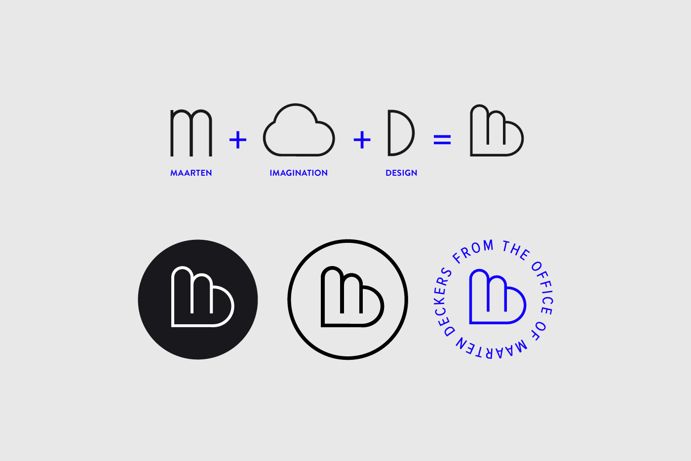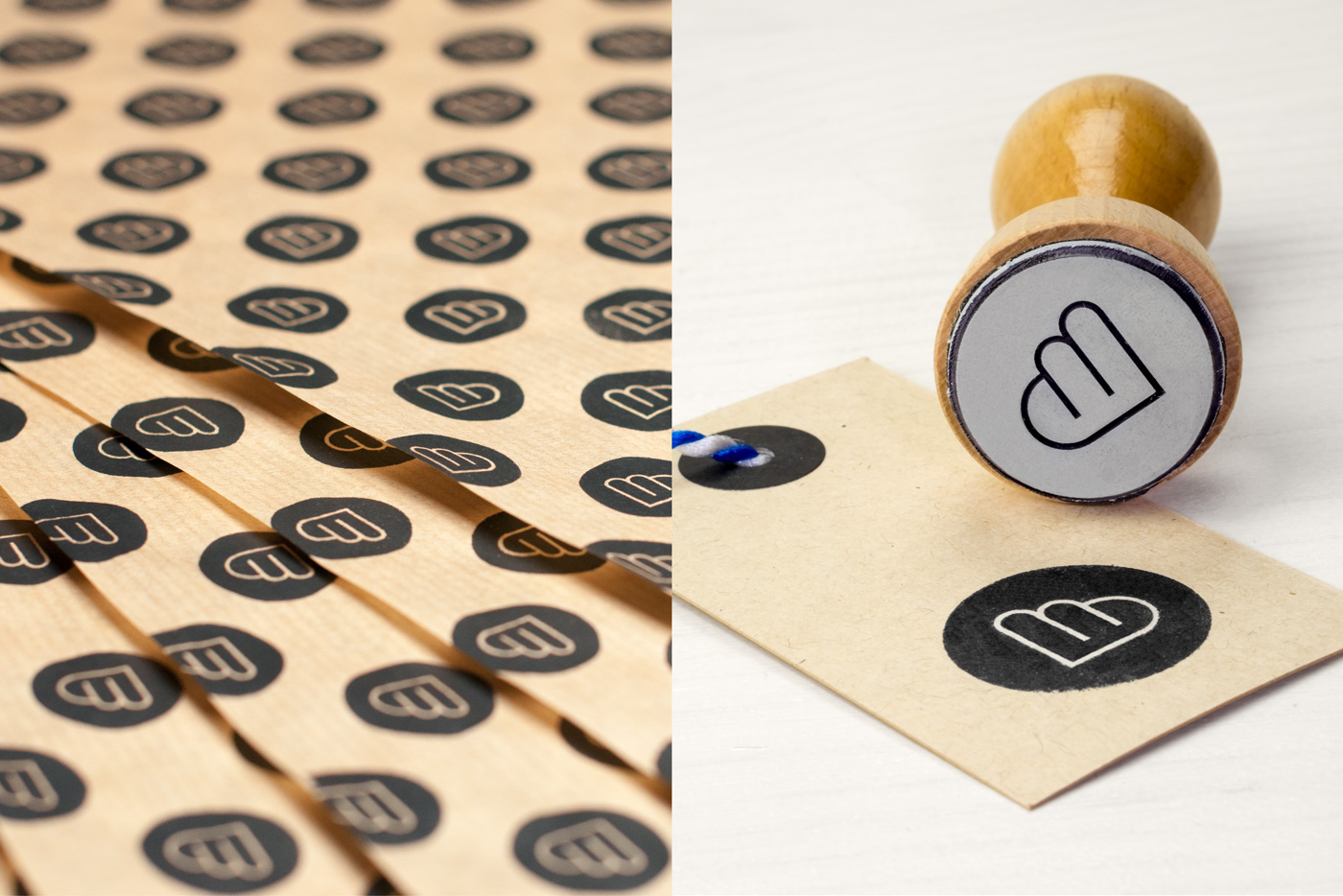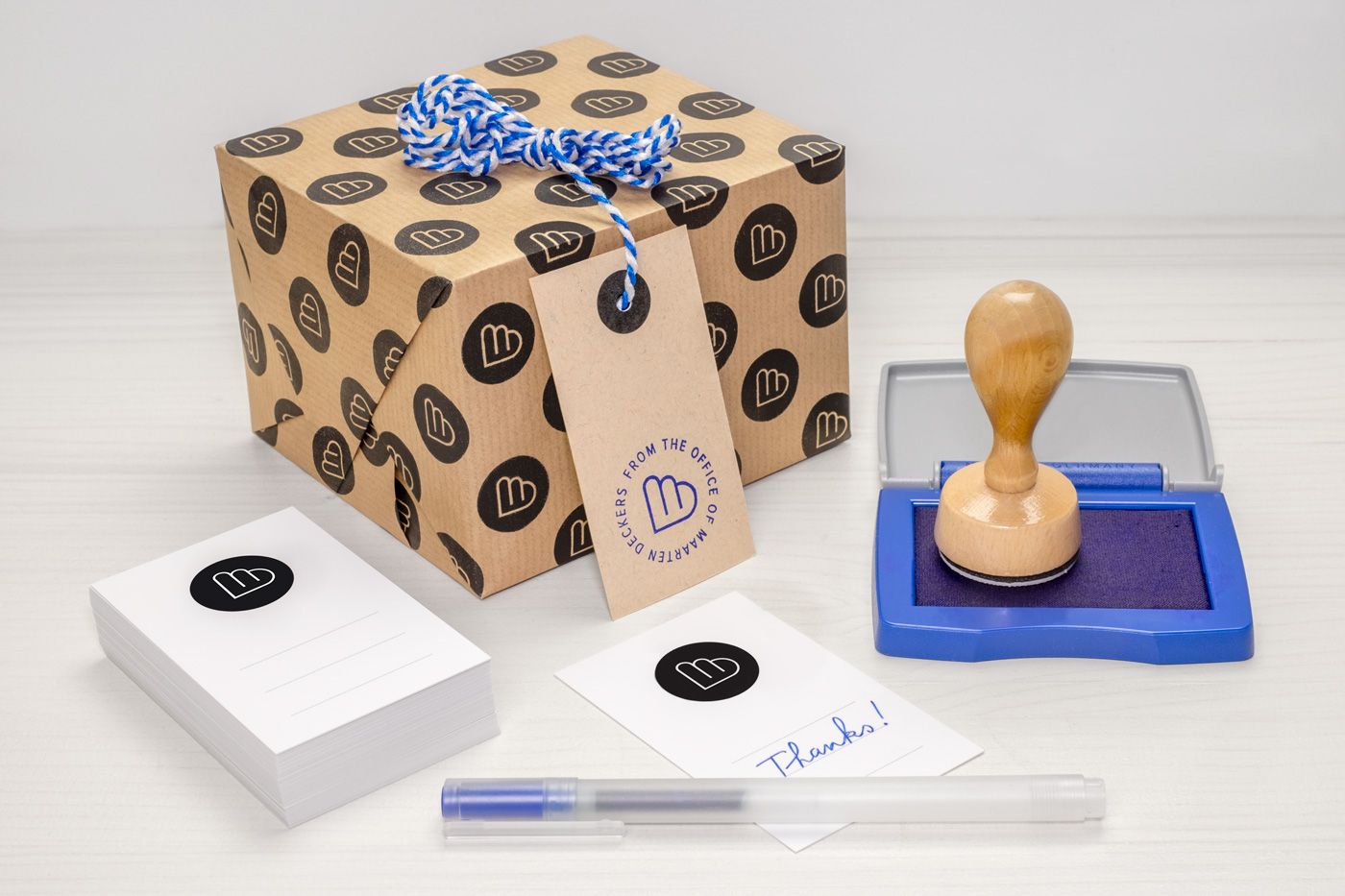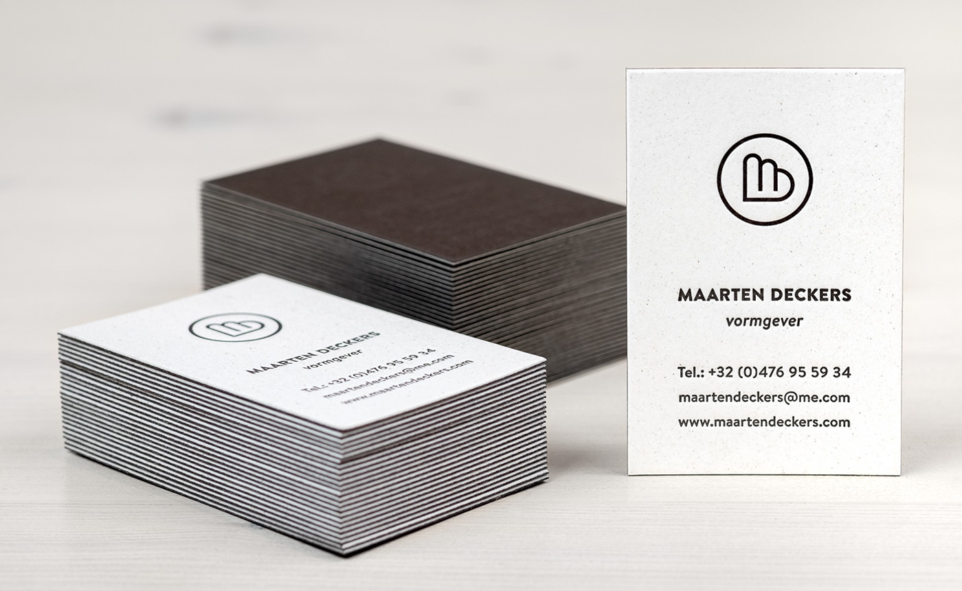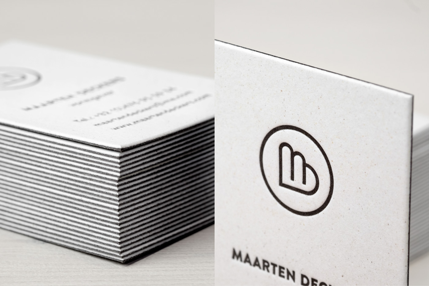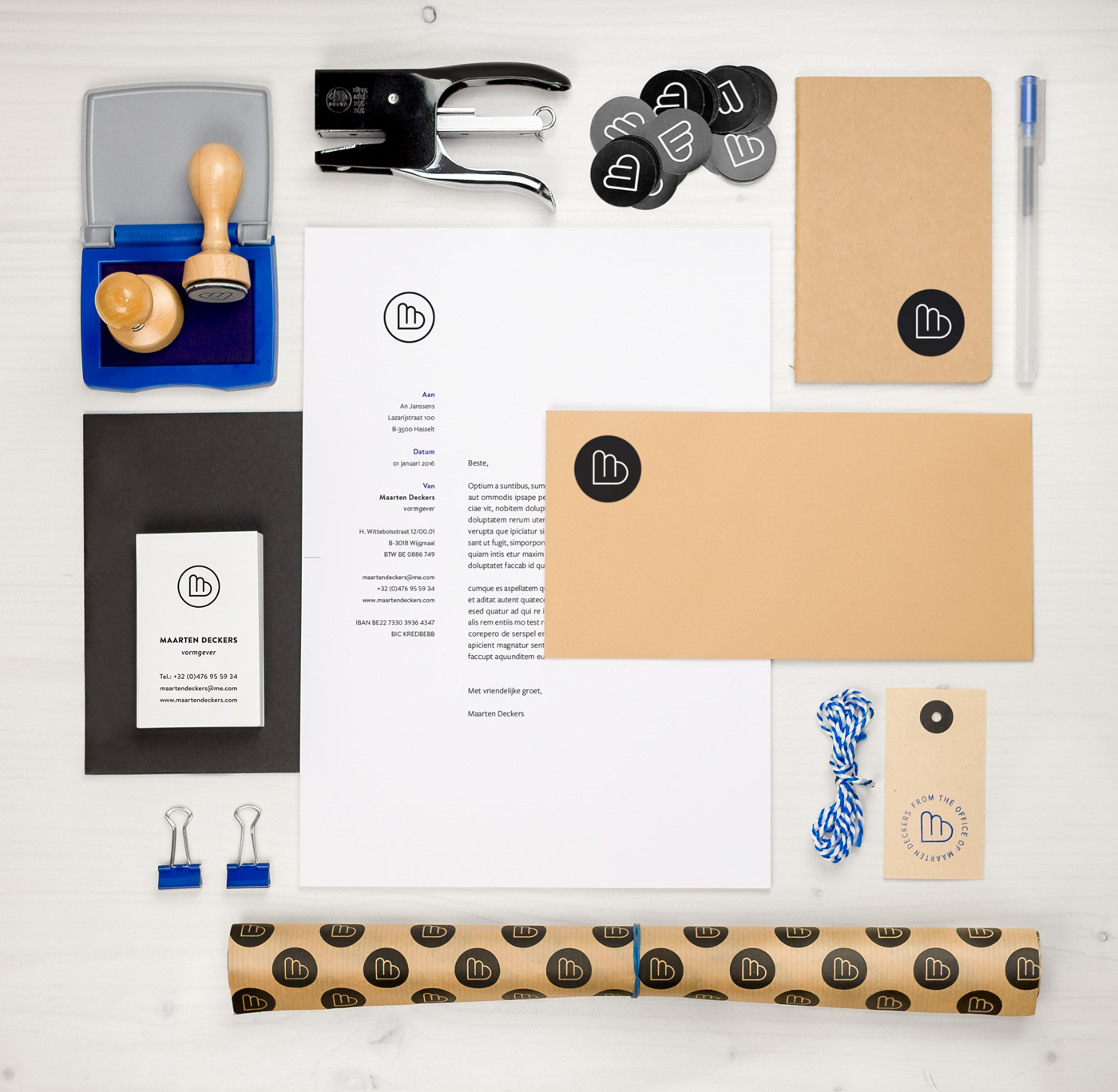

Simplicity and flexibility
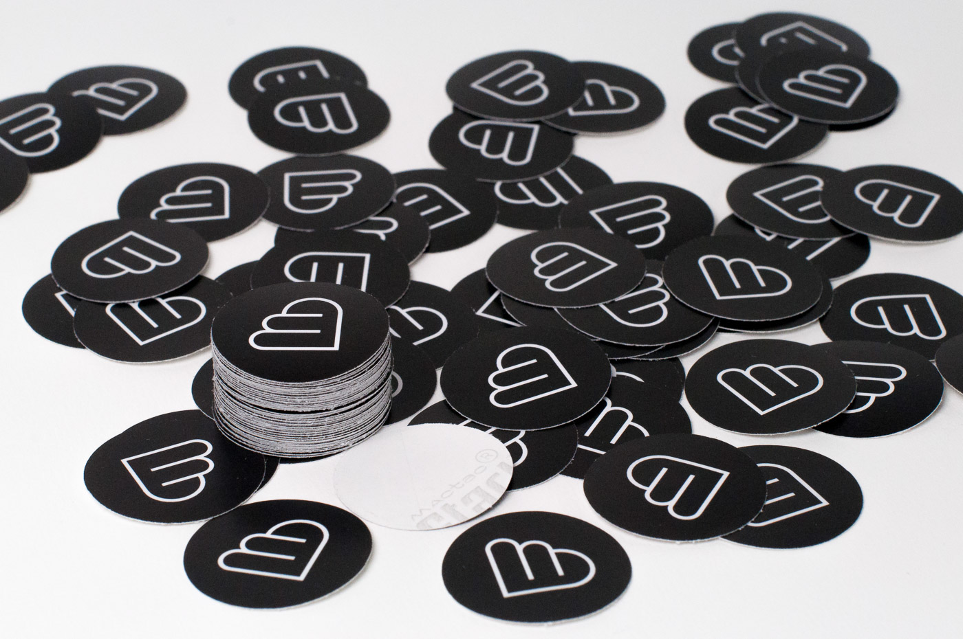
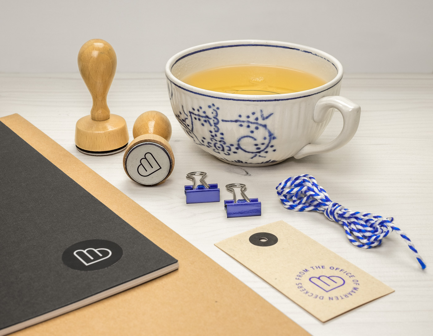
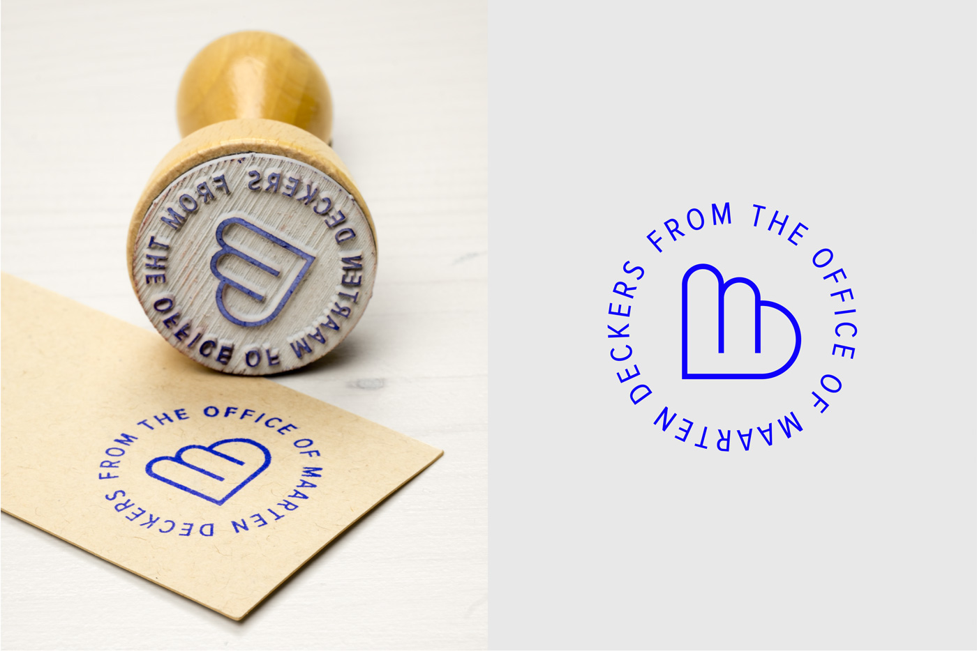
Designing a corporate identity for your own studio is not easy. Especially if you’re a designer with a tendency to constantly adjust and refine. Therefore I needed a simple and flexible design that’s easily adjustable and can grow over time. The elements that make up the logo are not farfetched. They are simply a combination of the first letters of my first and last name combined with a cloud of imagination, placed inside a circle. Why a circle? Because it’s a perfect shape I can’t improve or tinker with. Due to its simplicity, the logo works both as a positive or a negative shape and I easily switch between both versions. To make the design even more flexible, there’s no fixed color palette. Only black combined with one spot color that changes every now and than according to my taste. I don’t use a fixed set of fonts either, but rather a flexible selection of fonts that blend well with the logo. The rest of my brand elements are a hodgepodge of things I liked as a kid: kraft paper, wood structures, stamps and simple packaging.