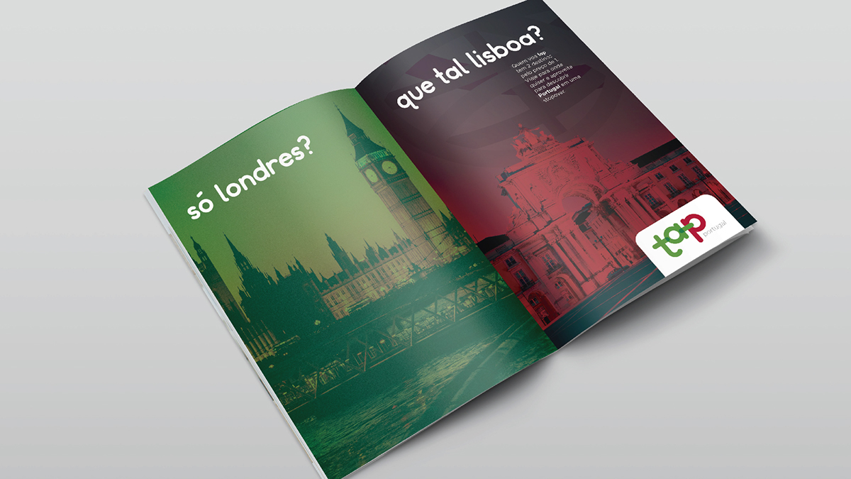
TAP Portugal is the flag carrier airline of Portugal founded in 1945. This is my attempt to give the company a new look, inspired by the brand's history and Portugal's national symbols.
_________________________________________
logo
The new lettering uses lower cases and rounded corners, giving the brand a friendlier feeling. I kept some of the important features of the current logo. The color scheme with the "T" and "A" in green and the "P" in red remains the same, the new logo also still includes a transparency effect.


_________________________________________
armillary sphere
The armillary sphere is an old model of sky objects and is associated with the Portuguese discoveries during the Age of Exploration, wich is why one is featured on Portugal's flag. Even though the sphere is not on the logo it is an importat piece on the new identity for the TAP Portugal brand.

_________________________________________
applications