


Cryptocurrencies are mediums of exchange which have been gaining traction over the last few years. But as promising as they are, they are far from global recognition.
One of them, Raiblocks, particularly caught my attention. It is a fee-less, instant, and direct digital asset with the ambition to become the future of peer-to-peer transactions.
Branding cryptocurrencies as such are uncharted territories for designers, but perhaps it is the missing link for them to reach mass-adoption.
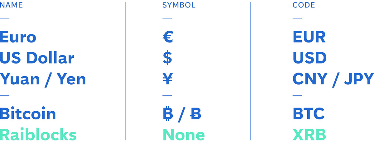
An issue Raiblocks faces is how confusing its name and code are. Raiblocks is sometimes mistyped Railblocks, while the XRB exchange code isn’t clearly linked to the name, and often mistaken with others. The first step to achieve global recognition will be to streamline its identifiers to Rai (RAI).
In order to be considered as a legitimate currency, Rai will also need a shorthand to ease communications. It took 6 years for the Unicode Consortium to add the Bitcoin mark to its code. Meanwhile, a part of its community has been using ‘Ƀ’ instead. People can now communicate the new symbol online, provided that the font used supports it.
Rai can avoid this hassle by adopting an existing sign.

The ‘R with stroke’ upper/lower case pair (used in the Kanuri language) is interesting for several reasons :
· it is available
· it is distinct
· an (ɍ) can represent a fraction of an (Ɍ).
The visual identity of the team will be based on these symbols to make the bond as clear as possible.
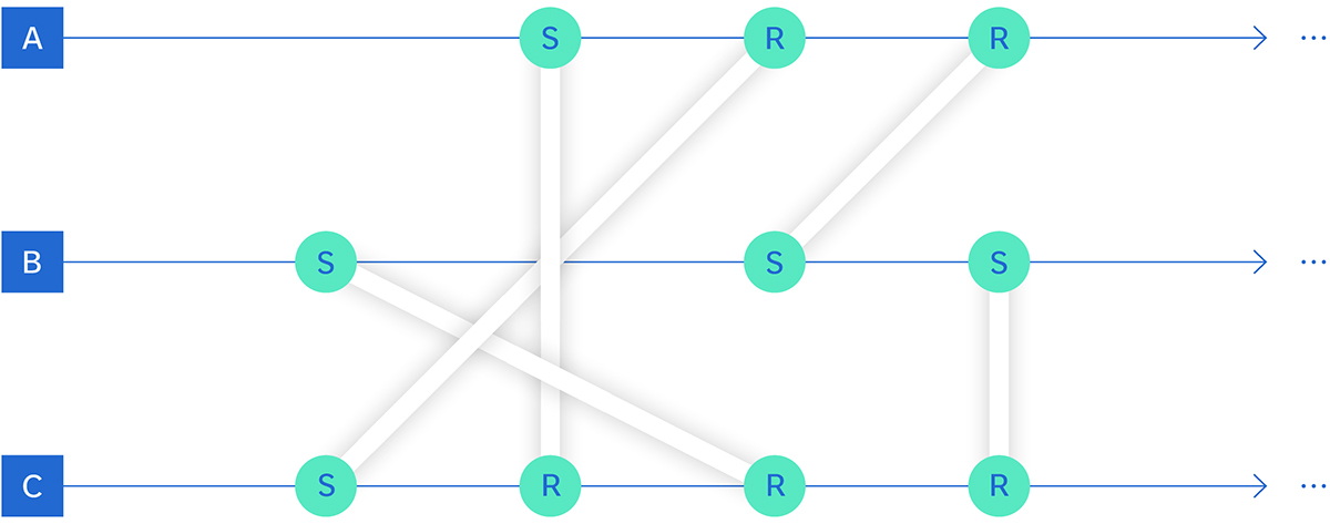
Visualization of the block-lattice architecture : "Every transfer of funds requires a send block (S) and a receive block (R), each signed by their account-chain’s owner (A,B,C)" (source: raiblocks.net)
What makes Rai unique is the – seemingly – simple block-lattice technology at the core of the currency. It is the cornerstone of the project, and it should be made visible.

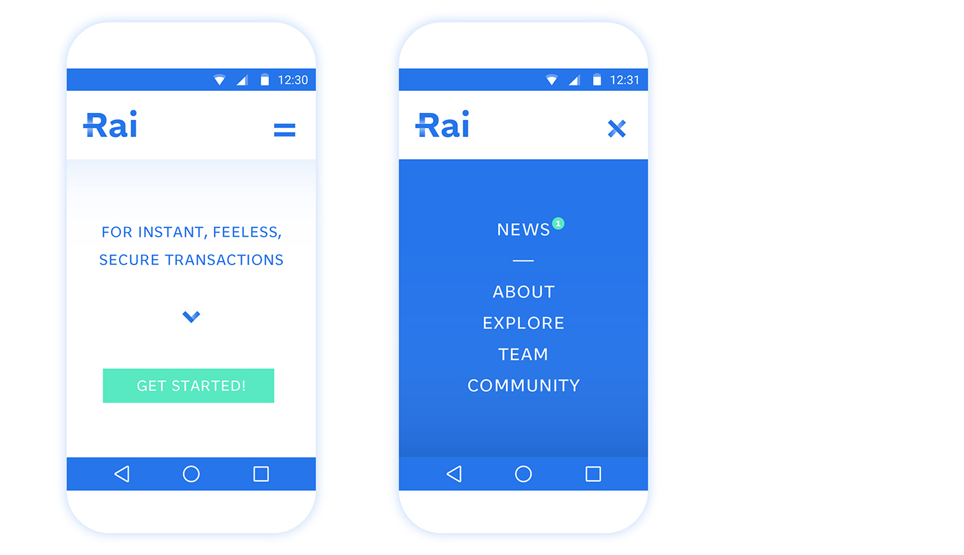
The logotype is made with the Aften Screen typeface by the Monokrom foundry. Its simplicity, friendliness and character gives a look in adequation with the project. Interestingly, this typeface was not intended for print.
The interlacement shown with a gradient is simple enough to be used on on other visual assets in order to achieve cohesion.


“Pay with Rai” is a slogan that could strengthen brand recognition regarding its pronunciation. The words pay and with are also simple enough to be understood in non-English speaking parts of the world.


Disclaimer: This personal project may not reflect the views or plans of Raiblocks


