


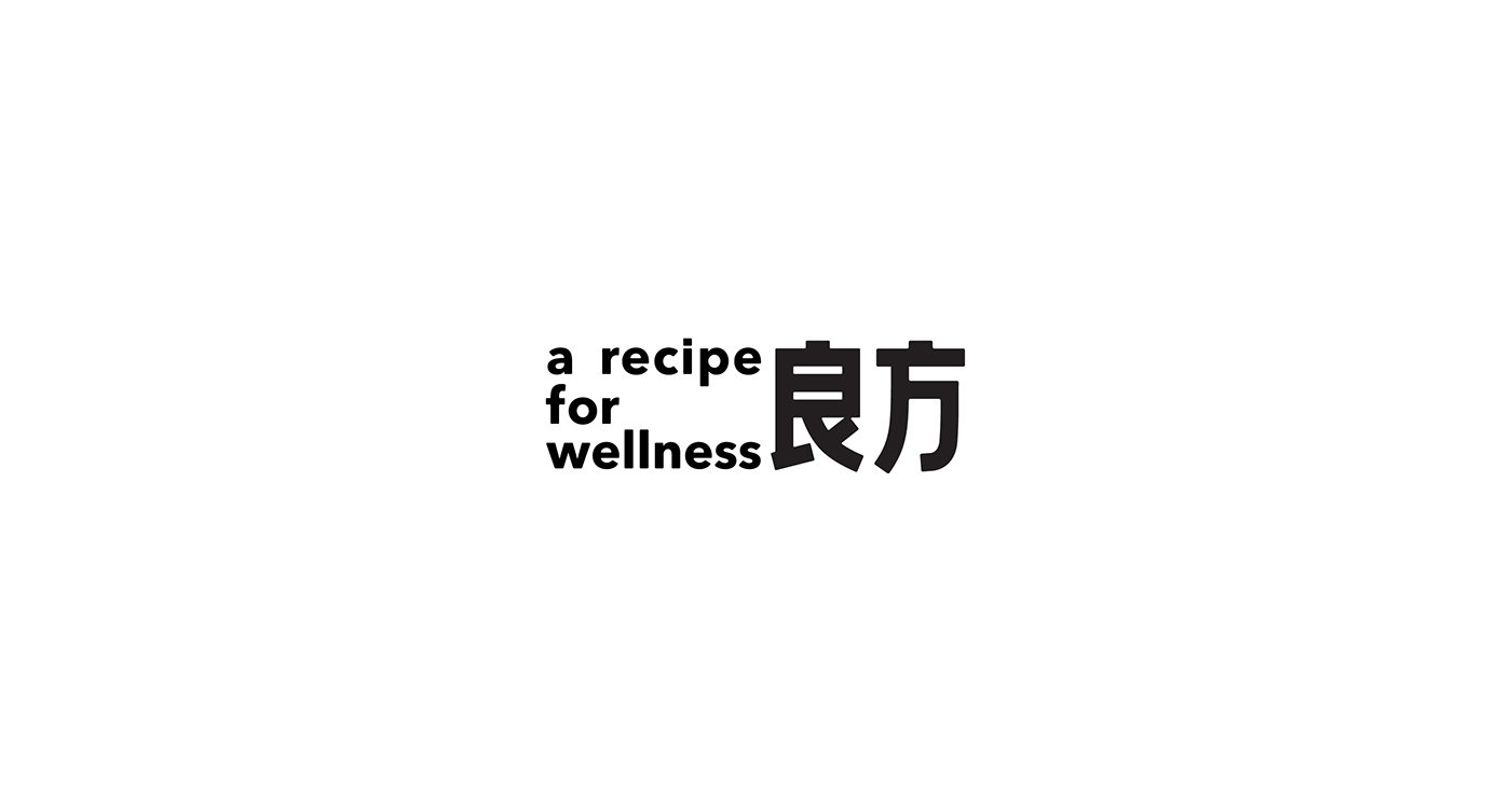
良方/a recipe for wellness
-
Branding
The basic idea of this project is to redefine Chinese medicine in contemporary context. As the only method to cure diseases and save lives, Chinese medicine was a medical treatment in the past, which was based on experience from generations over thousands of years. With the development of modern scientific and effective medical solution, the role Chinese medicine is playing changes. The image I create is more like a healthy lifestyle than a medical treatment. I intend to push the new meaning to let people see, understand and accept the brand new image of modern Chinese medicine.
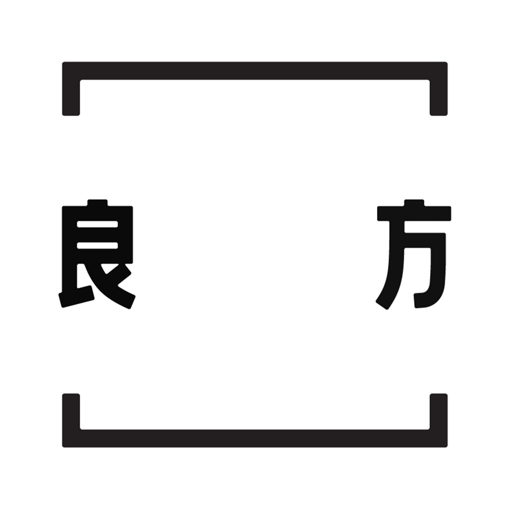
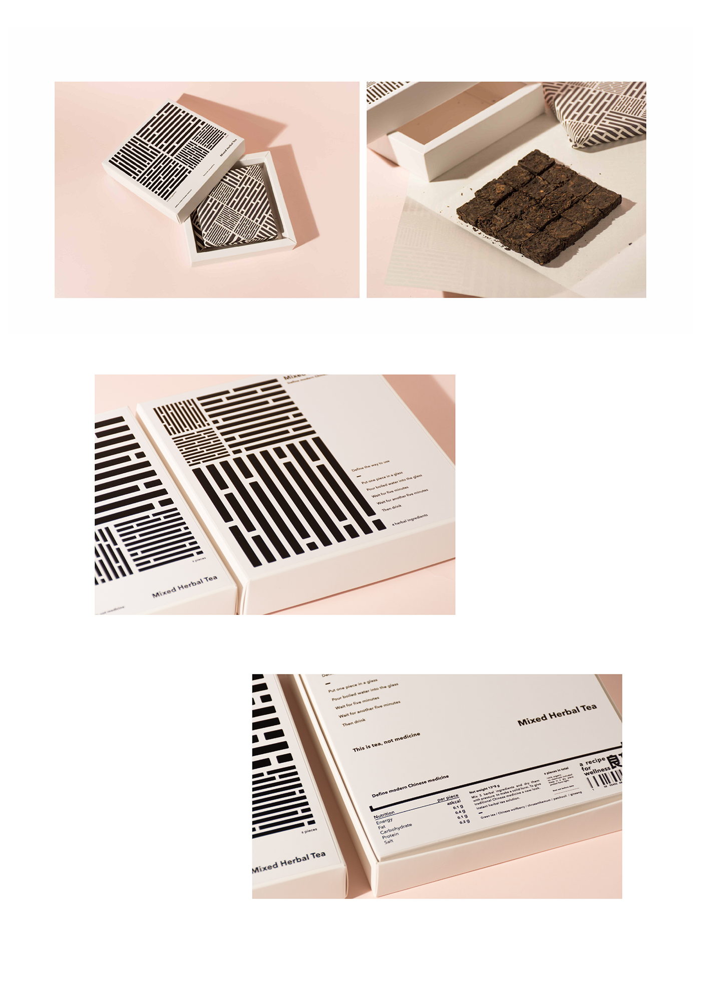
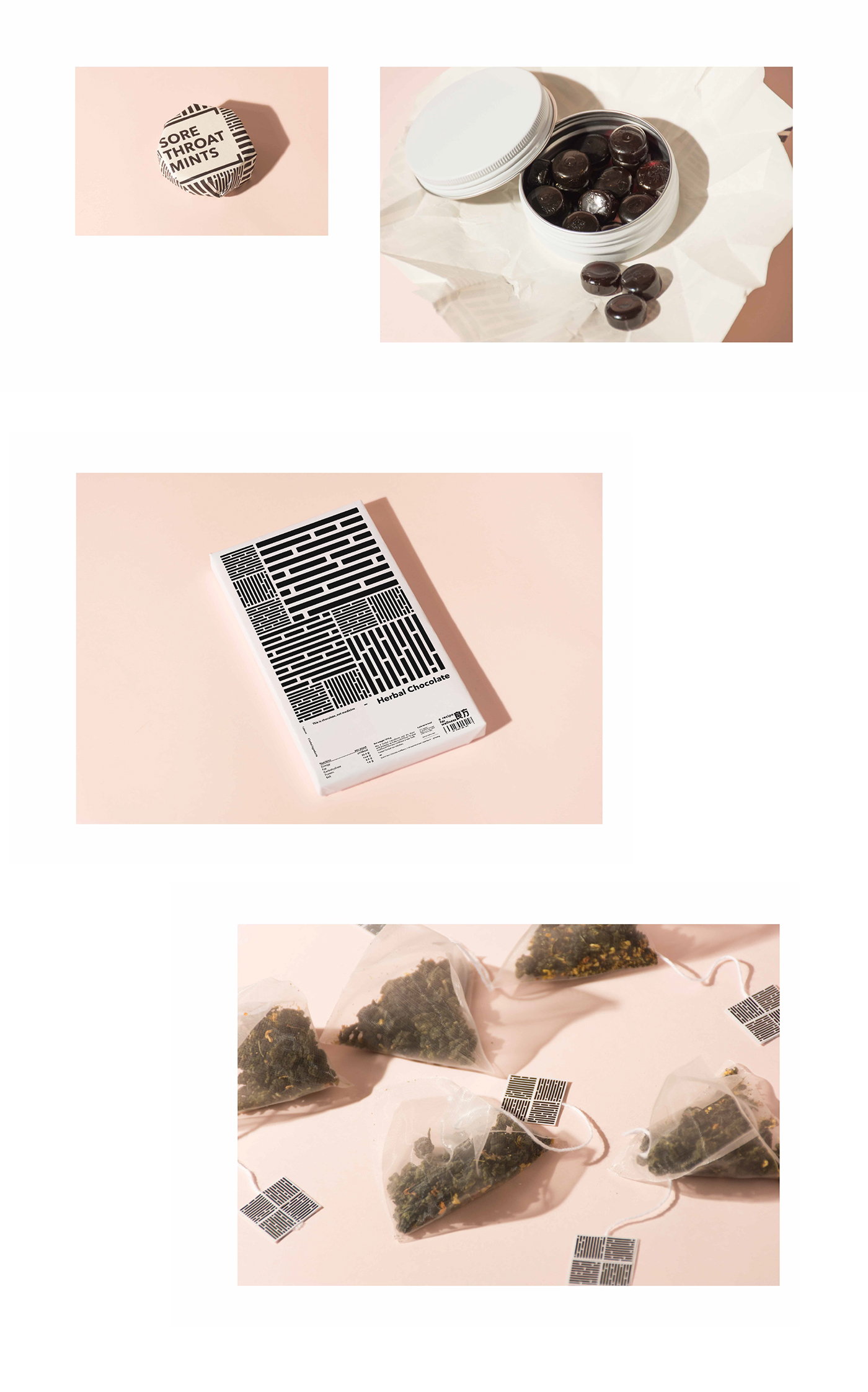
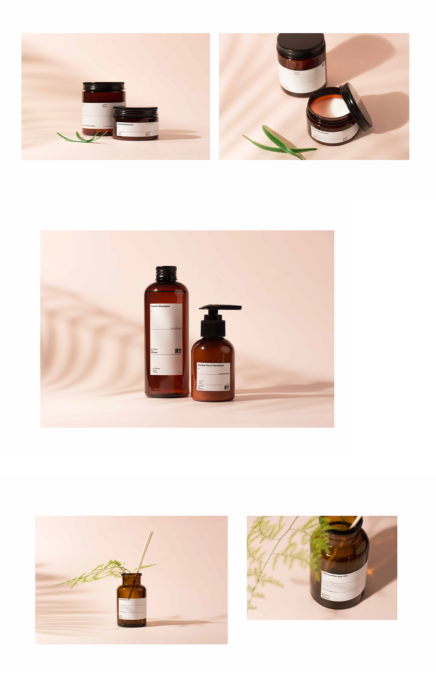
The inspiration came from traditional Chinese prescription. By transferring the tangible prescription into a more abstract form, I built a frame with two brackets, therefore, I was able to define the meaning between them. The traditional prescription is a carrier of various herbs and the complicated methods to cook them, which seems to make little sense to us in a modern context.
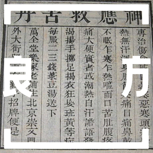
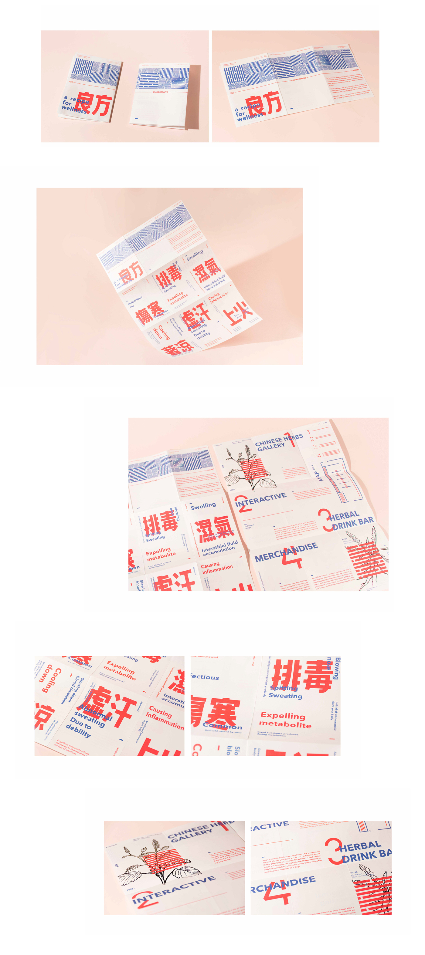
Attempting to interpret the content on traditional prescription into a modern language, I discarded the complex contents and simply kept the meaning. In a sense of redefining, I replaced the old meaning of prescription with a brand new definition – “ a recipe for wellness”(or 良方 in Chinese). The process of building this identity is exactly the idea of the whole project – “to redefine”.
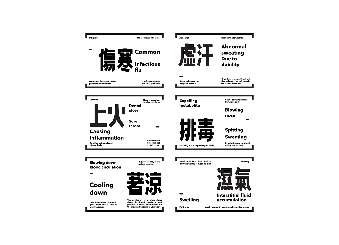
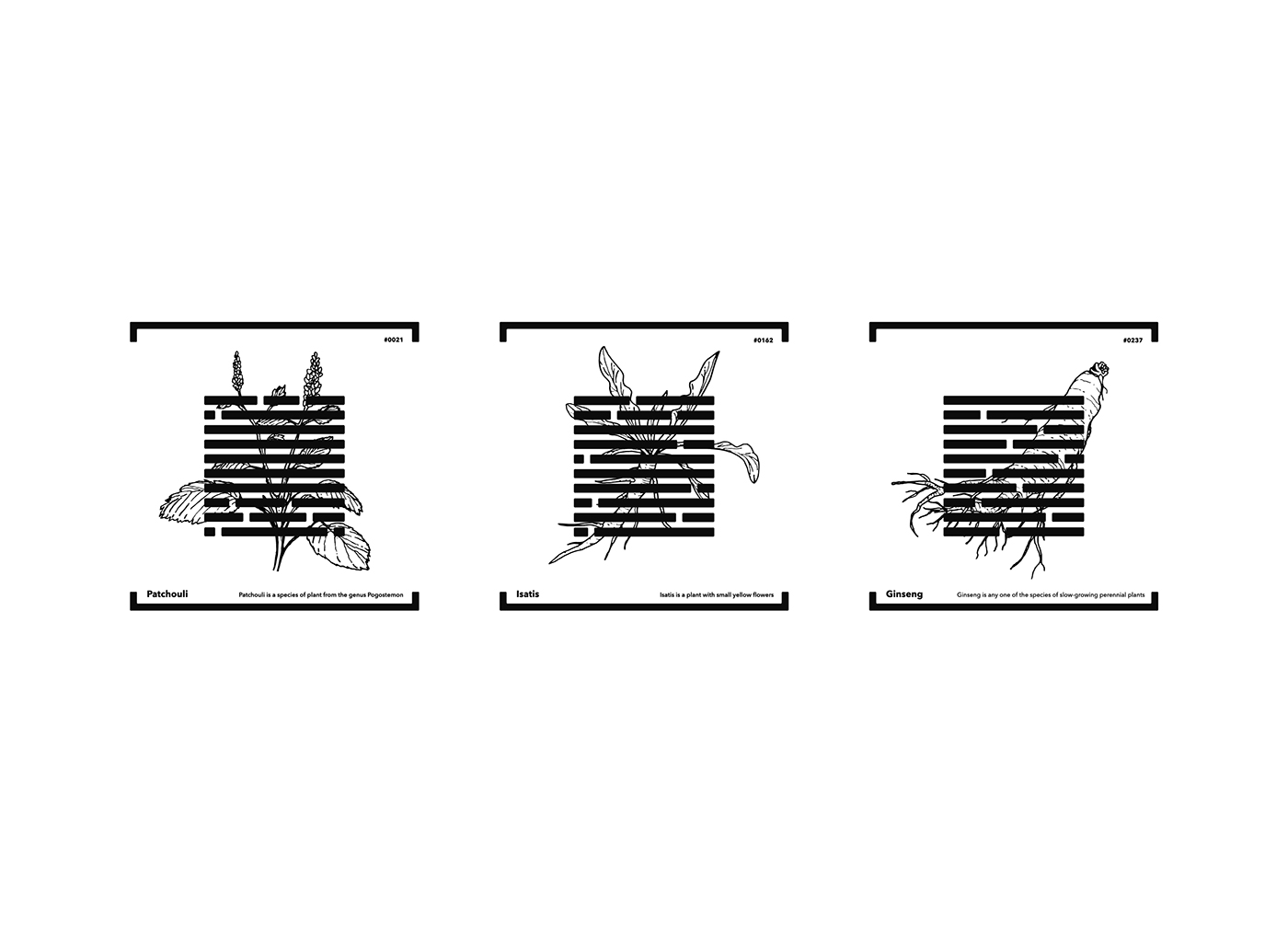

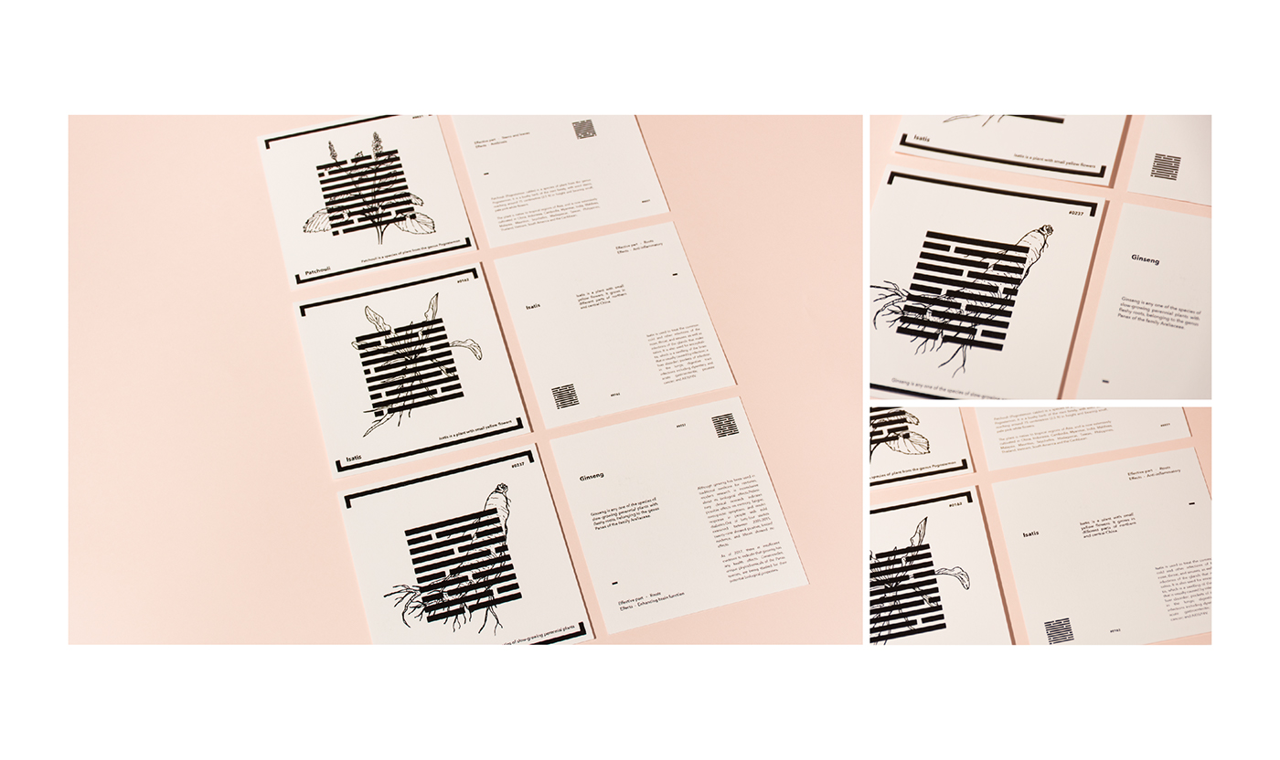
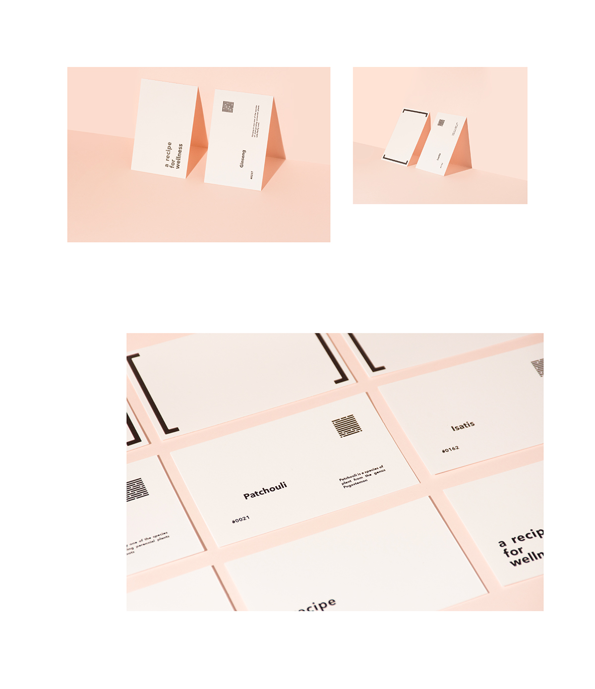
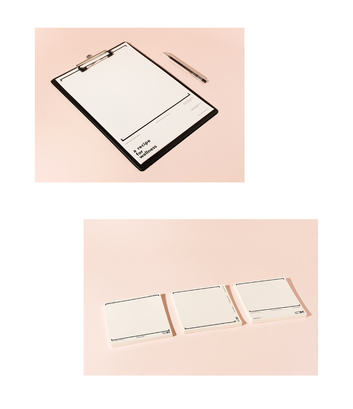
A recipe is normally translated as a list of food, while the prescription is the piece of paper your doctor gives to you. I defined the modern Chinese prescription as “ a recipe for wellness”. I used “recipe” instead of “ prescription” to emphasize that Chinese medicines are made from natural plants, which makes modern Chinese prescription more like a list of food than a list of drugs. By redefining this way, I attempt to create an image which is psychologically closer to people, since the medicines are something probably make people nervous. “Wellness”, which refer to both physically and psychologically well-being, can be interpreted not only having a healthy body but furthermore having a healthy lifestyle that advocated by this project.


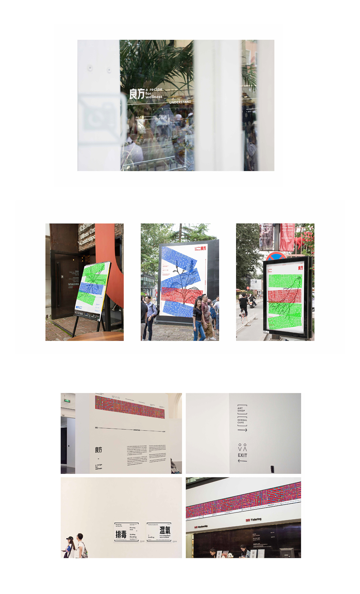
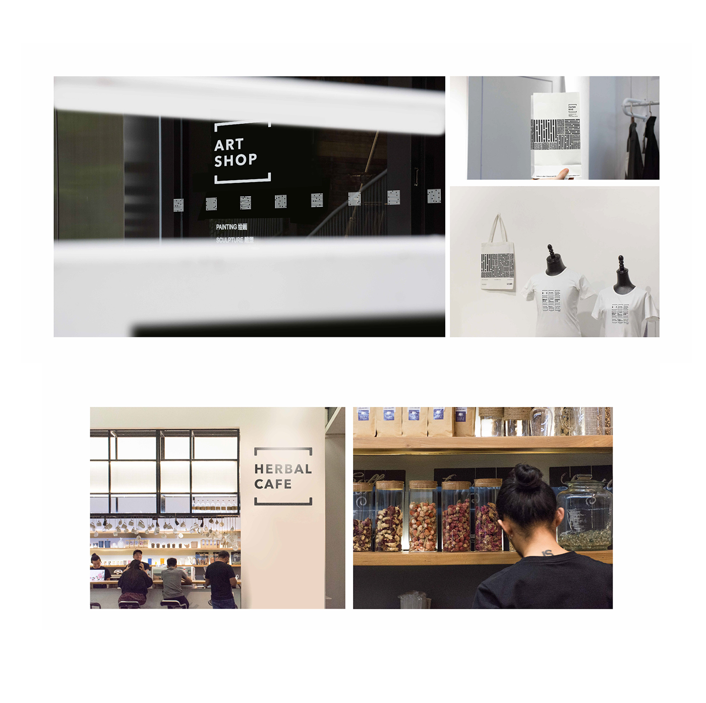
Exhibition & Pop-up Store
This activity intended to let more people know and understand then accept the new image of Chinese medicine that I defined.
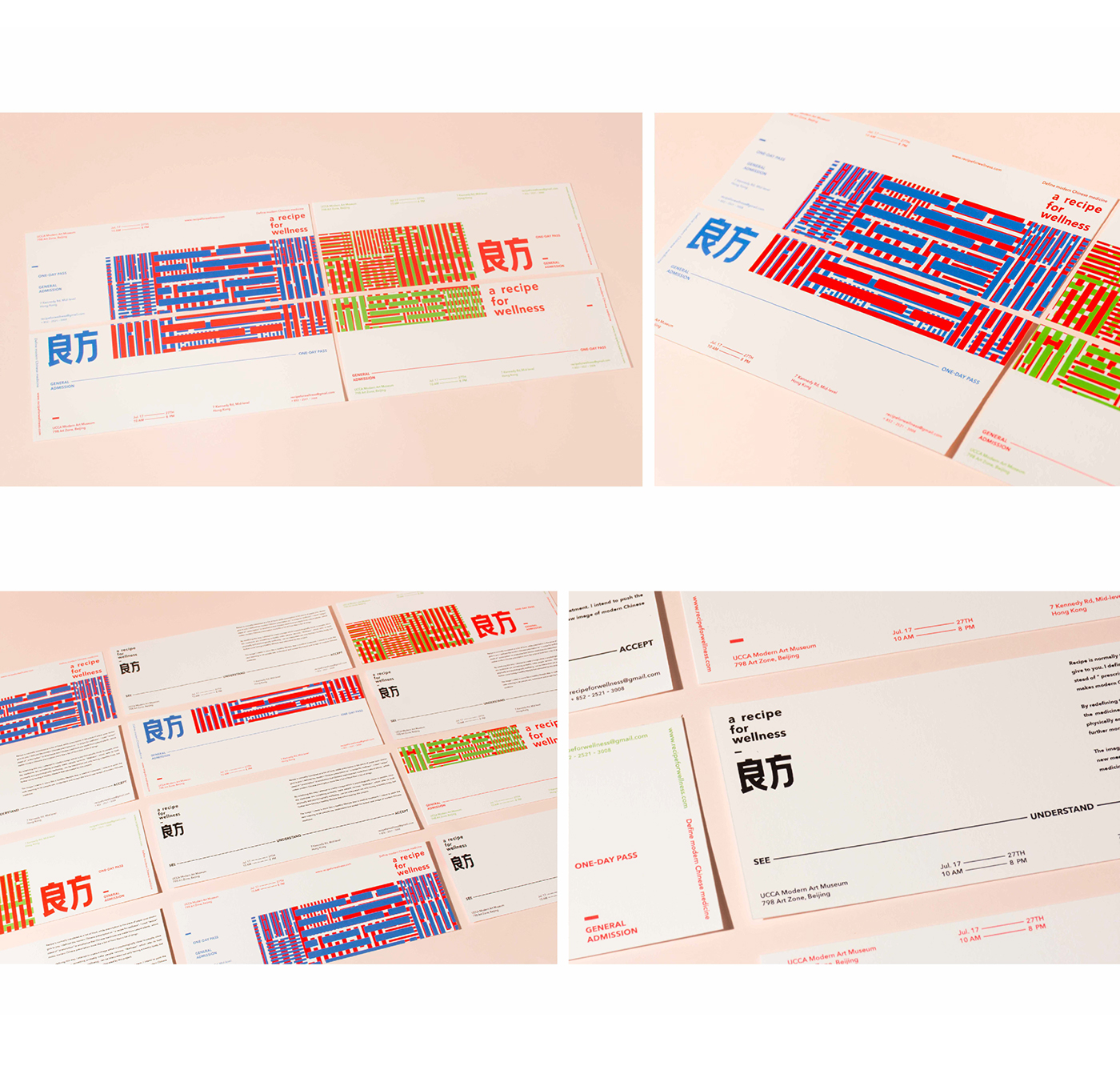
I played with the fingerprints pattern to make them overlap each other. I used red, green & blue as the theme color. They are also the three signal colors use in most of the digital displays to show the image on the screen. By making one pattern overlap another, I intended to express a sense of signal and data flow, as well as giving a modern look to the exhibition.

Art Director - Han Gao
Graphic Designer - Han Gao
Photographer - Han Gao


