WholeFit Branding 2018
This project was a re-brand of a local fitness centre that was going through a change in management. The new management wanted a brand that reminded customers of the old gym, but also showed them that things would be modernized, cleaned up, and taken more seriously.
The WholeFit gym in Lucan Ontario uses a holistic approach to fitness with a focus on building a complete healthy lifestyle. It's more than just lifting weights, its about building good habits and reaching your goals to ensure you are able bring everything together and continue them for a lifetime. The gym features a variety of classes as well as things like massage therapy, chiro, and yoga.
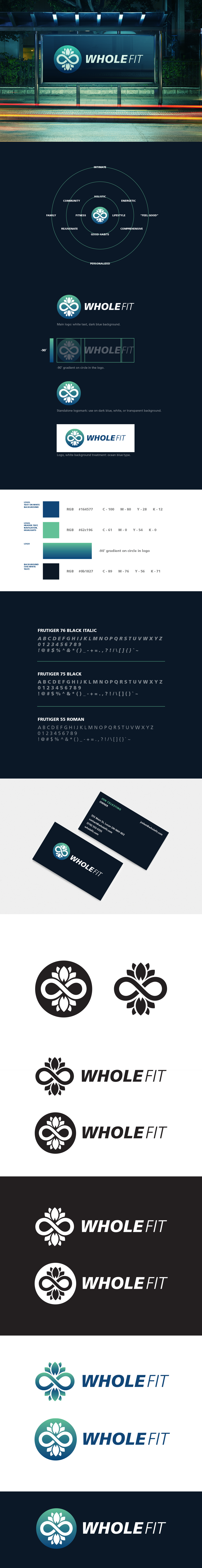
The symmetry in the logo was something I felt represented balance, alignment, while the infinity symbol represents continuing good habits long after a few classes are taken at the gym. The logo changed from having a spread of leaves on the top to a Lotus flower to further push the holistic feel of the brand.
The WholeFit gym in Lucan Ontario uses a holistic approach to fitness with a focus on building a complete healthy lifestyle. It's more than just lifting weights, its about building good habits and reaching your goals to ensure you are able bring everything together and continue them for a lifetime. The gym features a variety of classes as well as things like massage therapy, chiro, and yoga.
The symmetry in the logo was something I felt represented balance, alignment, while the infinity symbol represents continuing good habits long after a few classes are taken at the gym. The logo changed from having a spread of leaves on the top to a Lotus flower to further push the holistic feel of the brand.
The colour scheme was selected was "ocean blue" and a "sea green" to represent the natural power of large bodies of water as well as to reflect the calming qualities that they also have.
Frutiger Black Italic was chosen as the main type featured in the logo as it provides a solid foundation while the italics show motion.