
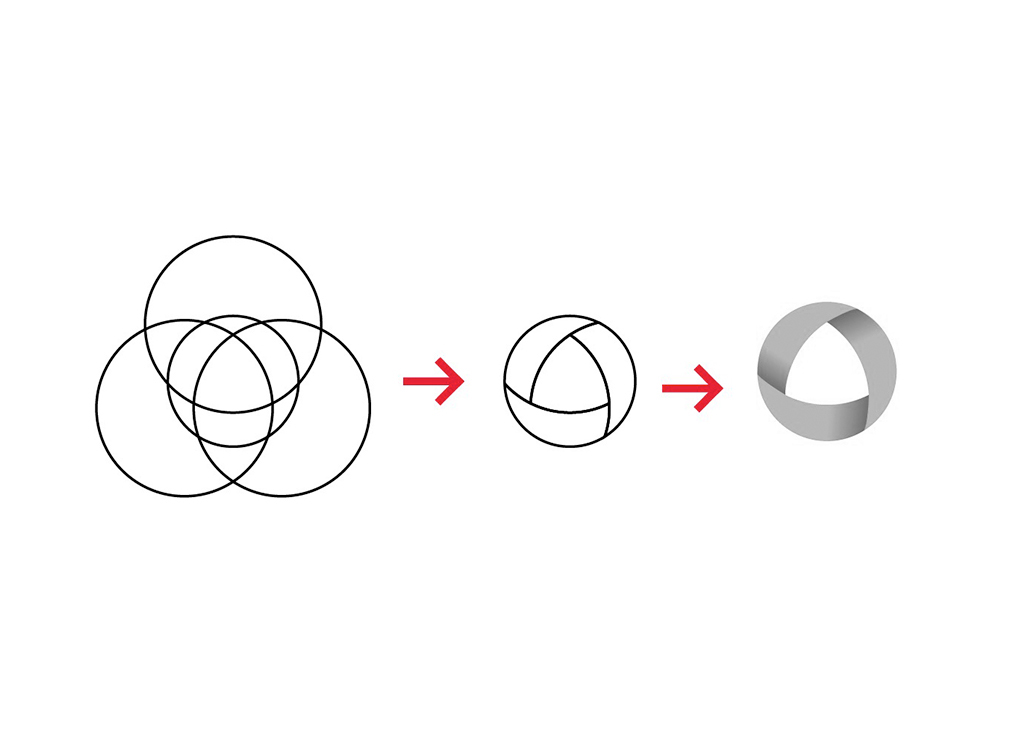
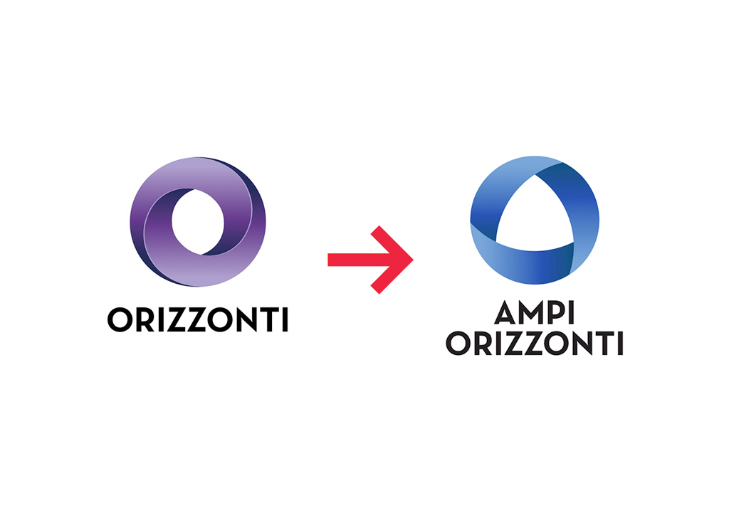
When from the Company ORIZZONTI was create a new section AMPI ORIZZONTI, the new company needed a brand image that was coherent whit the old one. Starting from the old logo, the main idea for the brand was to use the A instead of the O as a base. As I made before for the Orizzonti brand, a twist was needed: something that could give a three-dimensionality to the brand image.


See more of my works at my website: pels.it


