

Digital Portfolio
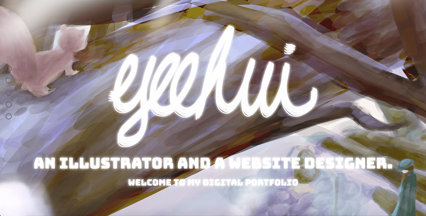
The assignment of the Digital Portfolio module I had in my second year was to build a website showcasing my work. As you might be aware of, I want to be an illustrator and a website designer. I built a website that suits both my interest. I showcased part of my work by including the process and the final product in the Portfolio section, in the meantime, building this website has evidenced my skill in coding in HTML, CSS, and Javascript language. For the record, I had been given two and a half month to work on this project.
Stage One
There were three stages in my process of building a website. In the earlier stage, doing research and studying about different types of website that showcase professional works in the creative industry was important as it gave me a vague idea about the layout and the effects I wanted to implement on my website. Sketches of the website were done during this stage too. Hierarchy arrangement of information was considered when I was producing sketches for the website. The below pictures are my initial ideas. I used block elements and notes to represent different sections of the webpage.


To my knowledge, a good website needs to have a well-functioning and user-friendly navigation bar, clear and succinct content, consistent design, and fast loading speed. In the stage of producing a Photoshop Mockup, I could only consider the first three elements. I wrote notes about the way the navigation bar would work as well as my overall colour scheme and a draft of my website before I started doing the mockup. I then conveyed my ideas by creating different blocks with annotation. Unfortunately, I was not able to maintain the idea of a minimalistic design because creating a website with a minimalistic design did not fit into my aim which was telling my story and unveiling my illustration world to the public. The pictures on the right are my website design mockup for both the big screen and small screen devices. The overall feeling of two designs is the same. But, the location of the text and the way to perform them are different. The screen size of a device will affect the visibility and usability of the website and therefore, adjustments are needed in order to enhance the functionality and interpretation of the website.


As the main theme of my website is ‘my world’, I created different illustrations and drawings based on the theme. The fundamental element that I picked for my design is winter, and therefore, the chosen colour scheme of the website is in cold tone. However, I managed to include a warmer purple in the mockup design, so that my design would not be too cold for the target audience.
I adjusted the design of the navigation bar of a small device after the evaluation session with my lecturer. According to his word, the icon of the navigation bar was not clear and would definitely create confusion for the user. Therefore, I substituted the icon with a simple text. It was clean and neat, in the meantime, stood up more than a single icon.
Stage Two
Stage two of developing a website was coding. Bootstrap and SASS were new knowledge that I needed to use during the development process. Using Bootstrap 4.0.0 had created huge confusion and difficulties to me during the development process of my website. Information that was useful for the third edition of Bootstrap barely worked on the fourth edition of Bootstrap. For instance, ‘.in’ class in Bootstrap modal box has been substituted with ‘.show’ class in the fourth edition of Bootstrap. Every tutorial that did animation effect with the ‘.in’ class wouldn’t work if I just included the exact same thing in my code. I only realised and understood the differences in between editions of Bootstrap after a long period of time. Moreover, the latest CSS settings implemented on Bootstrap 4.0.0 was not working on most of the web browser. Consequently, I had to prepare different solutions that produced the same functionality, tried them by using Google Chrome and Edge, and searched for the one which worked on both web browsers.
Using SASS brought benefit in the process of developing a website. I could simply use a different font family by changing the declaration and initialisation at the top of the SCSS page. However, it also caused problems. It was not a stable system and, out of a sudden, the SCSS would stop compiling to the CSS. I was not sure if that was the problem of Brackets or the SASS system because I could not identify any issue that was causing the sudden changes.
I designed two sets of navigation bar for the website, a vertical navigation bar for the widescreen and a horizontal navigation bar for the small screen. Although their designs were not the same, they would navigate the user to the same destination. The vertical navigation bar was composed of five circles and their corresponding labels. The label would only appear if the mouse was hovering on top of it. For the horizontal navigation bar, it was formed by five words that represented different sections of the website. The navigation was designed to move smoothly. I adapted the original coding a Bootstrap file provided for navigation purpose and combined it with the tutorial that I found online to create my own navigation bar. Most of the functionality I implemented on the navigation bar worked fine, however, the function of showing the user which section he was exploring at was not working perfectly. Besides, the ‘sticky-top’ value in CSS of the horizontal navigation bar was not working on Microsoft Edge. Therefore, I was forced to substitute it with a lengthy JQuery coding.


At the beginning of the coding, I did not use the grid system supported by Bootstrap. I tried to use Flexbox properties and Media Queries for every piece of information. However, it did not work for most of the information and had lengthened my coding heavily. Hence, I deleted the duplication of the coding and adapted my coding with the grid system. It has produced a better outcome with a shorter coding.
‘Use the website like a user instead of a designer’ was the lesson I learnt during the development process. This sentence has inspired me to change the perspective to view and explore my website. I was way too focused on fixing the default problem of Bootstrap that was causing padding difference when resizing. No user will continuously resize the webpage when he is exploring the webpage.
Throughout the website development process, I have encountered numerous coding problems. There were two ways of solving those problems, one was preparing and bringing all my questions to the workshop and asking for help, the other was searching solutions online and choosing the best suit to my coding through trial and error process. The websites I found particularly useful in coding were GitHub, Code Pen, and Stack Overflow.
Stage Three
The last stage of developing my website was to test its loading speed and conduct multiple sessions of user evaluation.
Optimisation of images and videos was one of the biggest problems that I encountered throughout the development of my project. I was quite happy with the overall presentation of my website when I received a bad optimisation result with Varvy, Google Insights, and Pingdom. I had to again optimise and resize all my images using Adobe Photoshop. It was not a hard work, but it was a boring one. Besides, to optimise the loading speed of my website, I had to transfer all my video files out and changed my <video> tag to <iframe> tag in HTML and CSS to embed the video files through Youtube. However, changing the tag name of videos has stopped the original coding from working. I, therefore, had to implement a different JavaScript function from this website (https://www.tutorialrepublic.com/codelab.php?topic=faq&file=play-youtube-video-in-bootstrap-modal) to create the effect I wanted to achieve, which was stopping the video from playing after the button was triggered. Through the optimisation process, the loading speed of the website has dramatically increased, in the meantime, the size of the website has successfully decreased from over 1GB to less than 20MB.
I managed to finish my user evaluation forms before the submission of my website. Therefore, it allowed me to do adjustment to my website based on the opinion of the users and the problem that I had observed. Before doing any adjustments, the navigation bar was showing on top of any modal box and it created misunderstanding to the users. I enhanced the value of ‘z-index’ of the modal box so that the navigation bar would never appear when a modal box was opened. I also did changes to the portfolio section. The placeholder of the portfolio used to be empty. It would not show any work unless the user pressed the button. However, I could tell that one of my users was having difficulties in opening the portfolio section as I was observing my participants during the evaluation process. Hence, I changed the display setting for the portfolio section when the users first open the website. Besides, I changed the background of the modal box from a pink pattern to pure white because I found the pink background quite distracting.
Conclusion
Bootstrap, SASS, and JQuery were new knowledge to me before I started building my website. After a term of study and practice, I became much more familiar with these different coding plugins and system. However, I think that I will need to do more studies and explore more features of these coding system as I only managed to apply some on my website. Learning and understanding more knowledge will allow me to build a better website in a shorter period of time in the future. As I did my Photoshop mockup and image resizing in Adobe Photoshop and all my coding in HTML5 and CSS3, I believe that my skills have improved during the process.
Picture Gallery
The below screenshots show what my website will look like when it is opened using a wide screen device.


The below screenshots show what my website will look like when it is opened using a smaller device.


