

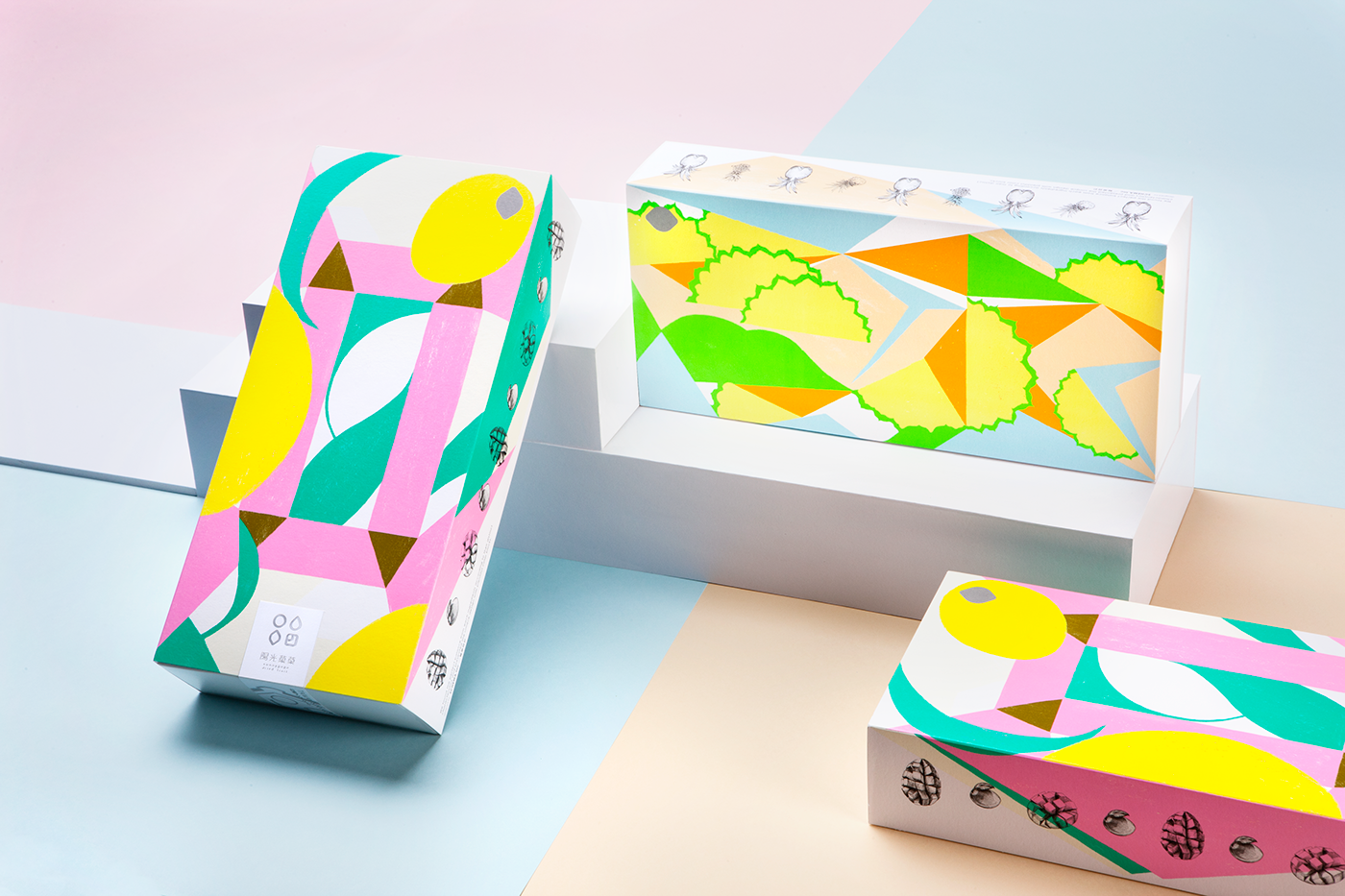
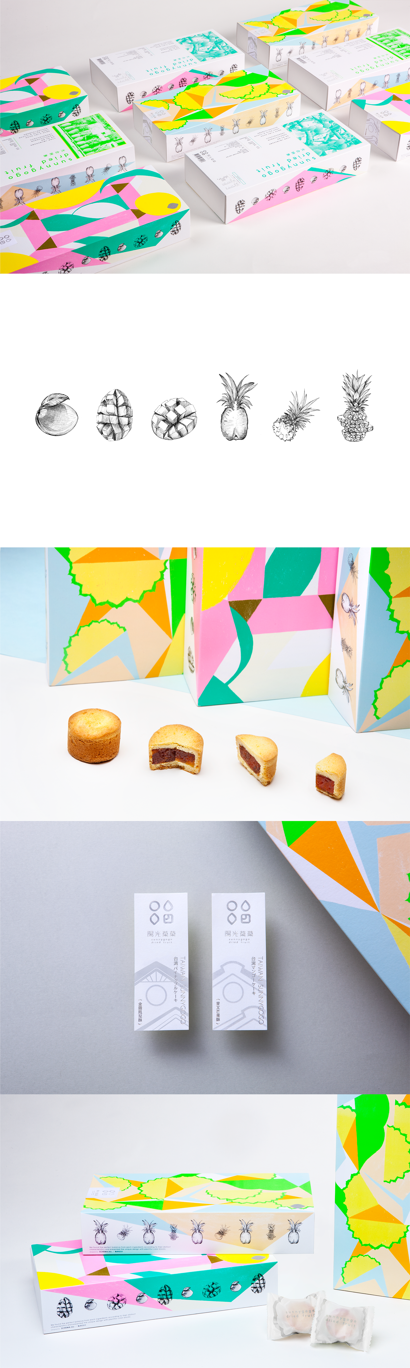
SUNNYGOGO以藝術詮釋水果酥
「立體主義」追求碎裂、解析、重新組合的形式,形成分離的畫面—
藝術家以許多組合的碎片型態從多種角度來描寫對象,將其置於同一個畫面之中,來表達對象物最為完整的形象。
引用此繪畫手法來重新闡述果酥的「既有形體、破壞、組合、轉化」等製作過程。台灣芒果酥與鳳梨酥,兩款包裝皆以4種螢光色水果多角型切面,搭配1個黑色K版水果寫實插畫為呈現,將每位匠人在製作時的意念以最佳色彩比例來呈現提案,明亮愉悅的色彩也帶給人們陽光般的感受。
藝術家以許多組合的碎片型態從多種角度來描寫對象,將其置於同一個畫面之中,來表達對象物最為完整的形象。
引用此繪畫手法來重新闡述果酥的「既有形體、破壞、組合、轉化」等製作過程。台灣芒果酥與鳳梨酥,兩款包裝皆以4種螢光色水果多角型切面,搭配1個黑色K版水果寫實插畫為呈現,將每位匠人在製作時的意念以最佳色彩比例來呈現提案,明亮愉悅的色彩也帶給人們陽光般的感受。
・獎項/Indigo Design Award 2018|Gold and Shortlisted Winner for Graphic Design of the Year
・出版/《第十四屆 APD亞太設計年鑑》《包装中的色彩吸引力》《[BranD] Magazine》等書籍雜誌收錄
・展出/FOODEX 2018 東京食品展
・販售/誠品書店、一針一線、陽光菓菓官網、百貨公司伴手禮區、機場昇恆昌
・出版/《第十四屆 APD亞太設計年鑑》《包装中的色彩吸引力》《[BranD] Magazine》等書籍雜誌收錄
・展出/FOODEX 2018 東京食品展
・販售/誠品書店、一針一線、陽光菓菓官網、百貨公司伴手禮區、機場昇恆昌
・Destacado en Packaging Of The World、Circle
SUNNYGOGO INTERPRETS FRUIT CRISPY WITH ART
Cubism pursues forms of fragmentation, resolution and recombination. Artists depict objects in fragmented combinations from multiple angles. The combinations are placed in one same picture to present the most complete image of the object.This technique is applied to re-elaborate the existing processing procedures of form, destruction, combination and transformation for fruit crispy. The packaging for mango crisp and pineapple crisp is presented in a 4-fluorescent-color fruit polygonal section, complemented by a black fruit realistic illustration. The idea of every crafts man who makes the crispy is presented in an optimum color ratio which brings people sunny feelings with bright and cheerful colors.
Cubism pursues forms of fragmentation, resolution and recombination. Artists depict objects in fragmented combinations from multiple angles. The combinations are placed in one same picture to present the most complete image of the object.This technique is applied to re-elaborate the existing processing procedures of form, destruction, combination and transformation for fruit crispy. The packaging for mango crisp and pineapple crisp is presented in a 4-fluorescent-color fruit polygonal section, complemented by a black fruit realistic illustration. The idea of every crafts man who makes the crispy is presented in an optimum color ratio which brings people sunny feelings with bright and cheerful colors.
EXTRA INFO
CI : 輪廓設計SCHEMA/株式会社スキーマ
Packaging Design : 劉家芸 Liu Jia Yun
Packaging Design : 劉家芸 Liu Jia Yun
Print : 立屹彩藝印刷


