Research and Inspiration
After some discussion with the client, we decided that a logomark would be unnecessary and the main goal would be to develop a fun and creative logotype. With the information gathered up until this point, I was able to go out and curate a bunch of good references that could be used to give some direction with the design going into the sketching phase. References are found using Google, Dribbble, and Instagram. I then go over these inspiration boards with the client so we are able to discuss potential ideas and I am able to better gauge their tastes. The examples below are the images that the client and I decided fit the brand best.


Sketching
Thanks to the research and discovery phase, I have a strong idea of what direction to go in for the sketching phase. This is the time to try things and figure out what will work and what doesn't. Sometimes I will iterate on a concept 5-6 times on paper before bringing it to digital. I noticed at this stage that the negative space under the 'r' next to the 'b' might cause problems, so I experimented with a ligature to solve this. At this point I will involve the client once again. It could end up being a waste of time to fully develop a logo without asking the preference of the client. The client was very happy with the first two sketches and that was the concept used going forward.


Digitalization and Development
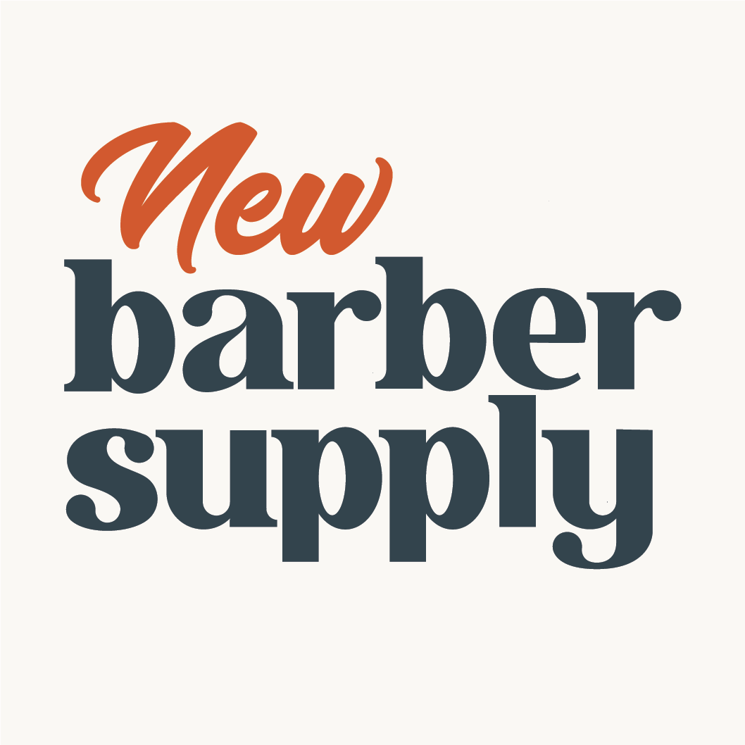
Using my previous sketches as a guide, I vectorized the letterforms in Adobe Illustrator, ensuring the letterforms are consistent and based off of geometry. The word 'NEW' was set using Futura Extrabold. Thanks to the 'r+b' ligature, the logo was able to be tightly kerned to get close to the ideal 1:1 square ratio. Both stacked and horizontal variants were developed for different use cases. After the logo was finished and looked good in black and white, I experimented with colors and decided that a dark blue against a contrasting bright orange looked great and was a fresh take.


Revising
After the above logo was presented to the client, we decided that while it was mostly on the mark, the lettering was a bit whimsical and the client wanted to see a style that was a bit more timeless and classical. Since I already had the lettering built, I edited the letters digitally to look more classic by adding serifs and shrinking the ball terminals as well as removing the semi-script ligatures. After I was happy with the way the main lettering looked, I went back to pencil and paper to sketch out a hand-lettered look for the word 'New,' to contrast the serif typeset of the 'barber supply.'


The Result
The client was delighted with the final product and I was as well! I hope this insight into my process was helpful or interesting!