i like this one because the text wraps with the image
here i tried to move the text beneath to make it look more like a poster

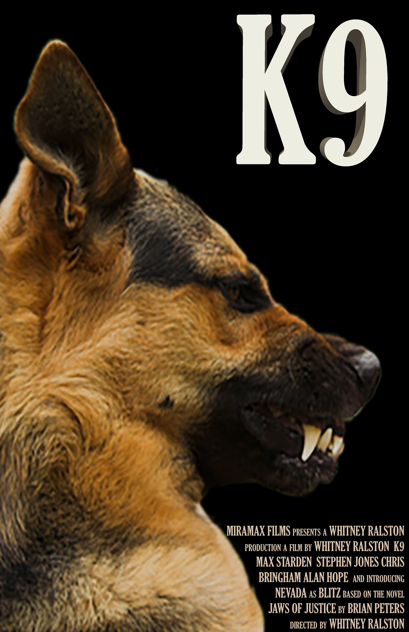
here i added a background and embossed the title to make it stand out more - i think it gave it some dimension

here i added a drop shadow and textured overlay to the title, but im not sure about the shadow on the title.

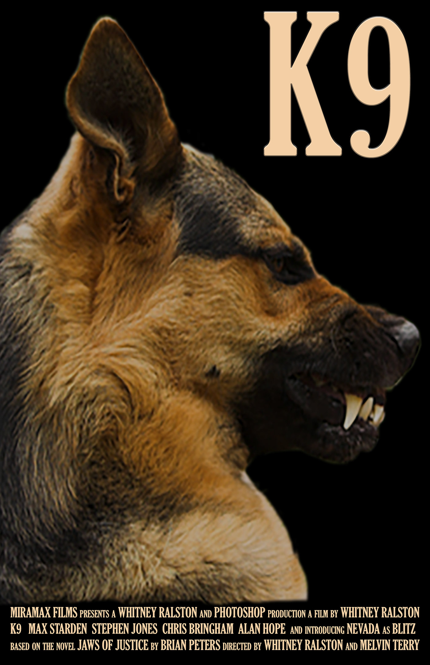
here i toned down the image in the background and added a patterned layer to give it a more removed look while darkening the color of the bottom text and the title
