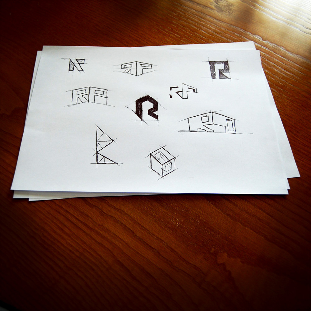
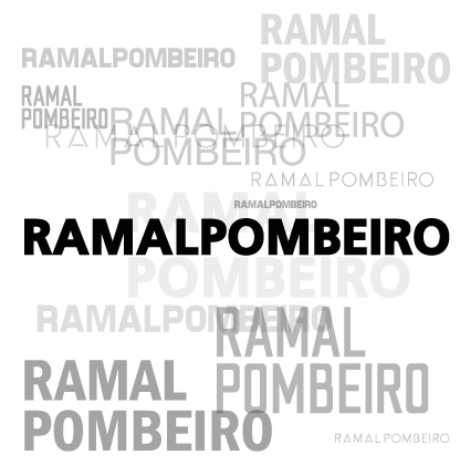
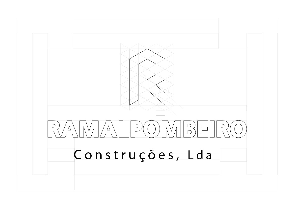
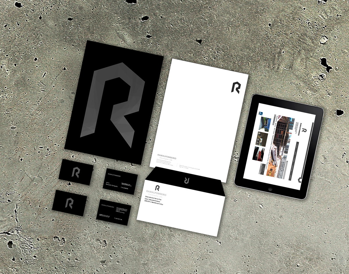
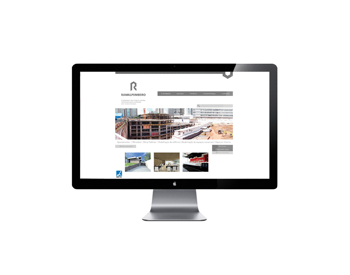
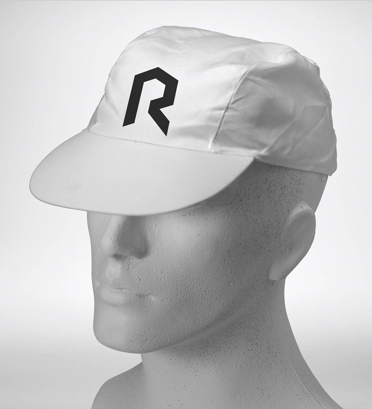
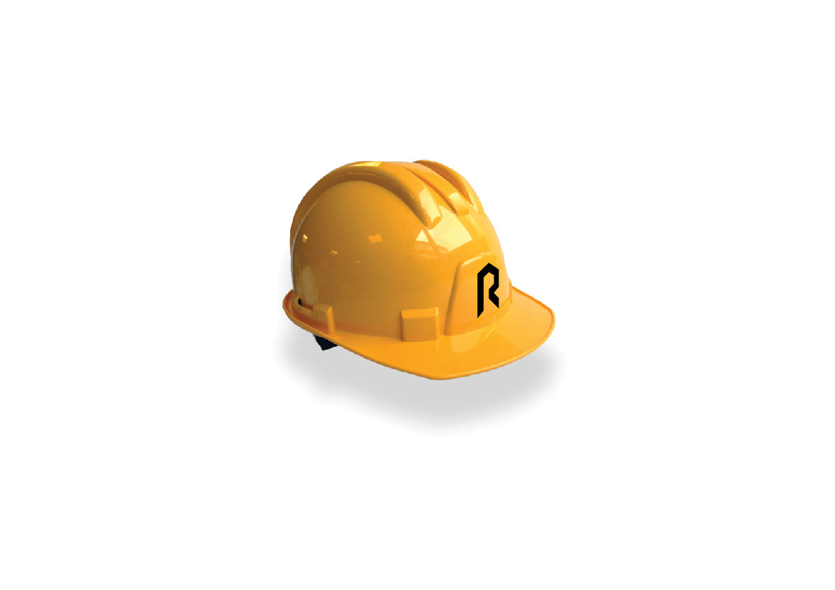
The work aims to recast the graphic identity of the construction company.Due to the very long name, prefer to use the R to crease the brand image.
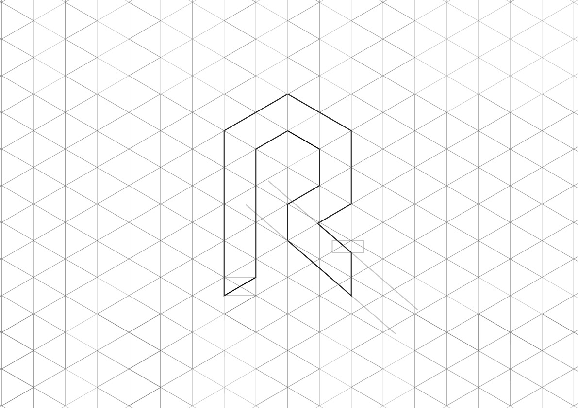
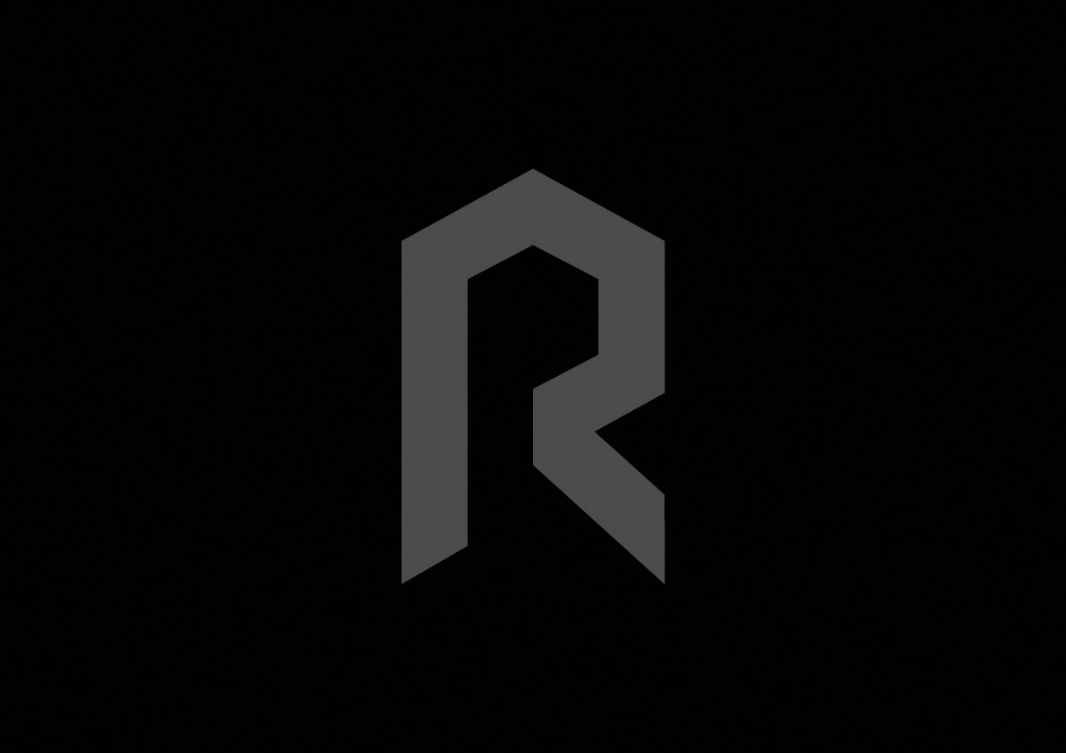
THe R derives from a solid geometric construction. The gray color was chosen to emphasize the concept.
THe R derives from a solid geometric construction. The gray color was chosen to emphasize the concept.