

The main objective of this project was to develop brand and packaging for the company, creating a visual language from the outset, with the premise of making it differentiated at the point of sale.

Here we find the semantic panel that guides us in the process.


The creation of the brand brings with it the concept of health, translated in green color, next to the concept of technology, which comes with the color blue. The typography is clean and easy to see.

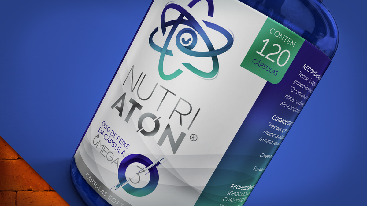

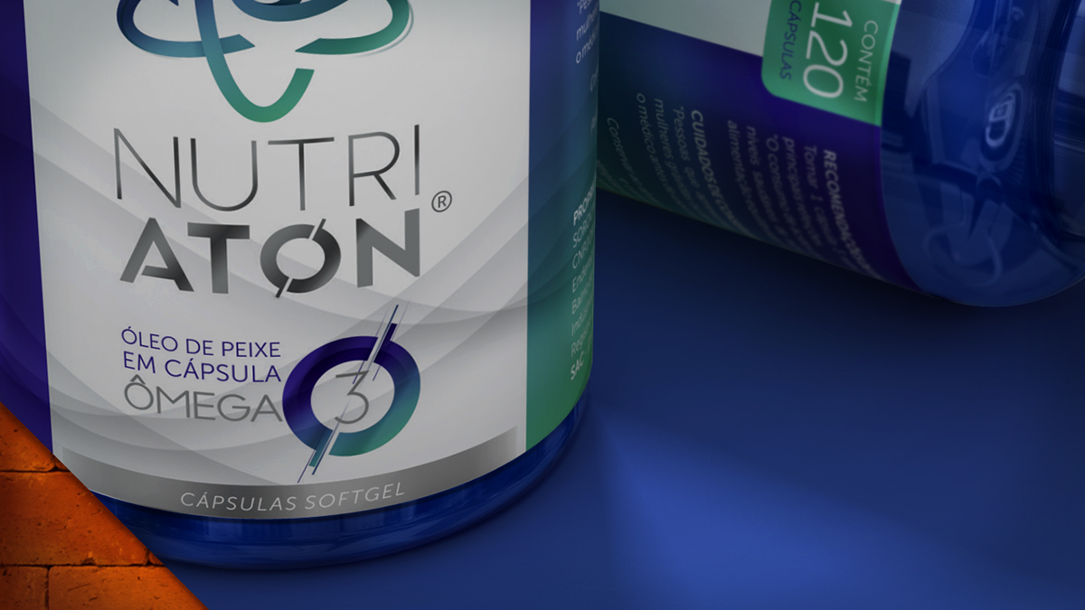
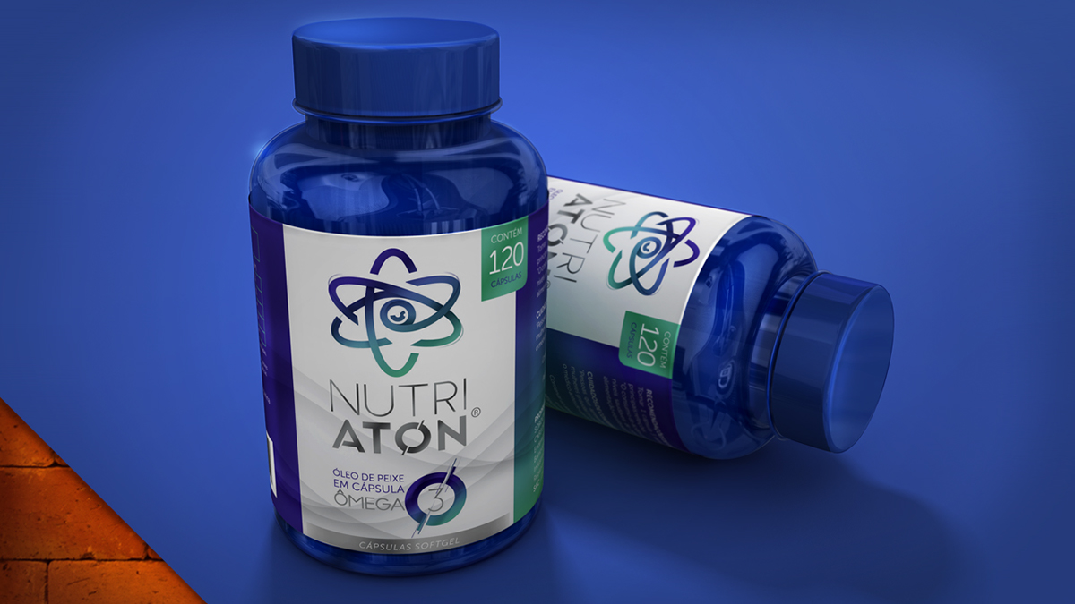


Practical organization of information and brand enhancement are important elements of the label. The metallic label and a contemporary image add even more the concept of technology to the label.
