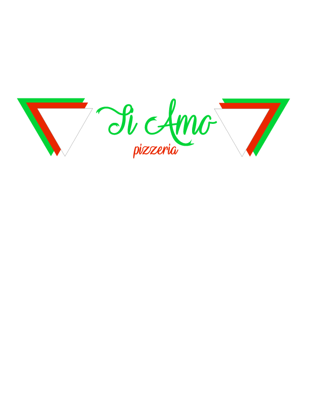
This is the logo design for Ti Amo pizzeria a small Italian pizzeria that emphasis in the family which is the theme for my logo. I kept the colors green, red and white like the Italian flag just with a small variation to neon colors to make it different from the other Italian places. Also, the color green transmit a warm feeling, the white color peace and the red color love what we usually find in families. We will see this colors repeat in all my pieces for the campaign. For fonts I chose the vampire font in my logo because I like the extension of the T and the A on the name and also grabs attention and enhance the name of the business. I also used triangles by the side of the name to create contrast and to have something related with pizza. I used this variation to make it different and original.
For the front of the business card I used the original logo because I had enough room. I just add a black background to give variation.

For the back of the business card I did a small logo to be able to work around the Qr. I kept the color black for the background to create a association with the front of the card. I used two different fonts for the writing: vampire font serif and alpaca sanserife. I used white and green colors for the writing to create contrast. I repeated the color green for the title and website. And I repeated the vampire font on the name to emphasis it.

For the envelope I use the the small logo to create repetition and I use a black strip to grab attention and to make a extension of the business cards. I used the color white for the name and address to create contrast with the black background. There is proximity between the name and the triangles. And, also between the name of the pizzeria and the address.

For the letterhead, I wanted to continue with the whole logo to create repetion and leave the black background in the top to create contrast.
For the contact information I like it in the bottom of the page. It gives a organize look to the letterhead having the name of the business on the top and the information on the bottom.
I chose to do the triangle shapes as a watermark because this, even though are noticeable you can still read the font on top of. And, also creates association with the logo and it gives a professional look to the letterhead.

This is an example of the letterhead with text on it. The letterhead is easily readable.

For my socials I used for the facebook profile a small logo in which I eliminate some of the triangles to make it fit. But it is the same concept, same colors just a variation of the logo.

For the twitter profile i did the same thing that i did with the facebook profile. A small version of the logo keeping the same concept and colors just eliminating a set of triangles and putting them on the bottom of the name of the pizzeria to create variation.

For the twitter cover I used a different picture than the one I used for facebook just with the same theme: family. This to associate with the main theme of Tia Amo pizzeria which is to make you feel at home.

For my facebook cover I just want it to post a picture of a family having a dinner at home. This is association with the main theme of Ti Amo pizzeria: feeling like being at home.


