Dec. 2017
野人設計| WILD DESIGN
野人設計| WILD DESIGN
_
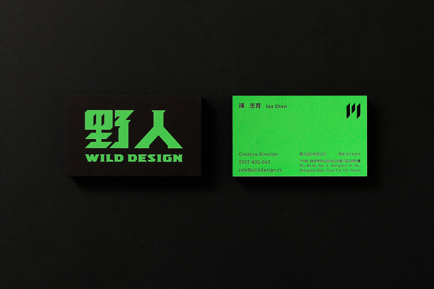
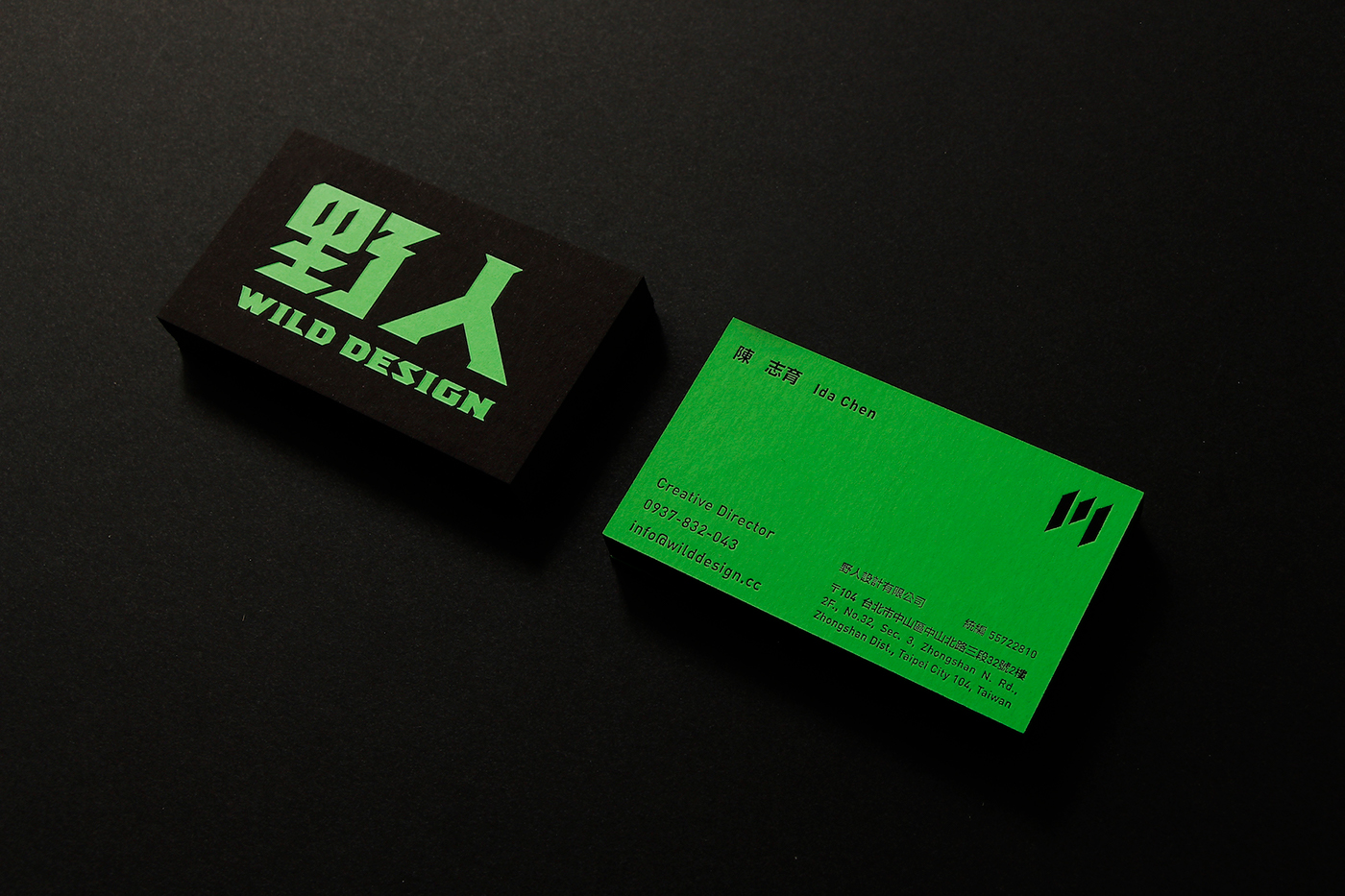
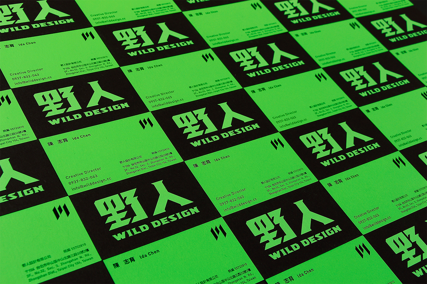
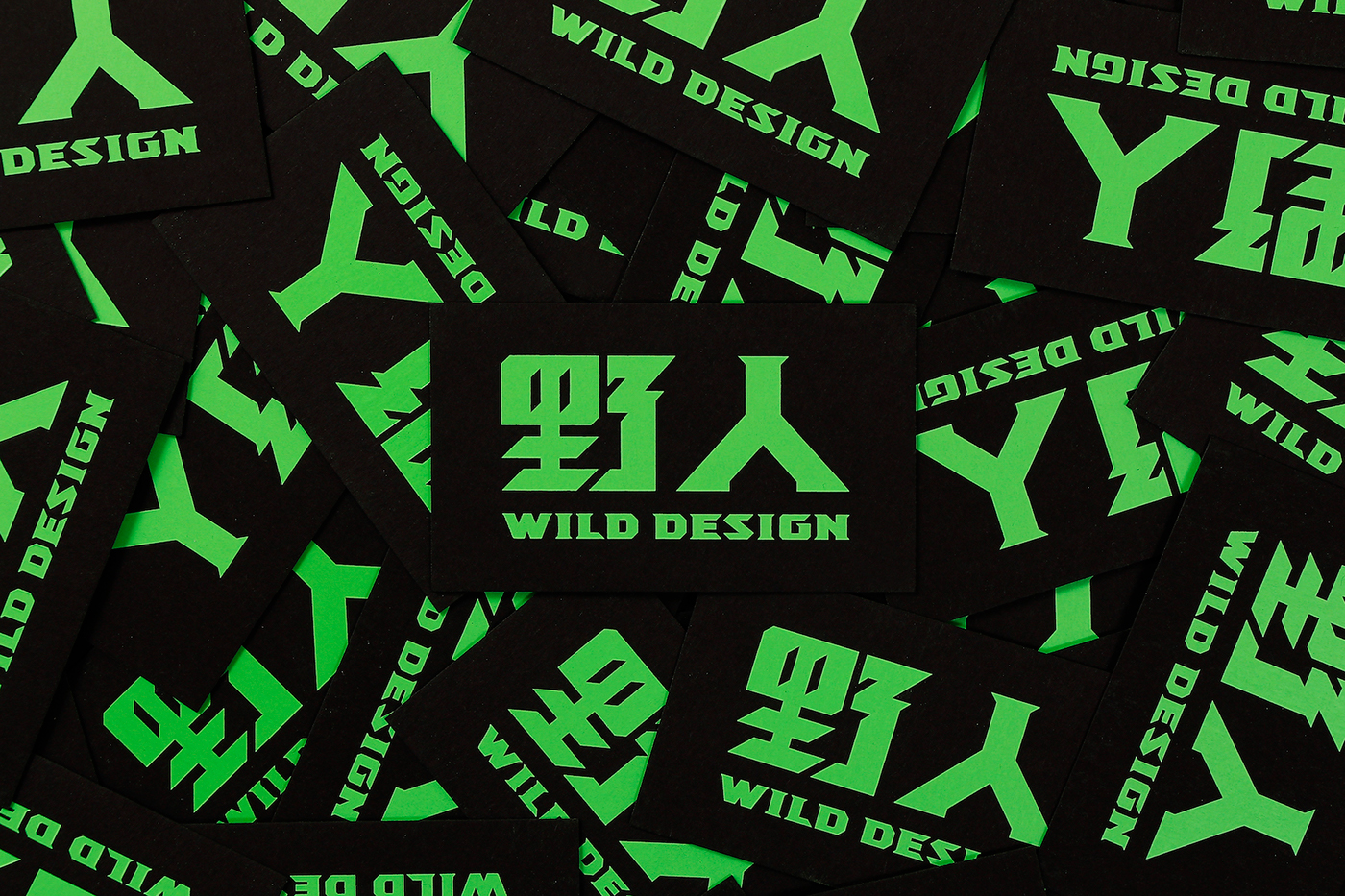
野人,是原始、聲音宏亮、有利牙、有毛帶刺的第一印象,我將這部分的想法加註於文字造型與卡片本身的印刷加工上。
原始的定義之於品牌設計中,我想更貼近於原創性,野人既是狂野且具有明確辨識性,無論是字體造型上加入如爪牙般的特徵、印刷採用非常大膽顯眼的螢光色...等,就是要直接給人一種「聲音宏亮,但不會吵」的視覺衝擊。
始於狂野歸於理性,是野人設計最好的解釋。
Wild man, first impression is original, loud voice and sharp teeth. I use these features in logotype design and the printing process of business card.
The definition of original in brand design, I want it to be more close to the originality, including it is added the characteristic of claw to the logotype, and the printing uses a very bold fluorescent color. So on, it is directly give a visual impact of "loud voice but not noisy".
Began with wild end to the reason, is the best explanation of this design.
_
Credit
Client:野人設計有限公司
Design:Tseng Kuo-Chan / I-Mei Lee
Paper:長瑩百代黑卡 450g/m2
Printing:山山印刷/正面網印U802(兩次)+打凹/背面網印U802(兩次)+燙霧黑