
Typographic and Layout Design: Experimental Type.
THE BREIF.
Project.
Develop an understanding of traditional typographic practices and selection and using type forms.
Aim.
Understand typographic principles.
Know terminology used in typographic and layout design.
Be able to use various media to develop typographic designs.
Context,
The usage of a type in any design situation requires us to assess examples of type design and to have an understanding of the principles and terminology used in typography as well as an understanding of the structure of a typeface. Many graphic design projects will require a designer to construct new letterforms or typefaces for all manner of print materials. To be able to create these with confidence a more detailed understanding of type is essential. This project looks at type terminology and the creation and review and presentation of such type forms in detail.
Task 1.
Written Work (MUST be well-illustrated) Min 500 words: 1. Choose a font and describe its history, Describe the terms design characteristics and show usage examples.
2. Describe the terms x-height, descender, ascender, serif and sans-serif and show usage examples.
Task 2.
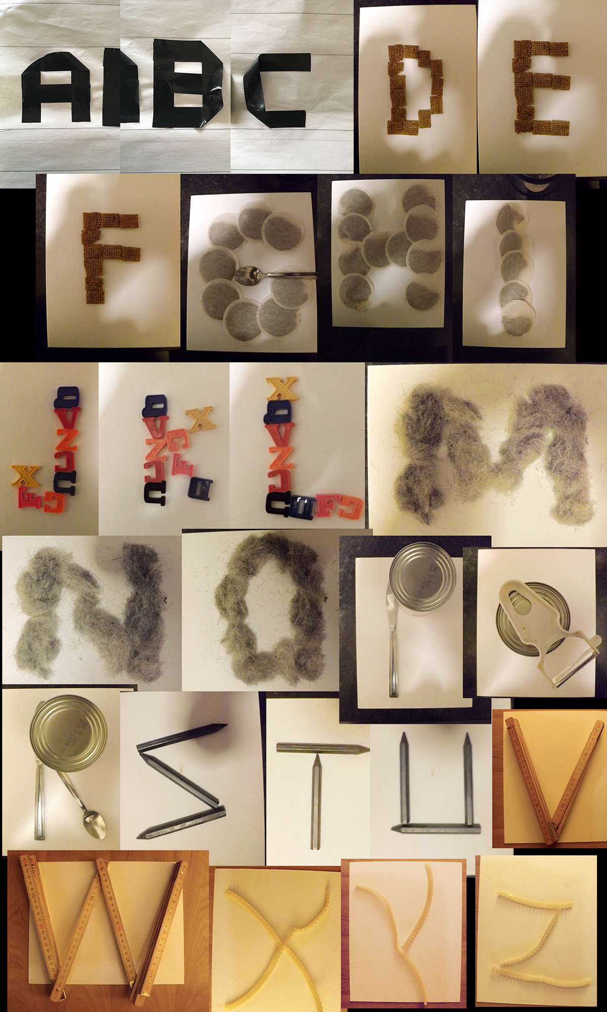
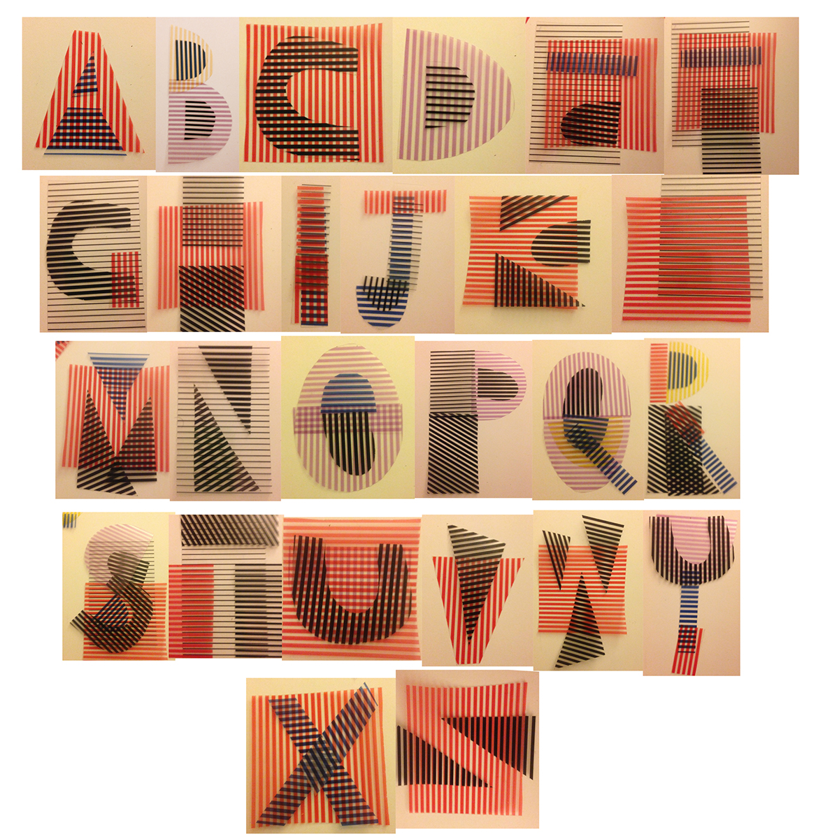
Using found materials, construct/design / create/fabricate a range (minimum 3) of letterforms based on either the font you chose in your written work or one of your choosing. Choose a typestyle which matches your chosen material eg. rounded pasta shapes for VAG Rounded. You are to make the letterforms using found or created materials. Any material or process is permitted. Be experimental and open to working methods. The materials you use will dictate the size of your original constructed letterform. Aim to produce at least three examples of your chosen font. Work quickly to establish your version of your chosen font. A created type may be taken into the computer and manipulated but not initially created in the computer. Presentation of your final pieces will be reviewed by both peers and tutor at your hand-in presentation where you will get a chance to present an informed opinion on your designs. Your pieces may be brought into the presentation and/ or photographed and presented on Behance. Remember that your constructed letterform should attempt to resemble the most obvious characteristics of your chosen fonts.


Found letters.
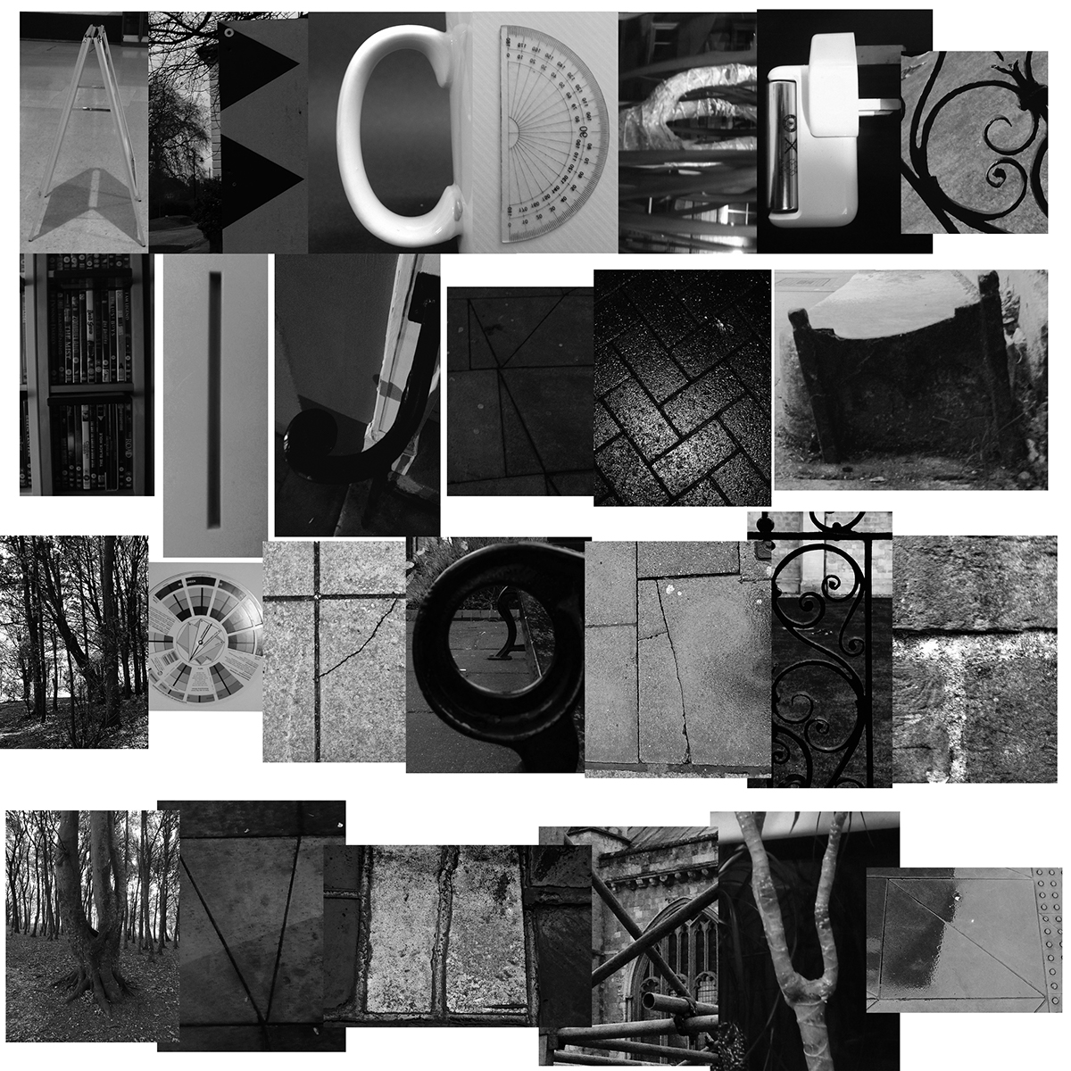

Type made from everyday objects around the house.
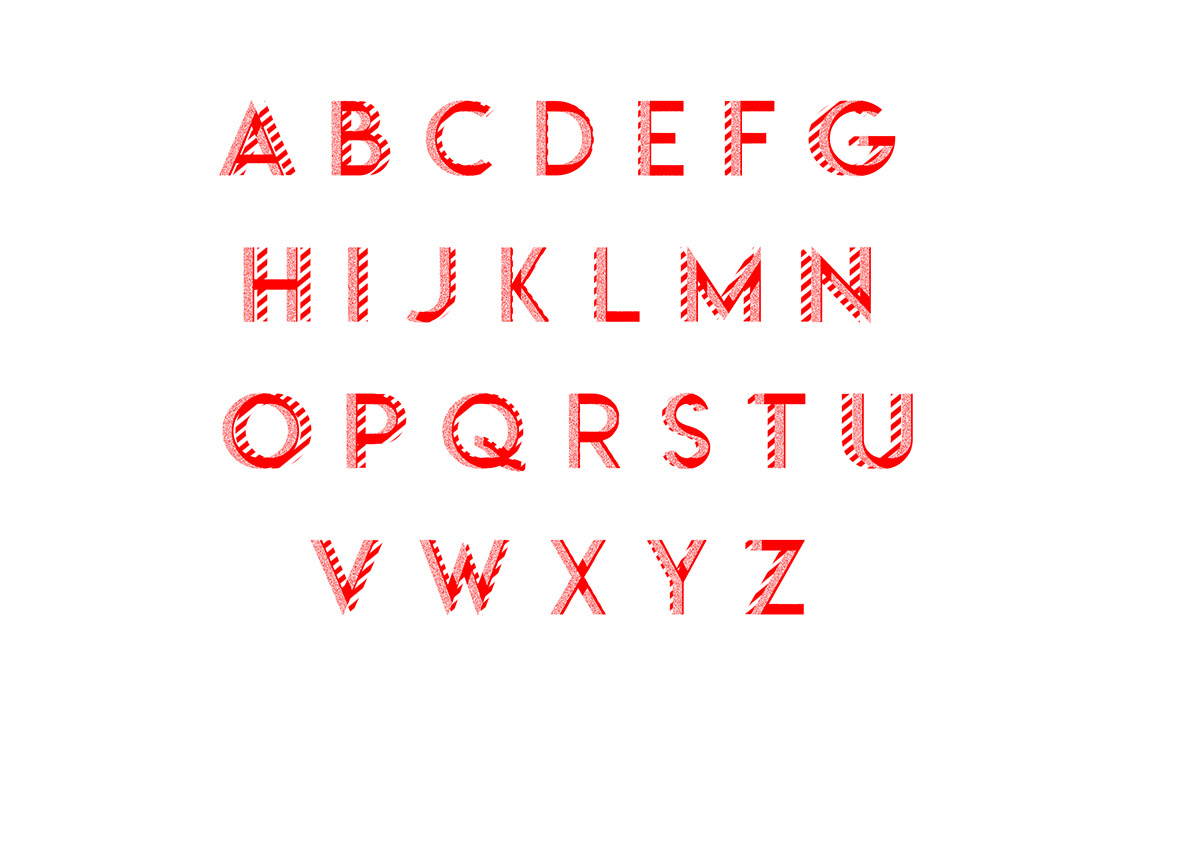
Type made from stripped acetate.
Letters made from post-it notes.

Type made from rubbish found on the street.

Letters made from coffee and tea stirrers.


Found alphabet in films.
Photoshop manipulation


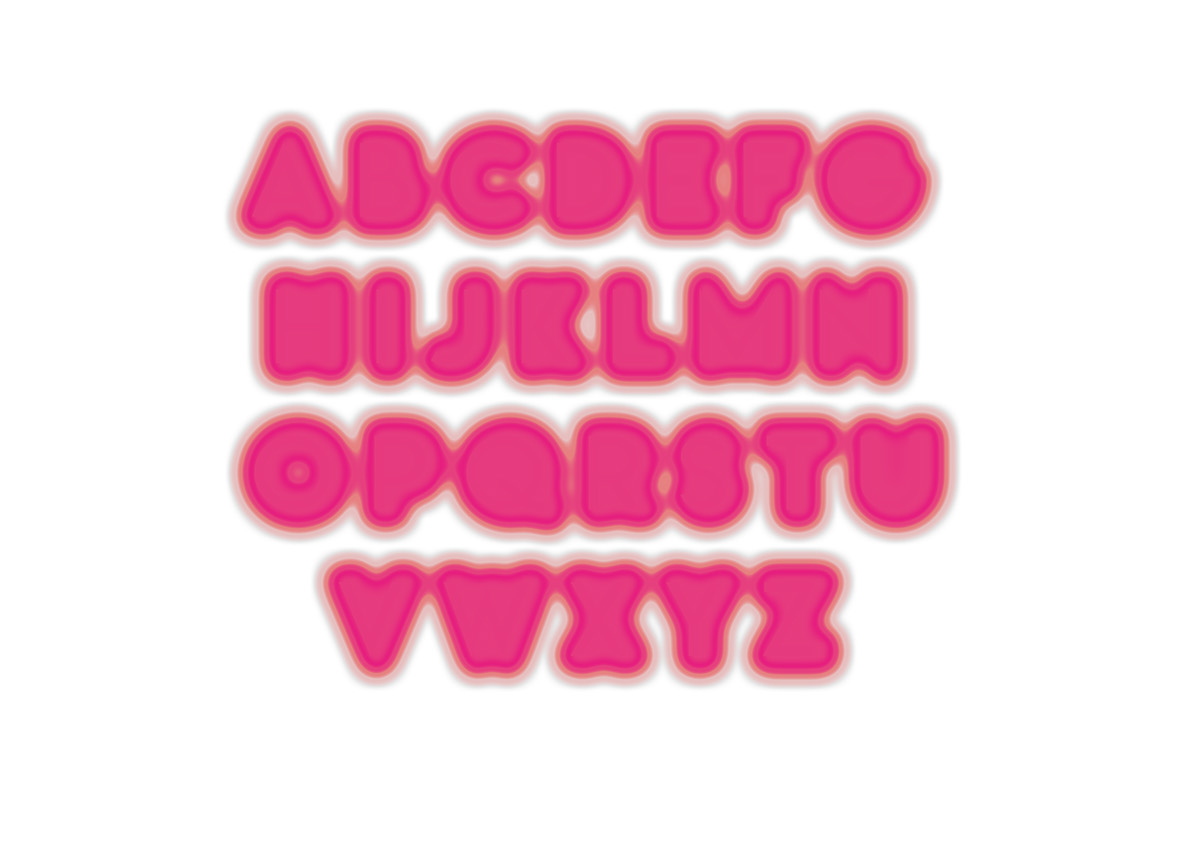
Here I took Helvetica Bold and used a app called Glitche to glitch the letters.


Below are some moving Glitched type.


