

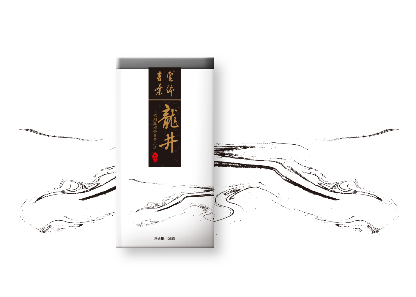
品牌调性索要呈现是“水墨中国风”,与传统的茶叶的不同的是,主视觉不采用任何的茶叶元素,仅仅依靠品牌的认知度,然后结合飘逸的水墨来表达出此款单品包装的特性。文字部分采用毛笔字写法,设计在黑色的色块中,突出主视觉,但也能一眼认出此产品是龙井茶。
Tonal brand claims to show is "Chinese style ink," and the traditional tea is different from the main visual does not use any tea elements, relying solely on brand awareness, and then combined with elegant ink to express this section of a single product Packaging features. The writing part adopts the brush writing style, which is designed in the black color block to highlight the main vision, but it can also be recognized at a glance that this product is Longjing tea.


Thanks for watching:)


