This project is one of the most feminine projects I have ever worked on. It was a very unfamiliar territory for my mind to think as a girl. The client contact me and briefed me quickly of the logo and she had an idea in mind already. She sent a rough sketch of what she wanted (below) and she said this is the idea but we don't know how to execute it. After I gathered all the information from my client to understand the nature of the business and the target audience and other aspects I moved to the next step.


My next step was to find styles of hands holding a pen or a brush. Also I was looking for styles such as illustrations, photography, cartoon, and iconic.

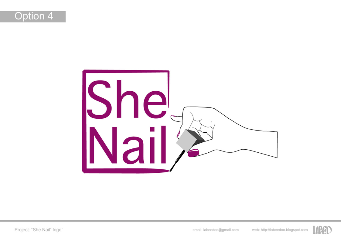
From the images gathered I illustrated a hand and picked a typeface that gives the feeling of a handwriting. The font was modified to show a fun teenaged girl persona. The feedback from these options was very positive but the client requested that the color is too teenaged and suggested a moroon color. Also to change the brush to have it look more like a manicure brush.

I had no idea what a manicure brush looked like so I searched and found alot of different types. So I asked Areej (my wife) to show me her manicure brush and to model. The image didn't need to be fancy I just needed a reference to trace. Below are the results of that image.


After I was done with those options I was happy but not not fully satisfied for some reason. So I starting looking for any inspiration around me and viewed many images to find a new approach. Then finally these images below sparked an idea!

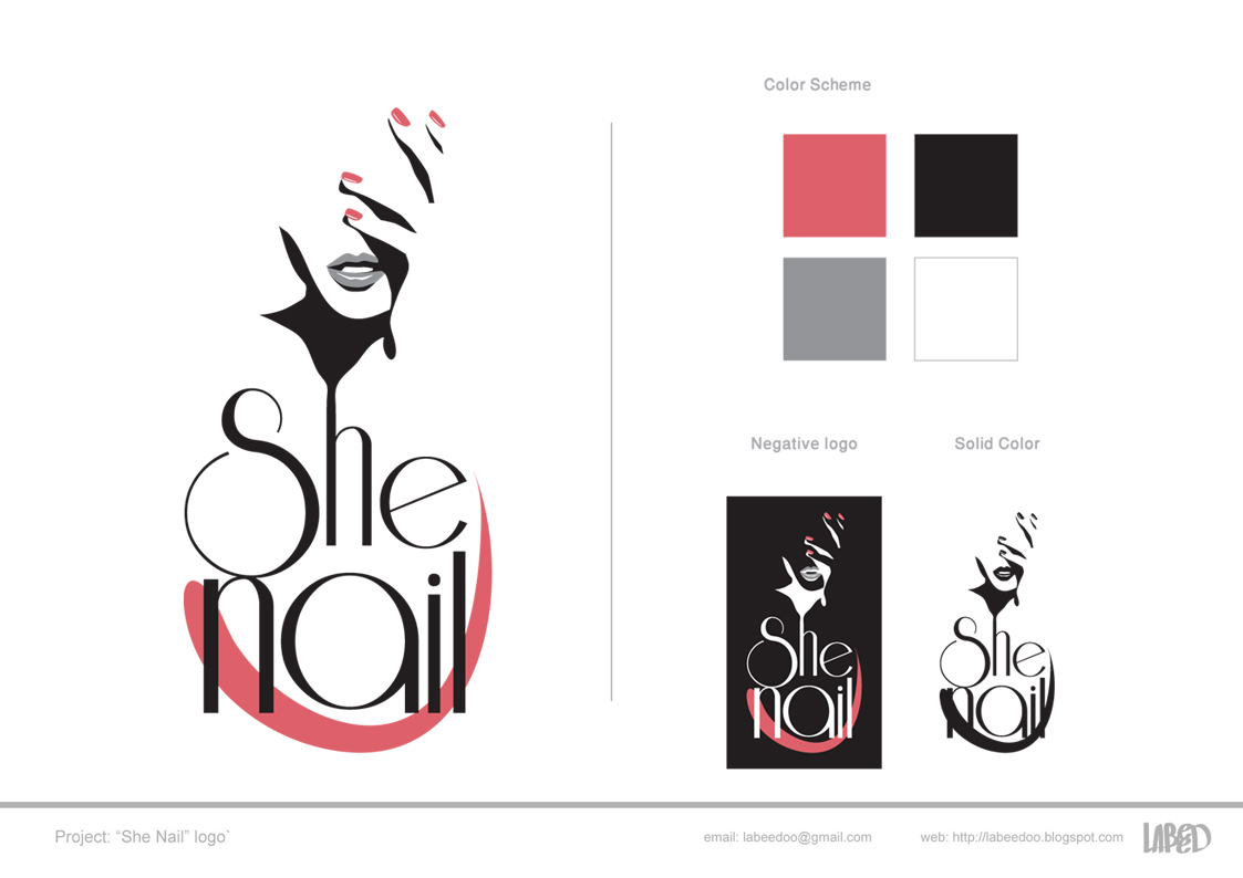
I liked the image of the girl on the top and the shadows of her hand over her face gave me an idea. I illustrated the girl and modified it to fit my needs and I had to remove unnecessary details such as the hair and the ring. Then I picked a font I like very much but never had the chance to use it in any design. After that I developed an additional set of options with the new approach away from the hand that had been suggested by the client. I presented all the options all together as you can see it says (options 6).

The client completely fell in love with the additional optional and she picked the with option with the curvy brush stroke. Also she requested for the eyes to be removed because it is not allowed to have a logo of a human face in Saudi Arabia. Let us not get into this issue.

From left to right: original option, eyes removed, eyes removed and part of the face is removed to create balance.
Final logo chosen.


Hope you enjoyed this post as much as I did working on the project it self.


