Acando
Acando, one of the top local IT- & Management Consulting players in northern Europe, gave us the opportunity to help re-position them from local hero to distinct global challenger. Their aspiration in doing so is to lead innovation, drive change and attract the best new talent.
The visual tonality is inspired by their proficiency in naturally adapting to change. Acando thrives in a tech-driven world using a user-centric approach; a company in constant flux but always with a clear view on where the world is headed. This mindset actuated and inspired our work with the identity, website, brand strategy, concept design, platform and tonality.


The world of IT/Management Consulting has to be one of the most generic there is. Acando included. But the move from Local leader to Global challenger really comes with a lot of aspiration and actions, which will help position Acando. Never be duller than the big ones. Always take a challenger position. Dare to stand out and be clear visually and in content.


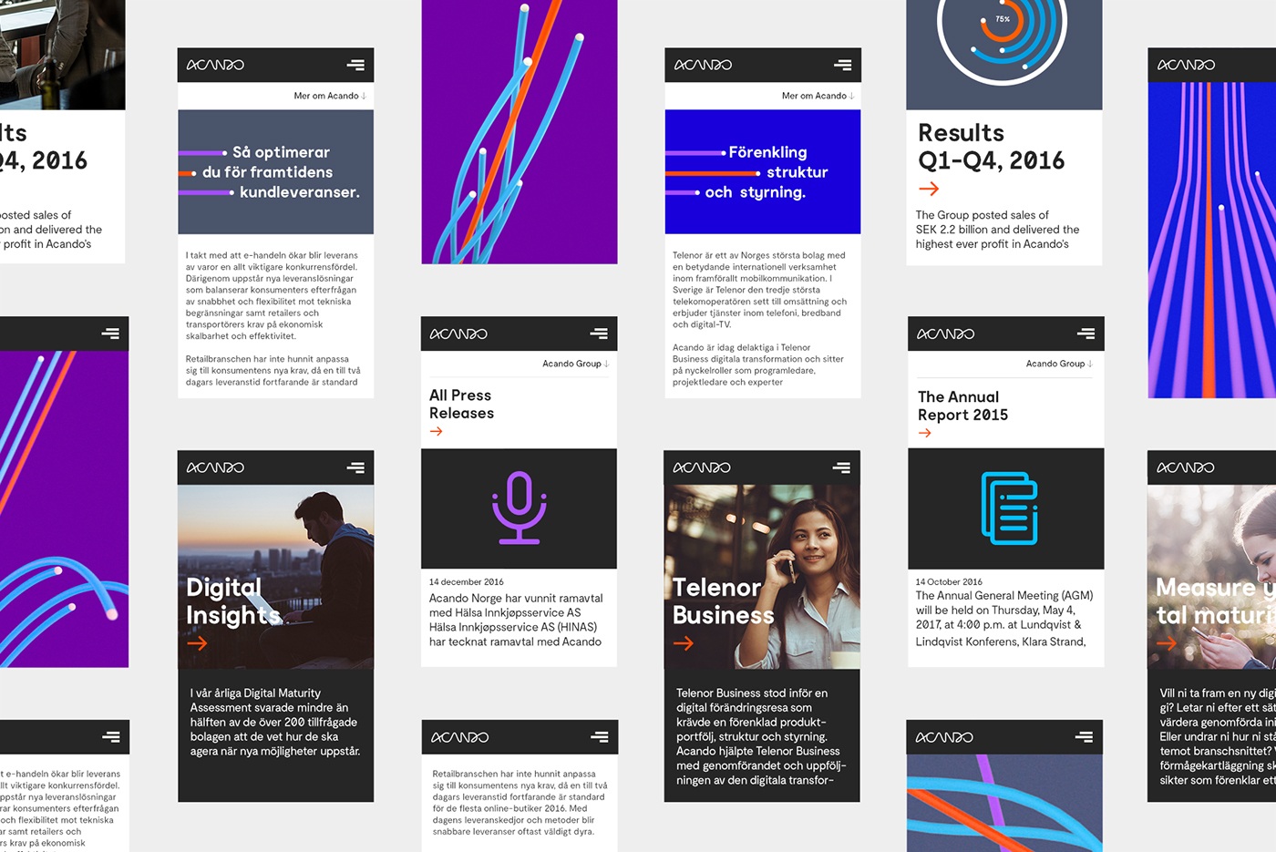
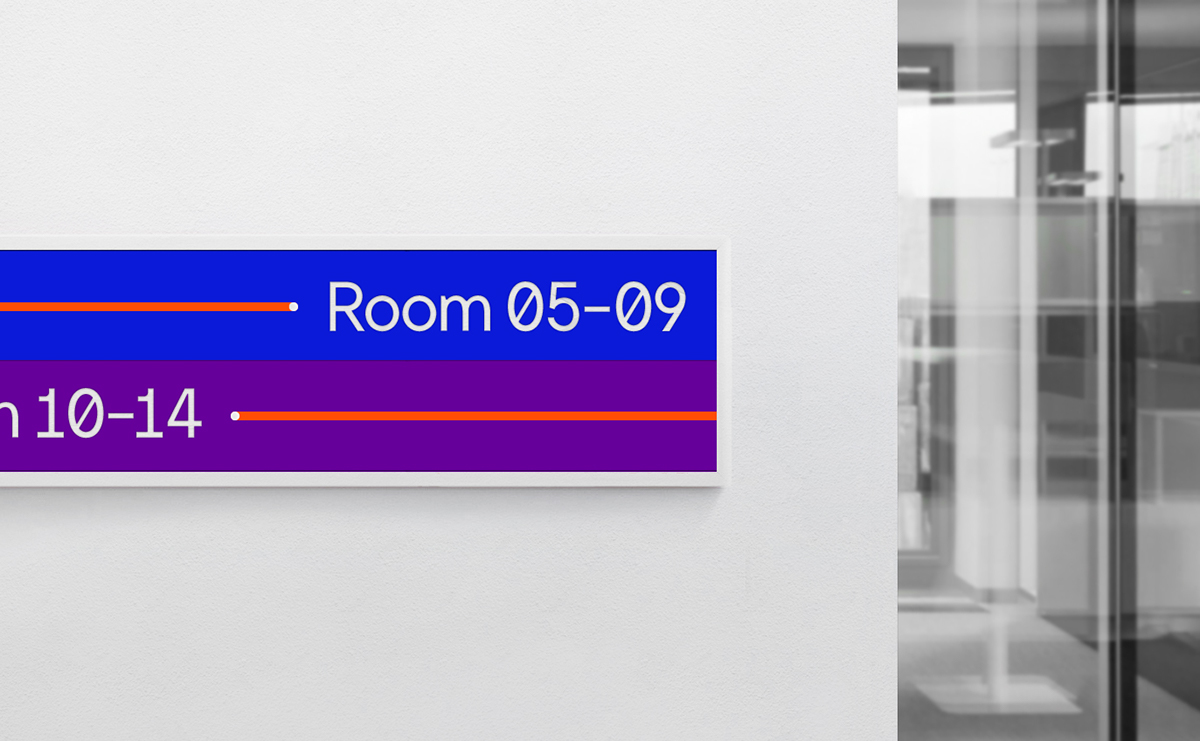
Derived from the logotype, continuous lines were chosen as a symbol for an unstoppable movement. A movement that is quick to adapt, fast moving and leading the way for an industry which is notoriously stagnate. It can be dropped on basically any surface. It can take any shape, move in any direction, at any time, be graphic or organic. Just like Acando.


The lines are not just a pattern, they’re a language. When not used as a full pattern, the lines work great for accentuating text fields, framing additional content or for leading the way in signage.

The website is built around an inbound marketing concept, where the content created, besides being thought provoking enough to be shared in social media, also should be an important host of the brand by being challenging, innovative, of high quality and taking a stand.