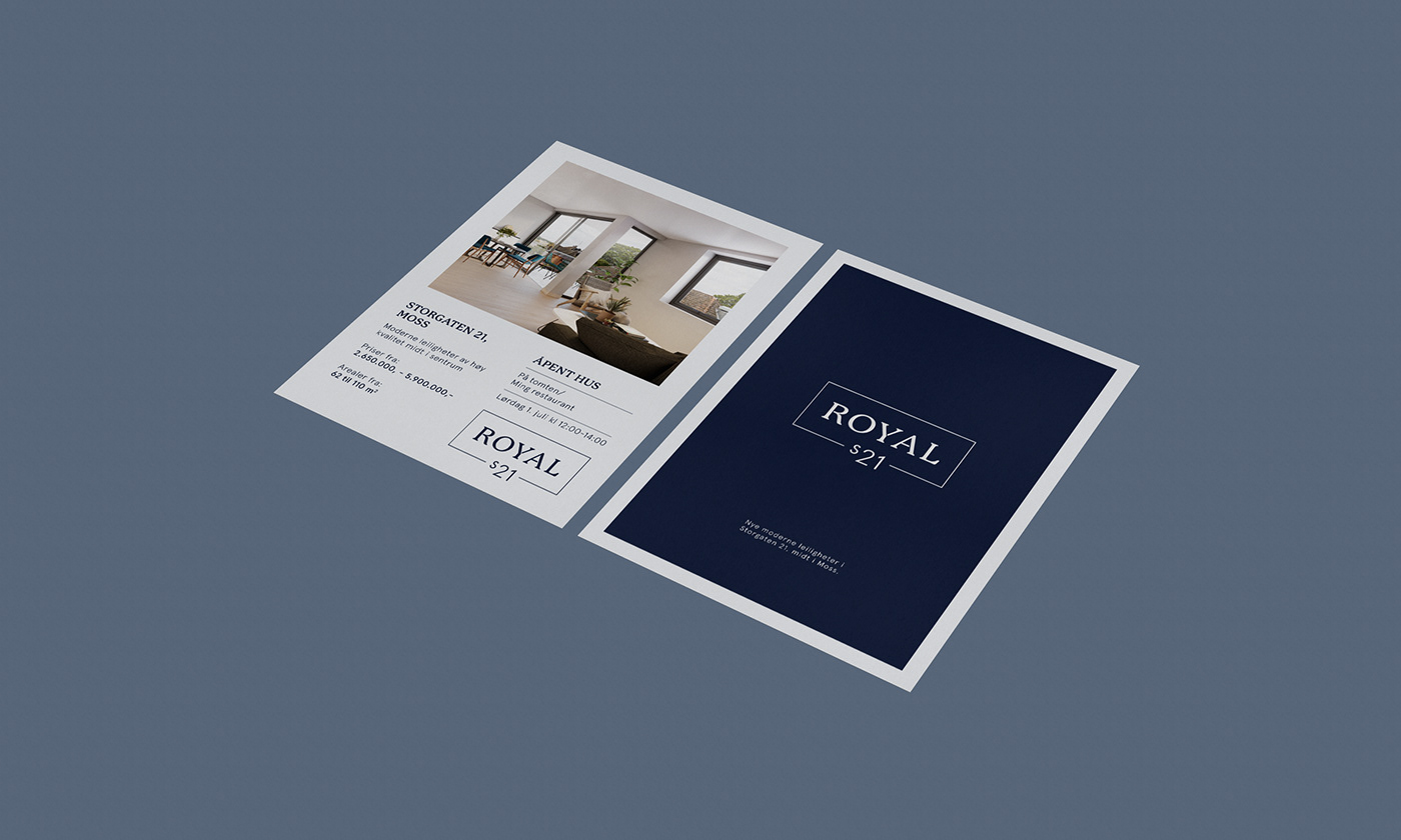
Real estate brochure and visual identity for the company Royal S21
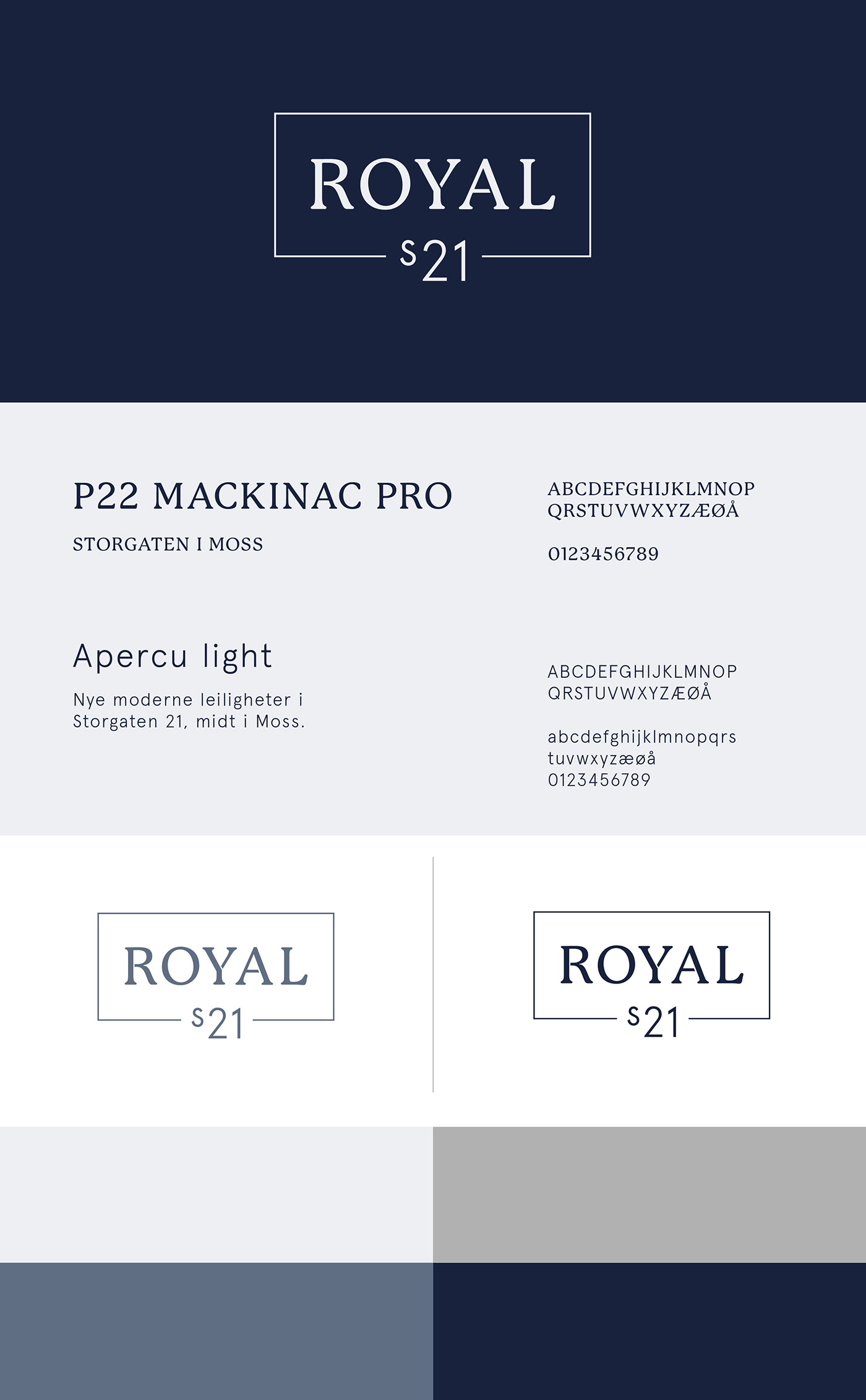
The client wanted a simple classical profile with a touch of quality and royalty. They also wanted the logo to be used in several projects with Royal as the main name and S21 as the project name.
A profile with blue and gray tones and two contrasting fonts. The thick Romanesque font in the headings and the logo has a royal and strong profile that stands in contrast with the simple sans-serif in the overall text. The border around the logo is connecting the main name and profile name as a whole and makes it easy to replace in future projects. The layout is kept tight, airy and clean with clear sections using lines and the underlying grid.


