


Abstracto · Overview
Diseño de concepto, promoción y publicidad de un restaurante especializado para aquellos días en los cuales uno no despierta del todo bien después de una fiesta o de un día largo de trabajo... exacto es un restaurante para curar la resaca. El proyecto comenzó por una experiencia universitaria, con la cual nos dimos cuenta de un nicho de mercado que no ha sido abarcado actualmente.
Concept design, promotion and advertising of a specialized restaurant for those days in which one does not wake up at really well after a party or a long day of work... Exactly is a restaurant to cure the hangover. The project began with a university experience, in which we realized a target segment that is not currently covered.
Construcción · Construction
Para la construcción de marca se planteó un isologo y un imagotipo, así como un tagline, y se hizo una ingeniería de los mismos en la cual se contemplaron las reducciones mínimas a las que se podía someter la imagen antes de que ésta perdiera su proporción. Se creo un imagotipo en la caracter ¨T¨ de una cruz católica con los cubiertos de una comida. Se indicó al cliente cuales eran los usos correctos de éstos en reducciones.
Branding. The brand itself is made of an isologo and an imagotype and a tagline. The engineering was made in which the minimal reductions to which the image could be subjected before it lost its proportion were considered. An image was created in the character of a catholic cross with the cutlery of a meal. The customer was informed of the correct uses of these in reductions.
Atributos del logotipo

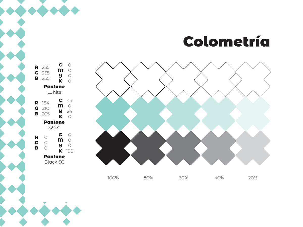
Colores y atributos · Colors and atributes
Los colores seleccionados como normativos buscan dotar a la marca de una caracterización tranquila y relajante, se busca que con este color el consumidor entre a un ambiente poco saturado y pacífico.
El color aqua se implementó ya que representa frescura, juventud, calma, limpieza y diversión; atributos que buscamos asociar con la marca.
El color aqua se implementó ya que representa frescura, juventud, calma, limpieza y diversión; atributos que buscamos asociar con la marca.
The colors that were selected as standard colours seek to give the brand a calm and relaxing characterization. The aim is that with this color the consumer enters a little saturated and peaceful environment. The aqua color was implemented because it represents freshness, youth, calm, cleanliness and fun; attributes that we seek to associate with the brand.

Naming
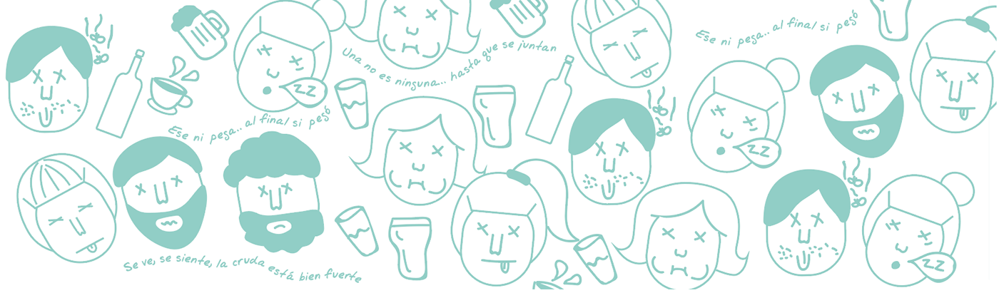
El nombre ¨El cementerio¨ surge apartir de las consecuencias que conlleva una larga noche, ya sea, de estudio o de fiesta (la resaca). Uno puede llegar a sentirse enfermo, débil, cansado o hasta derrotado. Nuestro concepto de lugar revitalizará a todas aquellas personas que llegan ¨muertas¨ a nuestro local.
The name "El cementerio" born from the consequences of a long night, whether it is a study or a party (hangover). In which one may feel sick, weak, tired or even defeated. Our concept of place will revitalize all those people who arrive to our place.

Proceso · Process
Para este proyecto fue necesario: investigación de mercado juvenil, conceptualización del proyecto, naming del local, exploración visual de competencia, desarrollo de diferentes medios de comunicación, diseño de identidad de marca, identidad e ingeniería visual, desarrollo de imagotipos y eslogan.
For this project, it was important: a market research, project conceptualization, local naming, visual exploration of competition, development of different communication media, brand identity design, visual identity and engineering, development of images and slogans.
Etapa 1
Etapa 2

Etapa 3
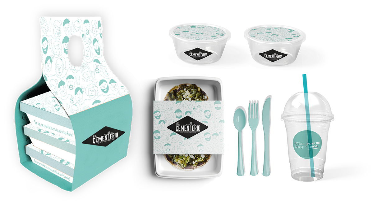
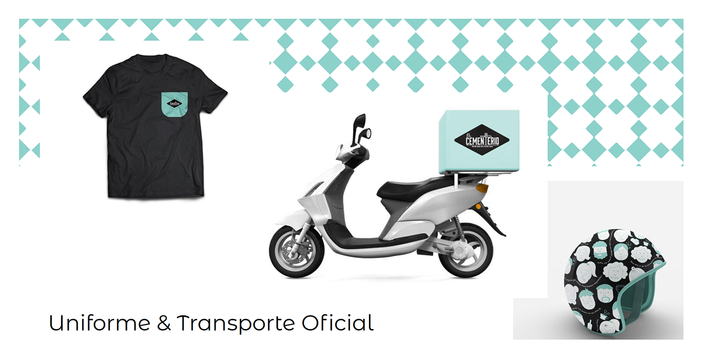
KIT PARA COMER

KIT PARA LLEVAR


Etapa 4


Etapa 5


Etapa 6
Eslogan · Slogan
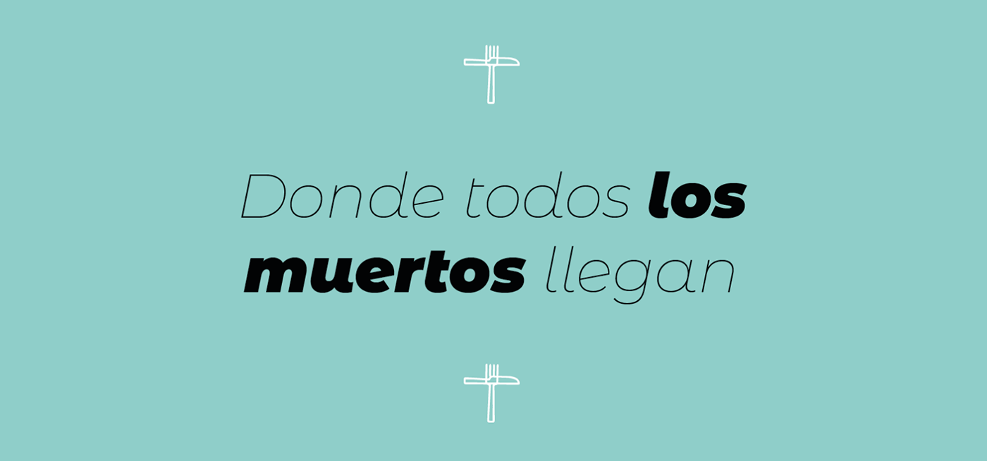
Para dar ese toque de misterio y humor a la marca, se desarrolló un eslogan que consiste en englobar el concepto del cementerio en 5 palabras: “Donde todos los muertos llegan”, tomando como referencia el nombre del lugar y el humor mexicano hacia las crudas con la intención de reflejar la esencia de la marca, sus productos y servicios.
To give that hint of mystery and humor to the brand, a slogan was developed that consists of encompassing the concept of the cemetery in 5 words:"Donde todo los muertos llegan", taking as a reference the name of the place and the Mexican humor towards the raw ones with the intention of reflecting the essence of the brand, its products and services.
Publicidad · Advertising
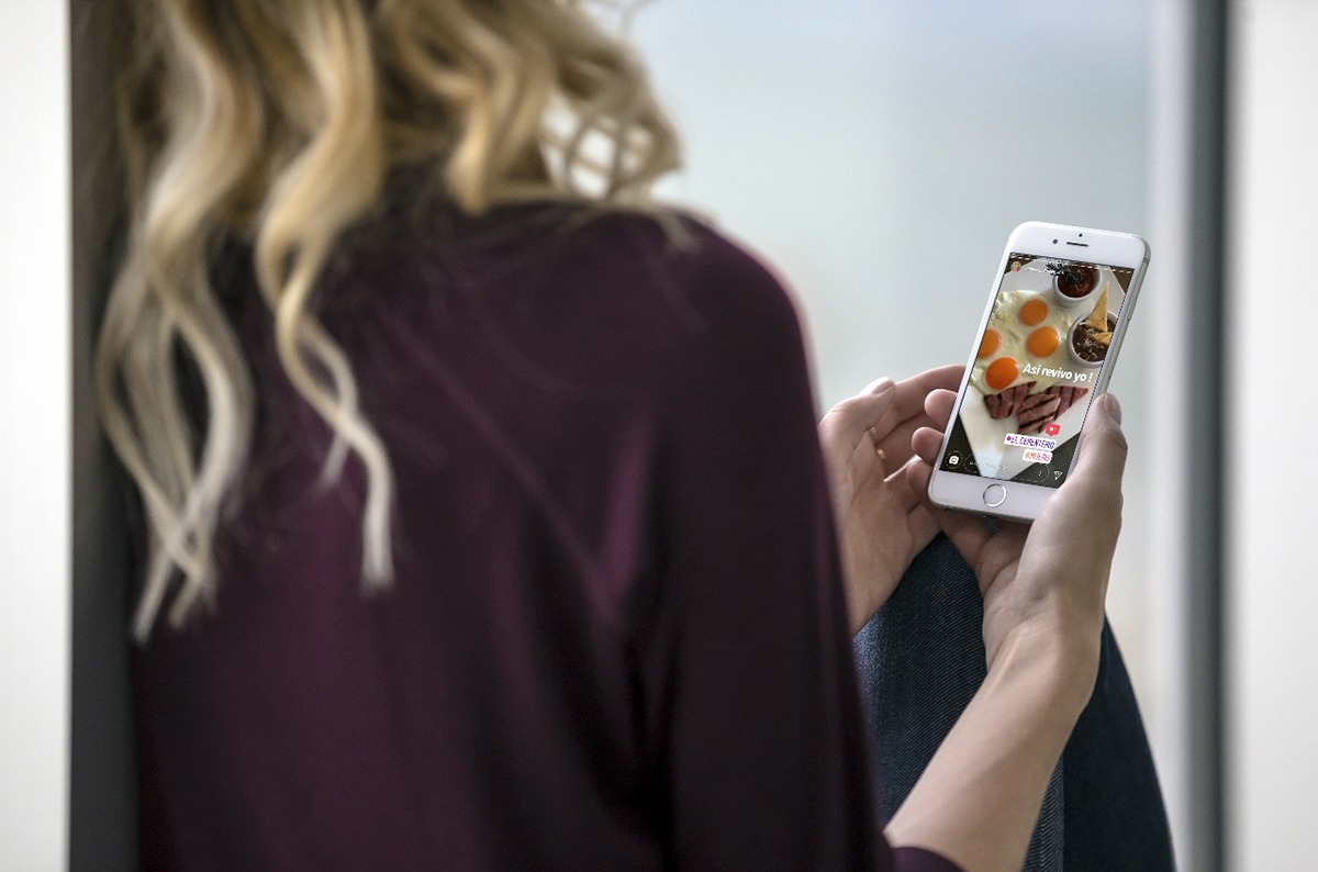
Para dar a conocer la marca se contempló que nuestro mercado será juvenil, no somos otro local de comida, somos un lugar de encuentro, de experiencias para ellos, así que al momento en que se definió el tipo de usuario del cocepto-experencial, se definió también que uno de los factores es los medios en los cuales se mueve, las redes sociales. Las cuales serán utilizadas como medio primario, sin que el usuario se sienta atacado por las mismas pero si atraído. Para explotar a fondo los diferentes medios comunicativos, se contempló la estrategia PESO creada en el 2014, la cual destaca los diferentes tipos de publicidad que utilizamos: PAID, EARNED, SHARED, OWNED.
In order to make the brand known, it was contemplated that our market will be youthful, we are not another place of food, we are a meeting point, a place of experiences for them, so that at the moment the type of user of the experience concept was defined, it was also defined that one of the factors is the means in which it moves, the social networks. These will be used as a primary medium, without the user feeling attacked by them but attracted. In order to fully exploit the different communication media, we contemplated the PESO strategy created in 2014, which highlights the different types of advertising we use: PAID, EARNED, SHARED, OWNED.
Objetivos de comunicación
El objetivo principal es dar a conocer 1 el nuevo concepto de restaurante para jóvenes universitarios en Puebla. Generar una nueva experiencia de consumo para que los jóvenes tengan un sentimiento de pertenencia con el concepto. Atraer al público juvenil de Puebla.
The main objective is to introduce the new concept of restaurant for young university students in Puebla. Generate a new consumer experience so that young people have a sense of belonging to the concept. Attract young audiences from Puebla.


Créditos · Credits
Proyecto freelance por Paloma Vázquez, Paloma Rojas, Fernanda Rodríguez y Estefanía Rodríguez.
Duración: 1 mes
Asistencia durante el proceso de construcción de la marca: Yolanda Moreno Cavazos
Tutoría académica: Yolanda Moreno Cavazos
Cliente: Anónimo
Licenciatura en Diseño de Información Visual, Universidad de las Américas Puebla (UDLAP)
¡Gracias por su visita! Thanks for viewing!


