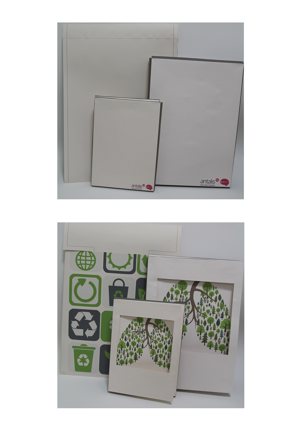
For the packaging design for Antalis, I chose to keep thingssimple.
The structure of the packaging itself is rather book-like.It is easy to hold in the hands or to be put in a bag. Due to it’s boxy natureit is stackable as well, making it convenient for storage. The bigger packagingthat is designed to hold both A3 and A4 comes in a package-like structure; withjust a hard backing and a foldable flap that slots in at the front. This is forease of adjustment if there happens to be too many sheets of paper. It is moreversatile as well.
Colours in shades of green and cream to symboliseeco-friendliness and freshness were used. These colours are soothing on theeyes, and can bring a calming and soothing effect.
The primary packaging; which are for the a3 and a4 papers,is dominated by one main illustration. I obtained inspiration from Japanesegraphic designer Ryuichi Yamashiro’s tree planting poster which is basically aposter covered with the kanji letter for tree.
The forests have always been called ‘the lungs of theearth’. Hence the trees, a la Japanese style, form the shape of the lungsdepicting the forest, with roots as the respiratory pipes. This is a reminderthat trees have provided us with oxygen and taken in the excess carbon dioxide,we should let them breathe as well by not cutting them down.
The bigger packaging is, once again, image centric with nocopy.
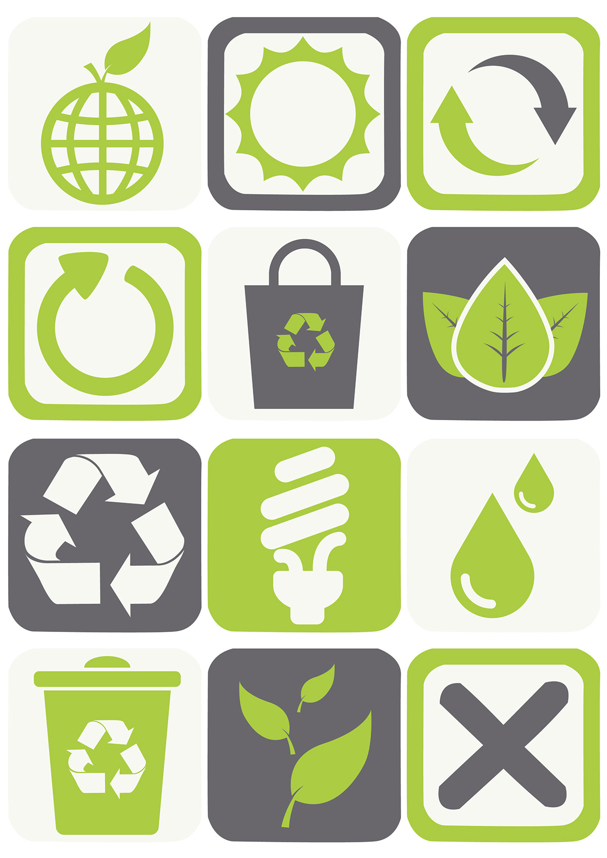
For this illustration, I was inspired by the tags on clothesthat tells everyone how to take care of their clothes properly. Everyone knowsof their existence, but no one bothers to take a second look. I was forciblyreminded of the situation in playing a part to save our earth: everyone knowsmother earth is in danger, but no one bothers to go the extra mile.
The ‘tags’ or rather symbology are all ecology related, andit (hopefully) serves as a reminder for most people that you can start doingyour part by simply using recycled materials or start recycling things.
The structure of the packaging itself is rather book-like.It is easy to hold in the hands or to be put in a bag. Due to it’s boxy natureit is stackable as well, making it convenient for storage. The bigger packagingthat is designed to hold both A3 and A4 comes in a package-like structure; withjust a hard backing and a foldable flap that slots in at the front. This is forease of adjustment if there happens to be too many sheets of paper. It is moreversatile as well.
Colours in shades of green and cream to symboliseeco-friendliness and freshness were used. These colours are soothing on theeyes, and can bring a calming and soothing effect.
The primary packaging; which are for the a3 and a4 papers,is dominated by one main illustration. I obtained inspiration from Japanesegraphic designer Ryuichi Yamashiro’s tree planting poster which is basically aposter covered with the kanji letter for tree.
The forests have always been called ‘the lungs of theearth’. Hence the trees, a la Japanese style, form the shape of the lungsdepicting the forest, with roots as the respiratory pipes. This is a reminderthat trees have provided us with oxygen and taken in the excess carbon dioxide,we should let them breathe as well by not cutting them down.
The bigger packaging is, once again, image centric with nocopy.
For this illustration, I was inspired by the tags on clothesthat tells everyone how to take care of their clothes properly. Everyone knowsof their existence, but no one bothers to take a second look. I was forciblyreminded of the situation in playing a part to save our earth: everyone knowsmother earth is in danger, but no one bothers to go the extra mile.
The ‘tags’ or rather symbology are all ecology related, andit (hopefully) serves as a reminder for most people that you can start doingyour part by simply using recycled materials or start recycling things.