

BEFORE & AFTER
Initial Product Sketches to Final Image
Initial Product Sketches to Final Image
Often times, we just see the final product or image created by the artist. I wanted to share just a few of my drawings that were turned into full illustrations or actual products like posters or t-shirts. Hope you enjoy!
Brass Tack Mother
This is a shirt design for Hydro74's Brass Tack Apparel. Made originally with 2H and 2B pencil and some microns. There wasn't much alteration done to the original image aside from some contrast adjustments and small fixes.
You can buy the shirt here. http://www.merchline.com/brasstack/categorydisplay.4405.c.htm

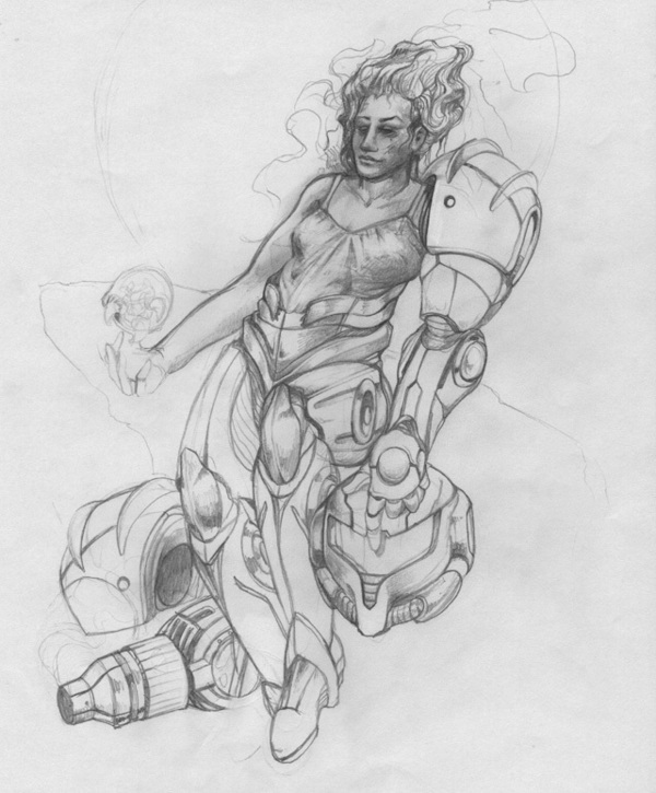
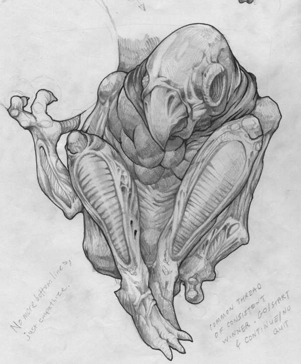
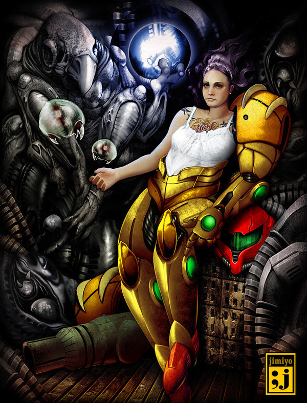
Samus Aran
This is a personal project. I wanted to illustrate Metroid's Samus Aran in an atypical fashion with tattoos, dyed hair, and blouse. I also wanted to integrate Giger-ish design elements into the image. Although I was unable to accomplish the Giger aesthetic and the direction was abandoned halfway through the project. The two sketches before were the main bulk of the illustration. Most times, I only draw a majority of the complicated objects in an illustration in pencil and finish the rest in Photoshop.
This is a personal project. I wanted to illustrate Metroid's Samus Aran in an atypical fashion with tattoos, dyed hair, and blouse. I also wanted to integrate Giger-ish design elements into the image. Although I was unable to accomplish the Giger aesthetic and the direction was abandoned halfway through the project. The two sketches before were the main bulk of the illustration. Most times, I only draw a majority of the complicated objects in an illustration in pencil and finish the rest in Photoshop.
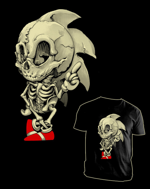
Skeletal System of a Posed Hedgehog
Obviously this is a parody of sorts of Sonic the Hedgehog. It was on sale at Teefury.com for $9. Teefury is the company for whom I work as Art Director. On occasion, they allow me to design as well. Check it out, $9 pop culture t-shirts. Can go wrong with that price.
http://teefury.com
Obviously this is a parody of sorts of Sonic the Hedgehog. It was on sale at Teefury.com for $9. Teefury is the company for whom I work as Art Director. On occasion, they allow me to design as well. Check it out, $9 pop culture t-shirts. Can go wrong with that price.
http://teefury.com

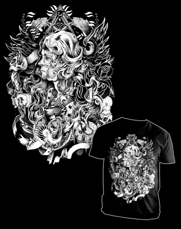
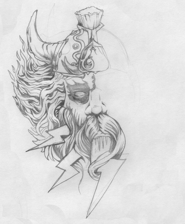
Saulvation
This is for an apparel line that is to come out this summer... erm... maybe.
As you can see, I only illustrated half the head. I duplicated and reflected. I often create the main object and utilize my own stock art resources to embellish the focal point of a design or illustration. It makes for a faster workflow.

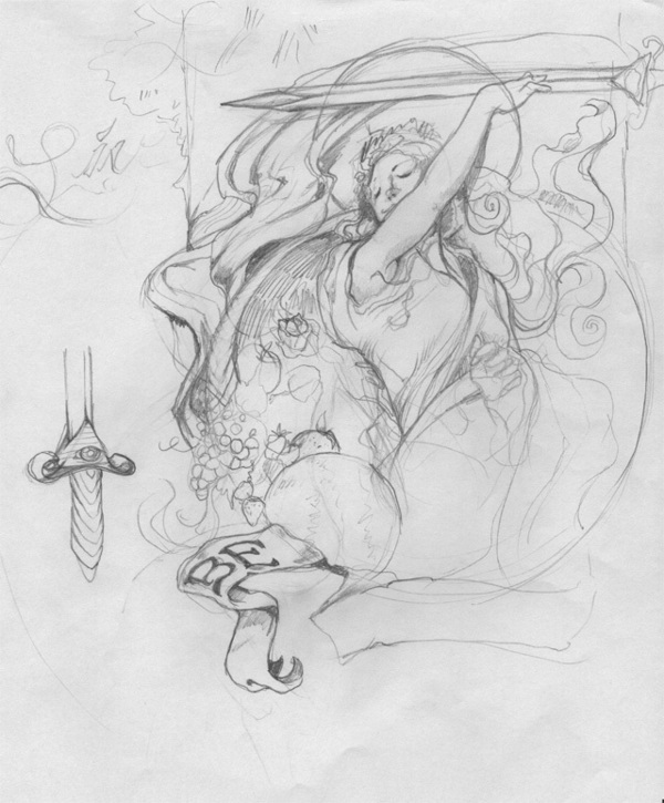
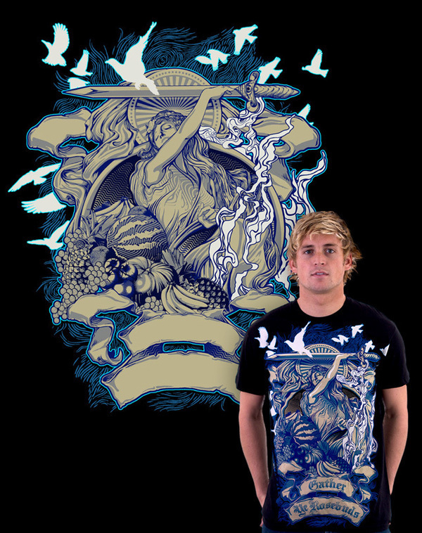
Gather Ye Rosebuds
This is an actual shirt, but you can't buy it. It's out of stock. Do me a favor and leave messages for them to reprint it. http://www.designbyhumans.com/shop/detail/3602?category=mens
Many of my illustrations has flowing elements and ambient swirlies. I usually end up adding them after creating the main focal points, eventually interweaving the objects together, and unifying the composition. Also to add more visual interest, I often add varied line shading.
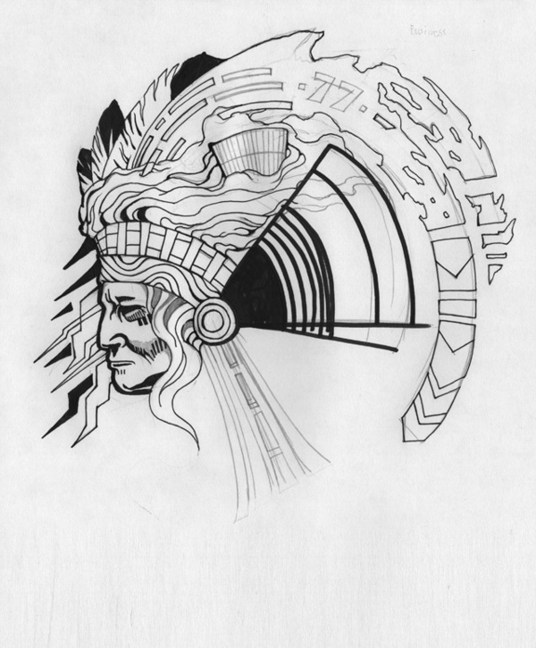
1977
This was a shirt on sale at http://Shirt.woot.com. It is one of my most favorite pieces,
I was inspired to become an artist back in the Commodore 64 days. I remember playing around with GEOS paint, and creating pixel art by inputting data strings.
What I remember most for some reason is an advertisement for Amiga Video Toaster with the typical indian head test pattern. That was my inspiration for the majority of this piece. The shirt is no longer available.

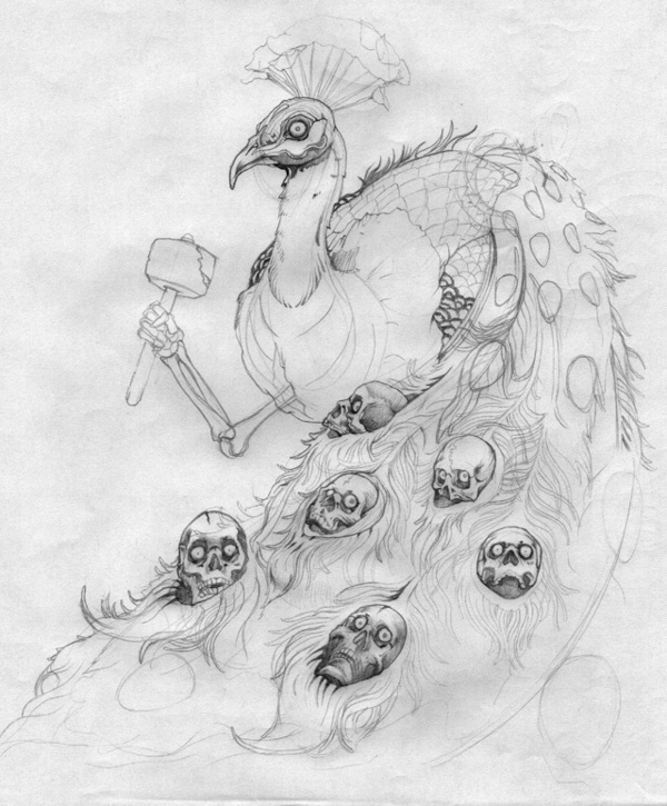
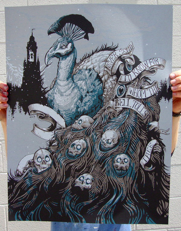
The Bells
This is my latest piece of art based on John Donne's poem No Man is an Island. Never ask for whom the bells tolls, for it tolls for thee. An omnious warning that death approaches! Run Forrest!
It was a long project. During the rendering of the peacock feathers I questioned why I would punish myself, but after the halfway point, I obviously couldn't stop. It wasn't until the 3/4 mark that I started to get excited about what the final product would look like.
It was inspired by Aaron Horkey's artwork. I hope that one day, I can be just as meticulous and detailed as he is with his work. I've read that he spends months on his designs, and I'm not sure if I could stand working on a design that long. BUT, I think he might actually not do any of his work in digital form which makes it even more impressive.
This limited edition poster is signed and numbered. You can purchase it at
http://jimiyo.bigcartel.com
Thanks for looking,
;jimiyo
JIMIYO
FACEBOOK: http://www.facebook.com/jimiyoart
TWITTER: http://twitter.com/jimiyo
WEBSITE: http://www.jimiyo.com
SHOP: http://jimiyo.bigcartel.com
FACEBOOK: http://www.facebook.com/jimiyoart
TWITTER: http://twitter.com/jimiyo
WEBSITE: http://www.jimiyo.com
SHOP: http://jimiyo.bigcartel.com


