Go Design Logo
This logo was designed as a source of inspiration and motivation for myself when creating pieces, both for my portfolio and for other purposes. The design is fairly simple, but I wanted to have a design that popped out, so I would see it and be driven by it. I thought of multiple different phrases and words to use alongside the word, “Design,” but in the end, I believe the word, “Go,” was the most effective word. The phrase, “Go Design,” is to the point and simply tells me to go forth and design great things. One of the most motivating parts of this design is not even in the design itself but rather the process. I sketched and drafted multiple different designs for the logo and revised the better ones. The process of scraping, redrawing, revising, and changing the logo design that I went through is motivation in itself. The final design was not one that I got on the first try, but knowing that a longer process produced this design motivates me on other projects that need to be improved.

2017 John T. Hoggard High School Prom Poster
Requested by my former high school’s faculty to advertise the prom dance last spring, this poster was created using Adobe Indesign and Adobe Illustrator. The teacher in charge of the prom committee who I worked with provided me with the information to be present in the poster, and she gave me full creative freedom in the initial draft of the poster. I decided to replicate the style and color scheme of a magnet that was given to all juniors and seniors at the school, advertising the date of the prom. After providing the teacher with a first draft of the poster, she only requested a few minor changes to the presentation of the title and added information. After the poster’s completion, it was printed and posted throughout the school.

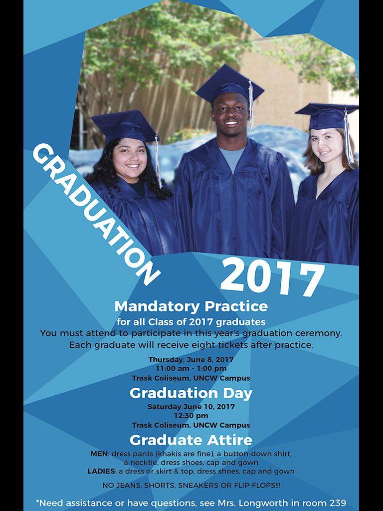
2017 John T. Hoggard High School Graduation Poster
This poster was requested by one of the teachers in charge of my former high school’s graduation ceremonies. She wanted an interesting design that would draw the eye that used the school’s colors and showcased some of the students that would be graduating that spring. I chose three students of different races to showcase the diversity of the school and photographed them in multiple locations. After settling on a single photograph, I made minor manipulations to it and created a design around it for the overall poster. I ended up creating three different designs for her to choose from for the final poster. The teacher chose this version of the poster and requested certain text format changes and color balance changes to the photograph after I presented her with the two prototype designs. The final poster was approved by her, and multiple copies were then printed and posted throughout the school. The poster was created using my own photography, Adobe Illustrator, Adobe Photoshop, and Adobe Indesign.

SEA-TECH Logo
This logo was requested by the program coordinator of the newly established technical high school in Castle Hayne, North Carolina. The coordinator asked for a logo to be designed for the new school and for it to use a wave or waves within the design somehow. I spent a few days browsing and choosing possible fonts to use within the logo, making rough digital sketches using some of the chosen ones. I decided early on that I wanted to make the “Sea” and the “Tech” in different fonts, with the “Sea” having a more organic font that would complement a wave graphic and the “Tech” being a more rigid, san-serif font to showcase the technicality and precision of a technical school. After presenting initial digital sketches to the coordinator, he approved two of them and asked me to finalize both. In the end, he settled on one of them, and asked me to make further adjustments in Illustrator until this final design was reached. The logo was then integrated into the technical school’s website, buses, and t-shirt designs.

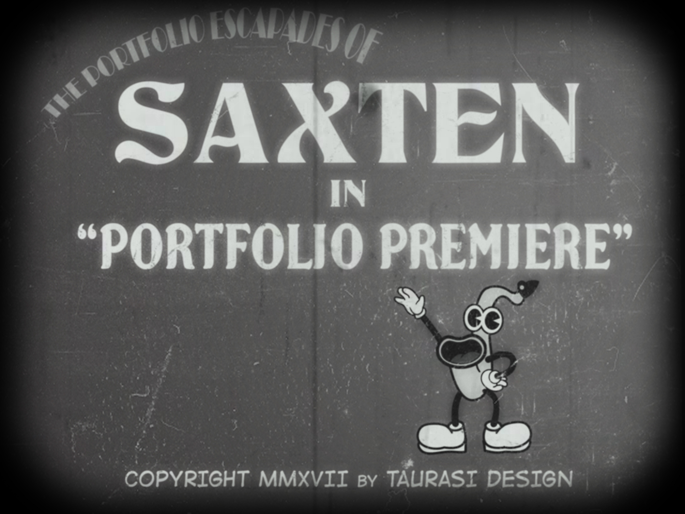
The Portfolio Escapades of Saxten
This piece was created to replicated the style of earlier twentieth century animated television shows. With the mindset of using older styles within this piece, I decided to take inspiration of a character that I would draw as a young child, an animate saxophone by the name of Saxten. I reimagined the character in the style of 1920s and 1930s cartoons. After sketching several variations of the character, I decided on one and drew him in Adobe Illustrator. In studying the style of the characters of this time, I also studied the title cards to these shows’ episodes and shorts. I replicated the style, using extravagant fonts and a lack of color. In addition, I added blur effects, scratches, and a film edge to the design, using Adobe Photoshop, to give it a more authentic style, as if it was played in a movie theatre during the early twentieth century.

A Far-Away Solar System
Created exclusively in Adobe Photoshop, this piece was created with the intent to showcase different celestial bodies. My initial goal with this piece was to create a design without planning anything out and then go back and change and improve the design. My first design lacked color, but certain aspects of the design looked like they should have color. I added a lot of vibrant color overlays to parts of the design, creating a more playful but pretty design. Through experimentation with these filters, I created an effect that looked like a bright star or a sun, so I created a sun in the corner of the design. I modified existing textures within Photoshop to create the textures that I used for the two planets within the scene. Rather than show the vast openness and emptiness of some areas of space,

Wilmington, North Carolina
My own home town, Wilmington, is full of opportunity and is home to many exciting events. With this design, I aimed to communicate this in a fairly simple design. I used one of my own photographs of the downtown area as the background, and I created a digital graphic with bright, vibrant colors that would contrast against the background. I also modified the background to be darker and duller to look similar to a night sky, making the spotlights more appropriate. When creating the “Wilmington” graphic, I took some inspiration from postcard headings. These headings that state “Welcome to …” are often large, curved, and they always draw the viewer’s eye to the place. I designed the “Wilmington” graphic with this intention.

Saxpression
For this design, I wanted to create an artwork that showed some of the complex meanings behind a saxophone. After taking a photo of one of my own saxophones, I digitally redrew the instrument in Adobe Illustrator. There were several things that I wanted to express through this design. First, I wanted to distort the dimensions of the saxophone, so certain aspects of the instrument would be emphasized. The mouthpiece area was enlarged because it is arguably the most important part of the instrument because it is where all of the sound is created. I made the body of the saxophone and its keys less clear and defined like the mouthpiece because to non-musicians, the saxophones many keys may seem convoluted and confusing. However, saxophonists can still look closely and identify each key. The bell of the saxophone is the main exit point of sound, so I drew the bell more clearly like the mouthpiece, but I did not enlarge it because many other exit points for sound exist in the many holes from the keys all over the saxophone. The decision to draw the saxophone in grayscale was to emphasize the forms over anything else. When initially designing the piece, I used some color, but the colors took away from what I was communicating with the design.

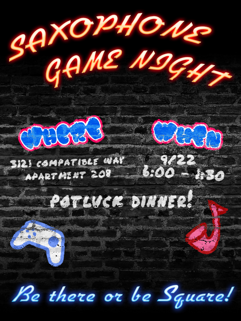
Saxophone Game Night Poster
With the intentions to create and eye-catching, playful poster for an audience of college saxophonists, I decided to create this design similar to graffiti on a brick wall. After creating the first draft of the design, I decided to emphasize the title and the closing invite of the poster by writing them in a neon-style font. I took a photograph of a brick wall for the background of the design, and the rest of the design was created in Adobe Illustrator and Adobe Photoshop. I worked with my saxophone section leader to create this design, with the section leader giving me the information for the event and suggesting minor changes. After changing sizes of objects and text blocks and adjusting the colors of headings, the section leader used the posters to advertise the event, posting it online and throughout NC States’ music building.

