
The story of the Koktebel trademark can be traced back to the second half of the XIX century, when the first vines were planted and the first drinks produced in the Crimean region of the same name. Today, Koktebel is one of the most renowned and successful brands in the Ukrainian market, which, nonetheless, appeals more to a more senior buyer group. The brand owners have decided to reorient it towards a younger target audience, while still retaining the brand’s recognizability and link to the legend that was used as the basis for the brand’s promotion in recent years. That's why we've focused on creating a tempered, classic, and, at the same time, modern label for Koktebel, which would correspond to the client’s reviewed vision of the trademark.


Историю торговой марки Коктебель можно проследить до второй половины XIX века, когда были заложены первые виноградники и произведены первые партии вин в одноимённой крымской местности. Сегодня марка Коктебель — одна из самых узнаваемых и успешных на украинском рынке, которая, тем не менее, апеллировала больше к аудитории в возрасте. Владельцы бренда приняли решение переориентировать его на более молодую целевую группу, при этом сохранив узнаваемость и связь с легендой, на которой было построено продвижение торговой марки в последнее время. Поэтому мы сосредоточилось на создании одновременно сдержанной, классической, и в то же время современной этикетки для бренда Коктебель, которая бы полностью отвечала пересмотренному клиентом видению марки.
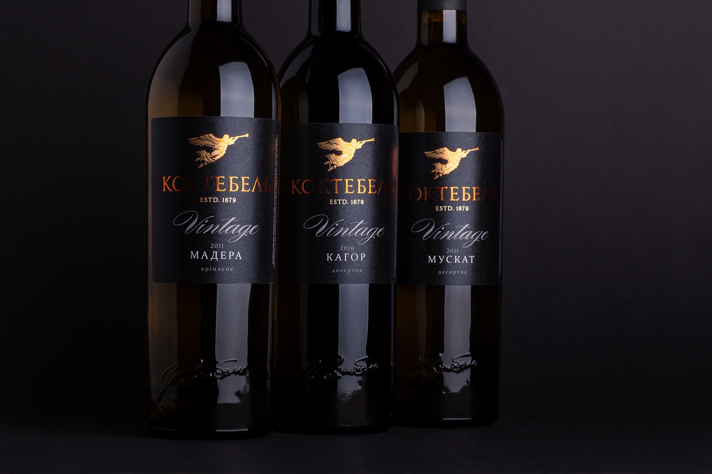

Stylistically the label design for Koktebel can be described as tempered, minimalistic, modern. The main identificator and graphic element of the label is the angel logo, specially reworked by our illustrator, which is based on an image that was previously featured only on the back label, and linked to the marketing legend of the brand. The trademark includes three different product lines - Monte, Elegance and Vintage - aimed at different price ranges. Each line has its own label design, which reflects the product’s positioning, while also sharing the general visual style of the trademark. All three product lines employ additional post-printing techniques that are used to amplify the volume of the label and make it more attractive.
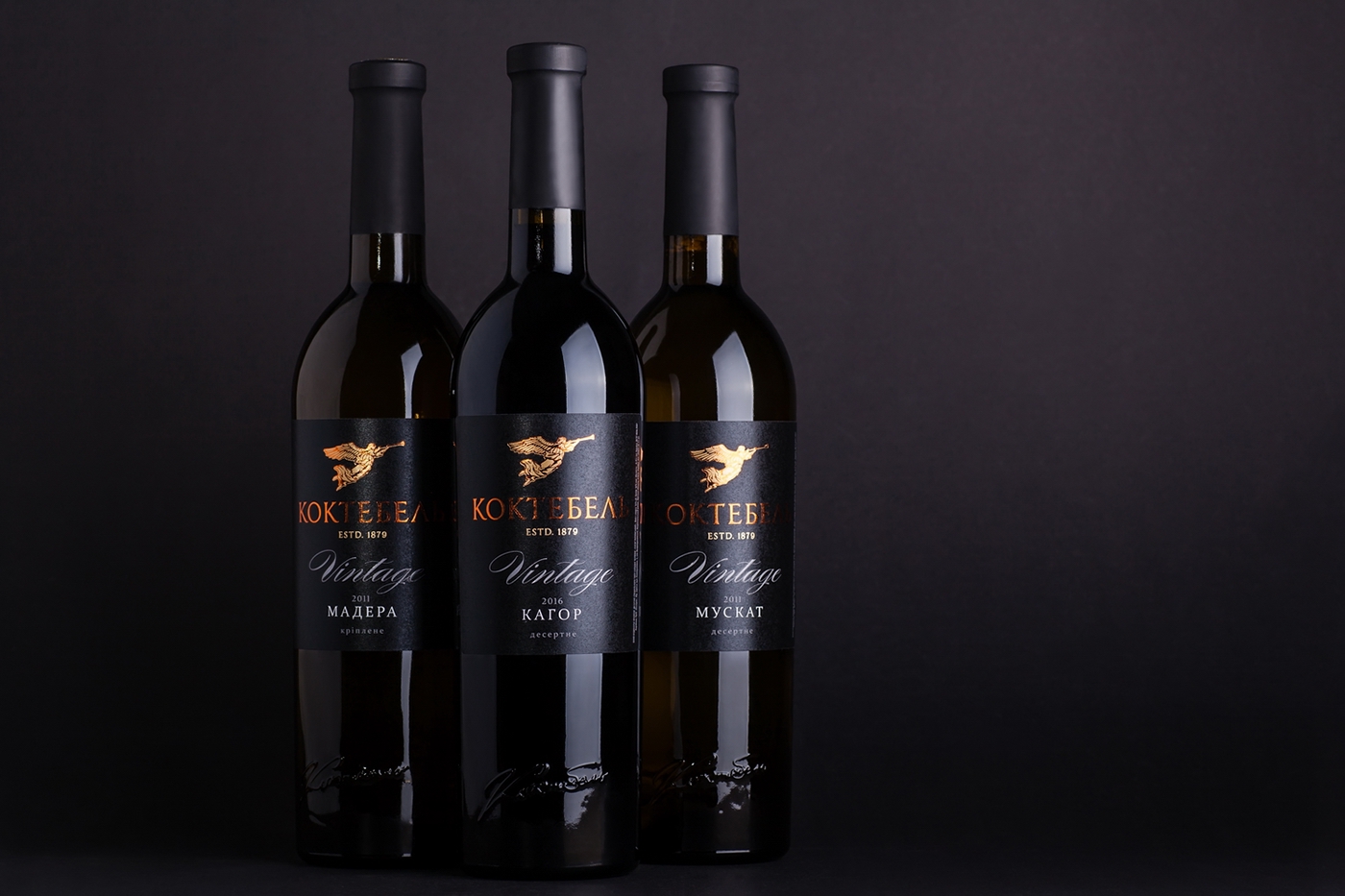
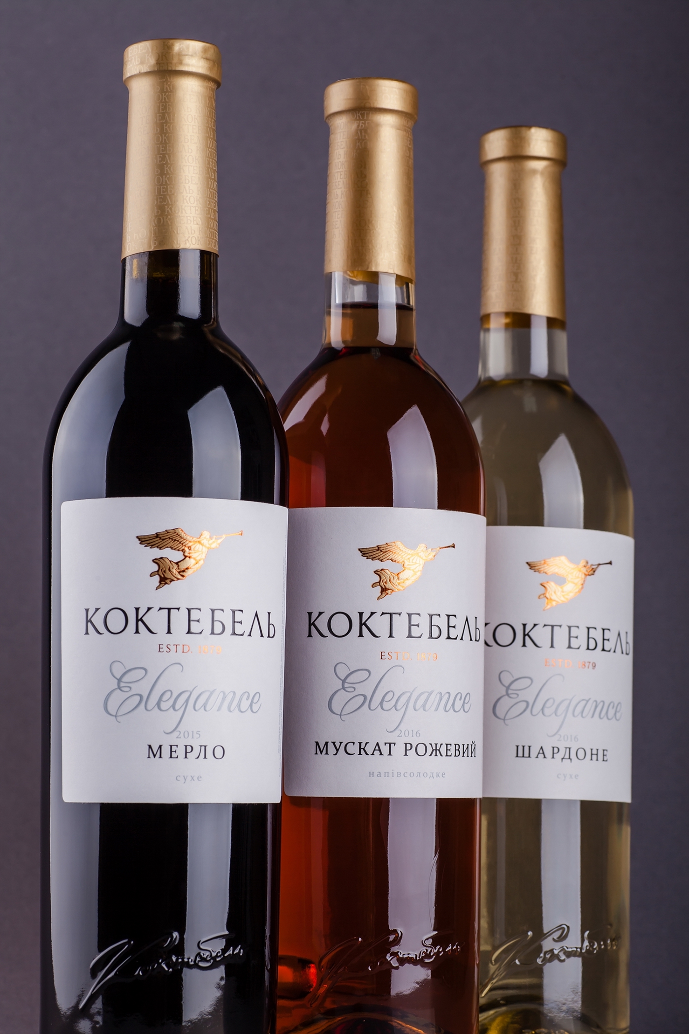

Стилистически, дизайн этикетки для торговой марки Коктебель можно охарактеризовать как сдержанный, минималистичный, современный. Главным идентификатором и графическим элементом на этикетке служит логотип в виде ангела, специально переработанный иллюстратором нашего агентства, в основе которого лежит изображение, располагавшееся раньше только на контр-этикетке и привязанное к маркетинговой легенде бренда. В торговую марку входит три отдельные линейки вин - Monte, Elegance и Vintage - нацеленные на разные ценовые категории. Для каждой из этих линеек был разработан свой дизайн упаковки, который отражает позиционирование продукта, и в то же время связан общей визуальной стилистикой торговой марки. Во всех трёх линейках использованы дополнительные пост-печатные технологии, которые делают этикетку более объёмной и привлекательной.


Photography - Kirill Zmurciuk


