


podioom supports personal trainers' work by offering and continually developing a tool that allows them to manage their working time and training sessions more efficiently as well as attracting new clients.

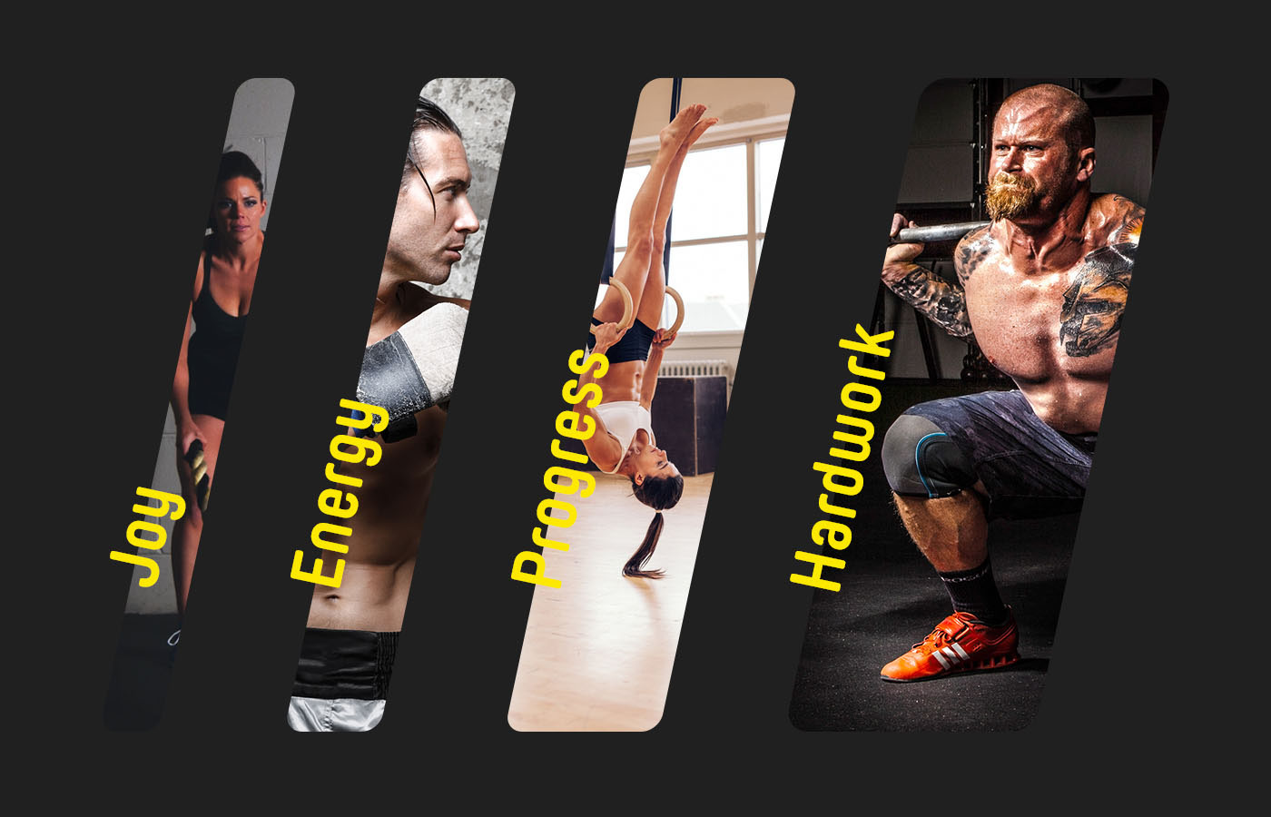
Values
While working on the design strategy we diagnosed 4 main Brand DNA components which are: joy, energy, progress and hardwork. We did loads of early concepts in order to visualize the values we aimed for.
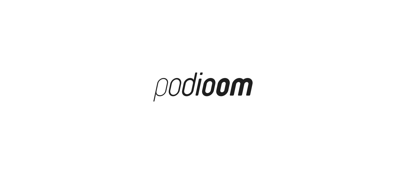
Logotype
The final logotype was constructed out of the Yummo typeface. To get more dynamic feeling we decided to skew the letters at 12 degrees angle. Each letter use a different font weight to emphasize the progress.


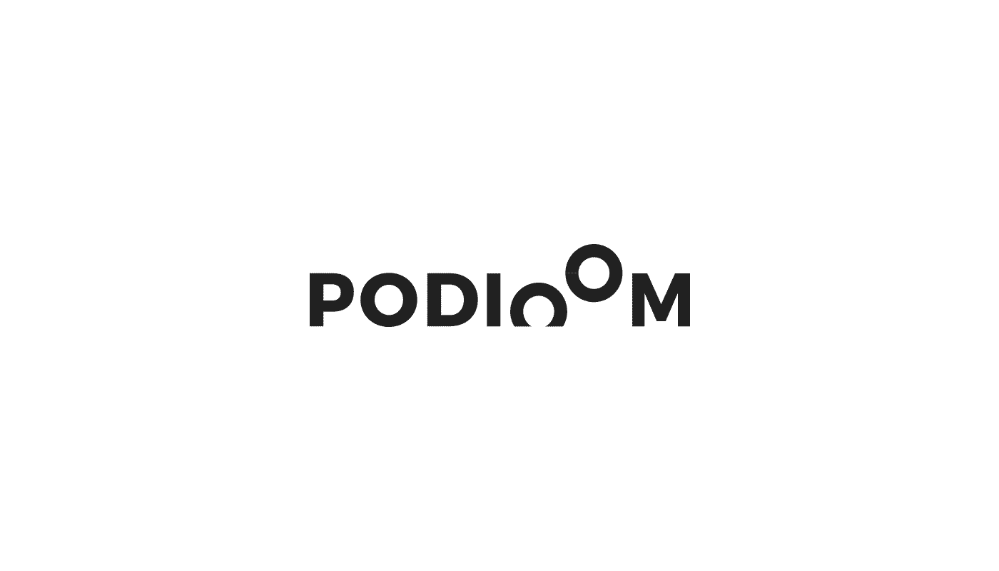
Supporting brand mark
To support main logotype we designed an additional mark that was build with four stripes that symbolize our brand values.
In the mark design process, as in logotype, we also follow the rule of 12 degrees skew and progress idea. Moreover in this case we based it on Fibonacci's golden spiral and used it to measure sign elements.
In the mark design process, as in logotype, we also follow the rule of 12 degrees skew and progress idea. Moreover in this case we based it on Fibonacci's golden spiral and used it to measure sign elements.

To distinguish trainer's app we added extra 'PRO' label which stands for 'PROfessional trainer'.

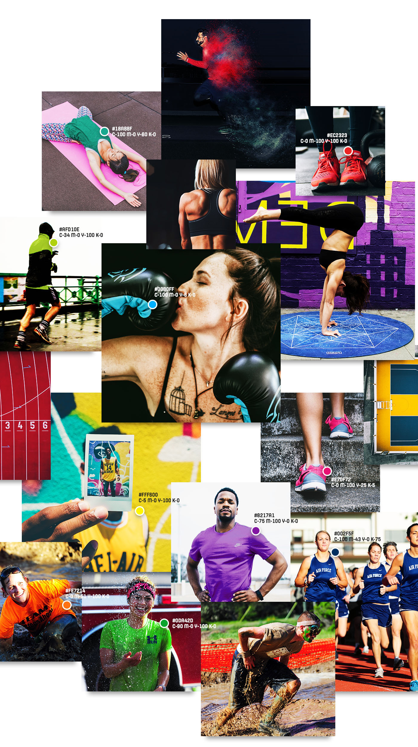
Colors
We picked the broad variety of colors to make the brand visually different from the others. Inspiration was the fitness 80's world and the high-color trends of that time but also modern aggresive fitness & crossfit clothes. As a result we selected 10 colors that were carefully selected to make pairs that subtly affect each other.

Brand Identity effects
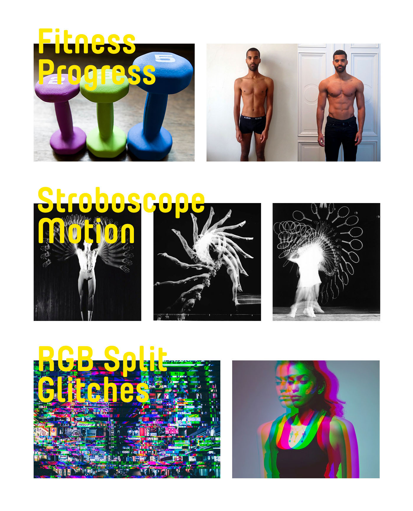
Fitness progress is the feel we want to express through our visual identity. To do that we present things getting bigger (mass building) or thinner (fat burning).
We use stroboscope effect to visualize movement and to add some dynamics.
RGB splits are used in dynamic photos and glitches/artefacts are used as an additional effects - mostly in animations but not only. Their purpose is to tell the receiver that it's a digital product and by the way symbolizes motion.
RGB splits are used in dynamic photos and glitches/artefacts are used as an additional effects - mostly in animations but not only. Their purpose is to tell the receiver that it's a digital product and by the way symbolizes motion.
Typography
Yummo is our main font used not only in logotypes but also in headings.


Photo credits
Alfonso Venzuela, Antony Mayfield, Marco Verch (flickr.com).
Harold Edgerton (https://creators.vice.com/en_au/article/bmd9kw/vintage-strobe-light-photographs-are-a-beautiful-ianatomy-of-motioni)
JuMa Twins (https://www.youtube.com/channel/UCMWOGb1av-UxgNRi-VGEUAg)
Fahad Ayyad (http://www.fahadayyad.com/portraits/ds-i)


