

Recently, we have participated in a contest organized by the Senate of the Republic of Poland. The task was to design a system of visual identification for the Senate, which would be the basis of the national visual identification system. It was a valuable challenge and experience for us - we are proud to present the results of our work.
As usual, we started the whole process with the analysis of the current state - we have noticed that within the government units there is an enormous lack of visual coherence. All these institutions use different graphic marks, representing different aesthetics and form, even though they do not compete with each other on any field. Moreover, their mutual goal is to act for the advantage of the Republic of Poland and all of its’ citizens.
The awareness that the Senate of the Republic of Poland is only one of many government units acting for the benefit of the country has provoked us to make a well-grounded project with the prevailing idea of unification of the whole national image, that could successfully be adapted for every unit.
It is crucial for the citizens not to feel dissonance while dealing with government materials, but to be able to construct (and in time also easily reconstruct) the national government image which would arouse the feeling of authority and proper respect.
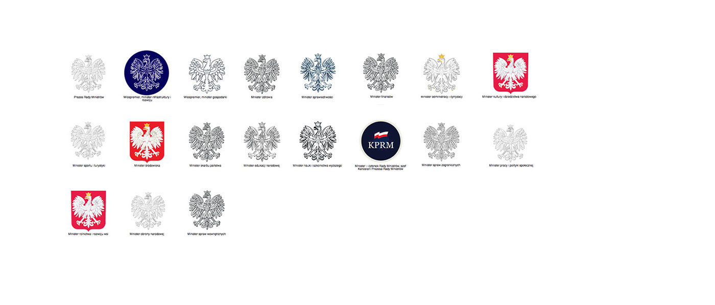
In the above set you can see all variants of the Polish White Eagle's image which are used within the identification of different government units. There is a visible lack of coherence and consistency, which ultimately affects the perception of the whole Polish state and can possibly be one of the reasons for the huge organizational chaos.
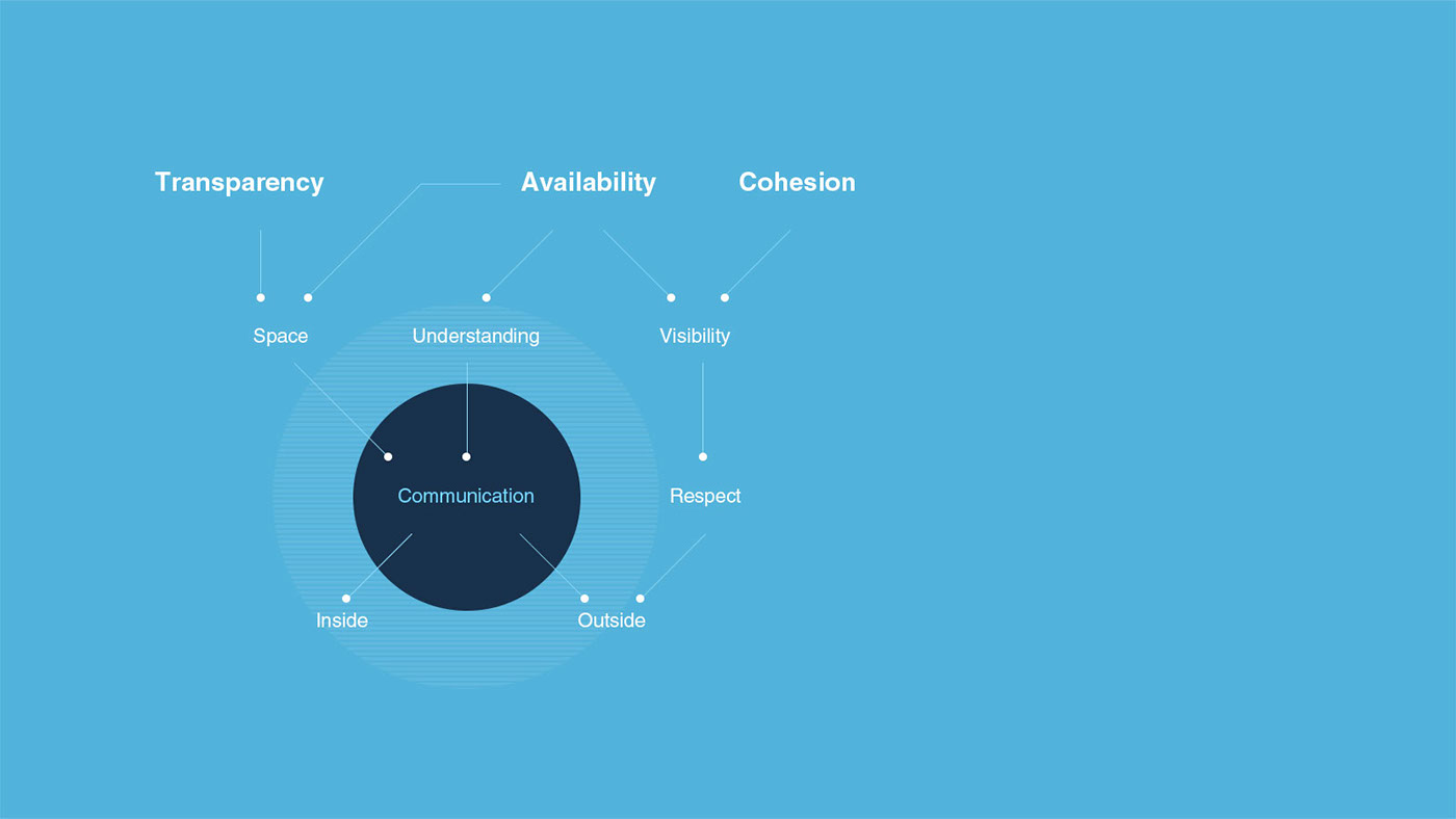
While working on the project, we tried to spend as much time as possible on the matter of the subject. We considered this as extremely important, especially in the context of such a comprehensive initiative. The design problems which we have defined are based on three values: availability, transparency and consistency.
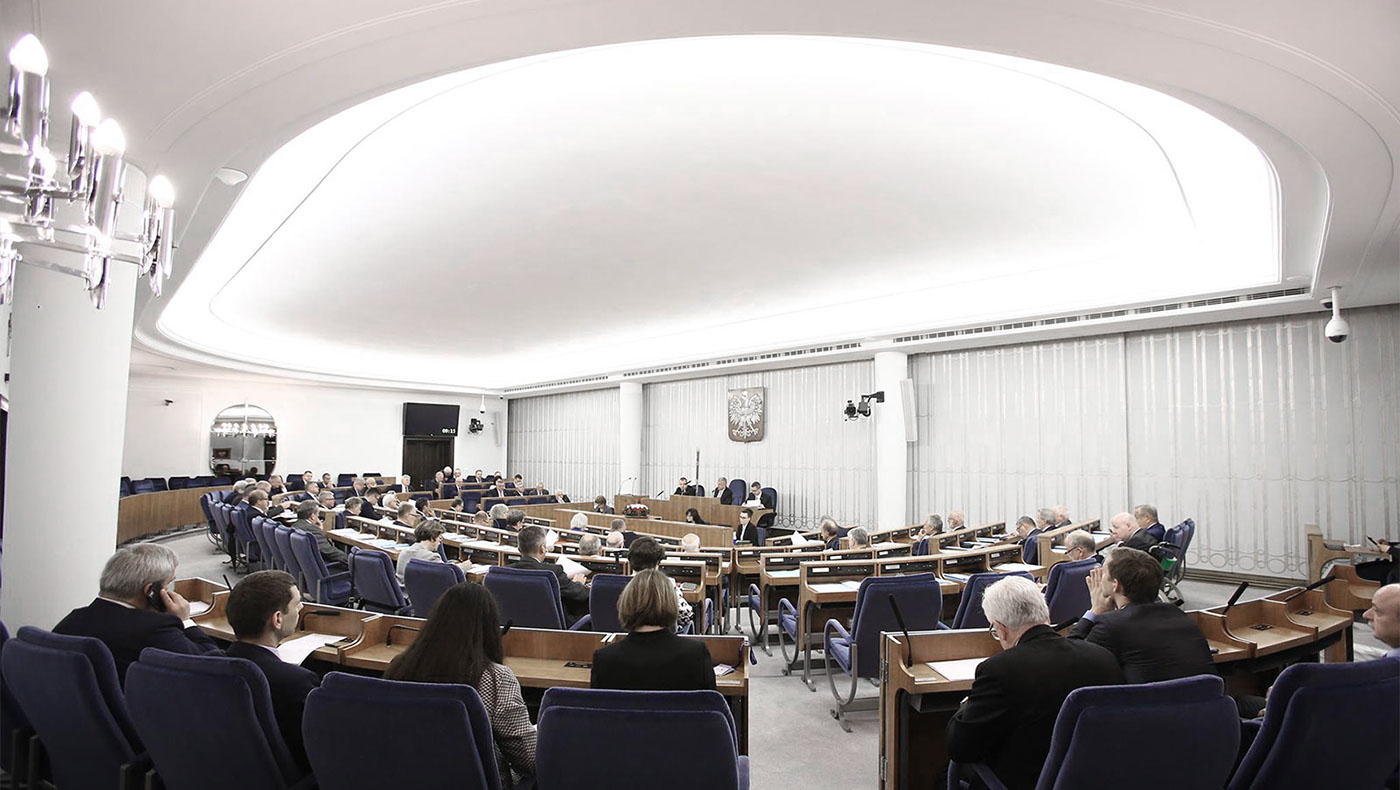
Perceived lack of availability is an outcome of a very closed area in which the Senate communicates. It is happening both inside - amongst officials and outside - where citizens are concerned. Those in turn often can not understand how and what kind of decisions are being made at the Senate and Parliament sessions. This lack of understanding influences the possible devaluation of qualities which should be acknowledged by every state unit: esteem and respect. At this moment the communication is not working properly, but we believe that a well-defined identification framework could help solve this problem.
In our opinion transparency is the desire and the ability to provide complete and accurate information, in time and place intended for it. It is important to create a communication space that will carry out activities characterised by openness. The new communication layer would allow an effective dialogue with the outside environment, without taking the attention from the most important, state affairs.
The consistency of visual identification is a guarantee of visibility, which is unlikely to emerge in the present situation of major blur and diversity. Disorientation caused by incoherence of the visual system can cause lack of trust, which could also translate into state institutions. Additionally, the chaos among the materials may entail a lack of respect and a decrease in the credibility of all the bodies subordinate to the State.
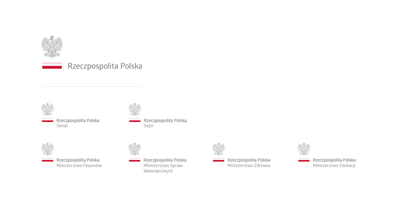
One of our main assumptions was that the prepared visual identification system should be adaptable and possibly extended to all of the ministries and local governments. In addition, it had to be firmly grounded and not merely based on a subjective view of the designer. But most importantly, our main intention was to find solutions for the previously defined problems.
We wanted to create a framework that could be exploited at one’s discretion, but at the same time would impose certain mandatory elements that will allow to maintain a harmonious and orderly image of the Senate but also the entire country.
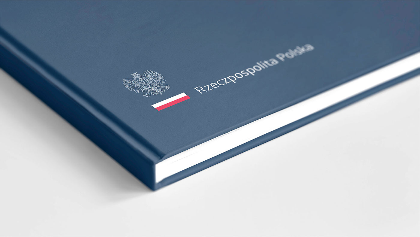
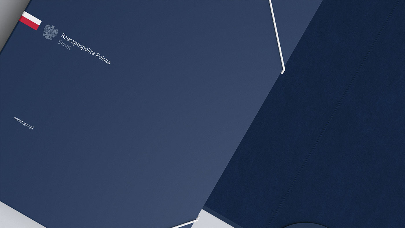
Our concern was to restore and strengthen the respect for the state offices. For this reason, our project is based primarily on the exposition of national symbols and reinforced by conceptual consequence.
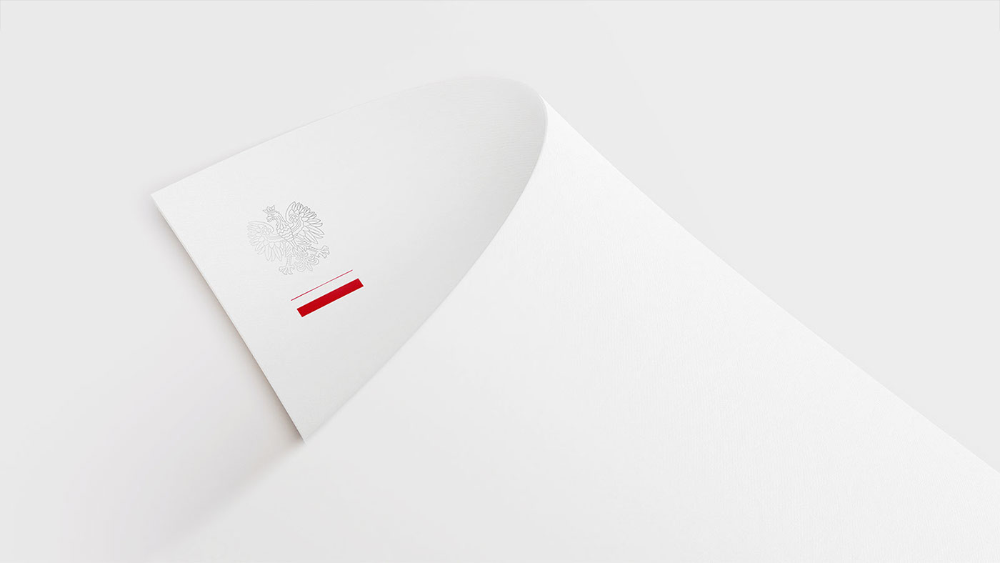
The symbol in its’ primary version is based on the National Symbols: White Eagle and the white and red flag of the Polish State, which in their reception raise the desired values - pride and respect.

The layout of the individual elements and typography supporting them is not accidental. Our concern was to get a noticeable hierarchy - based on the exposition of the White Eagle and the national flag. It is located at the same level as the country’s full name, while the name of the unit has been separated, put below and written with a less saturated color. Taking such measure was aimed at demonstrating its dependence and operation within the larger whole of the Polish State and above all in the interest of its’ citizens.
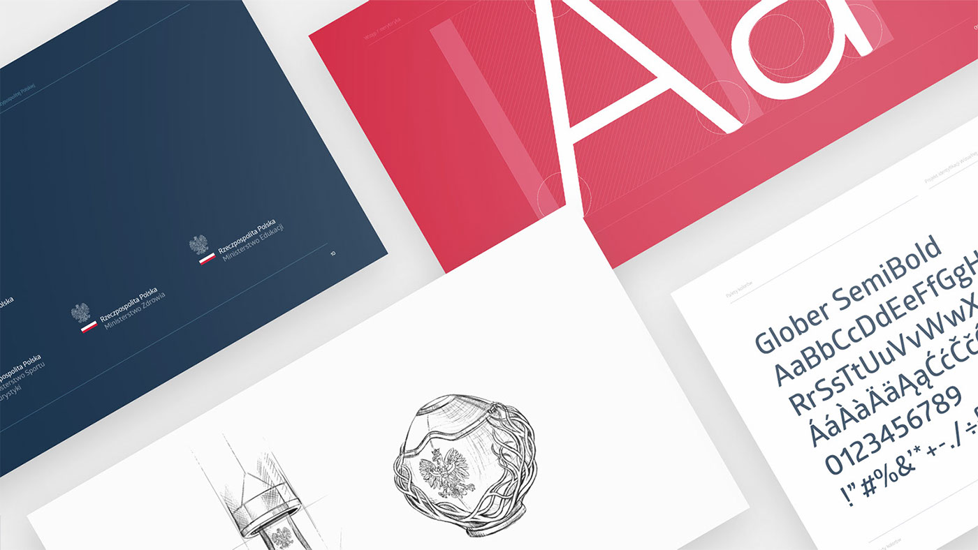
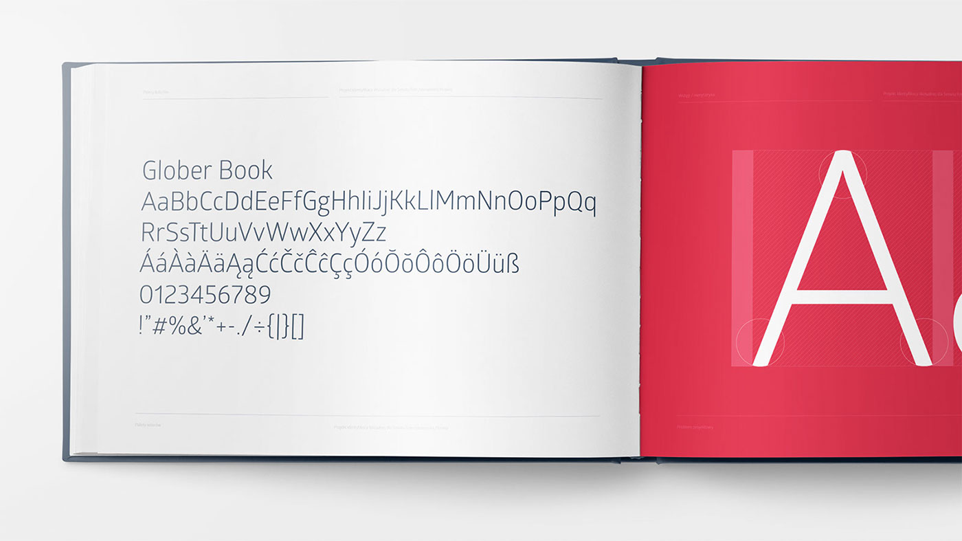
In the process of selecting the most accurate typography, our priority was to make it highly readable and for it to evoke appropriate reception in the face of seriousness of the individuals by which it will be used.
The Glober family typeface can be easily replaced by the Calibri system font (constricted to 95% letter width). These are similar enough, so in the case of replacing the identification system, it will not lose its consistency and visual consequence.
Chosen, substitute serif font is the systemic Cambria font family - it can be used both while arranging formal materials and also those of special significance.


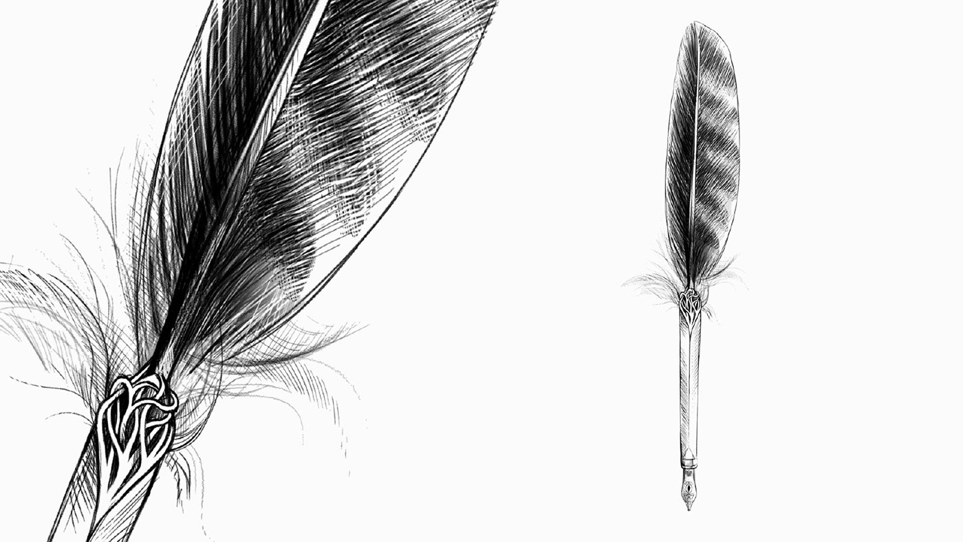
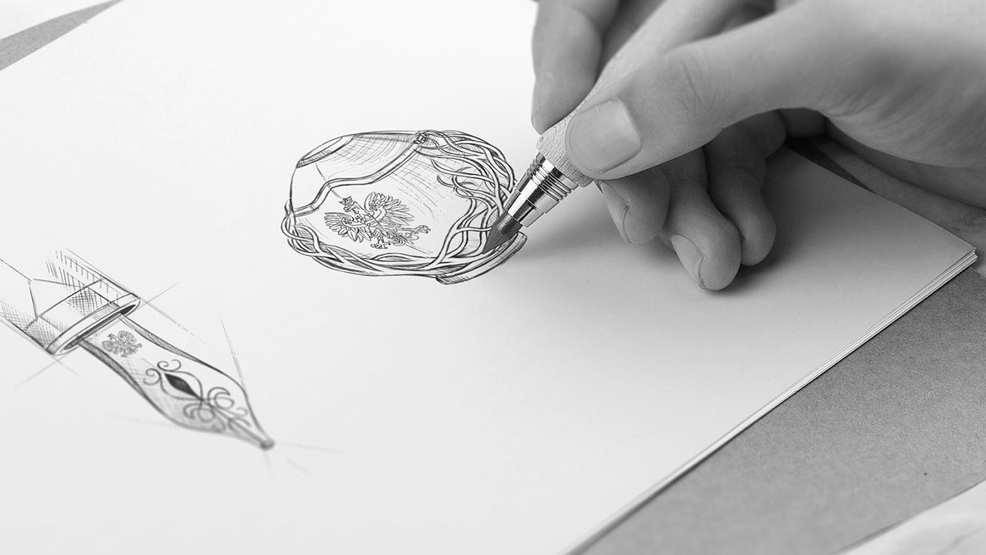
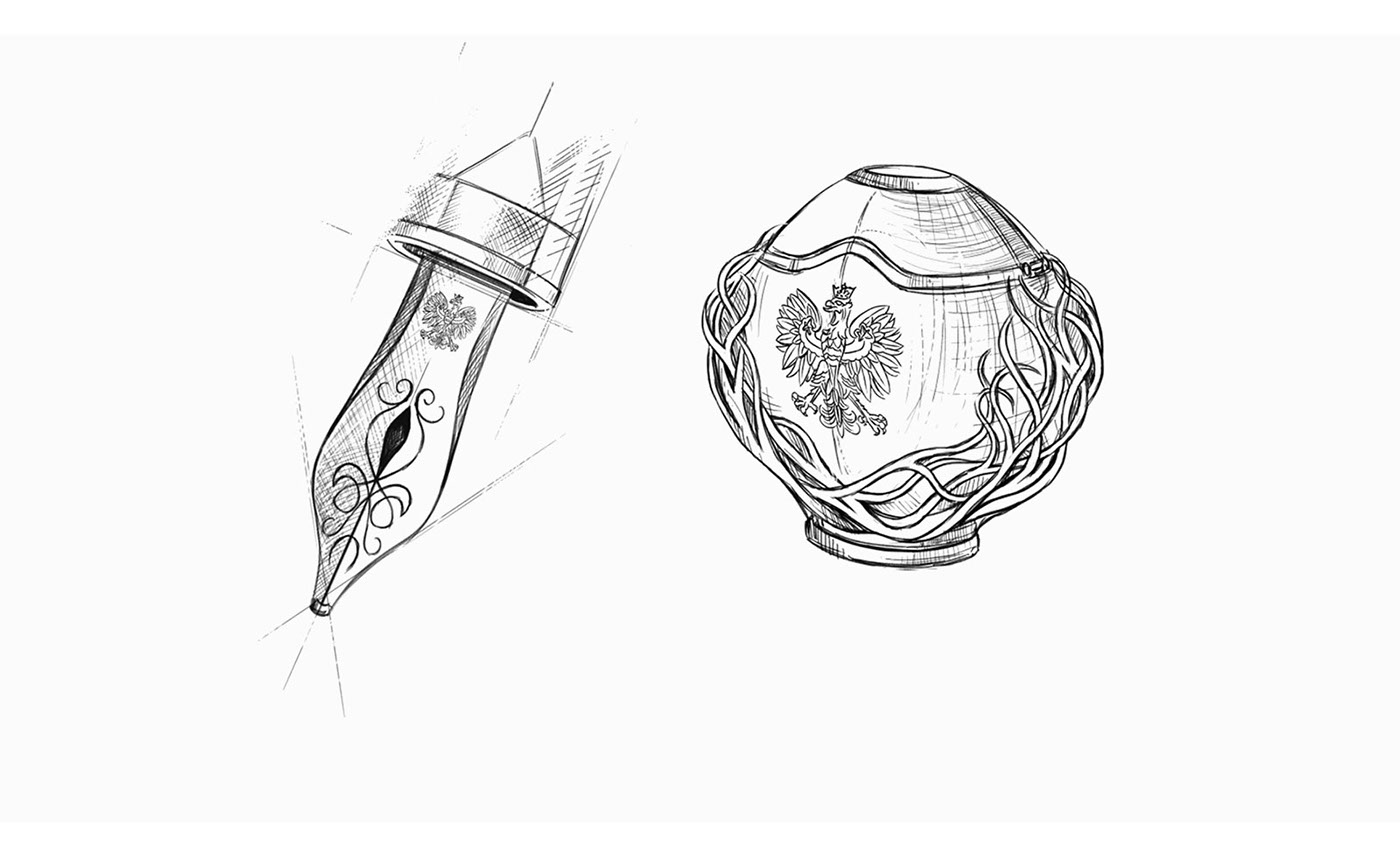
As a gift in the official circumstances, we propose a fountain pen, which in its form is a symbolic representation of an eagle feather, unambiguously associated with our national emblem. The image of the White Eagle can also be seen on the nib, while the cue of the handle is in the form of tangled twigs symbolizing eagle's nest.
We have also designed an inkwell, which has similar aesthetic features and when opened it allows the pen to dry by being placed on a special appendage.
Giving this kind of present could be interpreted as a wish to continue writing on the glorious cards of Polish history. On the other hand, when it is handed over to foreign delegations, it may symbolize the common desire for further development of the history of Europe and the world.
Thanks for watching!


