This year I had the great fortune of working with Danner, an American shoe manufacturing company established in 1932 which boasts a complete and impressive line of hiking, hunting, uniform, work and lifestyle boots. The quality of their craftsmanship and pride in their work is immediately apparent when you slip their boots on. As you can imagine, I was thrilled at the opportunity to work with them this year on an illustration for their Black Friday promotions.
Big thanks to Karen Wolf from Danner who really pushed for the use of illustration on their promotions. Clients looking to distinguish themselves through the use of custom illustration are always appreciated! Now let's dive into this wintery piece and see how it was made...
Thumbnail Sketches
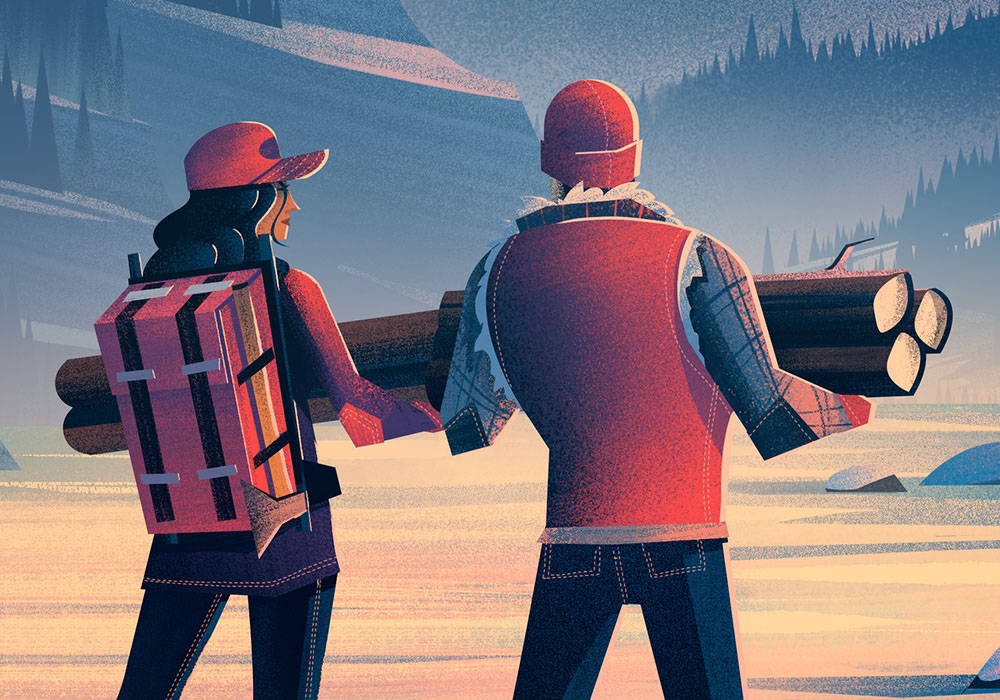
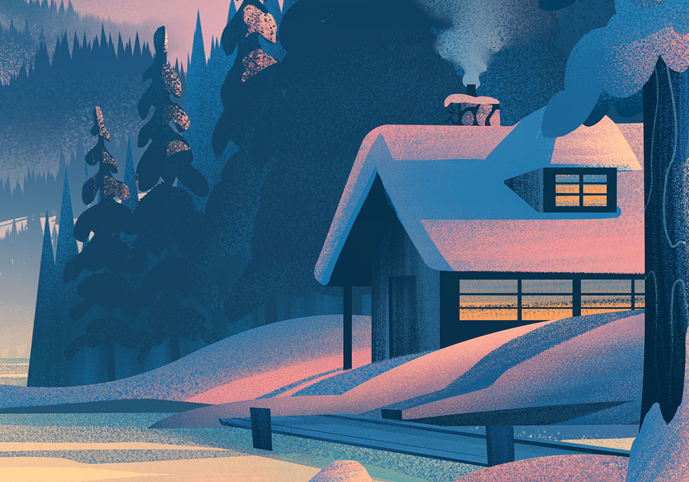
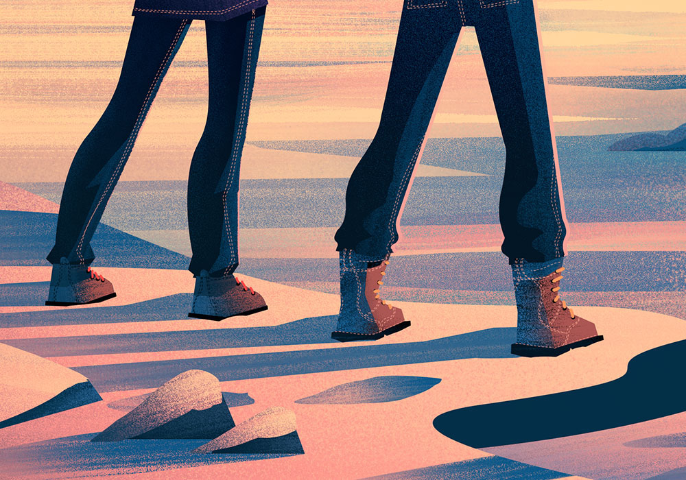
The brief for this piece requested 2 people and a dog in a wintery cabin setting. The figures needed to be shown at work and there needed to be room in the sky for type placement. The challenge I find with these kinds of compositions is creating a piece which moves the viewer's eye through and around the scene while framing out negative space for type. To solve this challenge, I often work small sketches to find the solution.
I typically have an initial direction I'll throw down first as my base. From there I'll explore using the initial sketch as a jumping off point. Some sketches will be iterations while others will be complete departures as I look at camera placement, rhythm, design, etc. Since this piece had a fairly tight type placement requirement (room for type at the top / center), I limited my exploration to the placement of the figures and cabin within the scene.

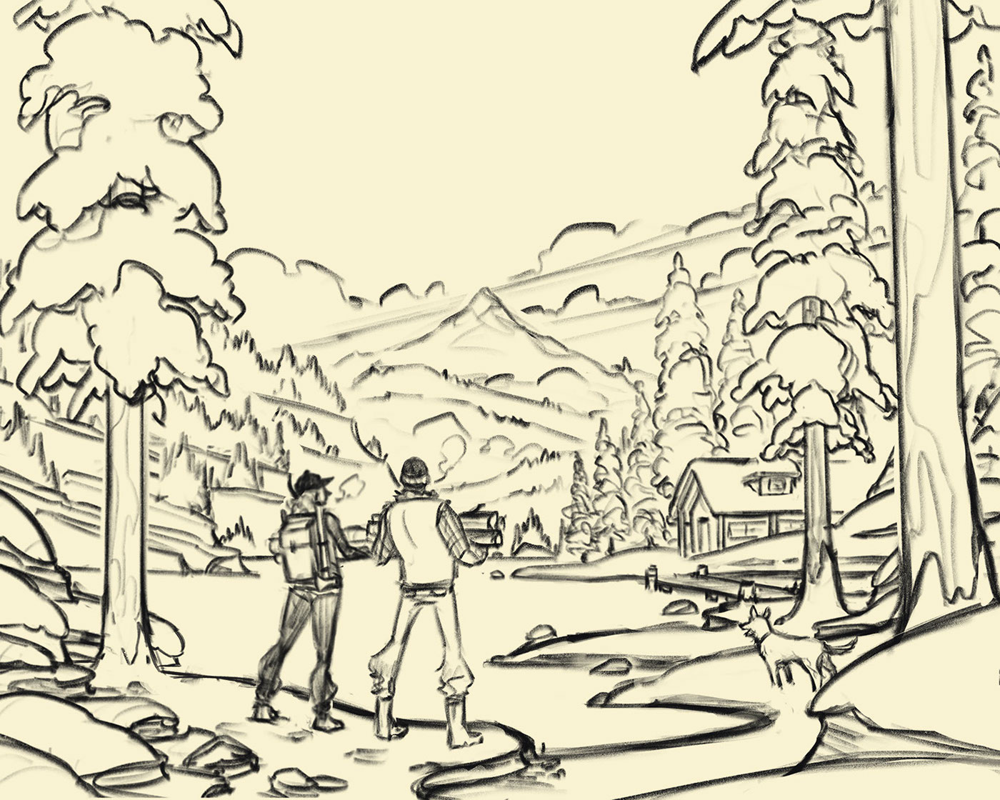
Sketch
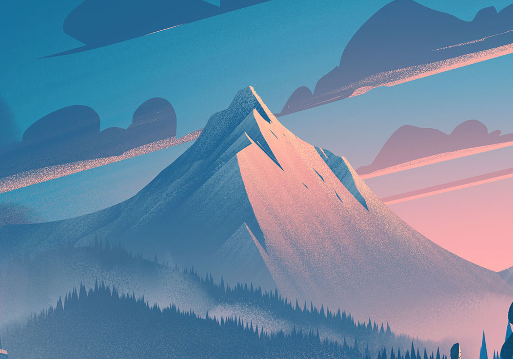
As I explored the composition, I thought it would be fun to place the cabin on a frozen lake as our figures hike toward it carrying wood. I looked for opportunities to create small scenes within the piece that emphasized depth (the bluffs in the background, the bridge leading to the cabin, etc.) and created movement which would encourage people to explore the piece itself. As a kid I always enjoyed when illustrators would put fun details into their work which I'd find only as I poured over the piece.
Color Study
As anyone who has tackled a snowy winter scene can tell you, painting an inviting snow scene can be tricky... If you go too cold with the colors, the piece can feel harsh. If you go too warm, it stops looking like winter. My goal was to focus on a mood, something nostalgic which was warm and inviting. To do this, I chose a color palette which felt like it hit that mark. I threw down colors in Procreate (the iPad Pro app I use to do all my sketches) just so I'd know exactly where to go with the final painting.

Since I had the rough color study in place and it hit close enough to the feels I was going for, I didn't need to use my typical Black & White value step in my final painting process. Instead I worked directly in the colors I established in the rough. I was pleased with the overall result and, most importantly, the client was too.
Enjoy the detail shots below and thank YOU so much for viewing my work and reading my ramblings!