The meat preachers
Client: Zamora
Location: Queenstown, New Zealand
Industry: Food
Best Design Awards 2018. Sausage packaging: Finalist
Render Artist meat snacks: James Pazzi
Published at:
About
Zamora Homemade is all about enjoying homemade food. They use natural ingredients in traditional recipes and add a modern twist. Zamora shows its strongest side is character and commitment to the present, without ever losing sight of its traditions.
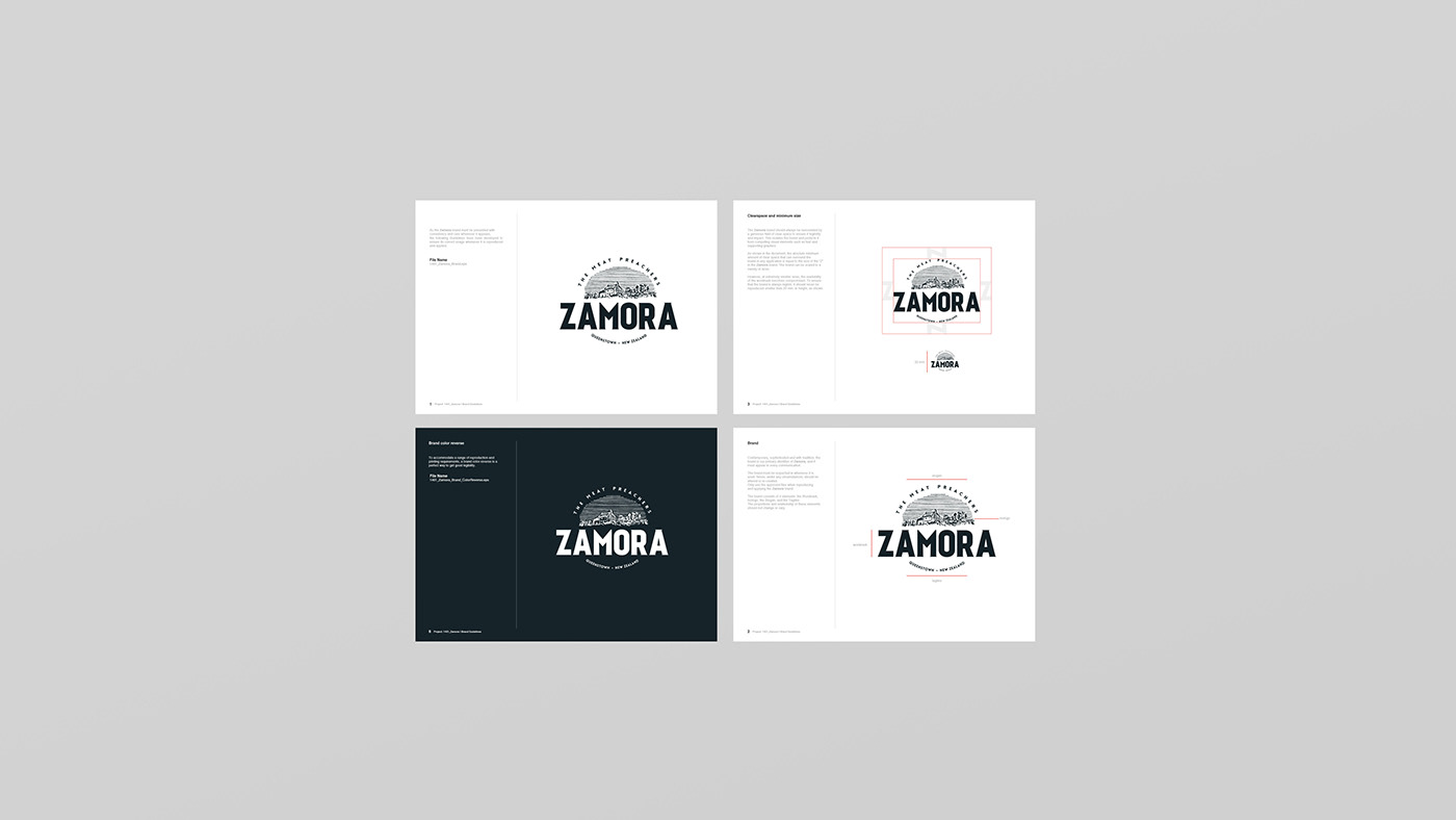
Branding
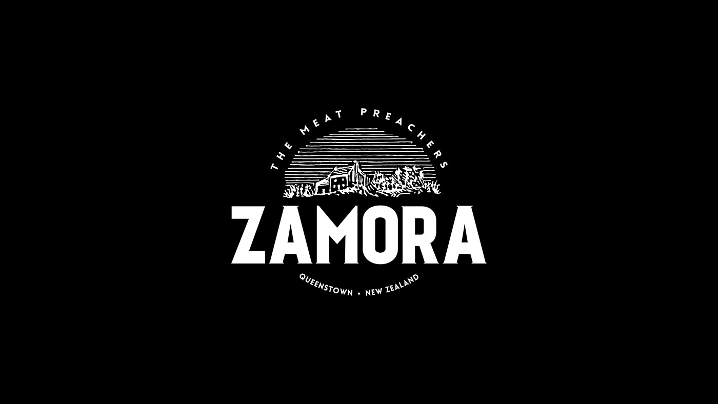
The spirit of the brand means: tradition and passion. This new brand in the New Zealand market was founded by two young experienced partners that offer a high quality handcrafted product. We were invited to work with them to develop a Brand Identity and create packaging that fits different conceptual formats.
Solution: Zamora’s strongest side prevails with character and commitment to the present, without ever losing sight of tradition. This is a brand that reflects the values of honesty and proven tradition in caring for the manufacture of its products. The concept is reinforced by selecting a mature colour palette but with the use of shapes in a loose and modern composition.
A brand that wants to be young, but with a clear trend towards maturity and experience. The farm isologo poses freshness with no anchor to any specific product, therefore keeping the ability to use the brand for future products from the farm as the business grows. The font selected is san-serif but with an almost imperceptible serif to help us denote this mix of tradition and modernity.
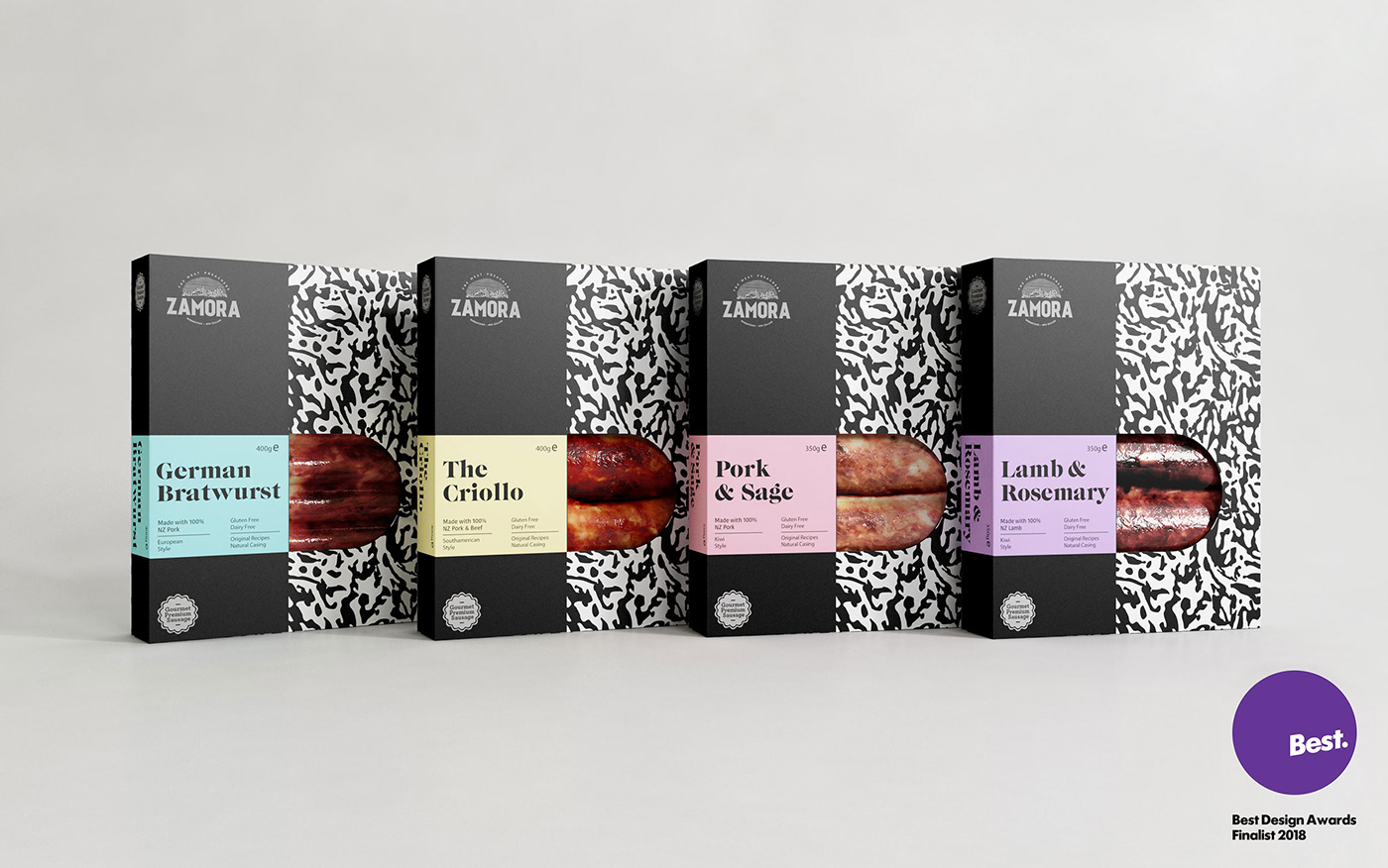
Sausage packaging
Zamora, is a boutique butchery based in Queenstown. Their love for delicious food and quality ingredients led them to make small batches of premium meat products.
We worked with Zamora throughout 2017 and 2018 to develop a new pack range for their gourmet sausages. The challenge for this product was to target the most discerning meat lover who is constantly wishing to discover unique flavours and is willing to pay for that experience.
To attract that particular foodie who appreciates and revels in the pleasures of eating well, and who is conscious of the importance of original and exceptional recipes, we've replaced the typical sausage tray packs with a sleek box that reflects and highlight the product's quality. The strategy of 'a different consumer experience' turns the sausage into an object of desire impossible to resist.
To achieve that strategy, the design approach was centred around a uniqueness and boldness of graphic execution. There is an elegance and visual drama surrounding the sausage collection that fits perfectly with Zamora’s brand values.
We worked with a unified grid system at the front of each box that clearly indicates the key attributes across the name, flavour and origin. This is paired with a pastel colour palette combined with a custom black and white pattern. This pattern it's a central part of the Zamora identity. It was created from the countryside illustration of the master logomark and it is consistently employed across Zamora products as a distinctive graphic element of the brand identity.
The outcome was a friendly sophistication that makes Zamora stand out in a very competitive sector.
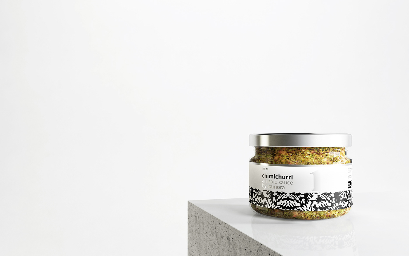
Chimichurri packaging
In this occasion we proposed to incorporate to the visual system a new code of numbers. This decision reduces the complexity of the product category in a way that is inclusive and accessible. It also opens the visual system in an easy way. The numbers works perfectly with the main elements of the brand such us colours and pattern, and allows us to use it in future products with a simple execution.
The label is a typeset composition. We decide to use a new sans-serif typeface because it has a good legibility and give us a contemporary look & feel. We combine it with the same serif font that we’ve used in the meat snack packs. This give us a continuity in the language between the meat snack packs and the sauce labels.
The glass jar has a really good format for two reasons. First, it is easily accessible for a spoon (we cover the functional part). Second, it is an unusual jar in the market (we cover the design part). The copywriting; ‘an epic sauce by zamora’ gives value to the product and connects the sauce with the ‘meat world’ of Zamora. We do not only achieve an impact with this aesthetic, we also made a really good use of the label shape. The lid provides a balance between modernity and tradition.
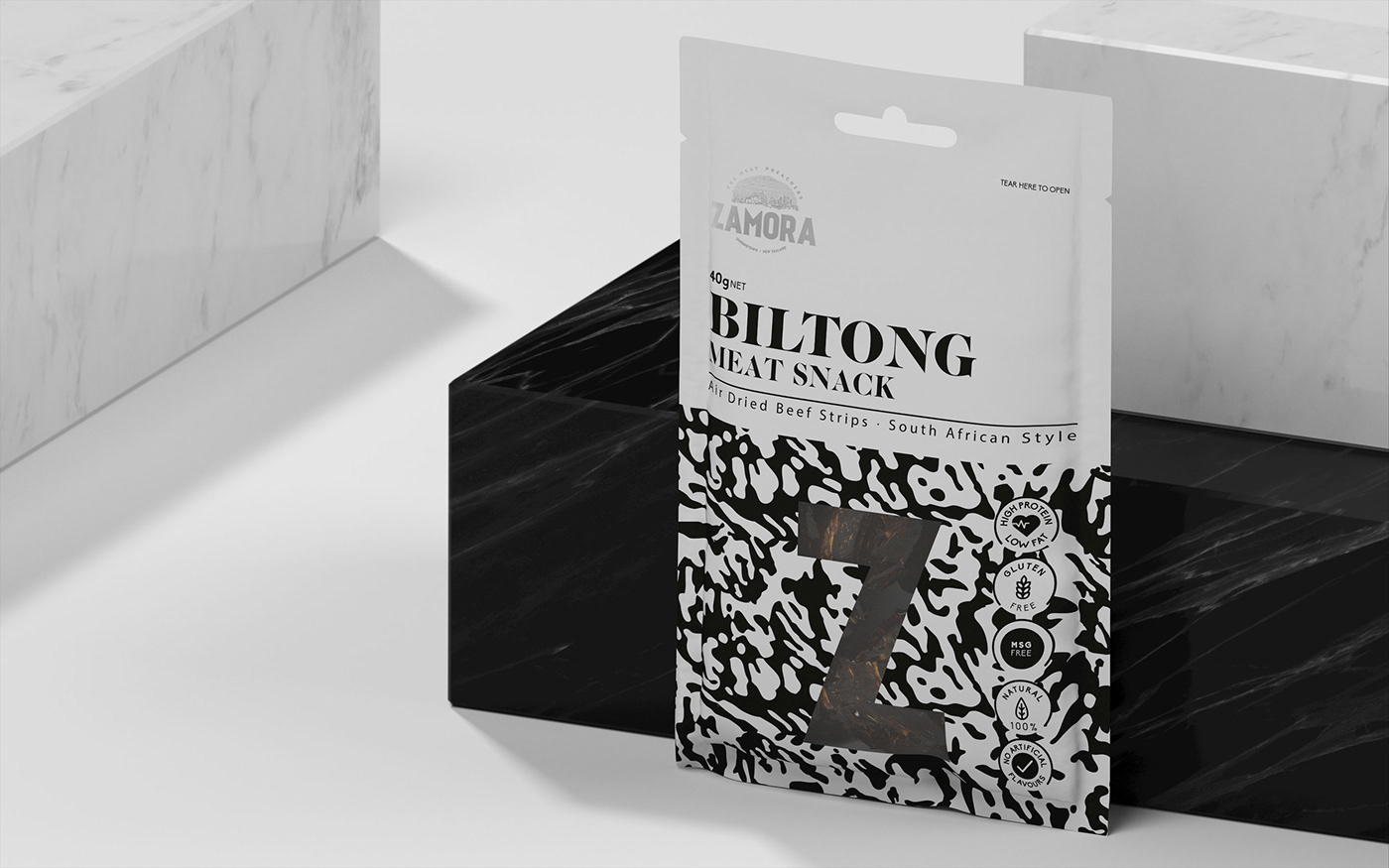
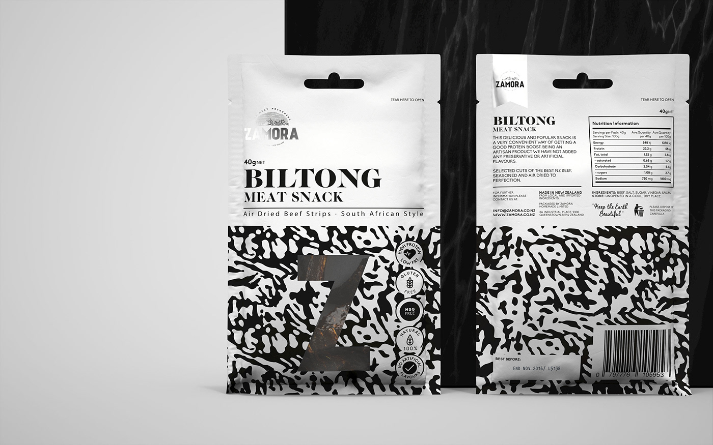
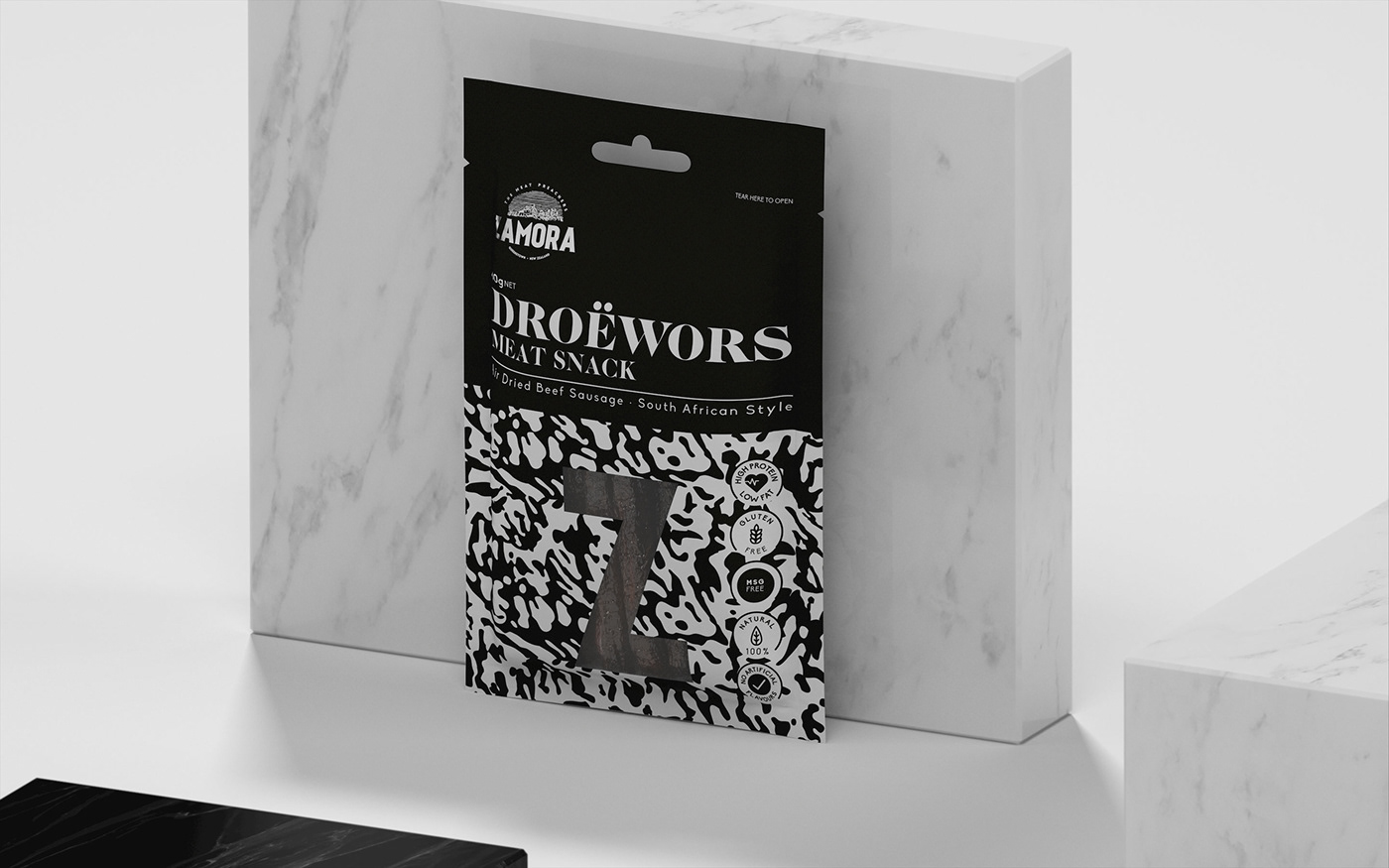
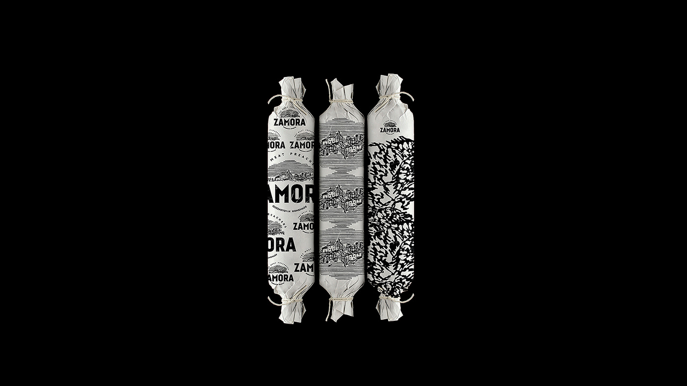
Meat snacks packaging
Context: Create a new range of packages that would be easily scale as new products will introduced and with a recognisable design system to built a strong visual communication. The goal was to create an engaging packaging solution for a diverse range of consumers. Not only the male target as always see in this kind of product but also we want to achieve the whole target health conscious market such as moms, females, athletes, families and the young/student market who were looking for high protein snacks.
Solution: Our approach in the strategy of the graphic design was to deliver a high quality snack within the premium snack food category. We know that a simple design is more effective and simple to recognize. We evaluate some of the competitors in the market and we we want to avoids looking chaotic, we want to be different. Breaking through category to include more people into this range of products. Our proposal is that our product is identified in the sector with the added value that the consumer feel that the flavour tastes “real” and not artificial. The decision of being rare pack in the group is strategic. In consequence, we generate a new experience with our design, creating a visual calm moment. An exercise in aesthetic impact derived from colour and form contrast, and a conceptual and communicative simplicity.
The design has a mix of traditional elements with a contemporary fresh design whilst also having a premium and universal packaging design. The simple shapes of the letterforms are juxtaposed alongside the very organic pattern design.
We work hard to create an iconic connection through the pattern design, because this Pattern we use it as part of the main visual communication of the brand. With this solution we want to generate an eye contact with our consumers just in a few seconds.
The design connects with the consumer so it be able to become an unconditional product, as a result we assure a successful outcome in the highly competitive market on the present day.
Our Work
Brand Design
Concept Development
Packaging Design
Visual Identity
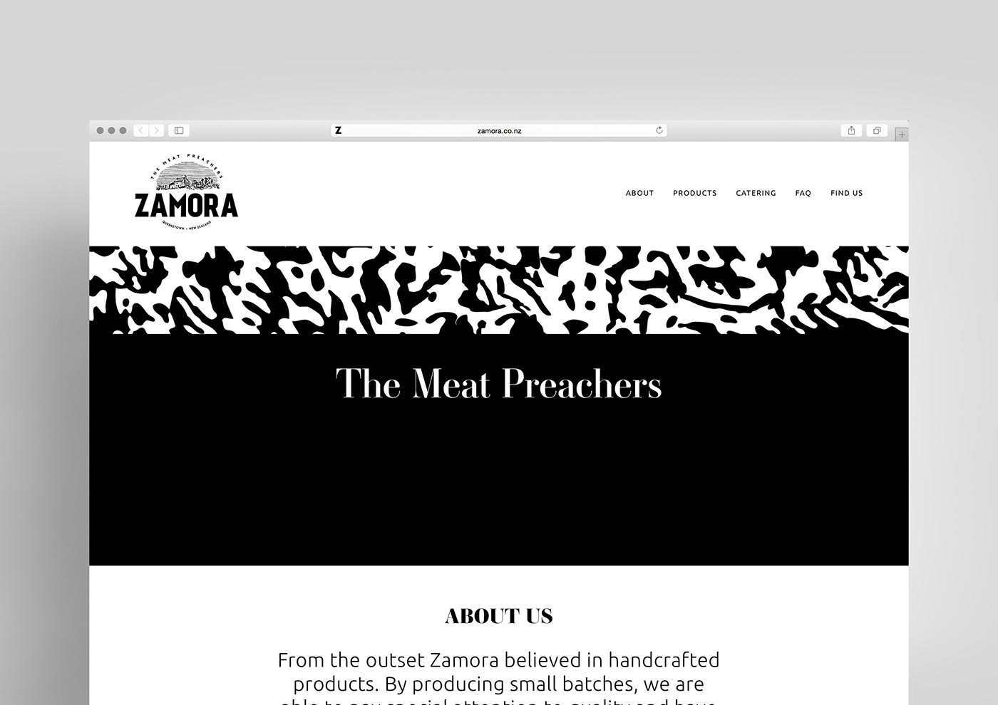
Web Design
Social Media