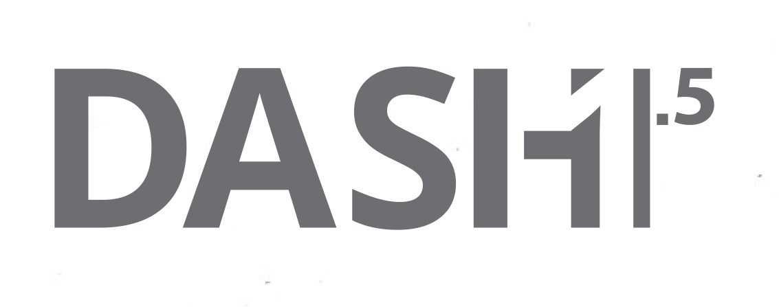
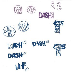
Friant has been selling their Dash line of office furniture for over 3 years now, had been planning a long desired addition. The running title of this addition, since it was adding a mere 300 new pieces to the line (!) was Dash 1.5. I set about with a marker and my trusty sketchbook to jot down some ideas.
While it was tempting to try to deviate completely from the standard tried-and-true sans serif Dash marketing identity to call attention to the changes to the line, instead I settled on the idea of using the "H" to help modify logo, so that not only does it read as "Dash 1.5", but can be read as a "+ 1.5" as well.
I did change the font, so that we spun off into the new 2017/2018 marketing pieces, it has a slightly more distinctive Open Sans logo, as opposed to the older Knockout 48 logo that all the Friant products shared.