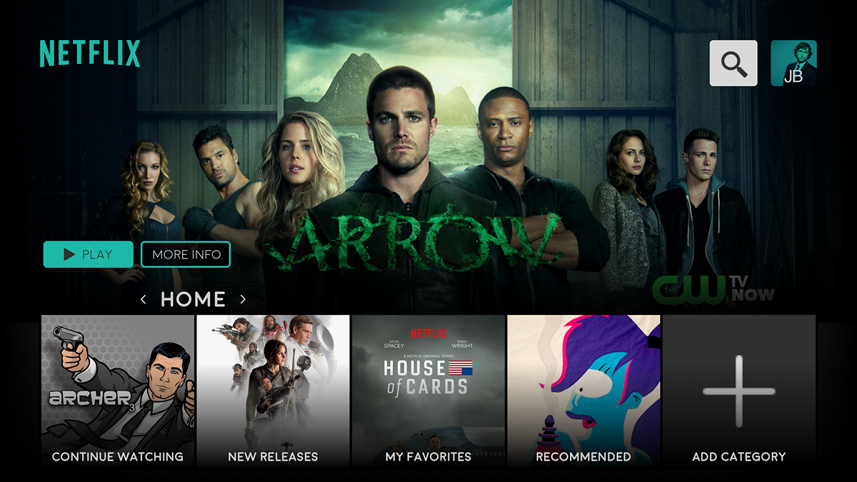
This redesign consisted of a full audit for the Netflix Samsung Smart TV and Iphone applications.
The main issue with the current app was the left and right scrolling within the categories, and the positioning of the categories was not optimal for all users.
The main issue with the current app was the left and right scrolling within the categories, and the positioning of the categories was not optimal for all users.
The solution was to transition to a grid system. With directional pad navigation on remotes and controllers, I decided that a 5 wide grid was optimal for TV to keep away from endless scrolling while keeping everything a few actions away.

Allowing the user to add, remove, and rearrange the categories on the homepage creates a faster and easier experience for users finding something to watch and enjoy.

While on the homepage the user can navigate easily with the directional pad by selecting the section title (pulling up the neighbor categories) and scrolling left or right for quick access and previews of the future destination.

The user has full control of their experience. Notification settings can be adjusted for new episodes, movies, and even recommend shows from friends. A ratings system is used to determine what shows/movies will appear first within the categories. Adjustable positions for the categories on the homepage. Also, the user can change the color of Netflix itself.


Mockup of the TV application.

Mobile application keeps the same feel and style of the TV application. The navigation instead of clicking and scrolling left and right to navigate to other sections. The user only has to swipe right or left to access the neighbor categories.

After the user clicks on a thumbnail, a card appears underneath with more information and ability to add to watch list, share/get notifications, like/dislike, and view more episodes if applicable.


Mockup of the mobile application.


