Branding, art direction & family design packaging for El Rosal.
El Rosal is a social economy project - a craft bakery that produces handmade biscuits with high quality ingredients - that offers new opportunities to vulnerable people with diversity of difficulties so they can work hard in order to overcome them.
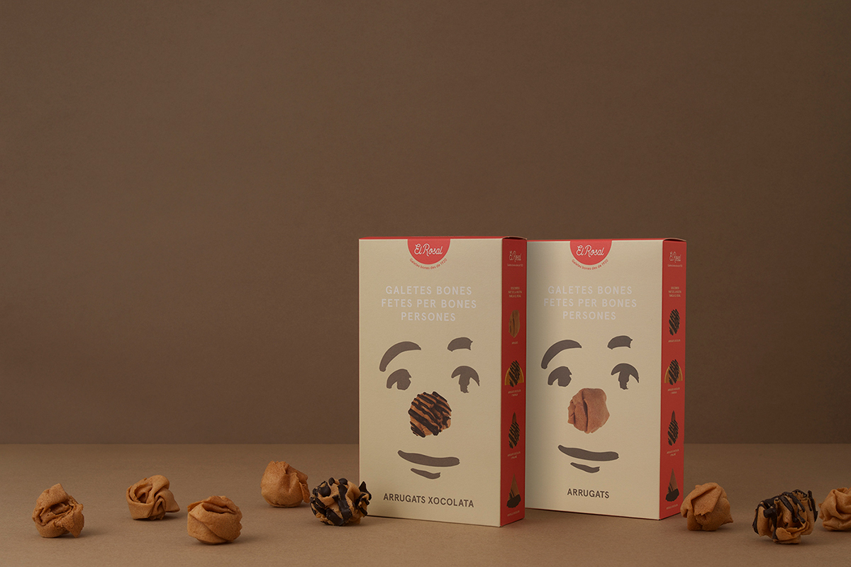
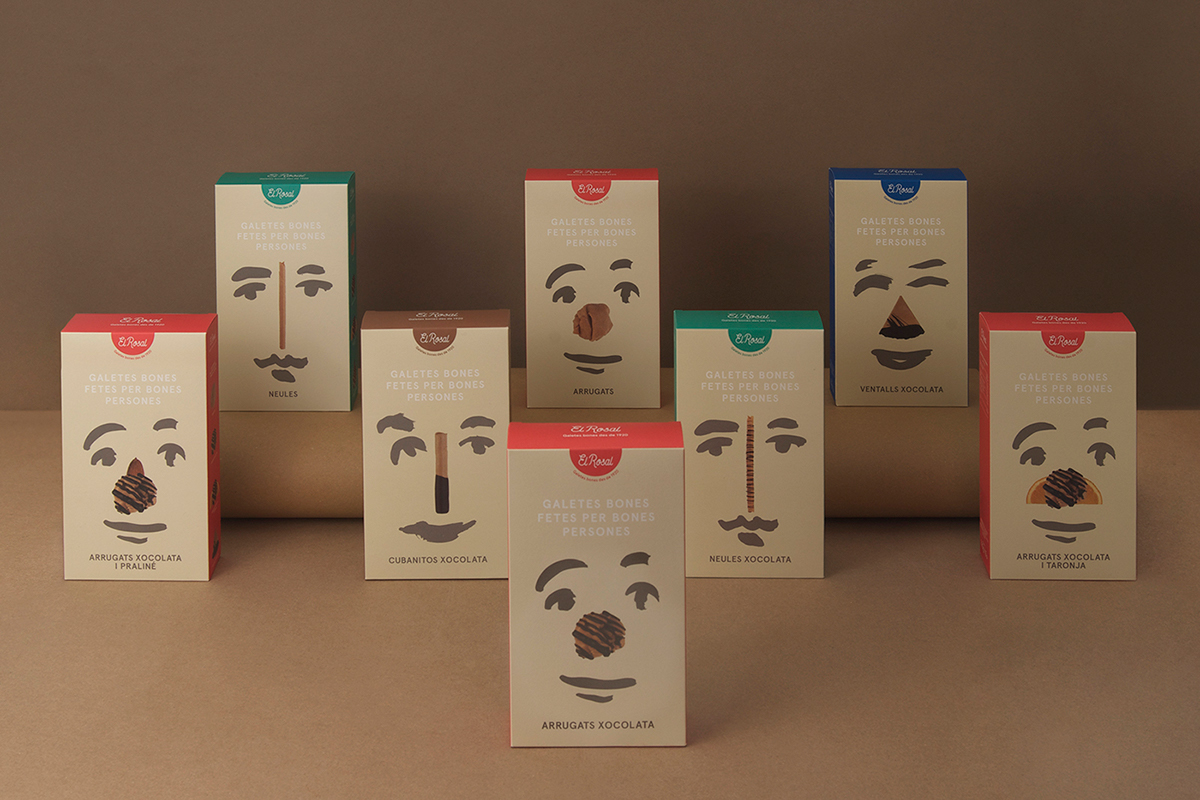
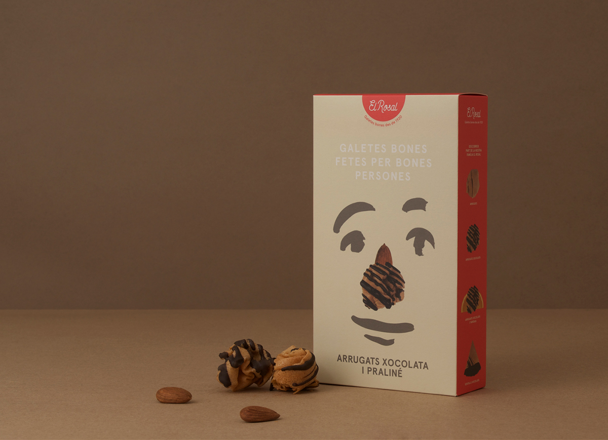
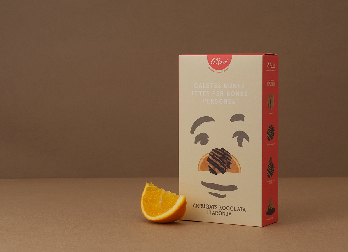
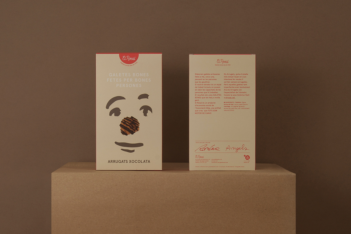
Its most popular product is called Arrugats based on a nice story:
"Lluís after rolling biscuits and ending up looking like wrinkled, El Rosal realized that imperfect biscuits were delicious!"
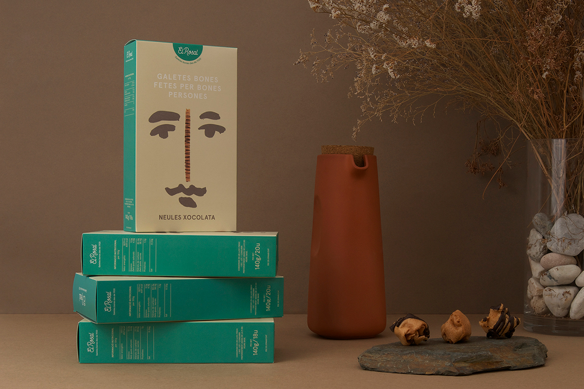
The conceptual aim was to develope the packaging as a means to send a message: the simplicity of making really good biscuits by real people - the authenticity (the imperfection) in a crowded marked. That's the reason for its family design: different people faces (meaning those people who make the biscuits) with a kind of empathy. The same people who sign in the back side of the packaging showing the value of those biscuits.
Client: El Rosal by Associació Alba
Art direction: Griselda Martí
Design: Gerard Gris, Laia Sáez & Griselda Martí
Illustration: Pol Montserrat
Food photography: Kema Food
Photography: Koldo Castillo


Thanks!
Follow us on Instagram


