

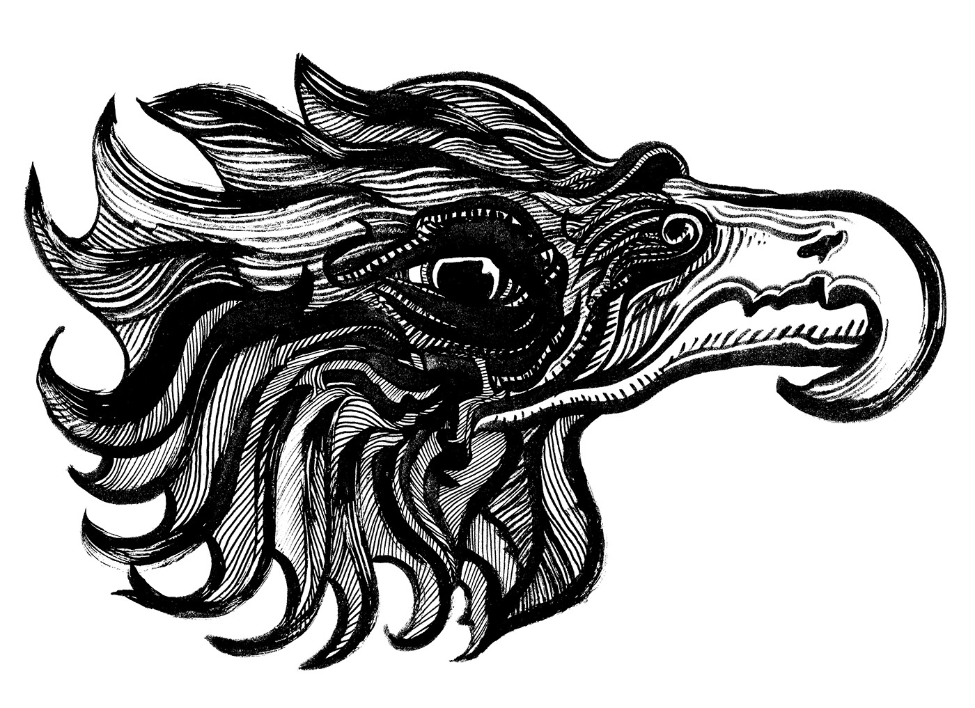
I wanted to used a woodcut/ lino print style of illustration to make a Lager label design. I want it to be simple but also have an almost industrial feel. I am basing most of my decisions within this logo draft from a bar I visited, where the beer was piped though a brass curved bar feature that had the the different beers labels illuminated.
I was playing around with the idea what the illustration would be like with colour. I prefer the black and white print effect for the label more as it scales strongly compared to one with this much colour/shading.

I wanted to keep things as simple as possible. I wanted to see the image sitting with a circle border as I had noticed many of the beer tap labels are now required to fit into fancy tap fittings that Illuminate the branding.
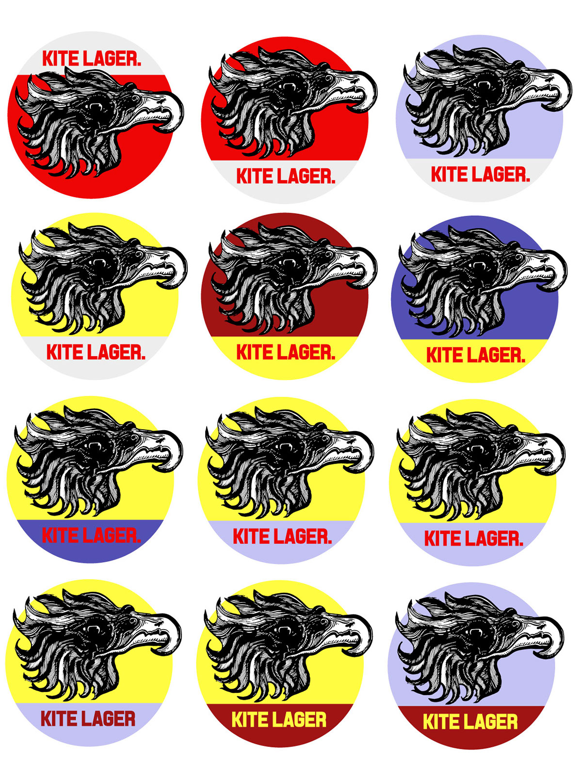
I liked the text on the bottom, I feel like having the text on top would work for a tshirt illustration however the height at which most customers will be looking at this image is dependant on them either picking a bottle of a shelf or seeing the bar tap.
The red and that grey starting point was based on the fact that Red Kites were being introduced to the UK in Wales when I went on a Mountain Biking road trip when I was younger. As fitting as this seemed I didn't see the Red as superior to the pastel colours, once I had placed the Illustration into the foreground.


For apparel and print purposes I would push that the protruding beak design be used. The beak has a weight to it that pulls the eye. The colours are rather pastel, this isn't something I would have initially thought of when thinking about existing craft beer where I live in the UK. I do however think that with the detail in the illustration the pastel colour themes compliment the form. They seem to soften the tenacity of the illustration.


This design would work within the point of sale style tap fitting that seem to becoming popular in the bars and festival tents that I have seen this year. I don't think that is has as much punch as the protruding beak logo, but it is similar enough that the customer would recognise the brand at the bar.


