ISTD 2017
Fads: Arsenic fad
THE BRIEF
Design a typographic work that explores the subject of fads. Investigate the widest interpretation of the theme from historical, cultural and global perspectives.
THE CREATIVE STRATEGY
People perceive fads as harmless due to “need to have” obsession that takes over in the selling of the item. They want to fit in no matter what, even if the obsession causes negative consequences. The attempt with the typographic interpretation was to take a historical approach on unknowing unhealthy obsessions of fads. With the explorations focus on the historical fad of the Arsenic craze in Victorian Brittan.
THE CONCEPT
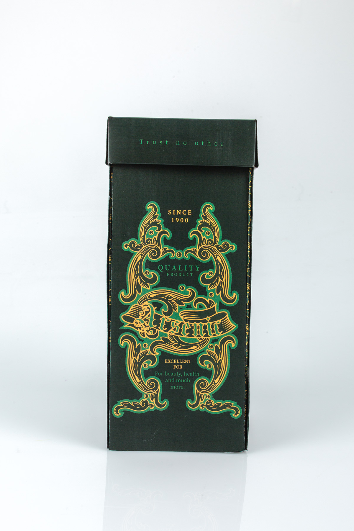
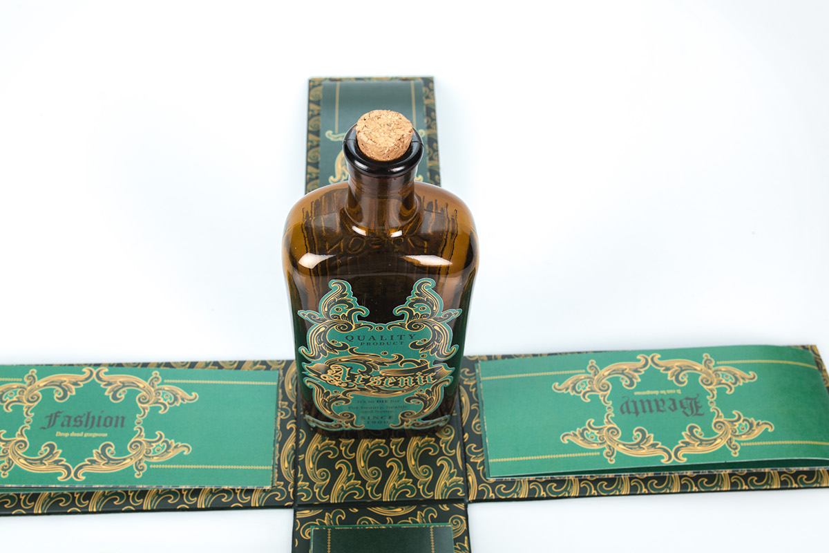
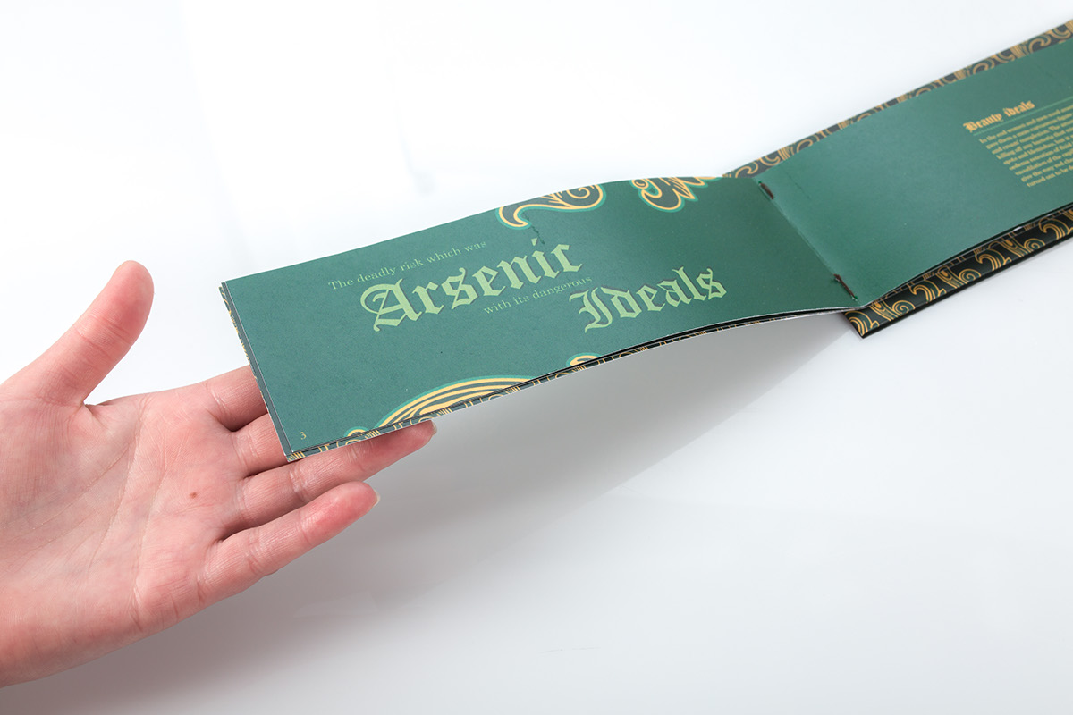
The concept is based on selling Arsenic as a harmless product to the public. The typographic elements create a sense of interest from the viewer to view this decorative packaging only to discover the dark truth behind this product after reading the typographic elements.
THE EXECUTION
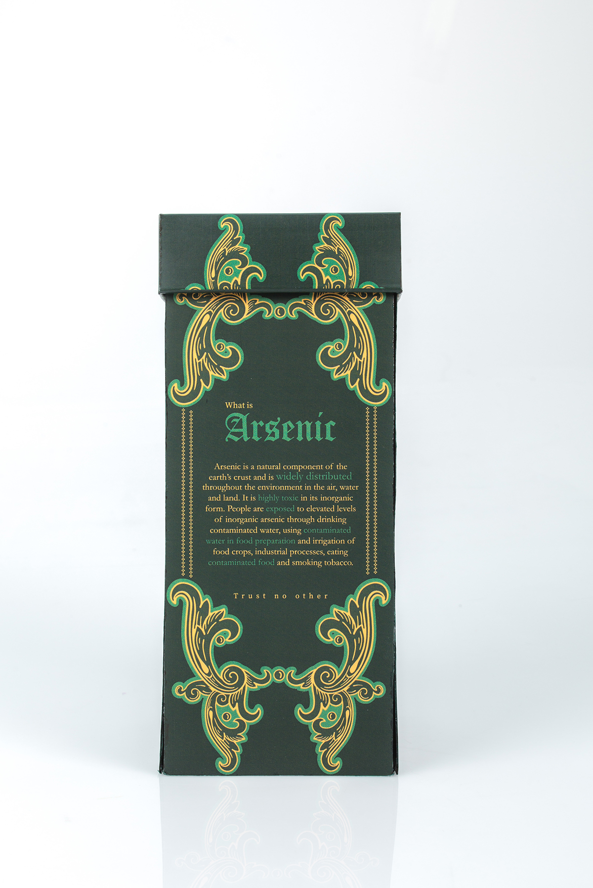
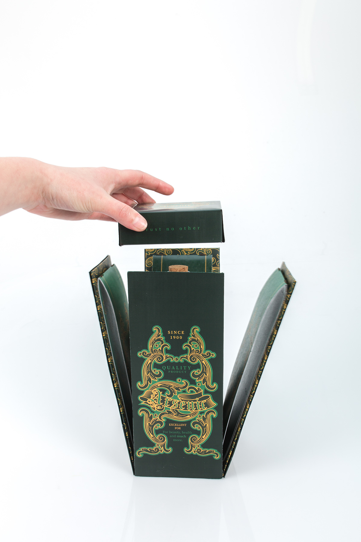
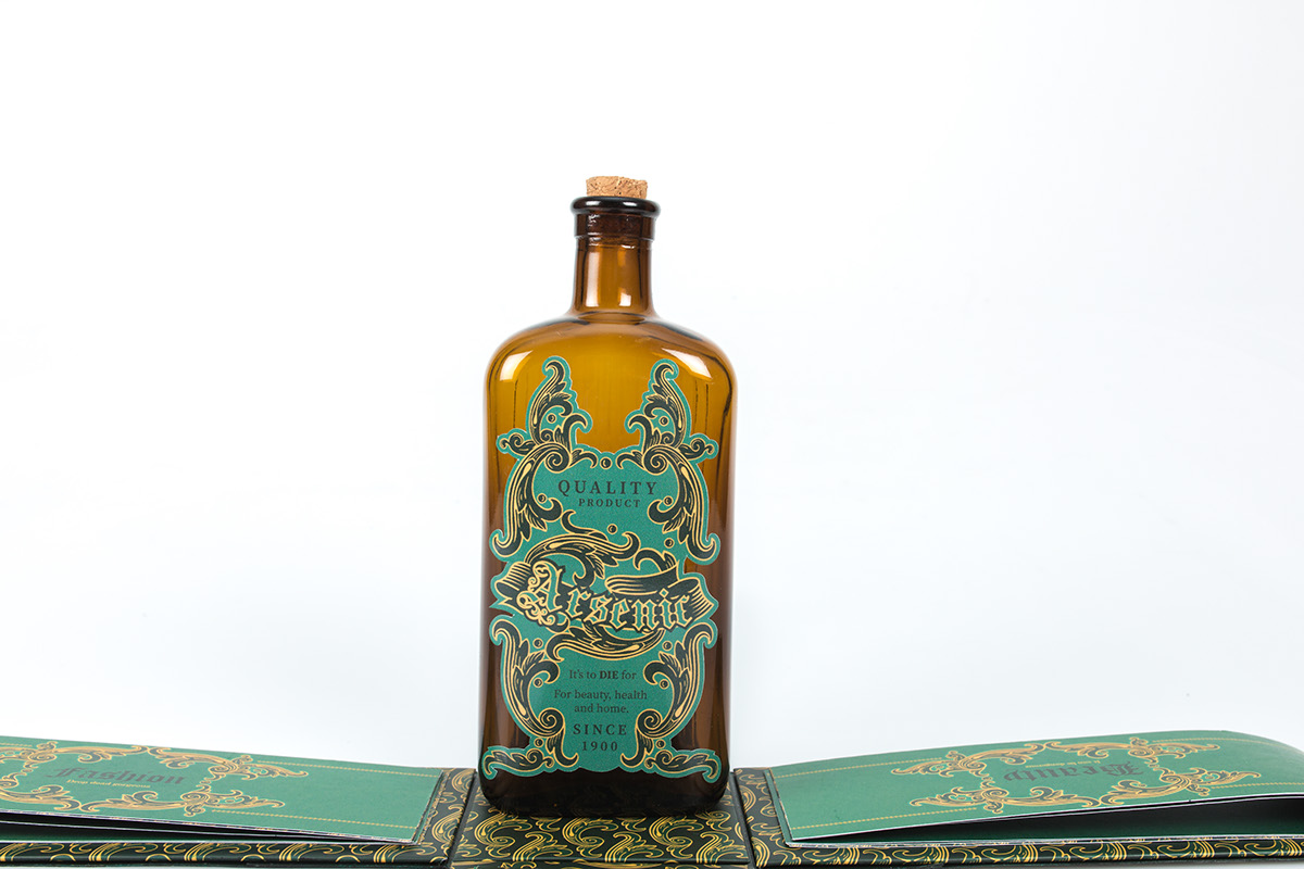
The illustration style and colour choices of the typographic work consist of Victorian-inspired decorative elements. Green shades will be used with the connection towards Arsenic popular use to create Scheele’s Green. The typography used was to sell this harmful product as something beautiful, while it is hiding a dark truth behind that beauty. Thus this consisted of a packaging selling Arsenic. The packaging contains a bottle and four categorized booklets containing information on Arsenic’s uses, namely beauty, home décor, fashion, and food.
Project featured in SA Times

Weblink
https://issuu.com/picturelibrary/docs/art_times_-_dec_graduates_2017