


Welcome to Impact City The Hague
Bookazine design about the impact economy in The Hague, The Netherlands
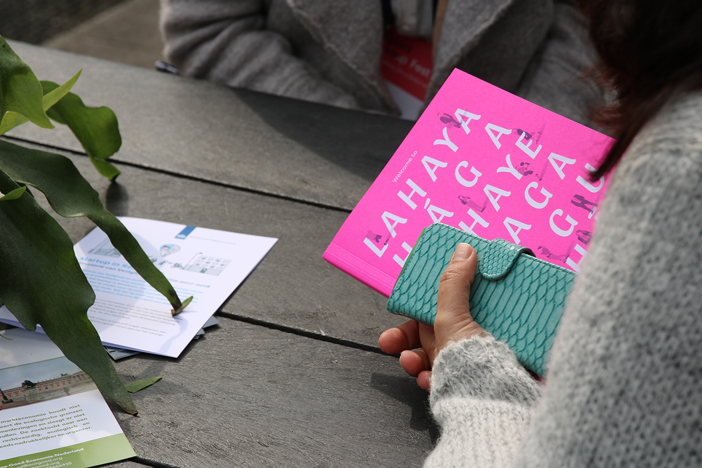
'Welcome to Impact City The Hague' is a publication by the Municipality of The Hague that gives information about the startup ecosystem and the Impact Economy in The Hague. To visualise the current stage of the impact economy in our city, The Hague, our studio was asked to come up with the concept and design. This 'bookazine' is the first publication of this program.


The assignment
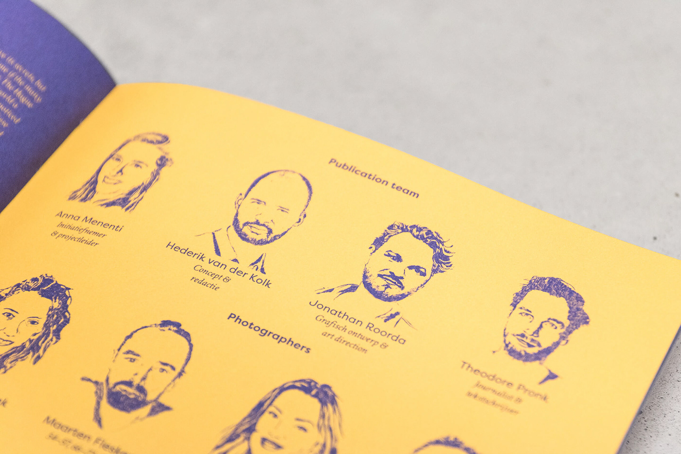
For this project we got a nearly 'carte blanche'. Together with Anna Menenti from the municipality of The Hague and copywriter Theodore Pronk we made the selection of organisations and entrepreneurs we thought would have an interesting story to tell. Our next step was to assemble a creative team of illustrators and photographers to assist us in the visualisation. Therefore, for this assignment, we were not only responsible for the concept and design but also for the editorship, a great opportunity.
The design
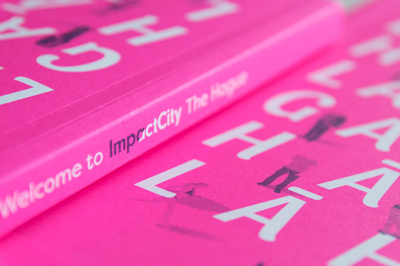
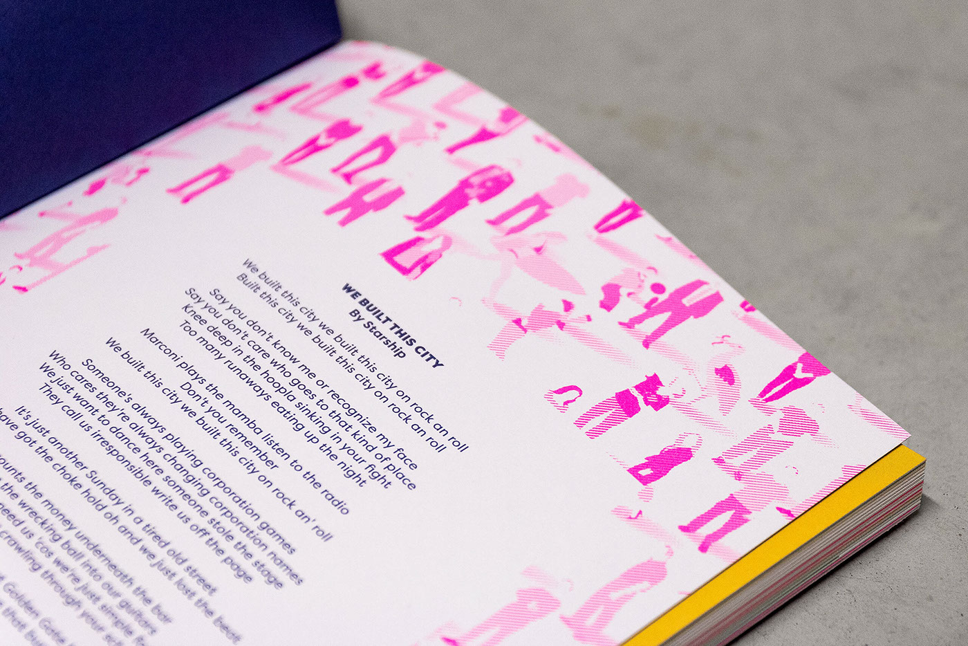
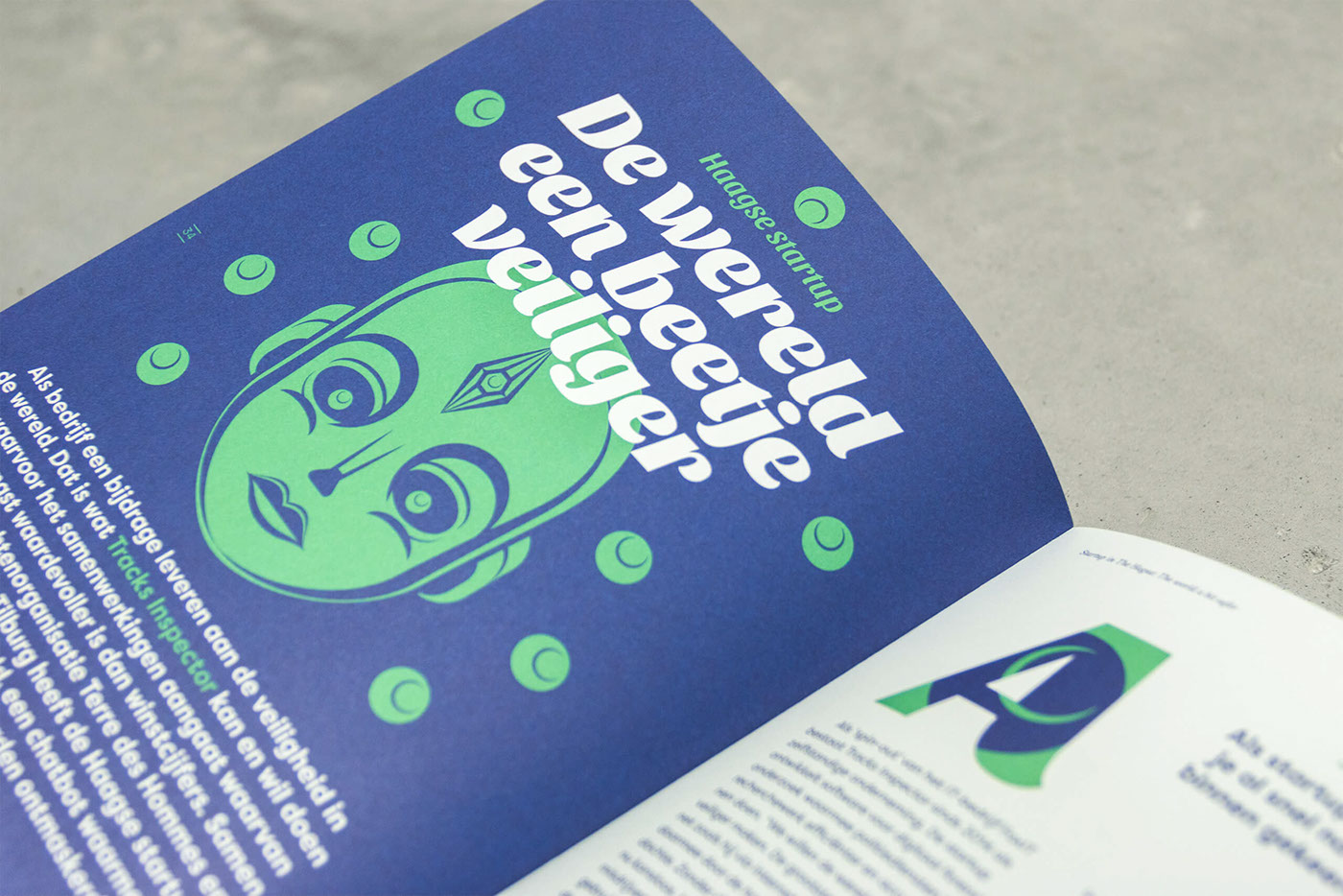
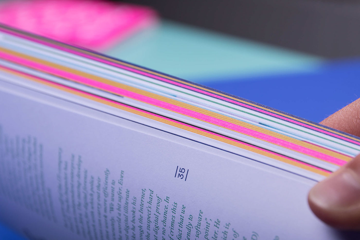
COLORS & FONTS - Impact City is an online platform with it's own identity. To make it part of this platform we used their corporate colors but adding the fluor pink to make it stand out. The size is 17 x 24 cm and it's bilingual, Dutch and English, to reach a greater audience. To fit both languages in the book we used for the main body text (Dutch) Filson Pro and for the English texts Crimson Text, readable on a small size. For the headings and quotes we used Sansita to give it a modern and playable look. As extra idea we asked Sytze Schalk to write a fictive story about Impact City which resulted in the short tale "Urbon". On each page you can read a line of the story, making it a page turner with the English translation in the back. On the cover we used The Hague in different languages to emphasise it's international character.
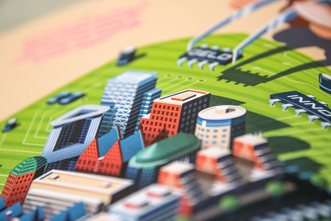
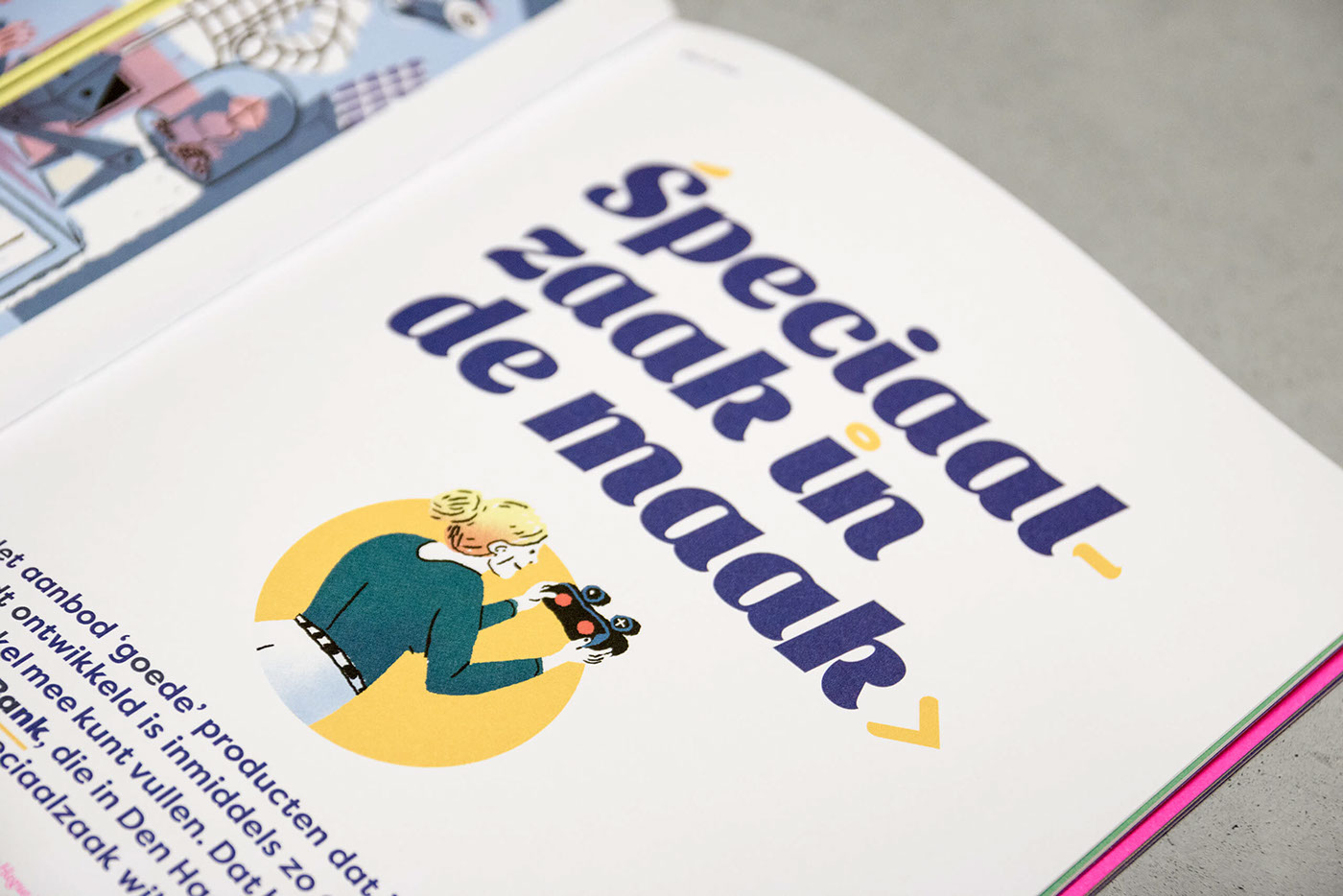
ILLUSTRATIONS - We have some illustration talent in house, but we wanted to use a variety of illustration to suit each article. Looking on Behance, Facebook, Google and checking our own network resulted in a group of illustrators we would be perfect for the job. The majority were upcoming talents and The Hague based, giving us the possibility to work closely together. The style of the illustrator determined which article would be suitable for him or her to visualise and we are really happy with the results. From city tech scapes to beautiful infographics to a futuristic store to an illustrated colophon, it's been a fantastic job by everyone.
PHOTOGRAPHY - Just like the illustrations, we started by searching the internet and looking at our network to make a selection of upcoming photo talents. Based on their portfolio we made a selection who could take the photos for which article. This resulted in a broad range of photography of documentary-, studio-, and event photography as well as using some of the provided images of the entrepreneurs.
PRINT - The booklet is printed by Opmeer in The Hague and contains full color + PMS 806 (fluor pink). The paper we picked is Soporset offset, 350 gms for the cover and 170 gms for the inside and a lay-flat binding technique. To enhance the effect of the fluor color, we chose a fluor pink thread for the binding.
The result is a versatile book of 108 pages showing the divers startup landscape of The Hague. The content is not news driven, making it a publication that can be used for a greater time span. The size makes it a comfortable heavy weight and we are very proud that the books sees it's 3rd edition in the near future.
Many thanks to everyone who made this project possible: the entrepreneurs, the visionaries, the illustrators and photographers, writers and the municipality of The Hague.


