
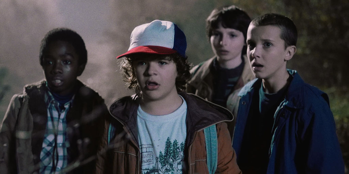
Project background
As part of a design challenge, we set out to solve an existing problem that was very close to home. Considering the number of hours we spend binge watching Netflix, the choice was rather straight forward. The challenge was discovering what users were struggling with on the platform and to bring that to light in a rapid prototype design with the aim of making it 10 times better.
Project length: 4 days, because pressure creates great work ;)
User Research
The first step was to ask users about their experiences on the platform. We got many responses across desktop, mobile and TV but found the issues on TV more intriguing to solve.
Day 1: Survey on Instagram
We used Instagram to glean out what Netflix users were struggling with on the platform, organically validating the most pertinent issues through likes.

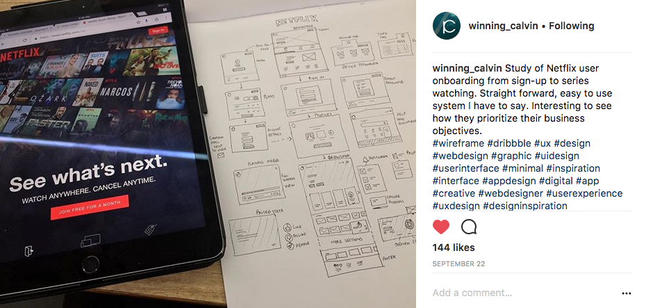
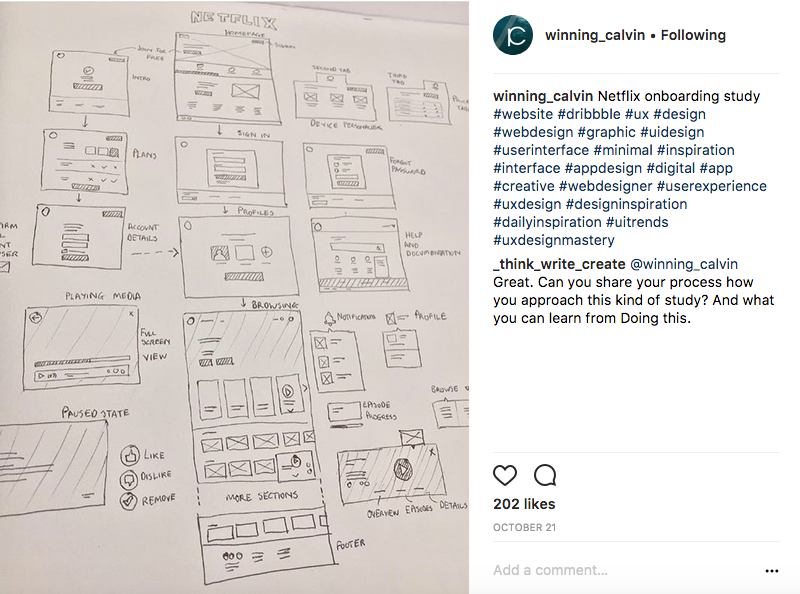
Rapid prototyping
From the information, sketches on paper we made of what the TV platform could be and then rapidly developed into rough UI mockups. We also put together video demonstrations of what it might work like as well.
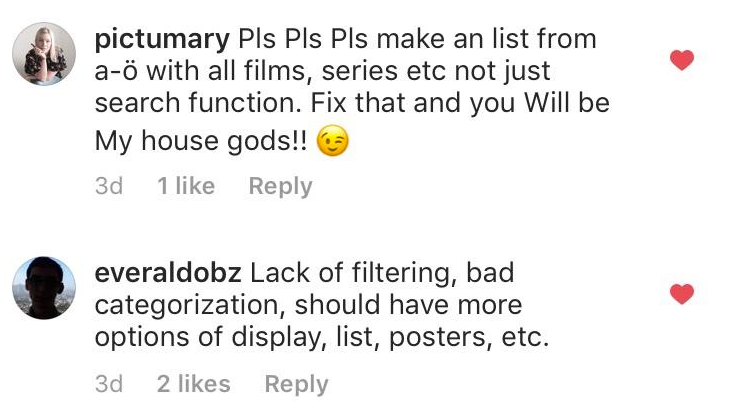
Concept screens

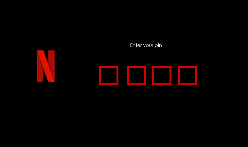
Parental Control
To ensure the little people do not have access to
the full violent and potty mouthed Netflix offering,
a optional security screen allows the user to
enter a pin to proceed.
Search listing
Through the use of the remote the user can
search a title only using the arrow and enter
button to select a title through letters.
Work in progress mechanic.


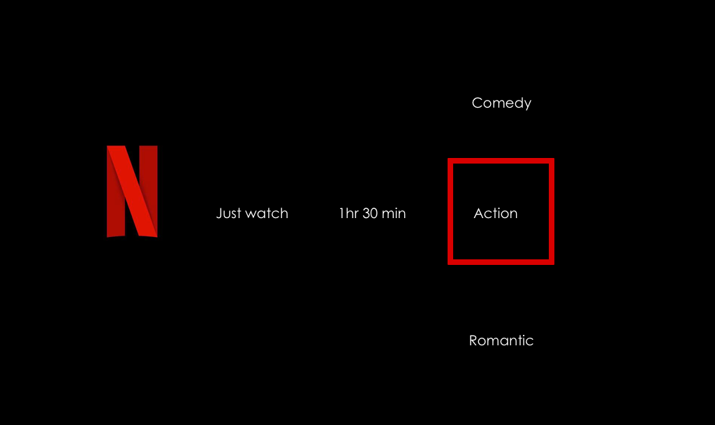
Why look for content. Just watch.
A big thing for Netflix fans after having watched a large amount of the library, is the lengthy search for content that is unwatched. Can't I just find something to watch please!!
"Just watch" comes to the rescue. Users will be able to chose how long they want to watch and what genre to watch from a selection of three of your most watched content. Made to be intentionally simple and mindless.


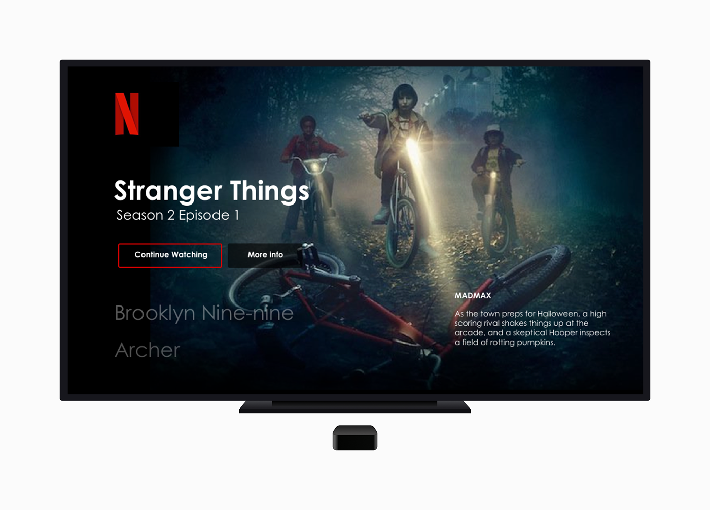
Home screen
Instead of a home screen with random listings, our experience would keep it very simple and straight forward. The last content watched gets shown first. Three titles are shown in the top section followed by the Continue watching and Popular listing sections. This leads to a richer and less distracting experience.

Watched vs unwatched
Watched content is visibly marked and can be excluded altogether from showing to allow users the ability to only view unwatched content.


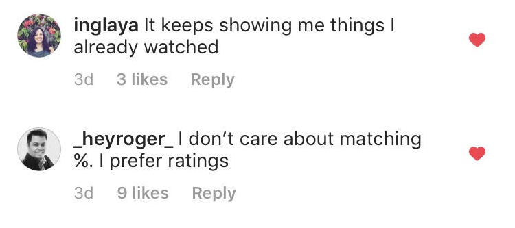
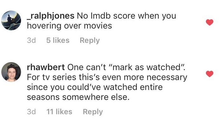
IMDB Rating system
Because % match and star rating can be relative to the audience in Netflix that actually rates programs, its not really useful. Instead we integrate media with a more reliable IMDB score for comparison.

Rating system upgrade
At the end of watching a show, we make sure more people can rate the title or episode by taking over a large part of the screen. IMDB rating is included to keep the review honest.

Next steps
Building of a prototype
Round of testing with actual users
Refining the prototype with user feedback
Kicking butt.

Tells us what stands out and what you think of the ideas.
Please leave you opinions in the comments and appreciate


