
OVERVIEW
I have spent most of my career working in non-profits because I love making a positive difference in the lives of others. I was lucky enough to work as an administrative temp at the EDF during my first month of living in NYC, and so naturally, when it came time to redesign a site for a personal project this was the first place that came to mind. I hope you enjoy!

I had three goals on the first version of the redesign: Simplify the menu, add modern/trending UI elements and maintain the clean and corporate feel.
Donation Page

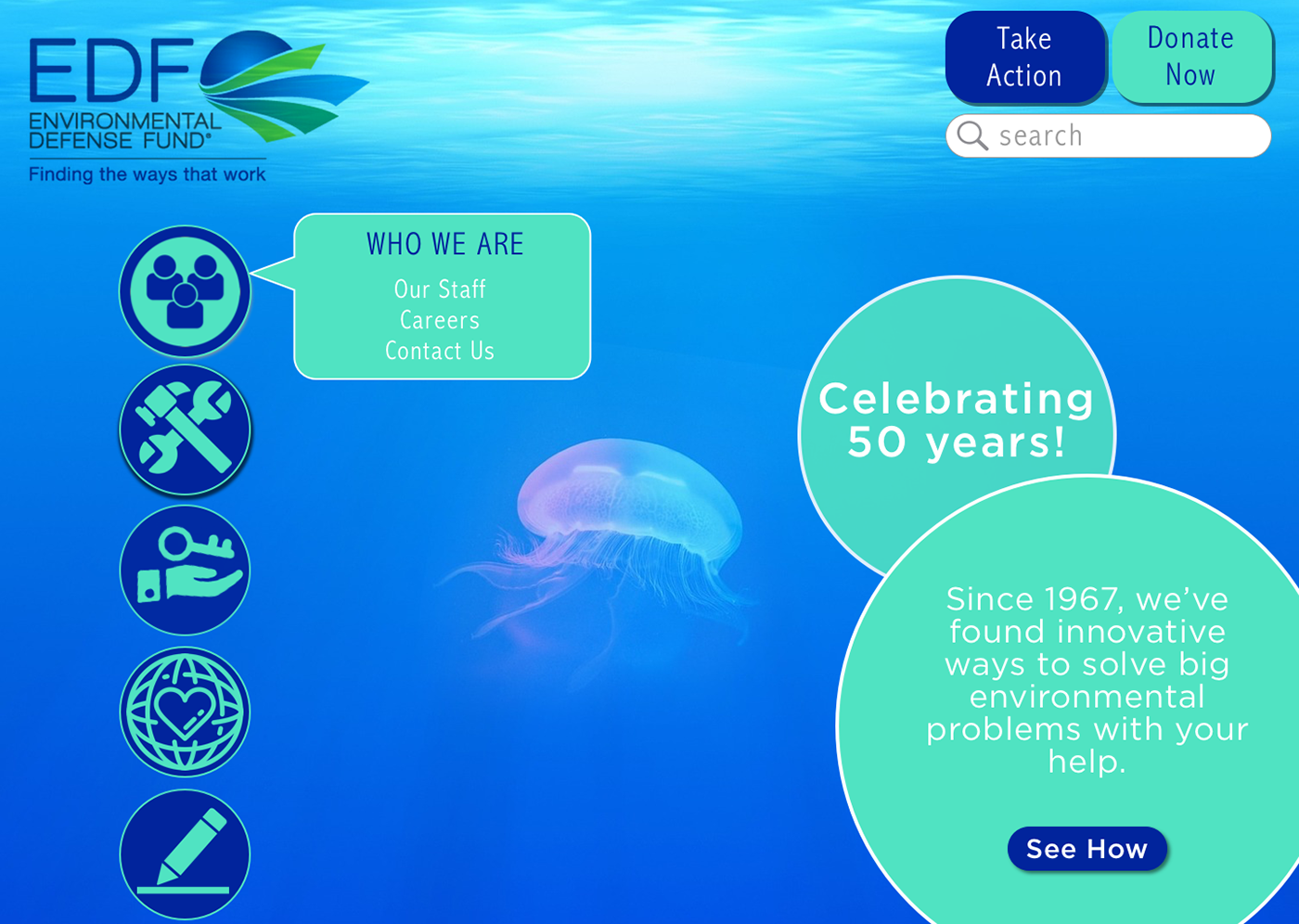
EDF REDESIGN #2
I wanted to take a fresh look on the site and completely let go of the corporate feel of the original site and the first redesign. You'll find more rounded corners, bolder colors and illustrative icons instead of pictures. 2nd Redesign Goals: Fun, Modern, Free.
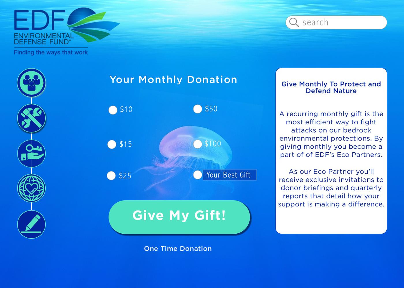
Donation Page Redesign #2

That's it! Hey, thanks for following along!
UI Specs:
Redesign #1:
Green: #3FC143
White: #FFFFFF
Blue: #4B91E2
Redesign #2
Cyan: 47D7C7
Blue: 01249C
White: #FFFFFF
Images
Turtle: Unsplash @Andres Abogabir
Whale: Unsplash @Abigail Lynn
Jellyfish: Pixabay @StockSnap
Designed on Sketch.
Infographic designed on Canva

