


After many, many scrapped sketches this is the basic shape we chose. It incorporates an "S", the first initial of my partner (the client, I guess), a backwards "P" and a "b". The balance (I know, almost a yin-yang) represents the two of us being complements of each other and our roles in the company, and the middle section, as you will soon see, is the trunk of a birch tree. I like to think of the S as a swirl of wind as well.

The first versions had bark sort of tossed in ad-hoc. I tried a lot of variations of different types and shapes, line weights, etc. I kept this weight after some testing, but changed the amount of it and the placement. You will also notice that I am still playing with the curves at the ends of the P and b at this point.

Playing with some Ps layer styles and shadows/highlights to see how it holds up in different treatments. I try to design in pure black and white so that I concentrate on the shapes themselves.

Playing around with some more photoshop layers and lighting effects. I was inspired by a mockup I saw on Pixeden.com. Theirs is way better. Continue on for the full, finished treatment.
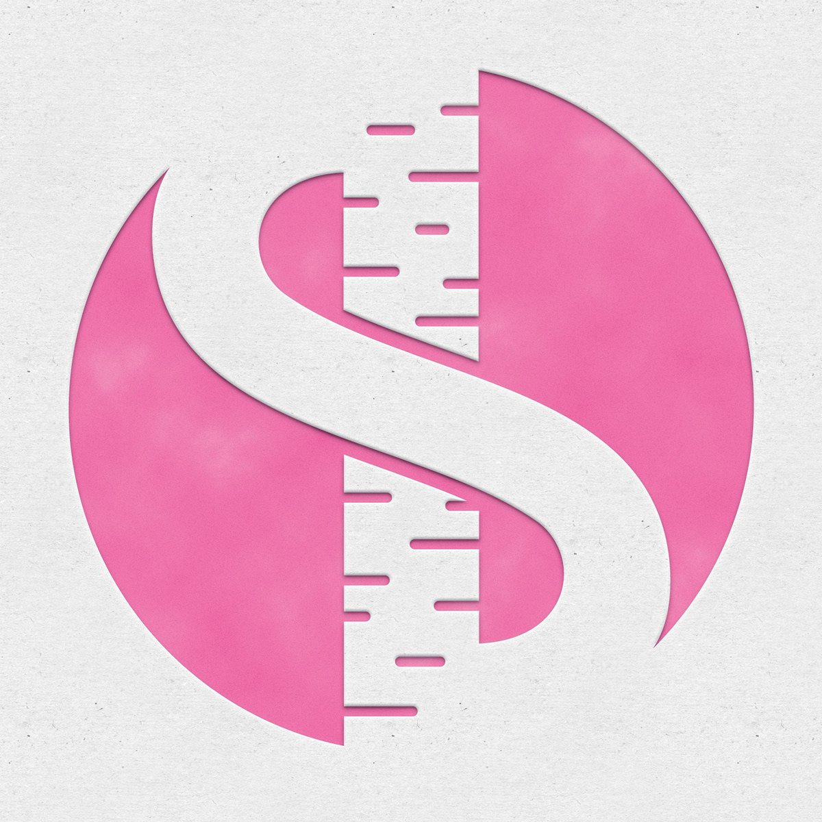
Here it is in its final form. You can see the lines of the P and b have been smoothed out and fixed up, the bark is arranged a little differently, and of course the final Ps styles are in place. The aesthetic is letterpress, not to be trendy but because that is what was right for this project. The entire site will be in this style, as we feel that the energy and attention to detail that goes into actual letterpress techniques is very similar to what we do as designers and developers. Most people never notice the attention to detail, and that's okay. We are targeting a certain niche of business professionals, and the logo and branding are aligned to reach out to them. The combination of the textured, heavy paper, as well as the subtle variation in the inked portion, along with the more obvious relief due to the process of letterpress itself all ties in to make a crisp, bold, yet engaging logo.


