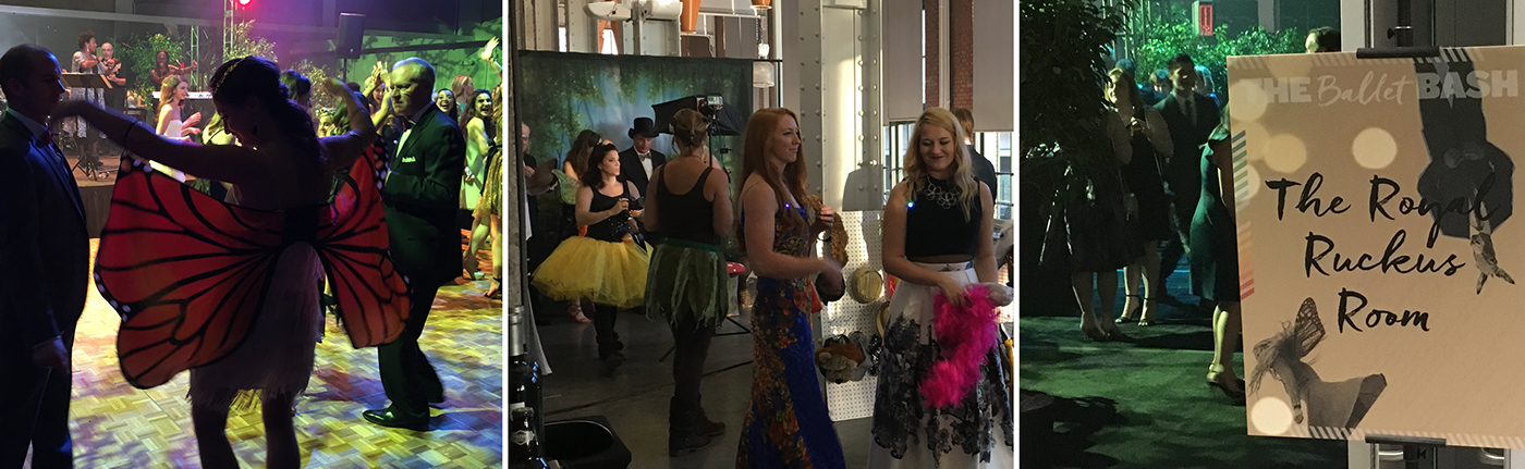
Kansas City Ballet Bash Invitation & Branding
The concept is a modern interpretation of Shakespeare’s A Midsummer Night’s Dream.The strategy was to appeal to a younger audience and create a new vibe. The tone is whimsical, energetic, fun, exciting, edgy and trendy. It says, this is the place to party in KC. Because the theme is A Mid Autumn Night’s Feast, rich-looking autumn colors take center stage, with ballet brand gold and blue as accents. Bokeh lights project fun, romance and whimsy for this nighttime event.
The flower is a Viola Tricolor, also know as a Love-in-Idleness. In Roman mythology, the flower is turned into a potion that causes people to fall madly in love with one another. The logo uses two typefaces: Knockout and Freeland. Knockout allows for a variety of thicknesses and widths for emphasis and adaptability. Freeland is a fun cursive brush type. When combined, these typefaces create a unique, flexible and identifiable brand for the Bash.
Concept 1

Concept 2

Concept 3