Build a mobile app
Product thinking


Zone enables you to discuss about a lot of different topics with people from the whole world. Post, discover, comment and share through public discussions related to your personal interests.
My design process
Here below is a schematic representation of how I proceed on daily basis to optimize the conception or the improvement of a product.
You can see that the design thinking process is not necessarily linear. Empathy is involved in the whole project, which allows putting yourself in the place of users in order to improve user-friendliness.
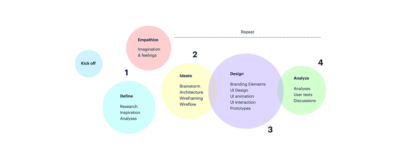
First of all, I try to have an approximate idea of the concept with daily watches on similar products to this app concept and I imagine a mix of several apps or websites proposing a concept close to it to study these ideas.
Then, I do a study benchmark with my daily watches. I look for apps or websites proposing a concept close to the one requested in the brief. I imagine a mix of several apps or websites in order to study the ideas. It is major to visualize the “big picture” of the app, and then obviously improvements will be made later on.
Inspiration
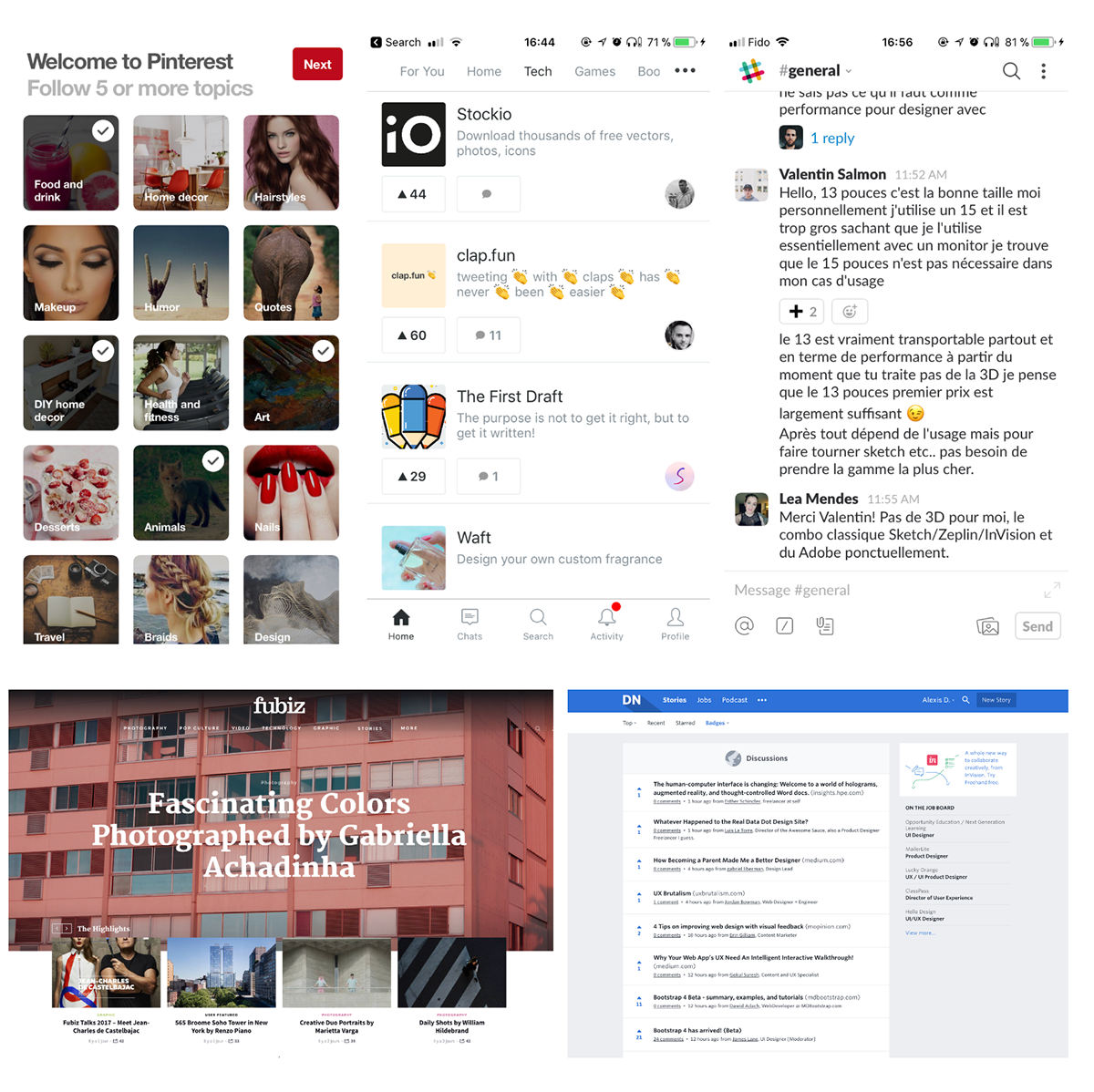
Pinterest for its « On boarding » where you let yourself get carried through topics as soon as you register
Snapchat for the horizontal and vertical navigation
Forums or Newsletters for their light topic listings (Designers news, Sidebar.io, stackoverflow.com, tomsguide.fr/forum/, dropboxforum.com)
Fubiz, the web magazine, for its style and photos
Product Hunt for its push button that pulls up interesting topics
Slack for the conversation part
Research
Then, I decided to take a look at the competitive landscape . I look for inspiration on several countries AppStore and I download everything related to the following keywords: “forum, community, public chats, discussions, chat groups” .

According to the competitive analysis, I noticed that most of apps are very similar in terms of design and on the experience proposed, but also in terms of content.
Analyses
Design : the design is simple and pure but looks often like the forums style, which quickly position the product as a support tool and not as a pleasant chat app.
Experience : I like to innovate on this part, which is for me a major part on an app. These days, an app stands out really by the emotion it arouses. Here below are points where I wish to improve the experience :
- Navigation
- Interactions
- Animations & UI animations
- UI Sounds
- Art direction
Content : the “Forum style” approach displays the published content. The conversations generated are mostly about problem solving, which means that a lot of people use this type of app in order to get support, but do not use it for mutual support, therefore many questions remain with no answer.
What is interesting here is that there are different interests and that it is not a specialized community, which means that we can direct conversations around hot topics. Users would exchange their point of views on diverse topics if a team were animating the community around hot topics.
Analyses
I decided to adopt a different approach. My objective is to make it in a way that the app is constructive, that users use it to read and know others point of views on different conversation topics, but also in a way that they can add their own conversation topics. User must think that the app has been made for him, so that he can let himself get carried through different topics he likes.
Ideate
I wanted to give the app a name so I called it “Zone”, which means “space”. In French we can also say a “conversation zone” to speak about a space where people discuss. I found that fun, short, memorable and international.

Due to a multitude of channels and subcategories, I wanted to illustrate by pictures and not icons for the different topics because icons are not precise enough. I used several images on Unsplash to highlight the chat channels.
In addition to this, I think the user has to choose a minimum of choices so that his experience is even more interesting and boost a greater activity on the app.
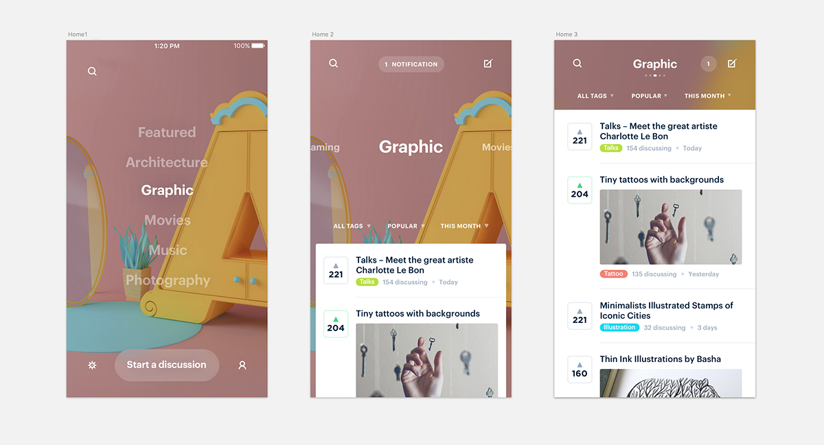
Wireflow
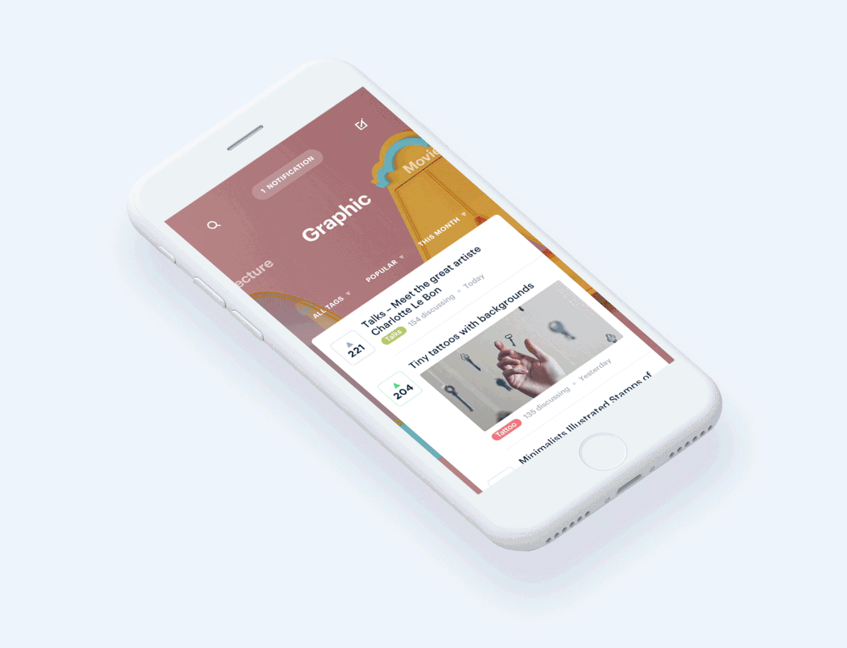
The scheme below represents different pages of the app. I limited the amount of pages on purpose to have a better interactive experience and to have the homepage at the center of the app.

I made a horizontal and vertical navigation with elements animation, which enables displaying more content only with the use of a swipe. The vertical navigation enables displaying more options such as the settings and the profile. The horizontal navigation enables channel changing. The swipe will be much more instinctive and fast, and makes it possible for the user to navigate with one hand only.

By clicking on a topic or by swiping upward, we extend the selected category that shows a conversation list and filters to organize the posts position and display.
The idea is to leave the user sorting the conversion lists according to his wishes (Trending, Popular, Recent, Tags, Date…), and thus to avoid highlighting some conversations more than others.
Twitter inspired me on the “list” aspect, as I did not want to force the users to publish necessarily a picture to illustrate their conversations. This would dampen publications and would help to limit poor quality pictures.
Design
I designed in Sketch App, the several parts of the homescreen
I designed symbols so that the design is pixel perfect on the conversation component.
It allows data customization (see the second image below).
Each discussion topic comprises :
- A discussion title
- A sub-category tag
- An upvote button
- A date
- Number of people discussing
Media (picture or video) optional


Prototyping
Then I used “Principle App” to prototype the animations and UI Interactions. I made several components that I animated according to the vertical and horizontal scroll.

UI interactions

The first home screen is the categories list illustrated with pictures representing the topic. The pictures change regularly with the topicality but they are pushed by the “zone” teams to manage their quality.
From this screen we can access to:
- Different settings (notification, account, language , localization …)
- Your profile (channels followed , discussion created, figures, old notifications, personal information )
- A push button to start a discussion
- A search tab to look for a discussion or a channel
- A Push notification that alerts when someone commented a discussion
- A channel list that allows access to the conversations
I imagined an animated effect that would zoom out on the backgrounds to create some perspective in this screen.
By clicking on a topic or by swiping upward we extent the selected category, which shows a conversation list and filters to organize the position and posts display.

Not to disturbing the user with the icons position changing, I deleted the bottom bar of the first screen and I added an icon to illustrate “start a discussion” on the second screen top right side. The top bar is composed of the most important elements (Search, Notification, Add a discussion) that have to be always visible.
For a better reading comfort and for an immersion feeling (fullscreen), I intentionally did not add any navigation bar in the app design.
We can navigate horizontally to see the other channels, the rest of the content (Top bar & filters) remaining fix. The background “fade” and change the image to illustrate the topic in order to improve the comprehension.

We can scroll in the list and it extends to display more of the conversation.
The UI elements interact and the background fades away.
In order to emphasize the zooming effect in a category, I masked the status bar and the conversation cards can also zoom to take up the entire width of the screen when we scrool in a category. If I had to keep on making the prototype until the conversation part that I have made in wireframe, I would have unfolded a conversation to display the chat.
By scrolling in a category, the category title goes up to display more conversations. Bullet points appear to indicate to the user that we can navigate horizontally to change of category and the notification component (if it is active) moves to the right.

