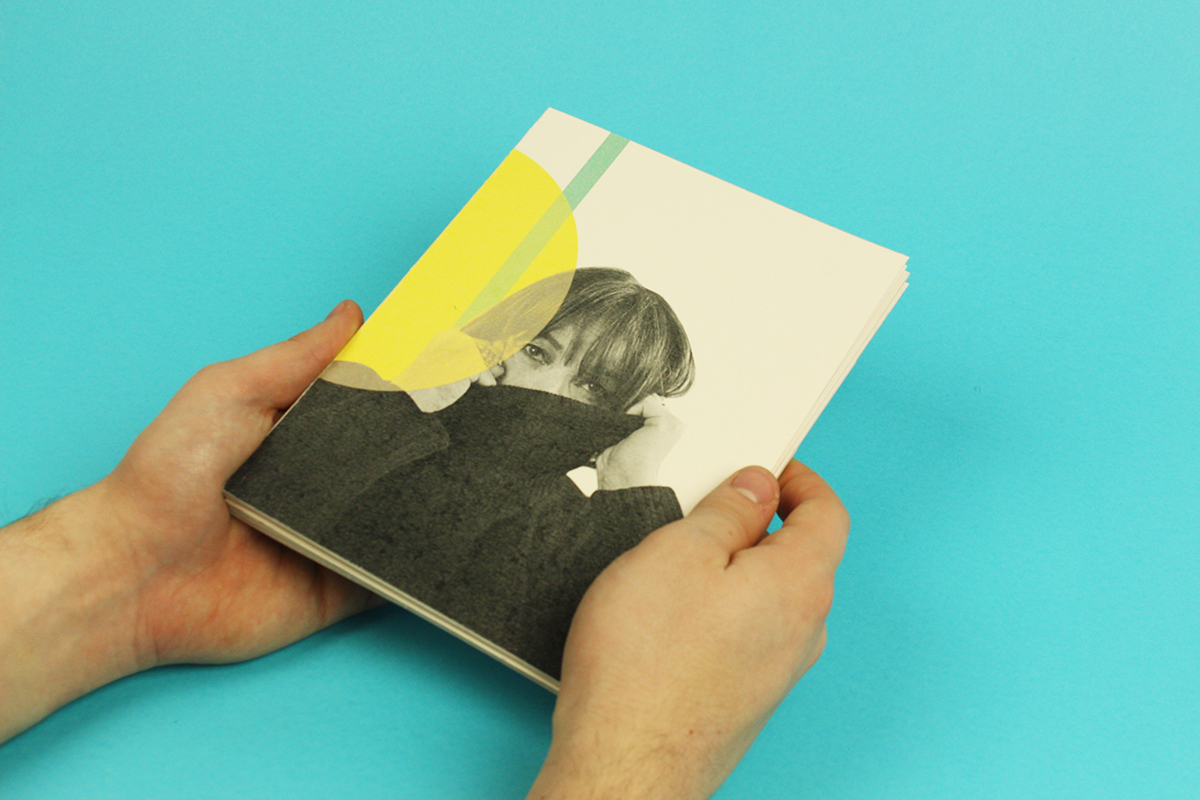
THE BRIEF
The goal for this project was to design an accordion book to highlight the life and work of Ruth Ansel. Much of the project was about understanding the work of another designer enough to use it as inspiration, instead of a template. There needed to be a balance between the designer's work and the design of the accordion.


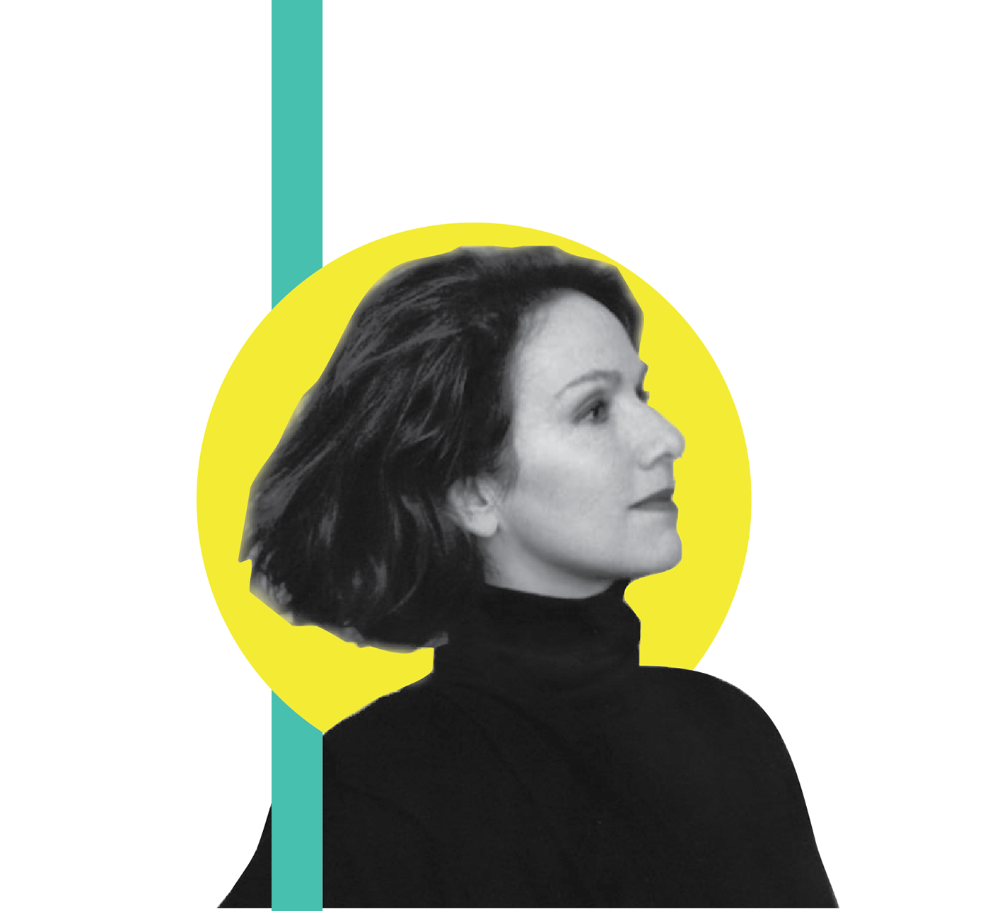
CHOICE OF COLOURS
The colour was influenced by the pop art movement as well as Ansel's work. She worked with a lot of bright colors like the colour pink, so It is printed on light pink paper making the photographs in the accordion appear with a slight tint. to compliment the pink a turquoise was used as well as a yellow to compliment it further. Although many different colors are used in this piece it still holds its balance, and each one serves a function of either highlight, balance, or decoration.
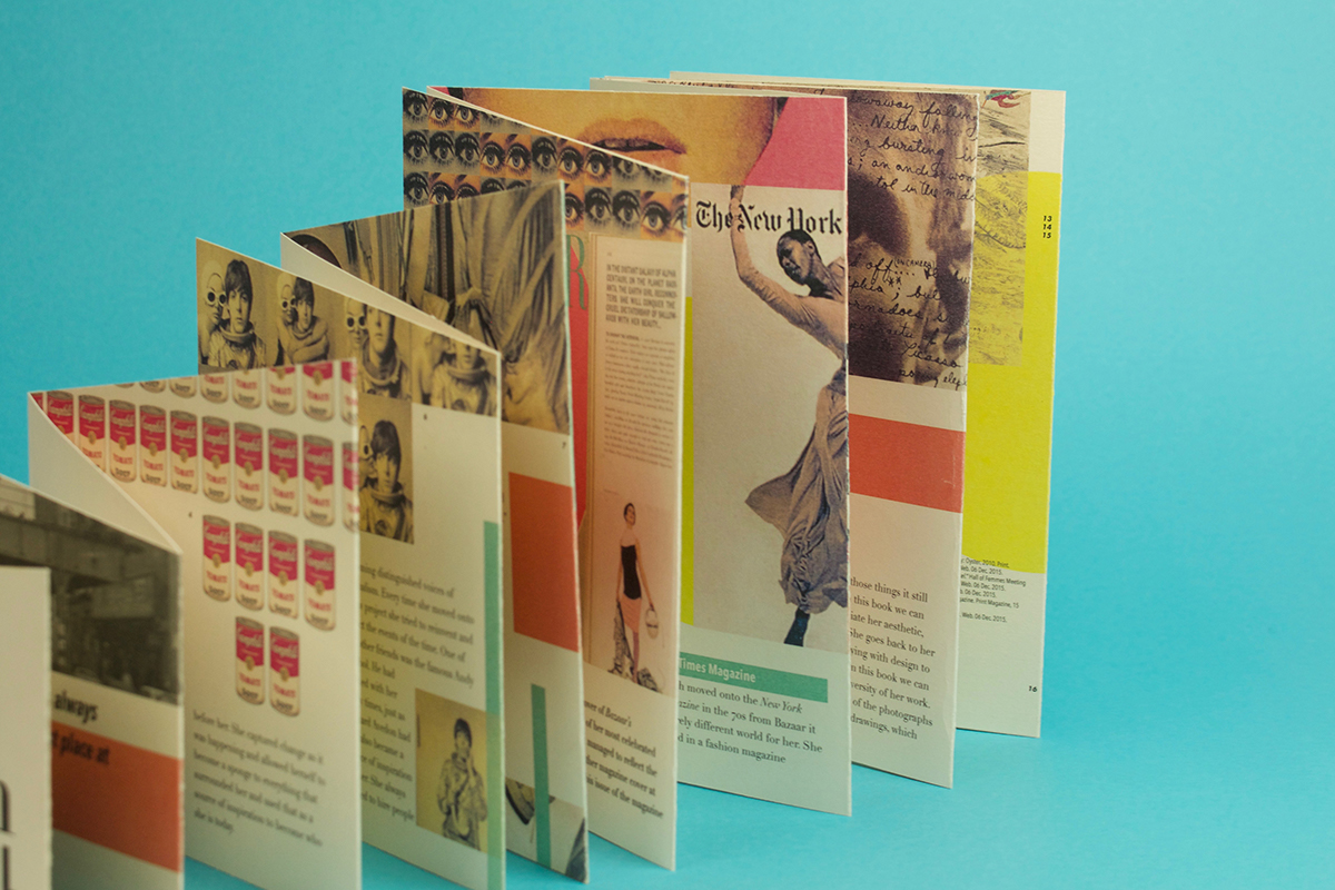
FINDING THE FORM
The book was required to be an accordion but that wasn't much of a restriction. After looking through Ansel's work it was obvious she was always unconventional and pushing boundaries of what was expected of her. The form of the accordion needed to reflect this, so book was designed to highlight the form and make it as noticeable and playful as possible.