

Redesigning M1 Desktop and Mobile website
General Assembly Singapore Class Project

For project 4, Shawn and I teamed by drawing lots. It was wonderful working with him again because both were committed to getting things done.
For project 4, we were asked to improve the User Interface of M1’s website and also to improve their mobile site by making it fully responsive.
The Client
M1 is the second telecommunications operator in Singapore, founded in 1994. I was in charge of the Business Analysis and I dived into research and analysis of the telecommunications industry of Singapore.
Being a small country as it is, the telecommunications industry is dynamic and highly competitive. Currently, it is still an oligopolistic market dominated by 3 key players — Singtel, Starhub, and M1 (in order of their market share).
In the past few years, we saw the entrance of boutique broadband service providers such as Viewquest and MyRepublic. This year, TPG Telecom was awarded the bid by the Informations Development Authority (IDA), making it the fourth telecommunications operator in Singapore. (Perhaps a forthcoming price war to benefit the consumers?)
Key Deliverables
For this project, we had to submit a high-level timeline for our work process, with the assumption of completion in 6 months. We had to deliver a pitch presentation that articulates our design process. This has to identify user problems, our solutions and how we address the pain points through our redesign works.
Current Site Analysis
Shawn and I went through the current website as we arranged for some users interviews. We want to find out how users of the website navigate around it and what are the key problems they find.
Through our analysis, we found some inconsistencies in the labels and placement of products. We drafted questions for the user interviews and proceed to extract insights from users.
User Interview
We interviewed users to find out what they usually look for when making a decision to purchase a mobile phone with plans. Through the interviews, we could understand their purchase behaviors, needs, and motivation. We also gave our users a task to try to purchase a Samsung mobile phone with the i-Lite+ plan. Using observation techniques, we noted on the steps they took, the problems they faced, as well as the features they hoped to have to shorten the purchase process.

User research and testing
User Research and Affinity Mapping
Since this is the fourth project, we are more familiar with the process of analysing our research data. From the data collected for affinity mapping, we found many similarities in our users’ purchase journey. They all wanted an easier way for comparison for the phones and a clearer view of the plans available.
From the user's research, we realised that one the biggest pain from the users was accessing the website using mobile devices. All our users had to choose “desktop version” before they could search for the product they wish to buy.

Affinity Mapping highlighting users’ needs and pains
Creating the Personas
A persona is a representation of a user, gathered from user research by including their goals, needs, and interests. By creating personas, it helps the designer to have empathy for the users by being able to internalize the users’ mindsets when they use the website. At the same time, personas help the designer to stay focus on creating a user-centric website.

Customer Journey Mapping
From our personas, we created the Customer Journey Map to indicate the process of how the user made a purchase. With this, we can pinpoint the important details required in our new design of the website.

Ella Lim was our chosen persona.
Ideation and Solutions
We sketched a few designs and integrated them to the website.
Design Objective
The objective of redesigning the M1 website is to increase the opportunities of new customers and build loyalty and positive opinions of the M1 brand. To achieve this, we will have to provide users with a responsive and intuitive website that makes them feel confident when researching and purchasing products.

Proposed Solution
1. Simplicity — Simple and easy to use navigation
2. Findability — Easy to find and compare mobile phones
3. Clarity — Display critical information upfront
4. Saliency — Reduce redundant steps during purchase
5. Consistency — Similar style and navigation across platforms
6. Usability (mobile site) — Lack of product and function
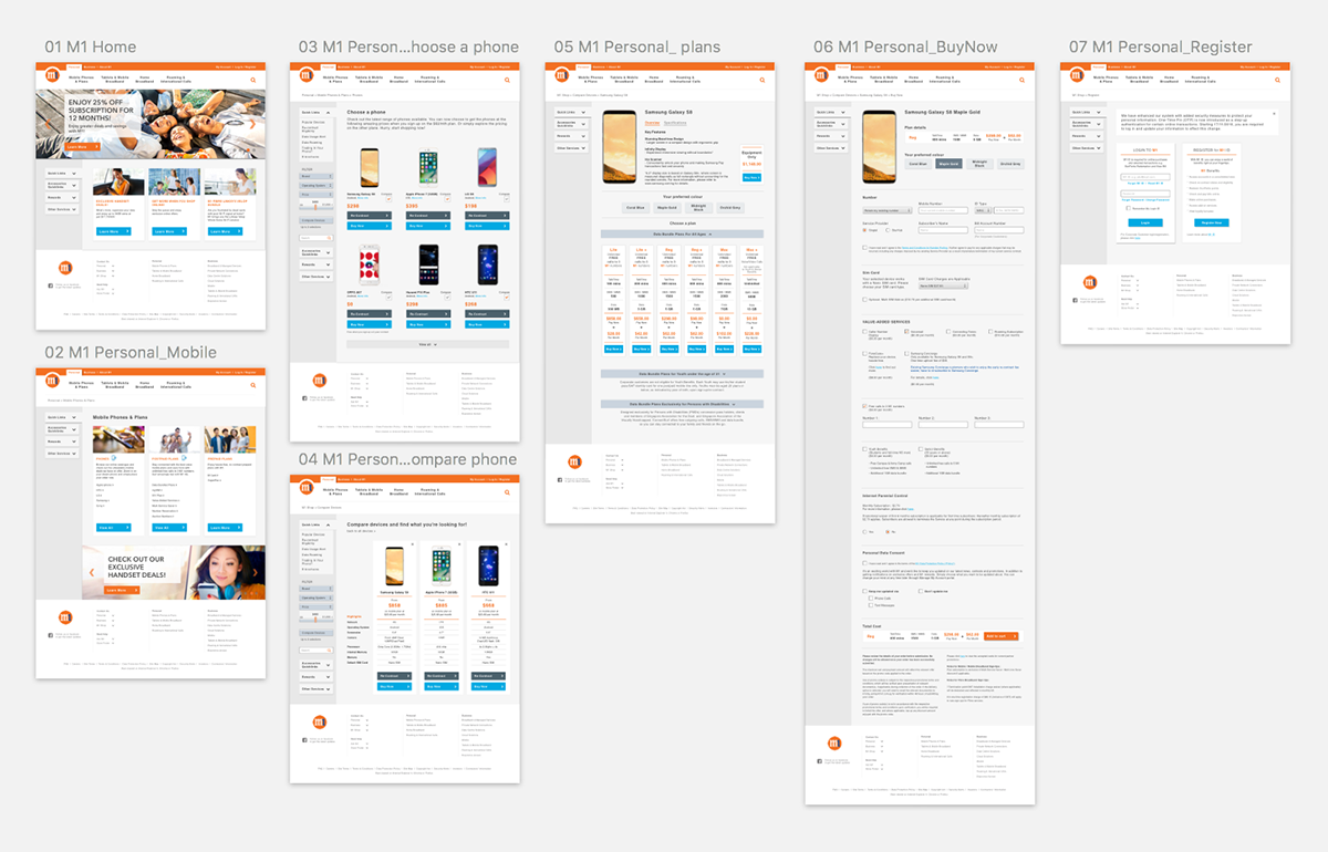
Hi-fi wireframe using sketch application

Solving CTA issue, and modernising the website.
User feedback
After our prototype was completed, we invited our users back to test it out. They took a much shorter time to complete their task to purchase the Samsung phone. They commented that the new design was clearer and easier to use as they were able to compare mobile phones with ease. They also liked the way the plans were shown in a neater structure.
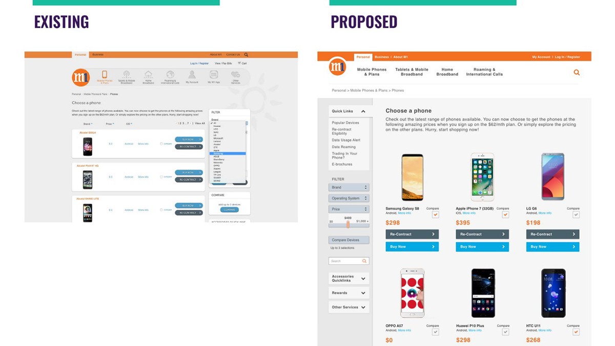
Bigger product images, clearer price figure and better CTA.

Solving product comparison issue.

Separating different product lines in different categories.
Users prefer the information of the price plans were clearly shown so they know how to select a suitable plan for themselves.

Took away the hidden form filling by having it upfront on a single page.
The new form is clearer in one page and the users know what is the amount of information they are expected to fill in. Compared to the current site, the users are now allowed to skip sections of the forms that are not applicable to them.
Mobile Phone Prototype
Since users all complained about the difficulty on accessing the website via a mobile device, we changed the layout of the website to be neater and adaptable to mobile screens. Previously they were prompted to switch to a desktop version and this was removed from our mobile site. The current website is also inconsistent with their mobile site. We created the design that will flow seamlessly from the desktop to mobile site version. We also did a hygiene cleaning of the mobile site content.
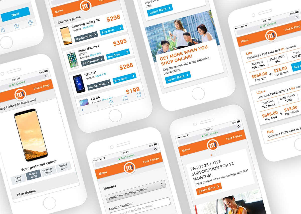
Viewing the site from a mobile device is now clearer

Hi-fi wireframe using sketch application

Users can click on the shortcut of the plan if they already know which plan they wish to purchase.
By tabulating the mobile plans, users can have a clearer view for comparison as they have a view on all the plans available.

Existing site prompt users to switch to desktop version when they tried to select a plan.
Reflections
I would like to improve the rest of the products that M1 has to offer to their clients such as broadband internet and business plans. It was a great learning opportunity to adapt the website to a mobile site as I had to maintain a consistent design on both interfaces.
Thank you for reading!


