PROMETHEUS CUBE UI DESIGN
Direction, Layout, Animation, 3D Stereo Compositing
Prologue Films
Direction, Layout, Animation, 3D Stereo Compositing
Prologue Films

The Making of Prometheus Cube Design

How did Ridley Scott and Richard Stammers articulate the look they wanted to achieve?
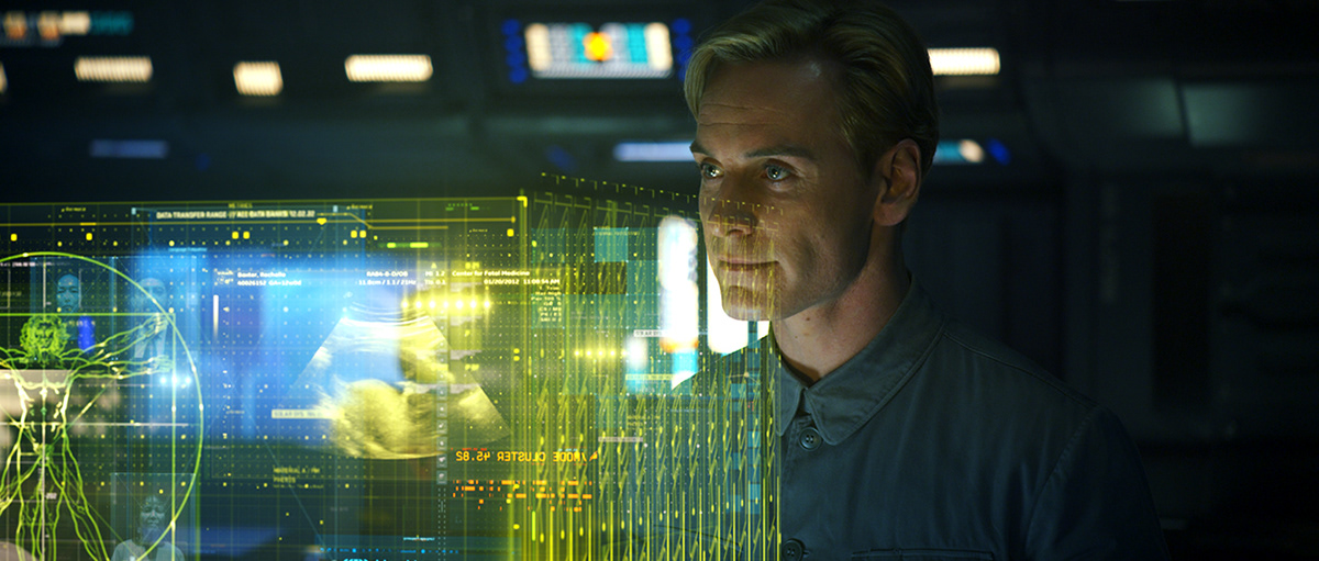
The main goal was to design two stereoscopic holographic cube sequences which would contain images. This Cube would rise out of a semi-circle console on the space ship, containing graphic layers of multi-cultural humanity utilizing unique and beautiful visual elements.One of the primary concerns for Ridley Scott was color. It's theme, tone, and palette. He wanted to affect a whimsical and golden warm feeling, like a lime yellow hue with an inner light. A gleaming yellow cube combined with gorgeous natural colors was to represent various aspects of humanity and it's culture. Ridley mentioned the "Ironman 2" hologram that Prologue created, but he felt that it was too digital & electronic feeling. He felt that it should be diffused and less defined. He asked us to think about how we could harmonize cultural communication with visual representations of positive iconic human images; such as music, math, art, binary codes, pi, hieroglyphic symbols, etc. The cubes theselves were not only supposed to harmonize elements, but they should be a visual explanation of the human culture. In concept of motion, he loved the idea of effervescing bubbles like champagne, floating upwards or in reverse and for images to constantly be in motion. For the powering up of the cube, he had an interesting analogy that it should be treated in the reverse action of an old fashioned TV set, when it turns off it goes to a singular point, then to black.

What was your biggest challenge and how did you go about creating a solution?
One of the biggest challenges was the treatment of design elements for culture and graphics within a color palette of a glowing yellow cube. I saw lots of gorgeous golden lights and caustics being used for the costumes and interiors in Prometheus, and Ridley Scott wanted to create these hologram Cube sequences with these similar beautiful yellow beams and lights. Visual effect holograms are made by adding positive values for color & brightness on transparency levels derived from dark levels. Cold color tones like green & blue can help to enhance digital images, so a blueish color palette is often used for this. The difficult part is that yellow is highest on the RGB range for additive color mixing, so if more than two images are overlapped inside this glowing yellow cube, it reaches maximum tolerance for brightness. Elements added onto a this yellow color are also not easily recognizable, and RS wanted to see natural colors inside the Cubes. In my imagination, it looked like a warm golden glowing cube, combined with the natural colors in human culture. The final solution was to subtract negative values reverse from maximum brightness and adjust positive and negative values by adding and subtracting brightness. Some layers create negative space from the bright yellow, and ultimately the final layers were added back into those positive values.


What sort of visual research was conducted and what were the challenges in creating:
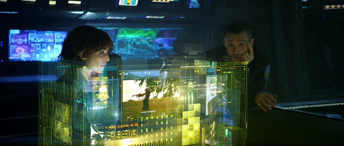
The major idea for the powering up and powering down was RS's idea of motion of champagne bubbles. Something that energizes up quickly and gradually loses energy, but in a more organic and natural way. The Prometheus visual effects team also wanted to combine abstract irregular graphical lines with bubbles for the start up of the cube hologram. Animator Yong-Sub Song created a nice movement of the electric lines with the organic bubbles. Each element of human culture and language were set inside a 3d structure, then many 3d structures or cubes are placed floating and moving within the main cube. Another challenge is to put stereo footage into the 3d cubes, so the container has 3d depth of stereo. Combining 3d depth of the scene with stereo footage in 3d container was a exciting experimental process as well as challenge.
Did 3D and IMAX make your life more complicated?
Unfortunately yes. CG Supervisor, Lee Nelson led the technical issues regarding 3d stereo process. 3d stereoscopic has additional processes especially when you are combining with live action. Controlling 3d depth of CGI with live action shots have many additional steps. Especially, vector graphic elements which are very sensitive for stereoscopic effects. At the final step, this issue caused small issues changing design and motion because some vector strokes were not great effects when viewed in 3d.
Unfortunately yes. CG Supervisor, Lee Nelson led the technical issues regarding 3d stereo process. 3d stereoscopic has additional processes especially when you are combining with live action. Controlling 3d depth of CGI with live action shots have many additional steps. Especially, vector graphic elements which are very sensitive for stereoscopic effects. At the final step, this issue caused small issues changing design and motion because some vector strokes were not great effects when viewed in 3d.
How did you maintain a uniform look with the shared shots amongst the different facilities?
We did not have this issue amongst other facilities actually, as we did stand alone sequences that did not really interchange with visual effects shots from other facilities for the two cube designs. We had a few instances where there were shared plates for background outside of the spaceship, but we easily incorporated their plates with our design. We also worked on a flash back sequence which was called a dream sequence. But we did find at the beginning of the research design process, our artists had shots within the same sequence and developed different design approaches and techniques. After the first design approach, I developed the composition of design elements and the way of color treatment throughout the whole sequence, and I also set the concept of motion and developed 3d scenes with stereoscopic composition. This way can sometimes have limitations depending on the scale and schedule of the project, but fortunately, it did work well in Prometheus cube sequence.
We did not have this issue amongst other facilities actually, as we did stand alone sequences that did not really interchange with visual effects shots from other facilities for the two cube designs. We had a few instances where there were shared plates for background outside of the spaceship, but we easily incorporated their plates with our design. We also worked on a flash back sequence which was called a dream sequence. But we did find at the beginning of the research design process, our artists had shots within the same sequence and developed different design approaches and techniques. After the first design approach, I developed the composition of design elements and the way of color treatment throughout the whole sequence, and I also set the concept of motion and developed 3d scenes with stereoscopic composition. This way can sometimes have limitations depending on the scale and schedule of the project, but fortunately, it did work well in Prometheus cube sequence.
Interview in The Making of Prometheus...Thanks Alicia.


