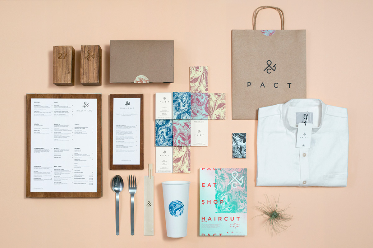
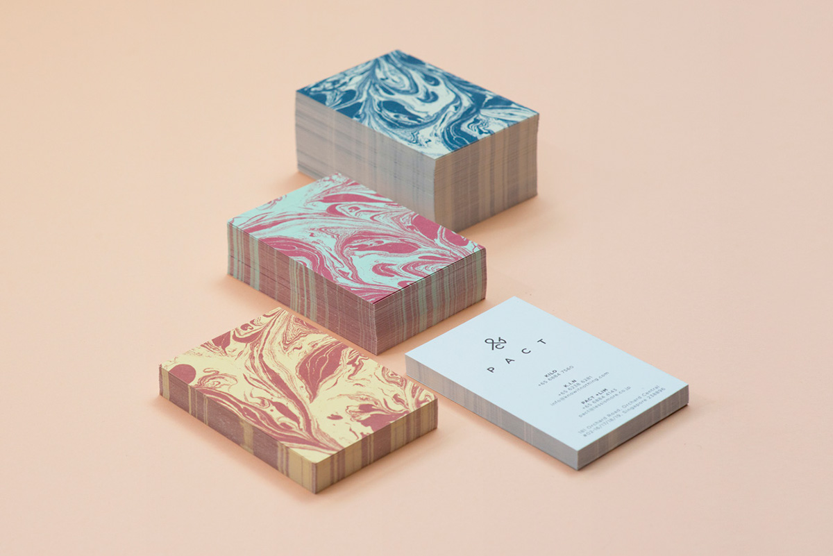
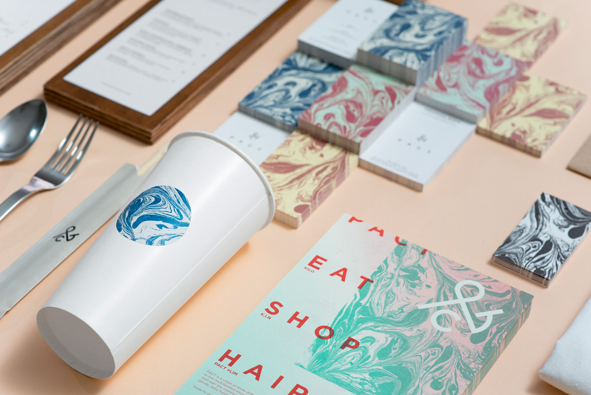
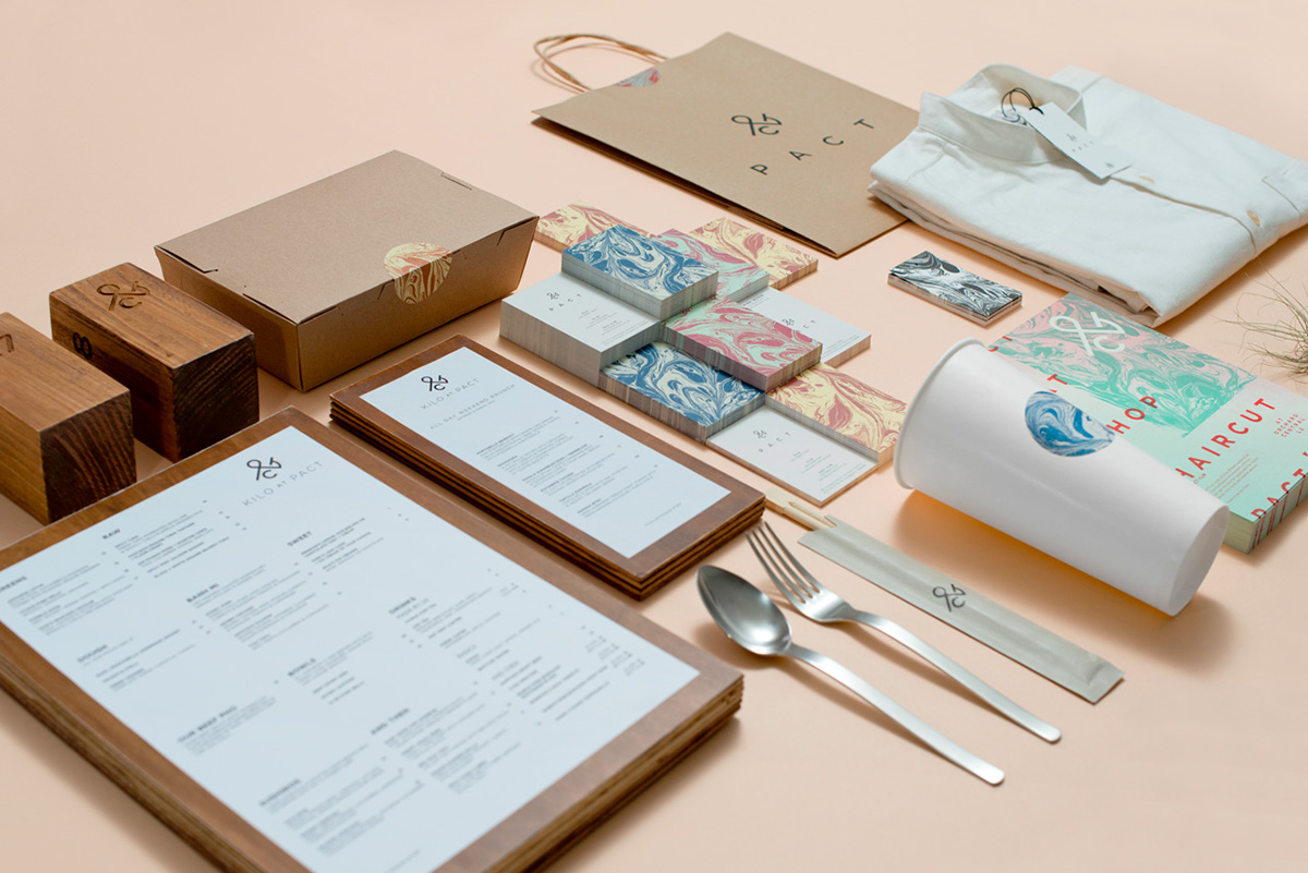
Branding & Identity

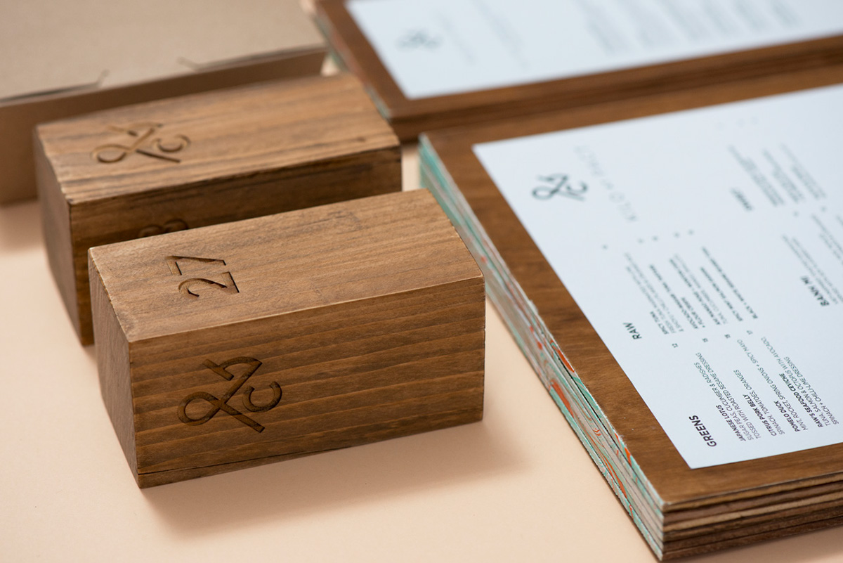
PACT is an open space where partnerships between like-minded businesses are housed. The clients’ different backgrounds in hairstyling, food and fashion, challenged the agency to create distinction amidst homogenising the brand experience. We first went about designing a unifying element with the use of the ampersand (&) symbol, altering its structure to spell “PACT”. The ampersand celebrates partnerships and is positive about the likelihood of future collaborations. The design execution of marbling was chosen to depict three dissimilar businesses coming together to form a single-minded entity. The swirls and mix of marbling underlines the brand’s reflexive yet determined vision of celebrating partnerships.