


NATIVE INSTRUMENTS REBRAND
A motion graphic embodying Native Instrument's new image. It was not completed due to time contraints.
For a Typography II assignment, I rebranded the audio hardware and software company Native Instruments.
Native Instruments is known for its leading software (Massive, Kontakt, Reaktor and Traktor) and hardware (S2 Mixers and Maschine) products for both novice and professional musical artists / audio designers.
My goal was to refresh the dated visual language used by Native Instruments to something that could be applied easily to the wide variety of products the company is responsible for.

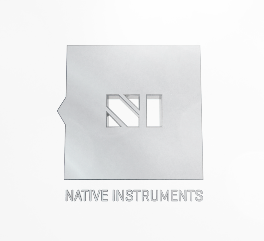
Native Instruments' original logo is a reliable logo that speaks to the solidarity and quality of the company’s products. The slate color is neutral, but also sophisticated. Additionally, the axehead shape alludes to a spreading soundwave or an axe itself held by a indigenous tribe. The bold type reinforces the strong presence of the Native Instruments logo in a balanced manner.
Despite its strong voice, the Native Instruments logo is clunky. The thick black borders, while increasing contrast and alluding to a physical button, wiegh down the logo. Native Instruments plays a leading, cutting edge, role in both audio software and hardware, not the blunt hacking visual alluded to by the logo. Native Instruments typically utilzes drop shadows, bold type, glossy graphical treatments and dynamic imagery. While aesthetically engaging, the graphical treatments add unnecessary clunkiness to Native Instruments' s net image that could otherwise be an incredibly sharpened, flexible and dynamic leading audio software and hardware brand.
Despite its strong voice, the Native Instruments logo is clunky. The thick black borders, while increasing contrast and alluding to a physical button, wiegh down the logo. Native Instruments plays a leading, cutting edge, role in both audio software and hardware, not the blunt hacking visual alluded to by the logo. Native Instruments typically utilzes drop shadows, bold type, glossy graphical treatments and dynamic imagery. While aesthetically engaging, the graphical treatments add unnecessary clunkiness to Native Instruments' s net image that could otherwise be an incredibly sharpened, flexible and dynamic leading audio software and hardware brand.

Initial Logo Explorations

Continued Logo Explorations

Initial Logo Potential Refinements
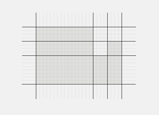
The Golden Ratio, which it utilized throughout the brand proportions.

Internal "NI" heavily inspired by the typeface Braggadocio.
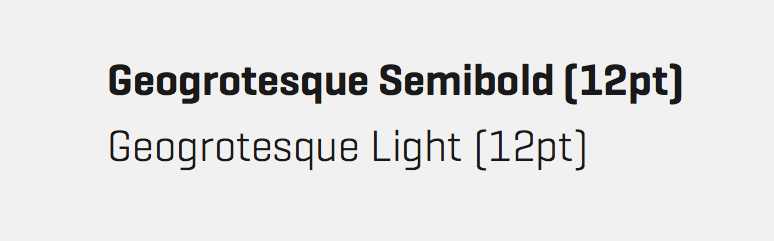
Geogrotesque chosen for its sophisticated technological, but warm feel.

Final Logo Proportions. Everything is locked to the grid.
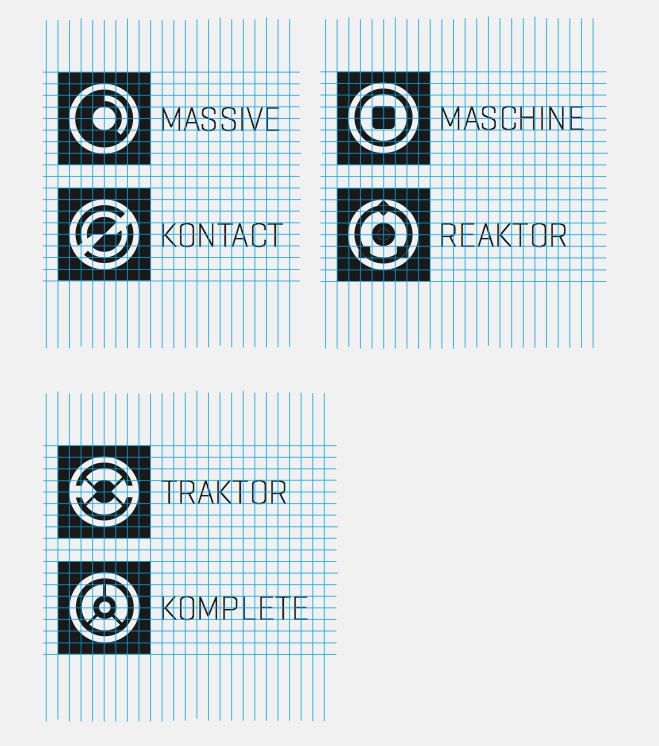
Revision on existing symbols utilizing the same grid proportions.
Potential graphic imagery.

Brand colors.

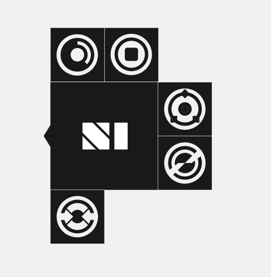
Deriving other graphic elements from the logo.
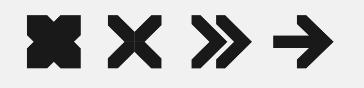
Symbols derived from the logo.

Full packaging design, also using the Golden Ratio.
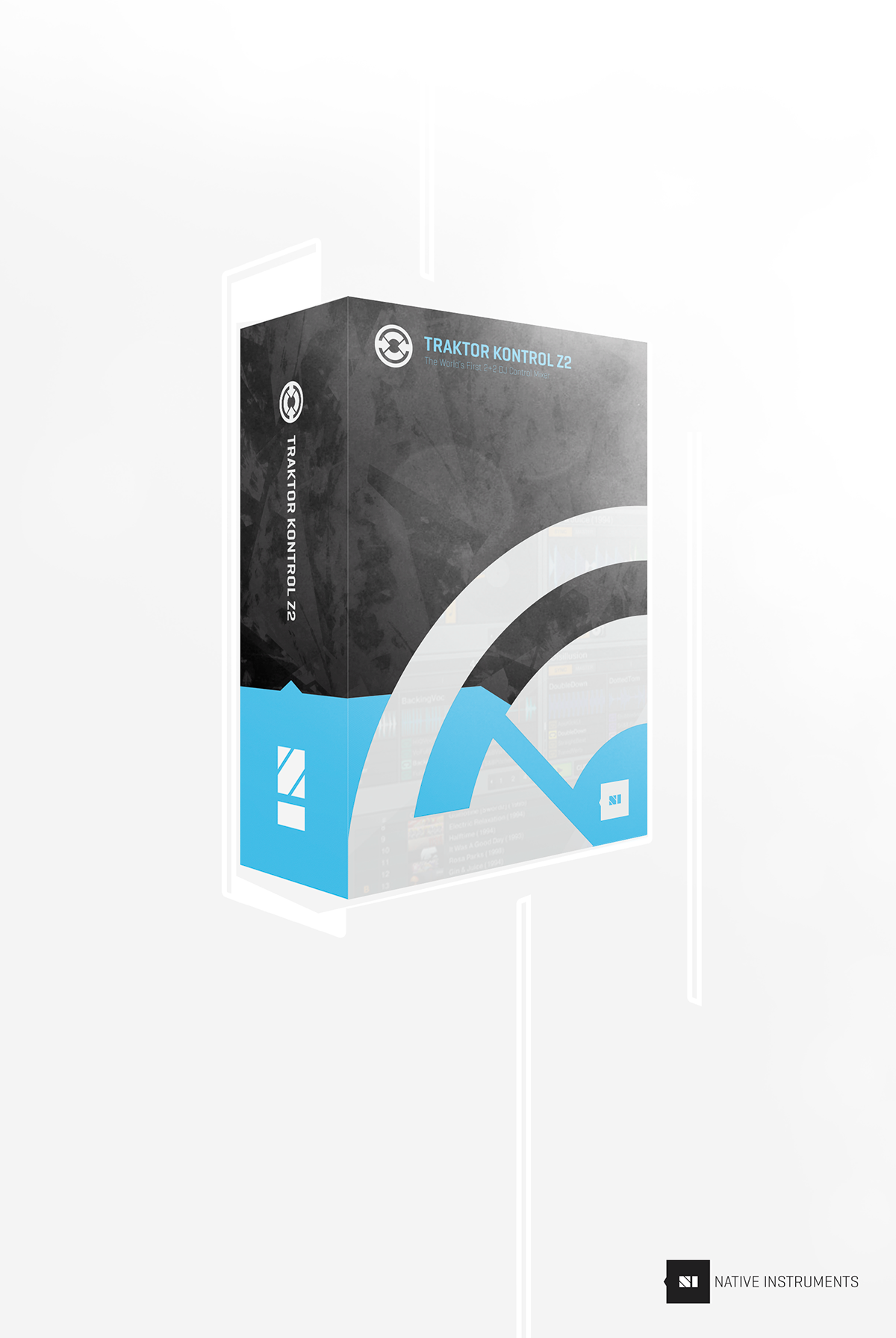
3D Packaging Design

Responsive Website Design
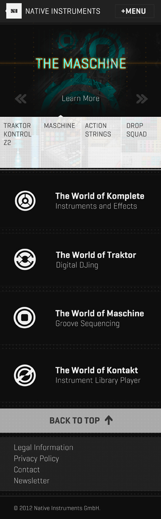
Mobile First Design

"Tablet" Design
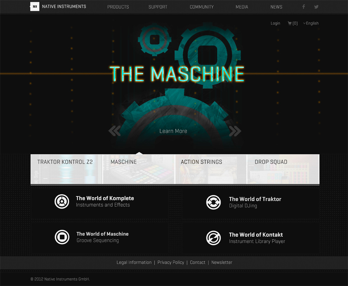
"Desktop" Design

Potential promotional material aiding Hurricane Sandy victims.
3D render.


