


______________
One of the projects I completed for the 30 Logos in 30 Days challenge was a logo for an animal foundation called "Wildlife". The design brief can be found below:
______________

I did a little research on the WWF website and decided that a similar animal cutout would achieve the client's goal of a stand-alone icon that could be recognizable on a variety of mediums, from web to print.
______________
My first attempts at drawing the logo were done by hand; it gives me more freedom to quickly scribble down an idea that might wander into my head. Since there wasn't much in the design brief and I wasn't able to ask more questions like in a real-world client situation, I decided to set up the following parameters:
{1} The logo had to fit within a rectangle or a box. Because this is a logo that would probably be used as stickers, screen prints, favicons, and web graphics, I decided that a clearly defined "border" would help optimize the logo to fit any scenario it might be applied to.
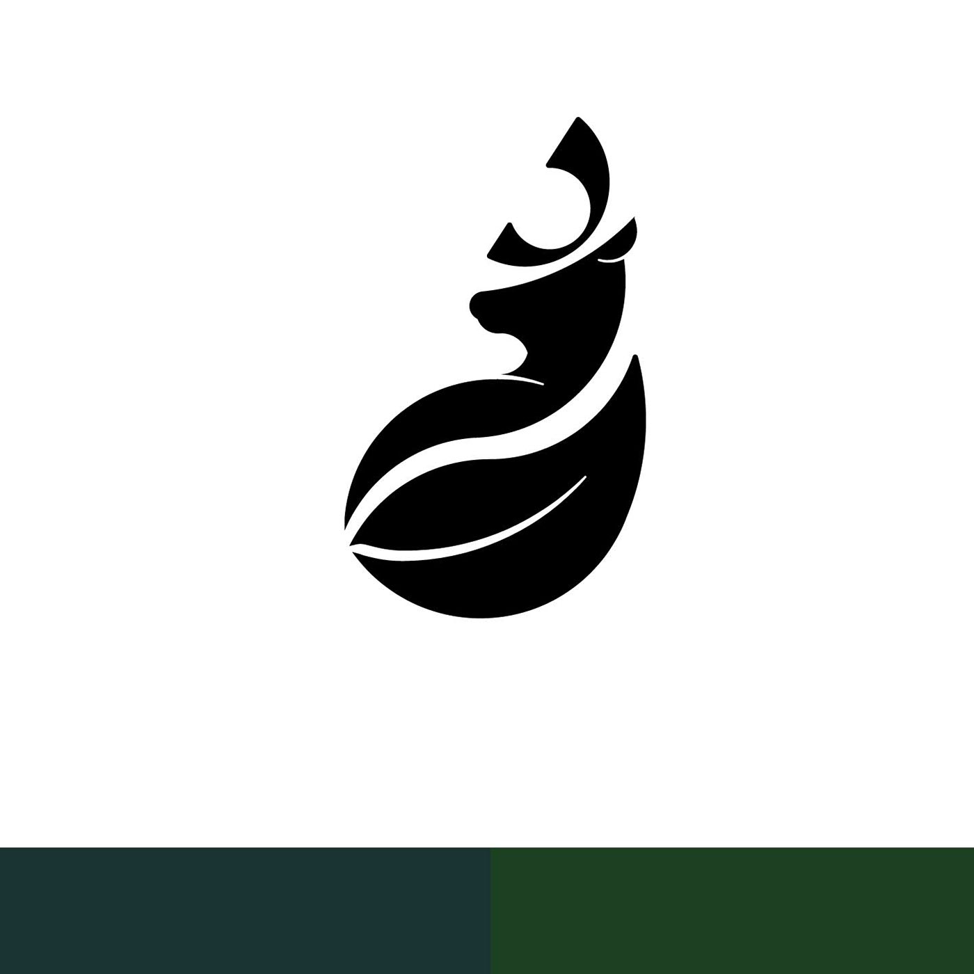
{2} The logo had to read in black and white before any color was applied. I knew already that the client liked the style of the WWF logo, so they clearly were drawn to the impression given by the negative space more than they were a lively color palette.
With those two ideas in mind, I set to work sketching for an hour or two, then transferred it to Illustrator. At this point, I decided that designing with the golden ratio was the best way to move forward with a well-balanced design.
______________

______________
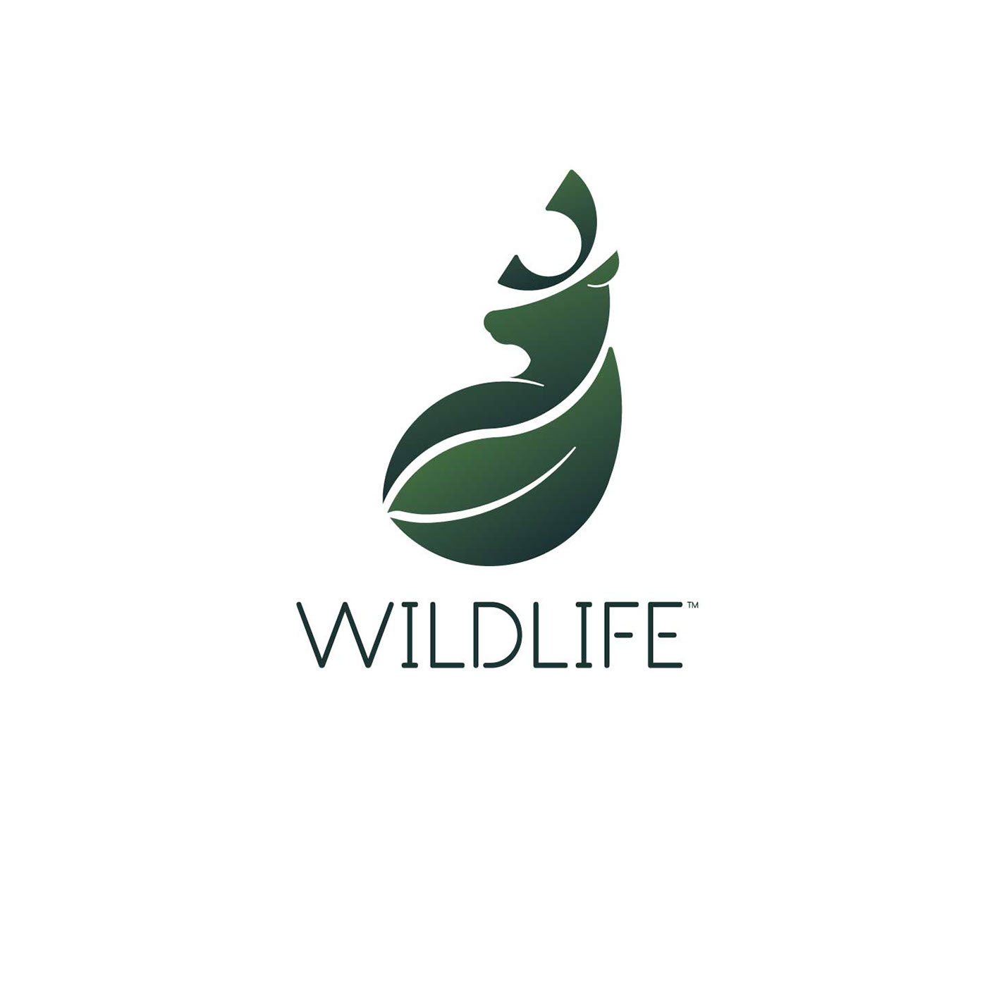
The final studies created below were the designs I was drawn to the most and the ones that I felt fit with the clients ideal the best. The one on the left, however, was quite busy and the finer details of the ear and mouth area were quickly lost when the image was scaled down to a 50px by 50px size. However, even though the second image scaled down better than the first, there were some distinguishing details missing, giving the shape a more blobby form than I liked. I tweaked a few more features and added some key lines, ending with the final shape you see below.
______________


_______________________________________________
Final Thoughts
I showed my coworkers the final logo and did the ten-second test; if they couldn't tell what the shape was for after ten seconds, I needed to rethink my logo design. My results were split half and half, with a bizarre outlier who said it looked like a naked lady.
I think I will go back and revisit the logo and play around with ways to make the face more clearly defined, as this was the most outstanding comment I received.


