-
新分享 WeShare 是一家大数据金融服务公司,其主要客户为国内各大型银行及个人投资方。
新分享 WeShare 是一家大数据金融服务公司,其主要客户为国内各大型银行及个人投资方。
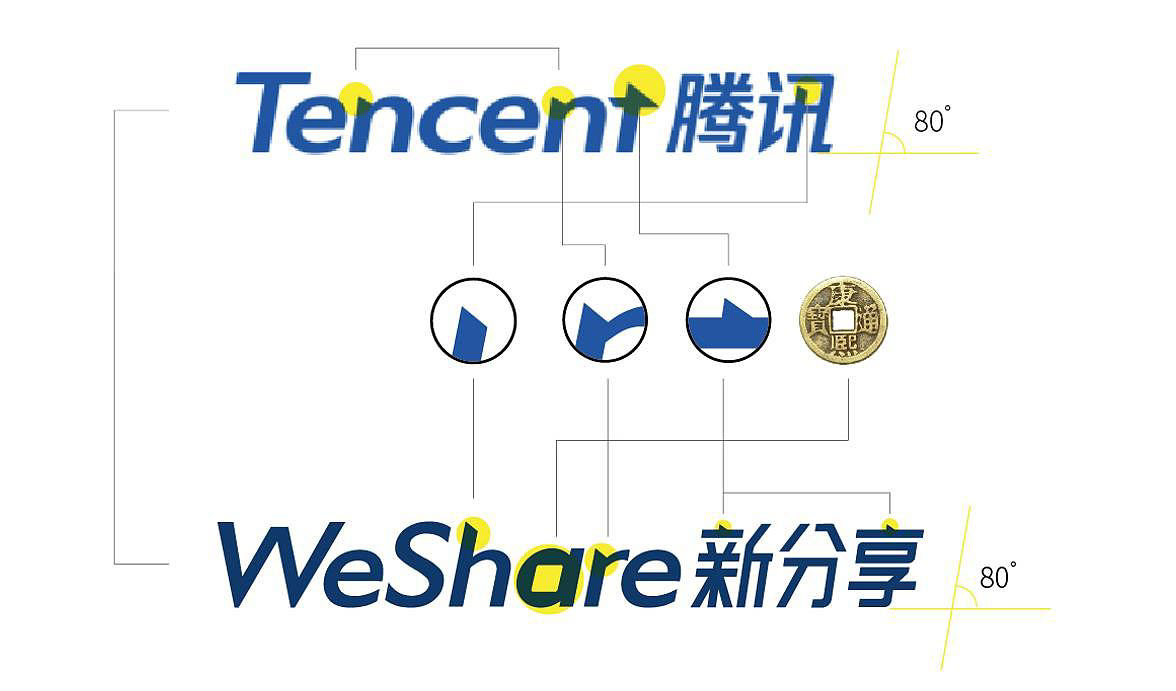
腾讯是其主要投资方,因此在设计中我们亦体现了和腾讯的色彩和字体关系。
新分享Weshare 的标志设计概念来源于多个方面的融合。我们试图在一个简单、容易记忆的图形中尽可能的将行业背景、行业故事、企业愿景及企业个性一次性传达出来。
我们使用“三道杠”的竖向排布来体现大数据的运算及存储机制——硬盘阵列及服务机房,体现其数据、科技行业特性。同时蓝绿色一方面代表科技方向的数据流动、一方面代表生活相关的金融行业特质。树形的结构为企业提供了像大树一样从小大到大、从简单到丰富、向多个方向逐渐延伸、逐渐成长的企业愿景。
-
项目成员:
张烁、张宏强、王小阳
室内设计:墨照建筑设计事务所
室内摄影:张超
-
WeShare is a big data financial service company but its main clients are all large scale domestic banks and personal investors. Tencent is its main investor, so in this design we also reflects the color and typeface relations of Tencent.
The symbol design concept of Weshare is originated from the integration of many respects. We tried to express the industry background, industry stories, company vision and company character all together at once in a simple graphic which is easy to remember.
We used “three bars” in a vertical way to reflect the operation of the big data and its storage mechanism—hard disk array and service generator room, and to reflect the characteristic of the data and technological industry. Meanwhile, the blue-green color stands for the data flow of technology direction on one hand, and on the other hand it stands for the features of financial industry that’s related to life. The structure of a tree offers the company a company vision of resembling a big tree that’s going from small to big, from simple to diverse and then extending to multiple directions and gradually growing up.
-
Project members: Zhang Shuo, Zhang Hongqiang, Wang Xiaoyang
Interior design: MOZHAO ARCHITECTS
Photography: Zhang Chao
Interior design: MOZHAO ARCHITECTS
Photography: Zhang Chao
-