
"Alex Presa" — the representational arrow, when split down the middle, the A formed on the left side, and the P formed on the right side, as two abstract triangles. The vertical focus gave the appearance of movement, and progress.

"Alex Presa v2" — The gothic letter was a bold typographical movement from the more representational arrow from the original logo. The symmetrical look of the A flipped, gave the "P" good symbolism, as well as good balance throughout the logo. The use of the hexagon, was also a bold shape and choice, as the points of each six sides accentuates the edges of the monogram.

"A L E X" — as time went on, I struggled with my identity (whether or not to use my last name, and if it could work ever in a design), So I experimented with the symmetry of a 4 lettered name (although my full name is Alexis), and yet another symmetrical and well-balanced logo, or mark was born.

"The Presa Collective" — this new found inspiration, with enough funds, and new endeavours, came the name "The Presa Collective", with a new vision to showcase all of my different facets of art; design, branding, photography, film, music, writing, etc, came the need for something natural and handmade, something real. Outsourced to a guy in New Zealand, Ryan Bowles, who was someone I was really looking forward to with, gave him my rough sketch and basically traced it out. To be honest, never sat well with me, the look of the design.

"The Presa Co." — A minimal and modern typographic solution to the ever-changing world of branding. The simple tracking and not-so-well balanced use of the words were some super rookie mistakes, but if looked at it with another perspective, see that the humanness of the logo was still relevant, and that the logo still was coherent in some manner, really stuck out to me that year.

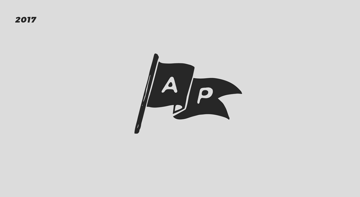
"Alex Presa Co." — another year of revelation and change. Change of persons, change of roles/positions, Going back to the real stuff and what people are craving for; genuineness. The analogy of a flag, means a bold statement. It means it represents something, some country, some idea, someone. That someone is the founder of this company, and seeks to continue to grow and develop.

2018 — The future is colourful...


