

Suds Brothers Cleaning
Branding project for mock cleaning company client.

This is the SBC logo I came up with. I wanted to stay true to the very recognizable blue and green colors often found with cleaning company branding but go for a more muted and airy feel. The two circular figures are my interpretation of the suds brothers and again I go for a simplistic design.
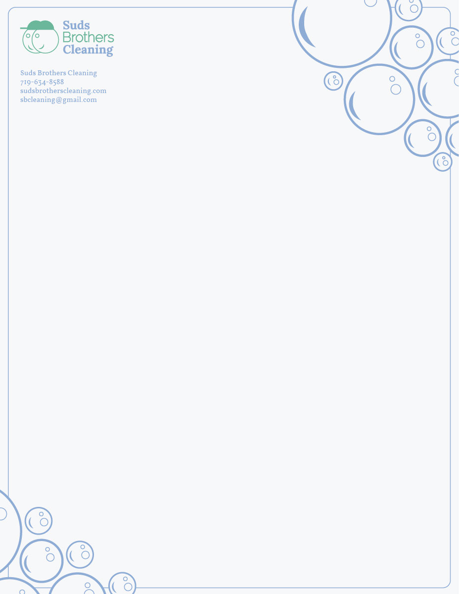
I wanted to reinforce "SUDS" brothers through out the design by adding bubbly suds graphics to develop more brand identity.
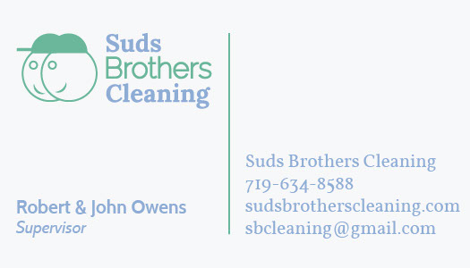
Single side business card keeping it simple and easy to read.

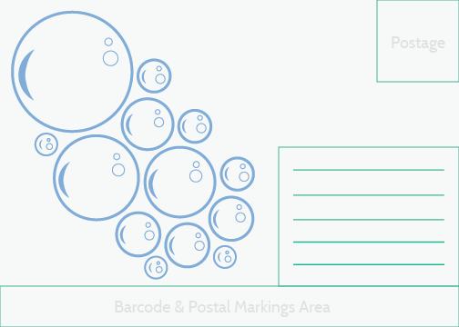
Simple envelope design with clear graphics and information.

Two sided direct mail piece with call to action on front.
Back side of direct mail.
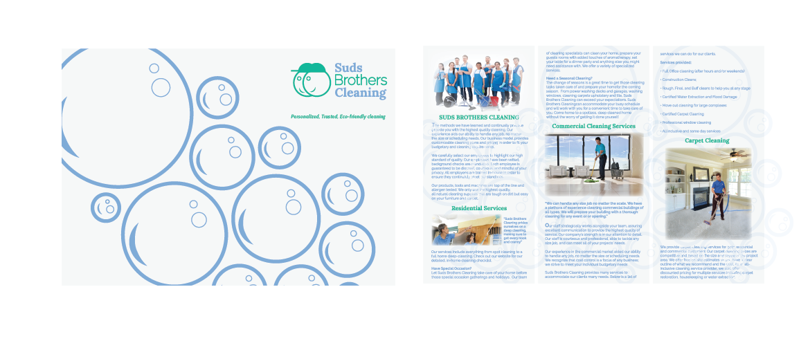
Finally my brochure design. I wanted a nice mix of vector and raster graphics. As with the rest of the brand I went for a clean and simple approach to layout the information.