

REČ
Magazine design
Magazine design
When I started designing Magazine REČ in 1999, it existed only in the form of electronic edition on B92 website. When we re-started printed edition, titled R.E.Č., the idea was to first publish all the texts that were on internet. Each printed issue was also published on internet. That's why, in the initial newly designed issues, you can find web graphicism, recognizable as html tags for creating web pages. For example, footnotes were made as open and closed tags (at the beginning and in the end). There are pages with one column, two columns, three columns of text, which is not typical for printed editions but for the web.
That way of text organizing extremely slows down printed editions production. After first four issues, in the end of 2000 when the magazine has gotten its old name REČ, it was redesigned again (part II).
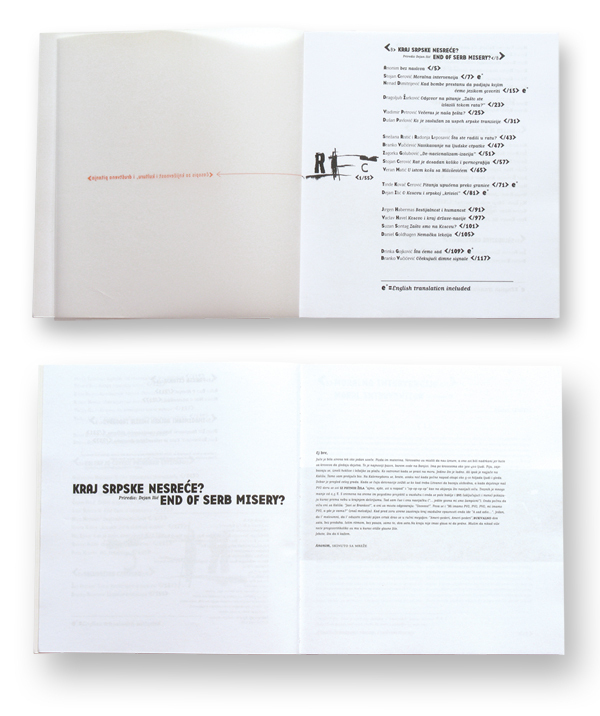
Compared to the old one (part I), it was much simpler, and adjusted to REČ book edition. The color of the paper is light yellow as in the book edition, which is suitable for reading. Layout is more elegant with big margins, and with lighter book typeface. Anyhow, dynamic was kept through different ways of organizing text into columns, which is acceptable in magazine design, while in book design, it affects readability.
For a very long time, the magazine title was not shown on the front cover, but only a piece by the artist presented in a particular issue. Because the magazine is voluminous, the title is visible on spine.
Year: 1999 Client: Samizdat B92 and Year: 2004 untill today Client: Fabrika knjiga
That way of text organizing extremely slows down printed editions production. After first four issues, in the end of 2000 when the magazine has gotten its old name REČ, it was redesigned again (part II).
Compared to the old one (part I), it was much simpler, and adjusted to REČ book edition. The color of the paper is light yellow as in the book edition, which is suitable for reading. Layout is more elegant with big margins, and with lighter book typeface. Anyhow, dynamic was kept through different ways of organizing text into columns, which is acceptable in magazine design, while in book design, it affects readability.
For a very long time, the magazine title was not shown on the front cover, but only a piece by the artist presented in a particular issue. Because the magazine is voluminous, the title is visible on spine.
Year: 1999 Client: Samizdat B92 and Year: 2004 untill today Client: Fabrika knjiga

Magazines where spine and cover are visible

Front covers of the magazine

Examples of pages where usage of HTML tags is visible, as well as different column dynamic


