


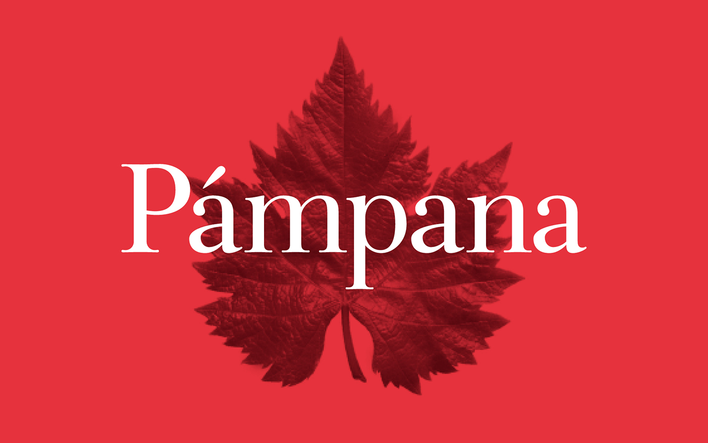
Botera
A Typography with wine flavor
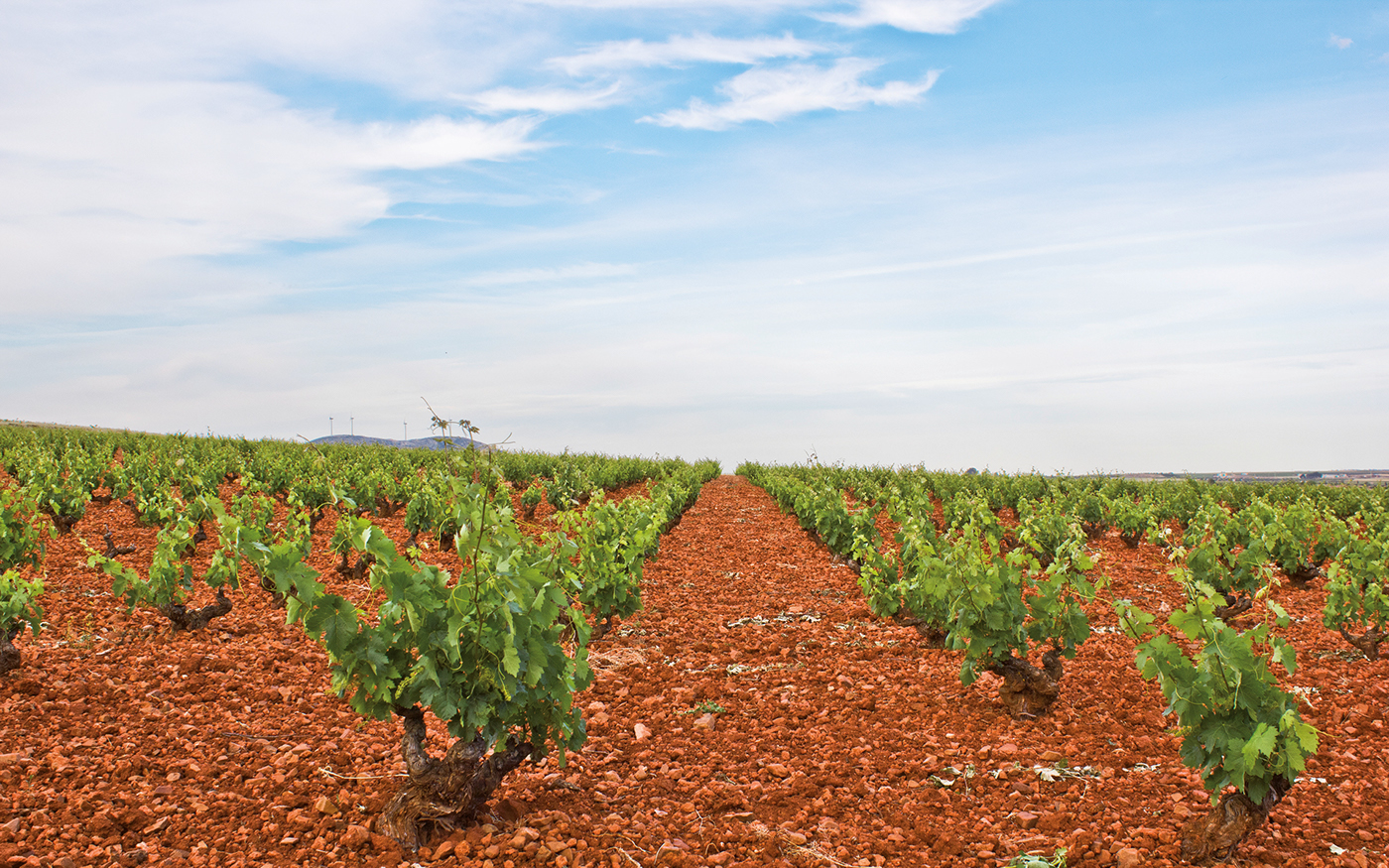
Botera is a Typographic Project based in the environment of Valdepeñas (Ciudad Real, Spain) and its wine heritage. Enology and typography speak the language of finesse. Both of them understand time in the same way: the owner of qualities related with knowledge of tradition and new influences.
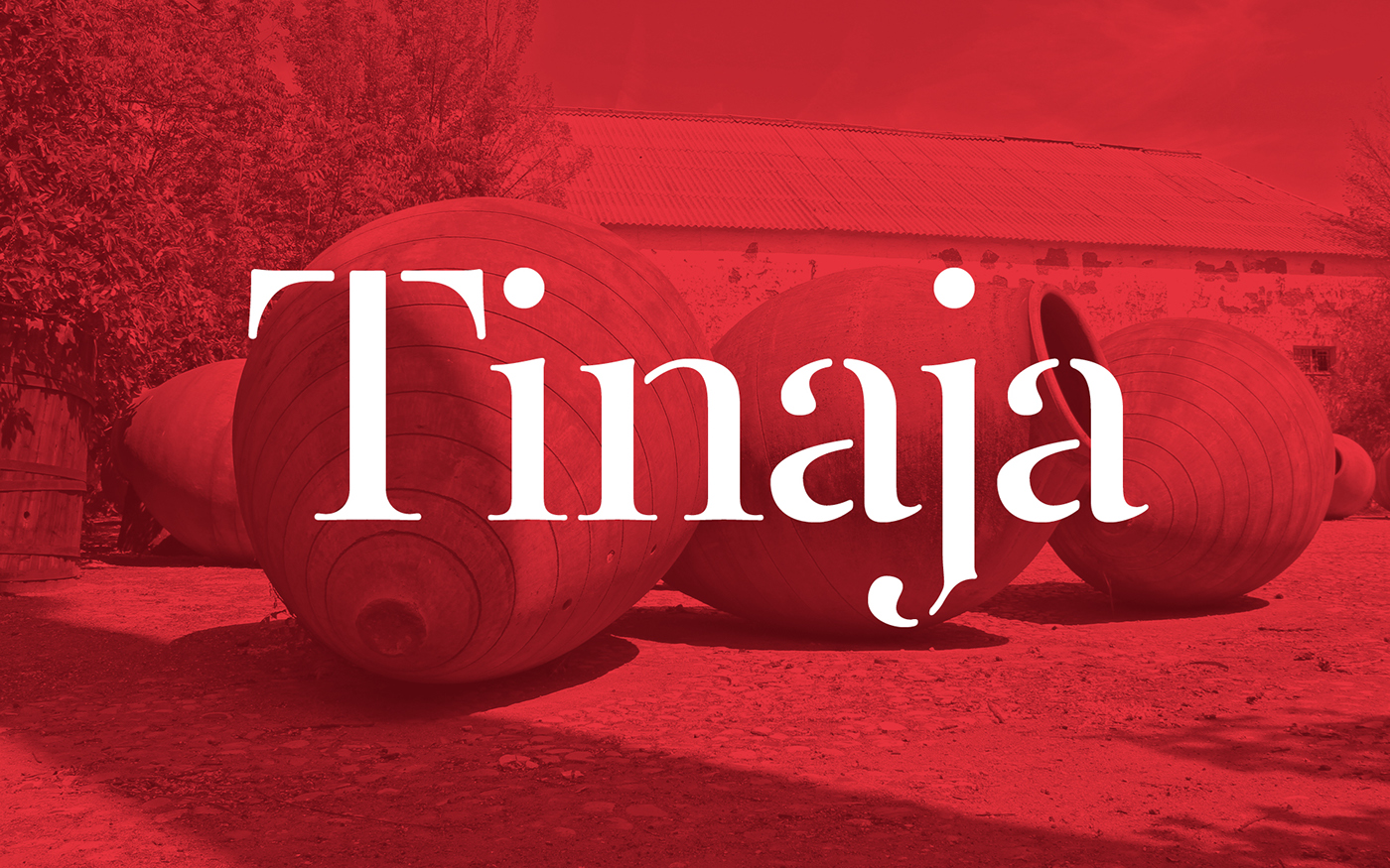
Bringing together the heritage and the flavors, aromas, contrast and power that make so recognizable the wines of this area. Reading texts in Botera type, we do not only use a font, but we give to the user an original heritage of a region consistent with its roots. We think Botera is a typographical project that is born in this particular place, Valdepeñas and according to its wine heritage.
As we like to say, enology and typography speak the same language and for that reason they are not so distant and have comprehension between both. Botera is like wine, we can use it every day or keep it for special moments. It is the safeguard of the characteristics of these wines, able to show us the knowledge of tradition and new contributions.
Awards
→ ADG Laus Awards: Silver'18
→ Étapes: Diplômes 2017
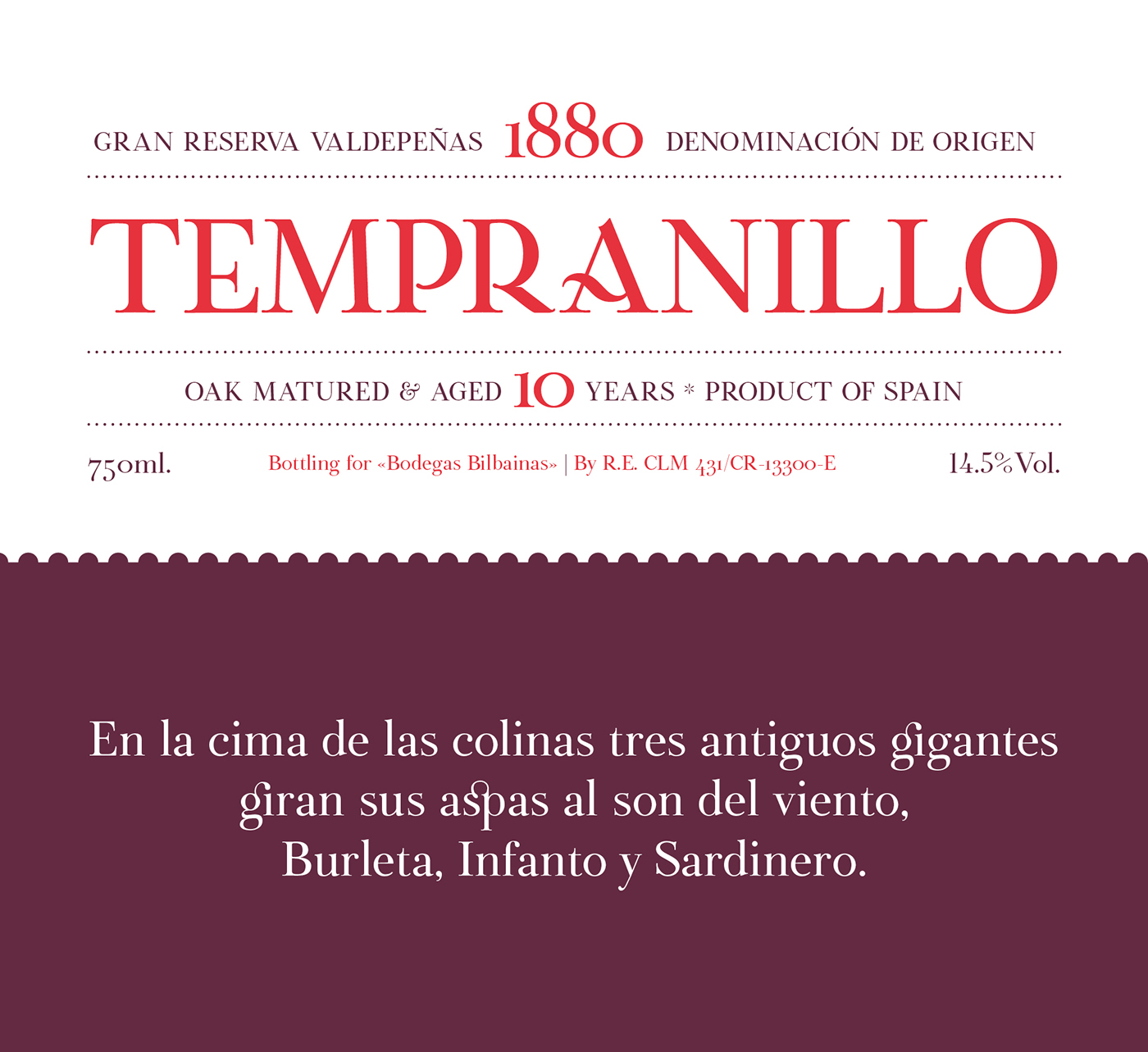
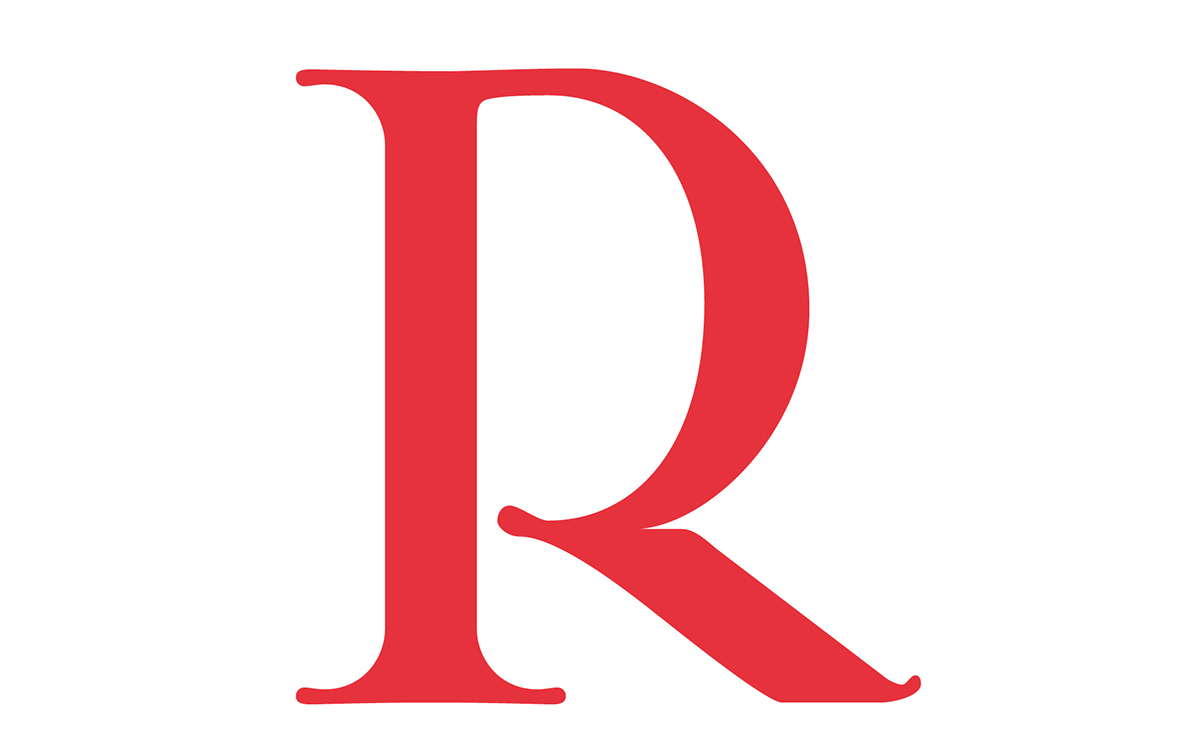
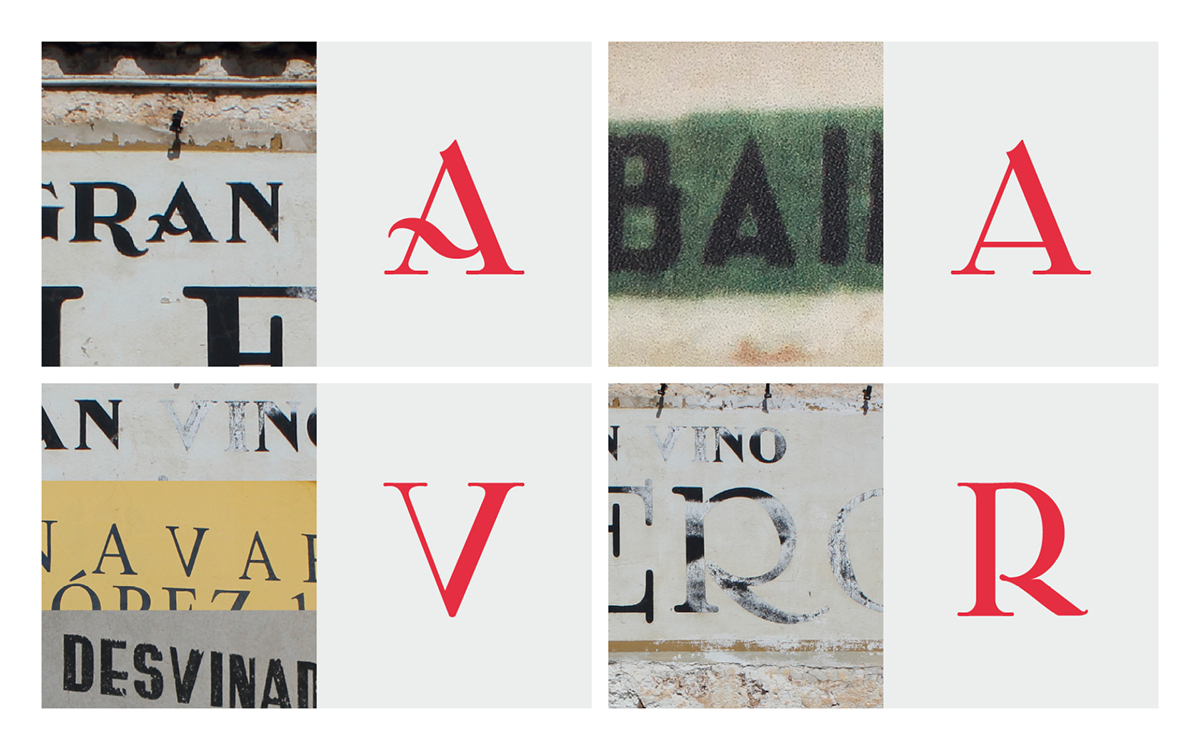
Botera comes from the need to create a typography adapted to the characteristics of Valdepeñas’ wines. These wines of great tradition and historical importance, which communication -as many other examples- rests on calligraphic and ornamental typographies, that have nothing to see with the connotations and characteristics of the wine. So, why do not we create a typography that shows the typical particularities of this valdepeñera drink, where form comes from function.
It is well known that our country has not been a great producer of typographies, as many other countries that have been important typographical creators, so maybe this is one of the reasons for what we always use the types established in the collective memory of the society, although when we have recovered some spanish typographies as the Ibarra Real. In this point is necessary to think that, relating to the wine world, the main discipline of graphical design would be packaging, but this project wants to go deeply into the typographical questions, into the concept of wine and to speak in the same language, as well as in the shades that are capable of transmitting our characters and visual codes.
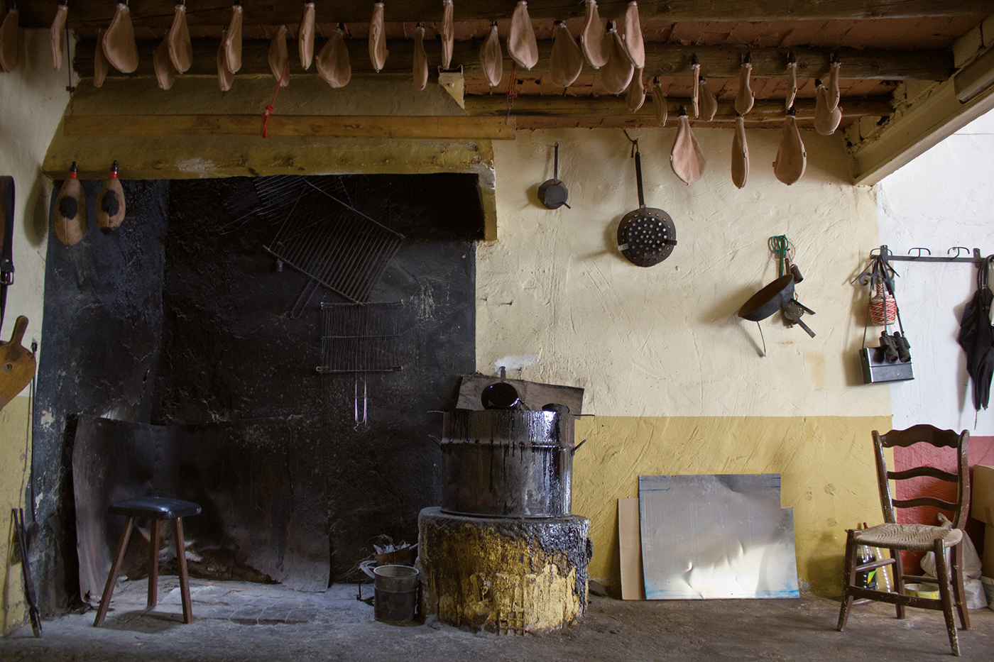
We think that the world of typography is not far from the world of enology, they are small subtleties, shades that have bows of comprehension between one and the other. For this reason Botera is born. Valdepeñas’ wine has general characteristics and every cellar too. That’s why, due to its historical development, we take as a reference the Corcovo wine cellar, since it is the example between the tradition and the current vision of this wine. It doesn’t exclude the rest of wines since there have taken generic enological characteristics of this drink to be able to represent it in the most coherent form in each of the typographical compendium. Having investigated the whole environment that forms Valdepeñas’ wine area, we have taken decisions that will give us the graphical shape that Botera characterizes.
Botera applications
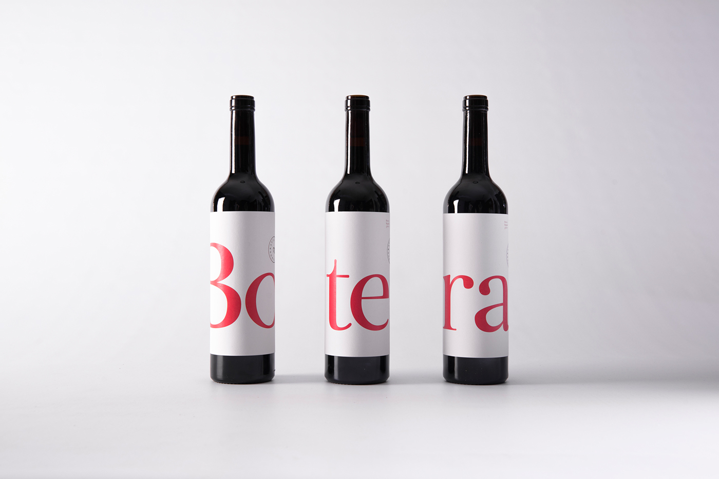
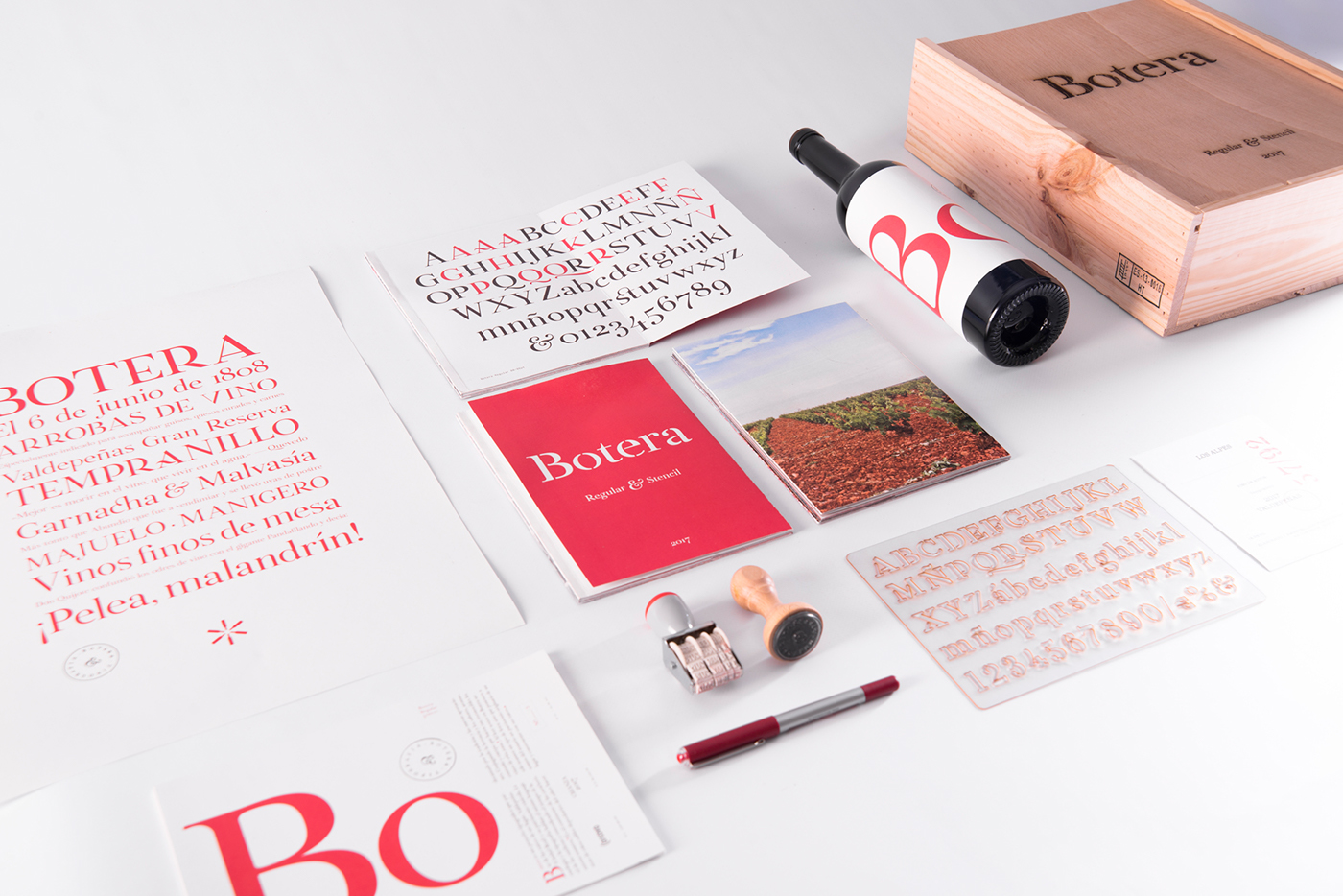


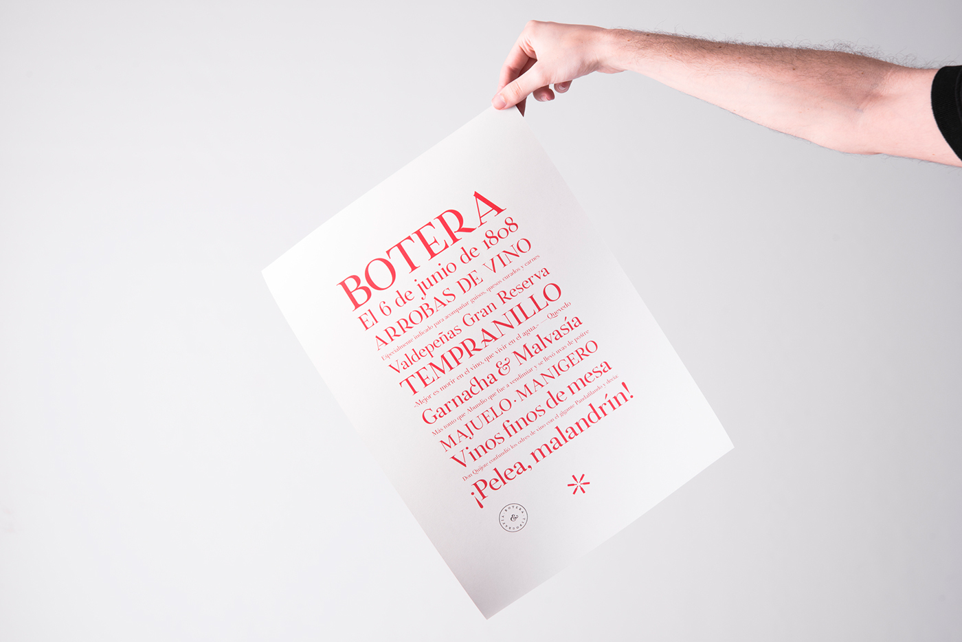
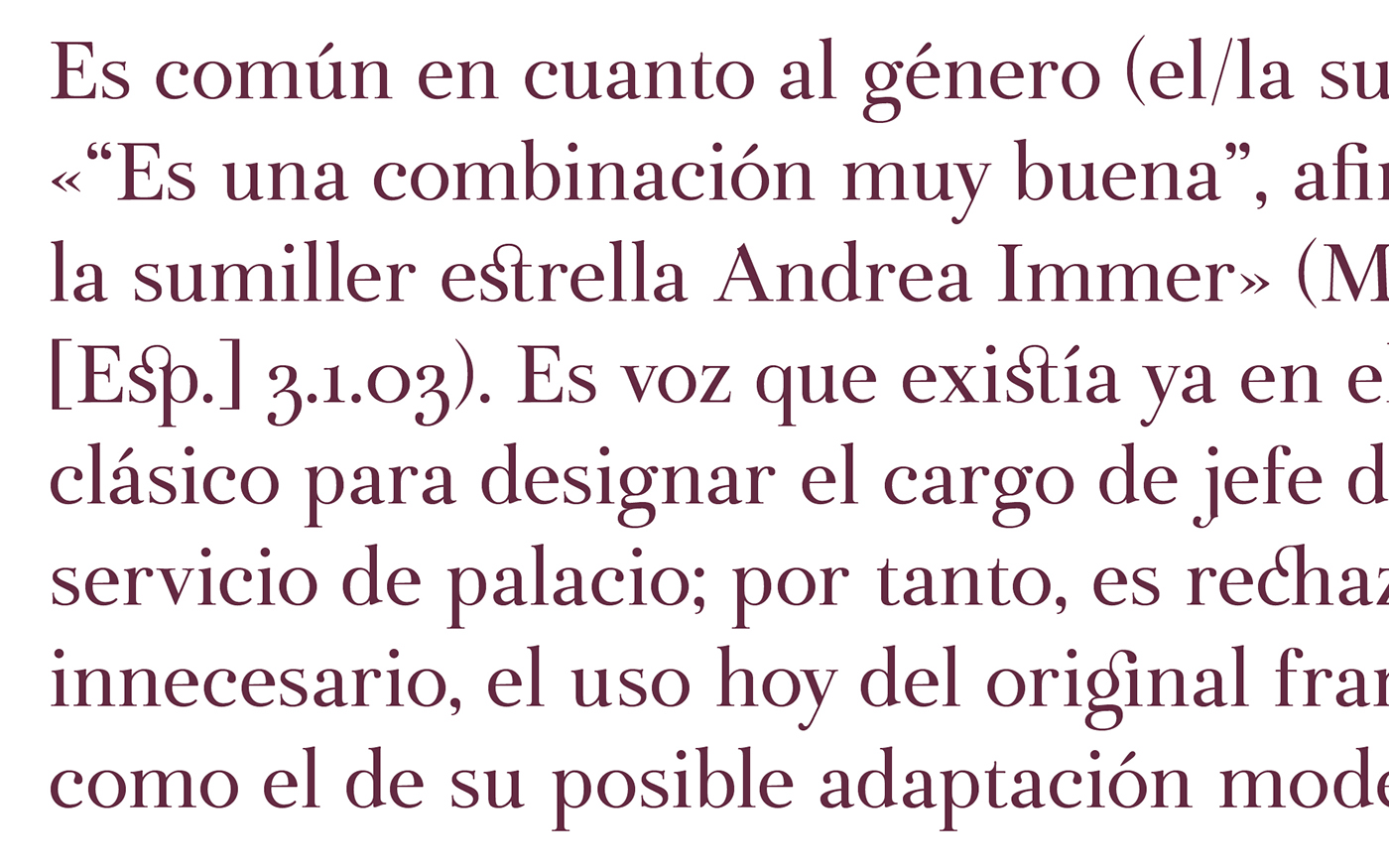
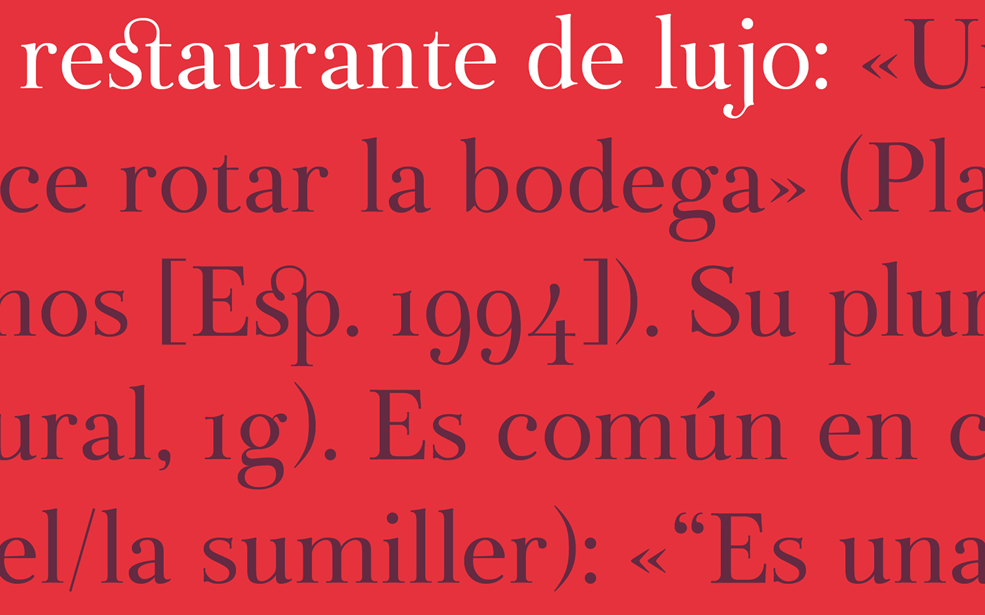
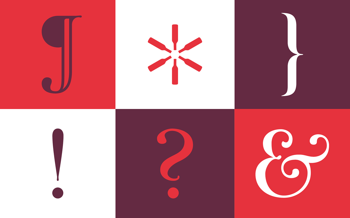
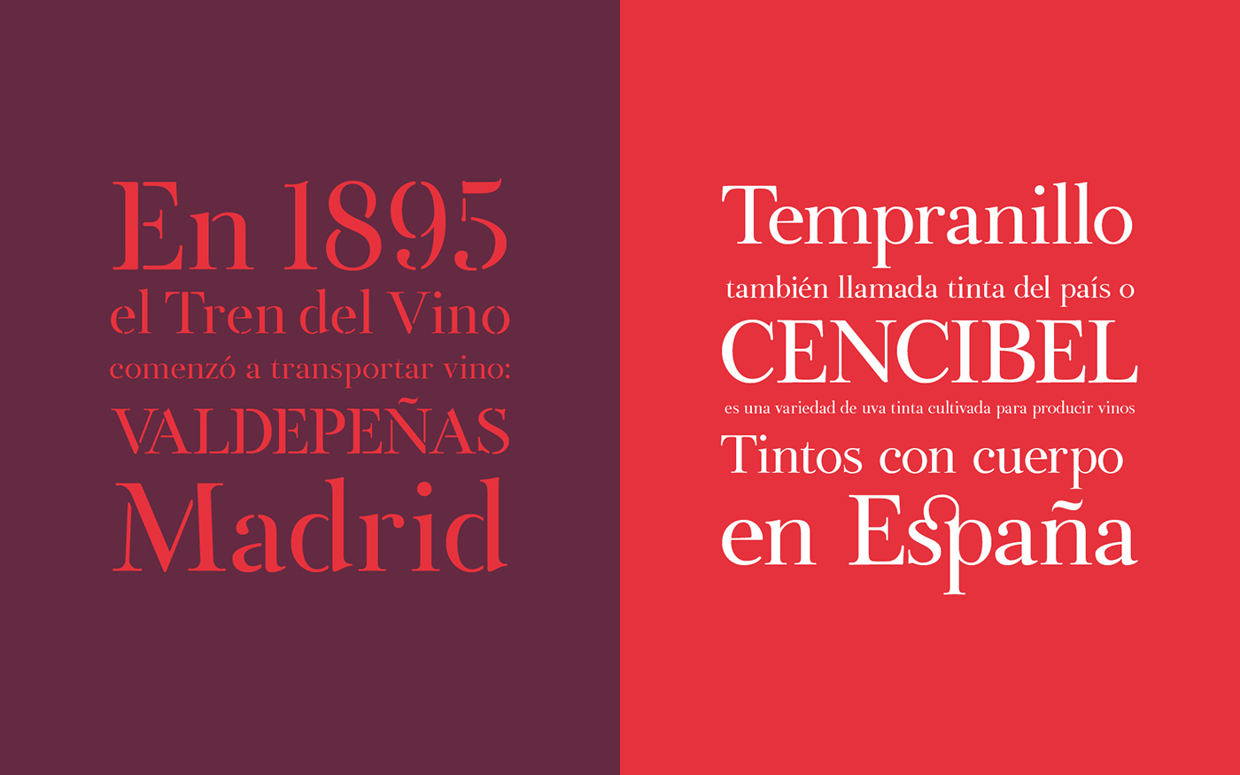
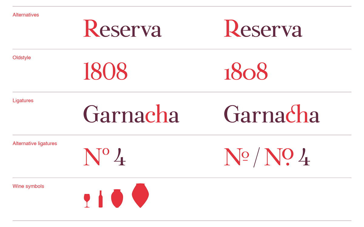
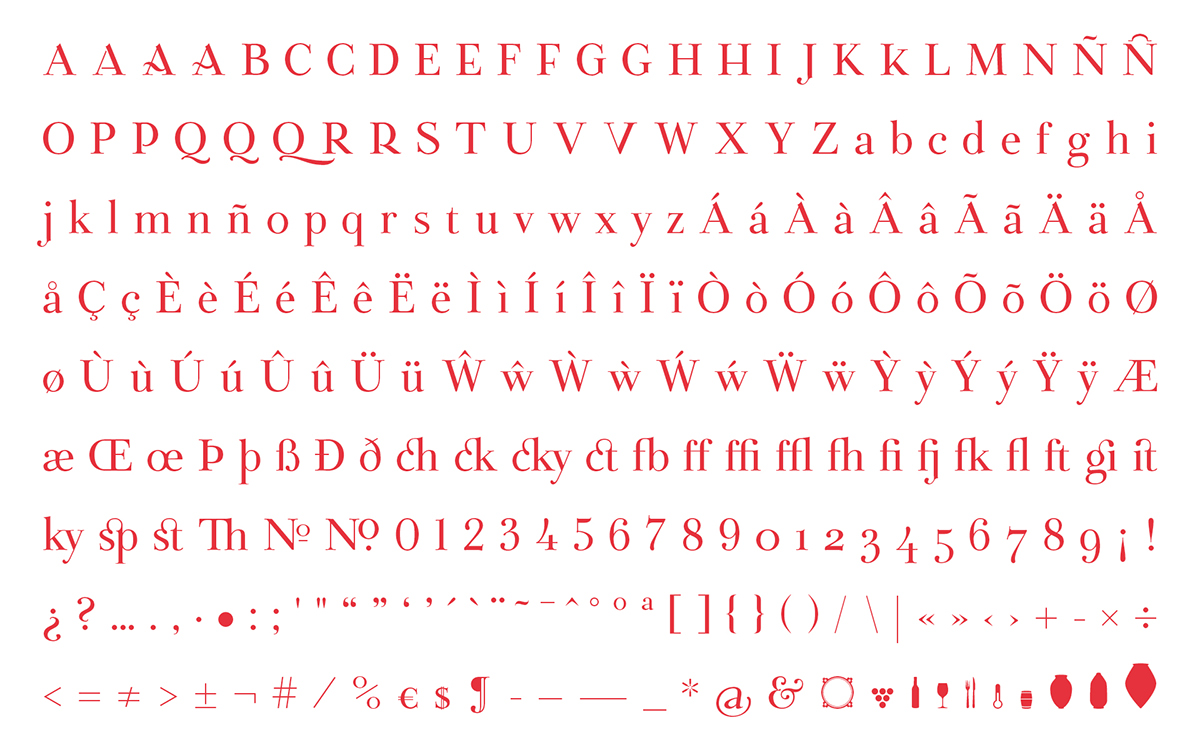
Botera® is the result of the Graphic Design Final Project. Botera is an OpenType typeface, composed of two weights: Regular and Stencil, and with a total of 278 characters each: Uppercase, lowercase, alternative characters, ligatures, decimal and old numbers, punctuation marks and some pictograms related to the world of wine.
If you are interested in this project, have any questions or want to show some work using Botera, you're welcome to contact through hola(at)javimontoya.es


